SLC21/WK2: Introduction to Logo Design.
Hello, Steemians. I hope you are well and doing great. By the grace of Almighty, I am also fine. Today, with the post, I am going to entry in the SLC21/WK2: Introduction to Logo Design contest run by our beloved Professor @lhorgic. Let's move to the main point.

A unique symbol, design, or monogram used by a company or an organization to represent its brand and identity visually is called a logo. Logo helps people to recognize and remember a brand. Logos often look simple but meaningful, which reflects the brand’s value.
Quality of a Logo
There should be some quality of a perfect and well-designed logo. Let's discuss it widely.
Simple
A logo should be simple, but meaningful. It should be like when people see it, they will get who is behind this logo and what they do. A perfect logo will never be complicated. The logo is not a puzzle, it’s the identity of a brand.
Memorable
If a person can't recognize which company or brand's logo this is after watching a logo, the whole concept has failed. A logo must be rememberable.
Original
If your logo is not original, that means your brand is also not original. This is another principality of a logo that it must be original. To do this, we can follow some steps:
- Avoid similar or familiar logos that are already in.
- Avoid common icons or symbols.
- Avoid the color combination that already exists on another brand's logo.
- Can go out of the box like Samsung, Tata or Sony.
Evergreen
Another quality a Logo should have is that it should be evergreen. It won't be bound to any time frame. Whenever people look at it, they should feel like, Wow, it's new. A logo can't be old-fashioned. It should be modern but timeless.
Balanced
A logo must be balanced. A logo is not a mountain or something created for a short time. The logo is the identity of a brand. And it lasts forever. So it can't be shaky, can't be messy. If a logo had a slogan it shouldn't be larger than the original company name. Every part of a logo should be perfectly aligned. The color combination should be perfect. Every part of a logo should set up a compliment for the brand.
Versatile
In this modern era, the versatility of a logo is a must. A logo should be merged wherever I want to put it. If I can't use a logo on different things, that wouldn’t be a quality logo. Sometimes, I may want to put it on a t-shirt, on a shoe, on a coffee mug, on a school bag, on an online poster, or a printed page. It should look the same on everything.
A logo has a significant role for a brand. Logo produces the brand values and builds up the identity of a brand. A brand without a logo means nothing. Even, an amateur brand also has a logo. This is how important a logo is for a brand.
A logo makes a brand recognizable to people. Build up an identity for the brand. That's why, the brands put their attention to the logo.
A logo makes the first impression of a brand. A memorable, visually appealing logo can get the attention of people and create a long-lasting impression. A unique logo can help a brand to stand out in a crowded market. A logo is more than just a design; it's the identity that represents a brand’s essence and values.
To make a great logo, we need to follow some steps and avoid some mistakes. We need to balance our Icon, Name, and Tagline. Here, our Icon, name, and tagline should be perfectly aligned. It can't be shaky.
 |
|---|
| ✅ |
 |
|---|
| ❌ |
The tagline or meta line shouldn’t be larger than the Name of the brand or headline.
 |
|---|
| ✅ |
 |
|---|
| ❌ |
Unnecessary spaces between characters make a logo look flashy.
 |
|---|
| ✅ |
 |
|---|
| ❌ |
No gap between the lines makes a logo bullshit! And that won’t be readable.
 |
|---|
| ✅ |
 |
|---|
| ❌ |
Imagine, where I currently work, a pharmacy named Palash Medicine Corner, the owner ordered me to create a logo for his pharmacy. So, I am now going to make it with Canva.
At first, I opened my Canva and created a new canvas for the logo, which I learned in the first week. At first, I choose the background of his choice.
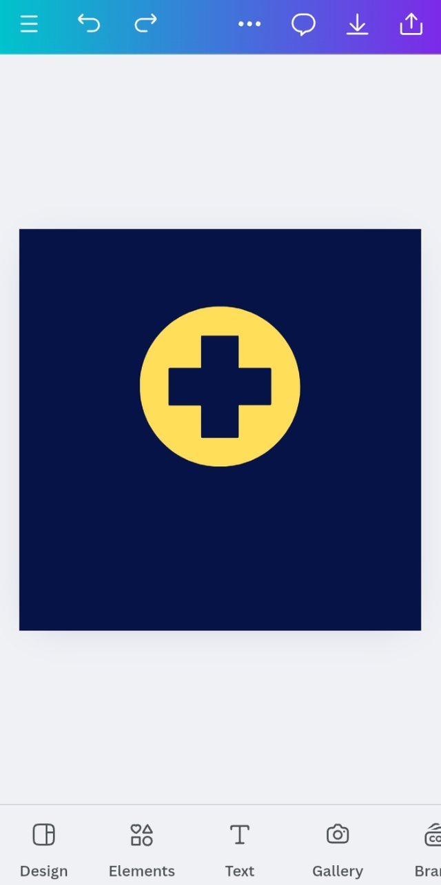
I added a logo based on medicine and treatment.
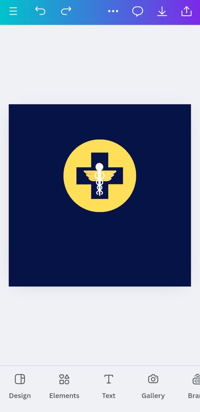
It looks very simple. So I decided to add one more icon familiar with medicine. Matched the color with the central icon.
Now, I put the brand name and used the Headline format. There was something on my mind. In Bangladesh, a pharmacist's name bears the brand value. The pharmacist or paramedic is the brand here. And, the shop name was after him, so I focused on his name.
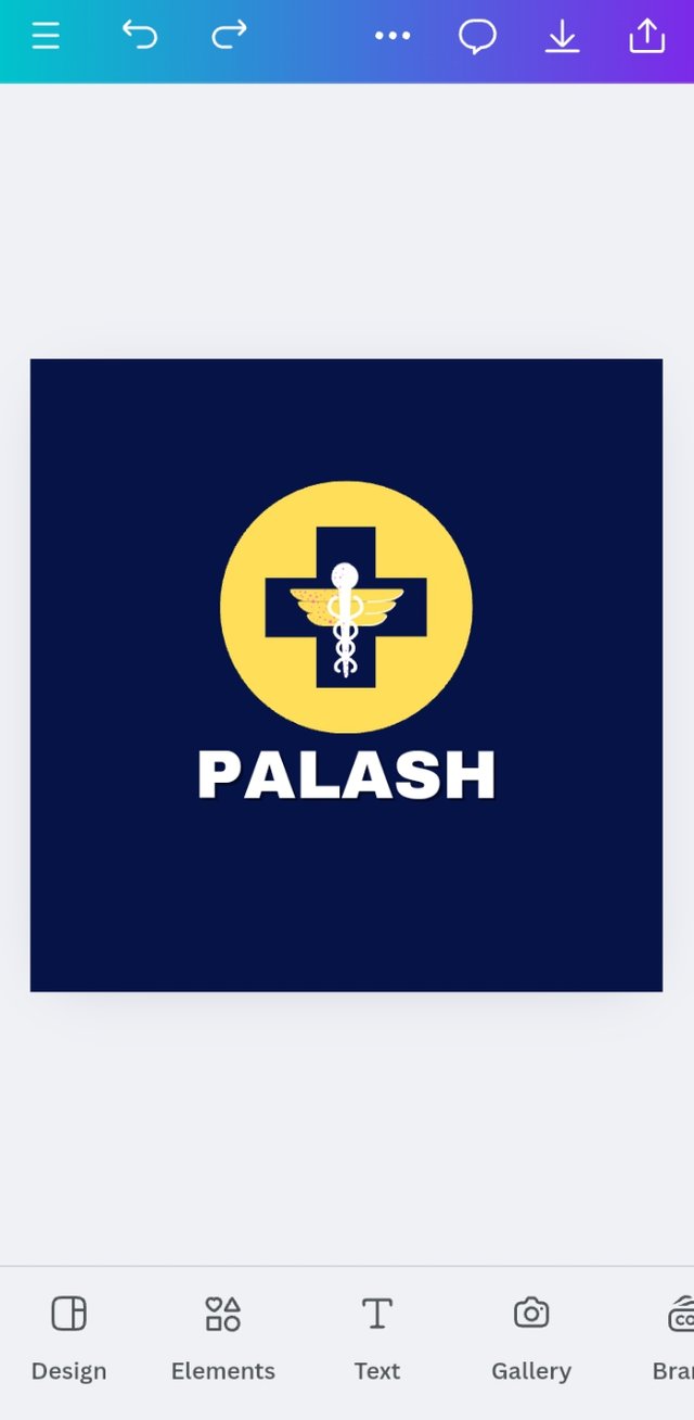
Here, in Bangladesh, a pharmacy shop or medicine shop doesn't require any tagline or meta line. But, the main name didn’t provide enough data. So, I added the shop's/business type as the tagline.
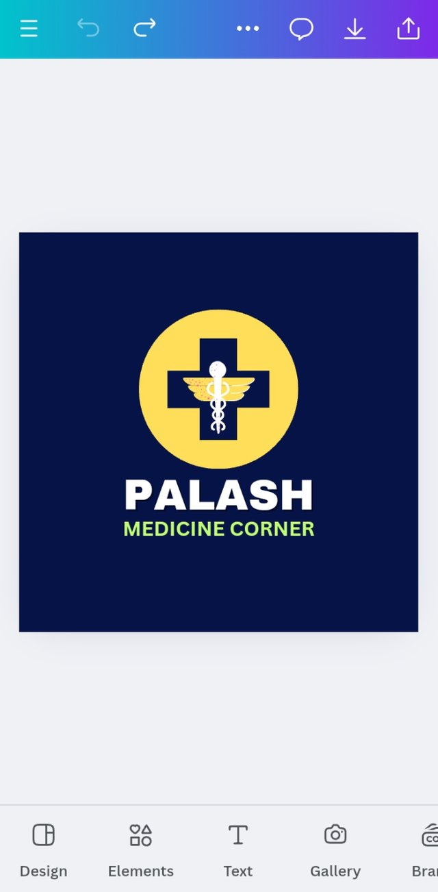
And that's how I did my job.
I would like to invite, @mostofajaman,
@fizabatool, and @djanita to perform.
How small decisions in logo design can have a big impact, he has explained in a great way! Nice to read such analysis. Good luck for the contest.
Thank you bhai for such inspiring comment.