BTC - The updated Dino Chart...
I have seen this quite a bit over the years, but this is the latest updated version...
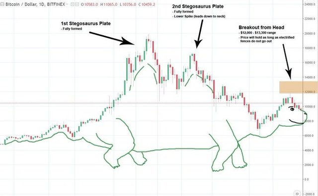
Bitcoin made a stegosaurus full plate back in December of 2017.
This was followed shortly after with another stegosaurus full plate a couple months later.
Which is often seen as a bearish pattern.
Shortly after, we saw a large retrace.
Now we are seeing a breakout from the stegosaurus head pattern after a long decline, which is often seen as a bullish pattern.
The measured move should lead prices up to the $12k-$14k range.
Simple as that:

(Source: https://twitter.com/Bitcoinomist/status/1235494998356848640/photo/1)
The price will hold here as long as the electric fences don't give out and the stegosaurus doesn't run out of new food to eat. :)
Stay informed my friends.
-Doc
this is an awesome analysis,so that means the possibility of a bullish trend on the bitcoin market is now high...@jrcornel
Posted via Steemleo
When the BTC dino decides to rear its ugly head, the FED will soon be dead. "I have an affinity for lead", someone, somewhere, at some point in time, has probably said.... probably not, though.
Nicely done!
Dino Charts— the most pre-historic form of TA...
Posted using Partiko iOS
True, that was the first pattern ever discovered by homo erectus in their earliest cave-dwelling days.
Yes, but is it making a lower stegosaurus or a higher stegosaurus?
It all depends on whether this electric fence line holds.
Great chart!! From the past to the future... hihihi
Certainly an interesting way to show Bitcoin charts, though it does convey the message well. BTC's seeing some growing momentum, especially with Halving on the way... I guess this is where the charts turn into a Brachiosaurus...