SEC20/WK5: Graphic Design Hands - On practical 2
 |
|---|
hello all my beloved friends...
is the fifth week of the season and I am so excited to be able to take this course and start having fun with what I am learning. I feel great benefits from this learning process. This is one of the skills that we must have because we can use this skill in many ways especially to have an attractive appearance on the steemit platform. And I will start this 5th week course.
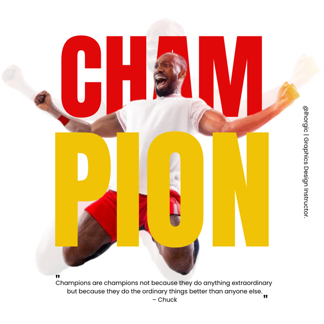
Replicate the design above. Let's see who comes close...smiles. "Skillfully" spicing up your design is also welcome but make sure it doesn't become the reason your design ends up looking unappealing.
To create a similar design, we need several steps to complete it and I will use the steps in the previous practices that have been taught by our design teacher.
Step 1;
 |  |  |
|---|
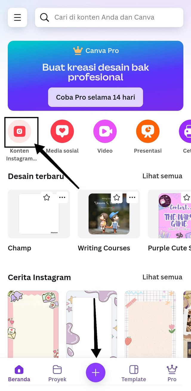
- I Canva application and click the "+" sign, select the size option with a size of 1080x1080, then a white screen will appear with the size we want.
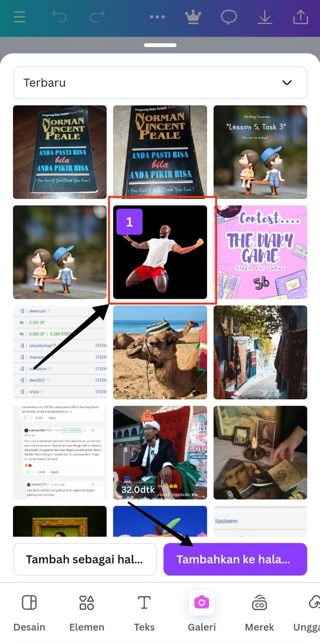
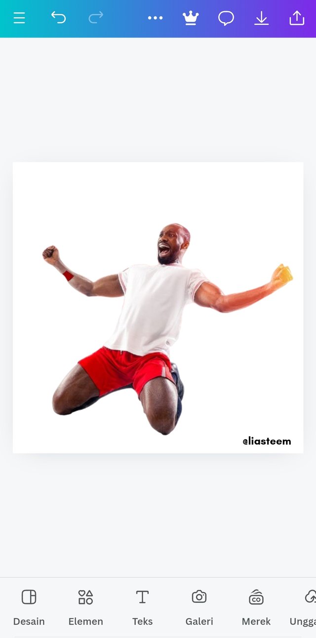
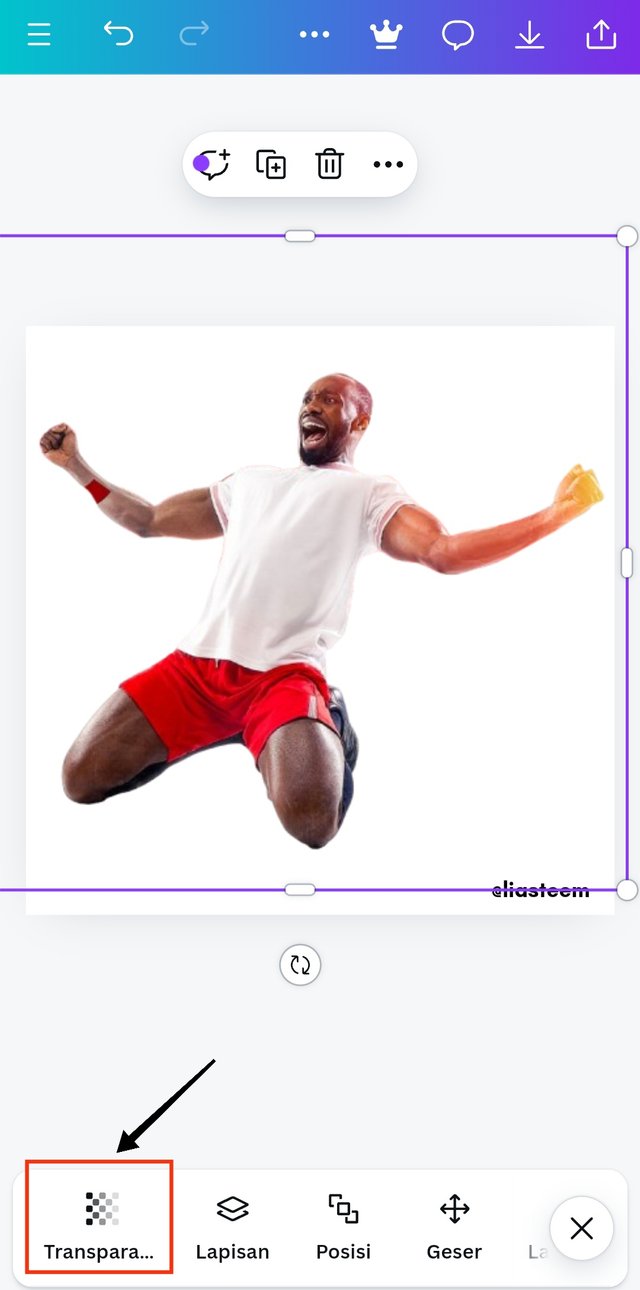
- to add a background image, I choose an image that has been recommended in the gallery and add it to this worksheet.
Step 2;
 |  |  |
|---|
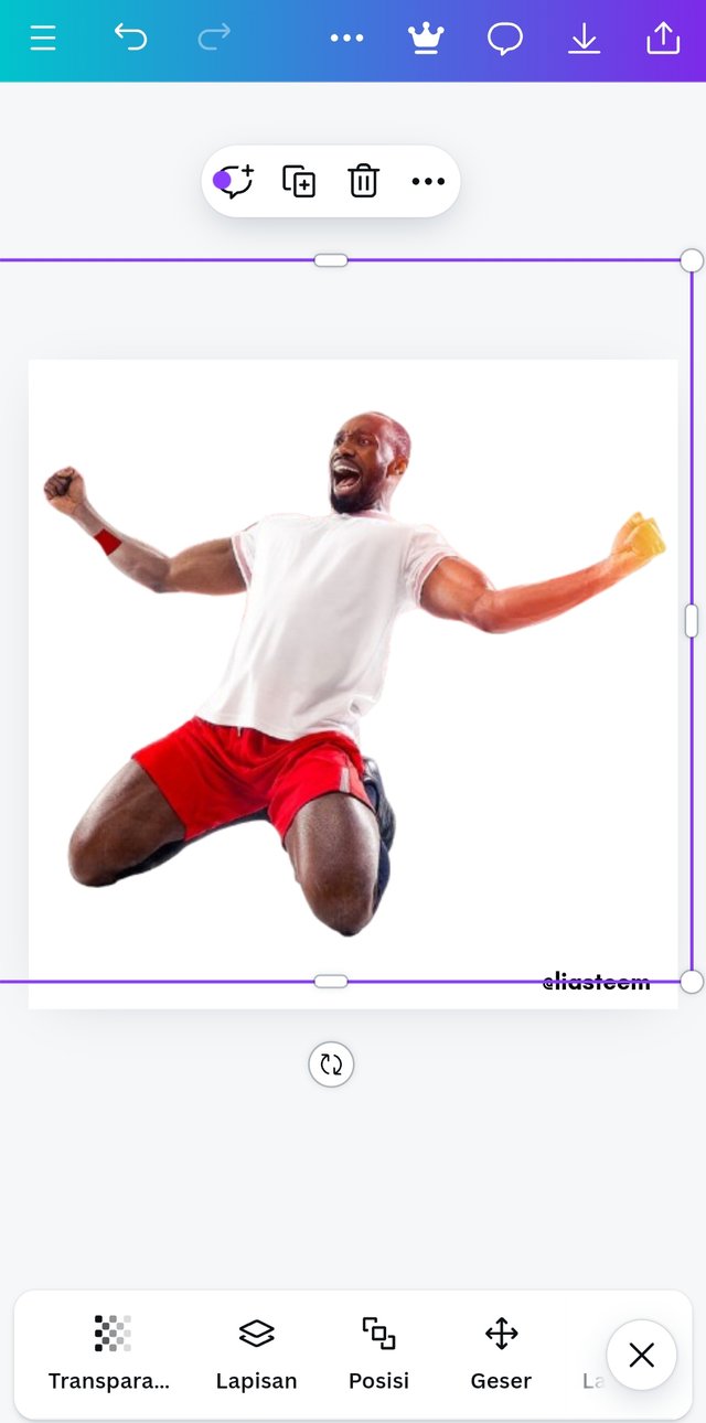
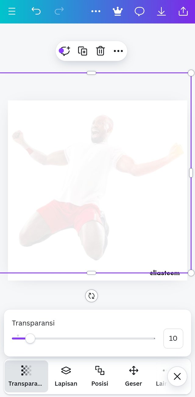
- after the image appears, then I will click the transparency option to get the background effect we want as assigned. I set it to transparency 10. Then I also enlarge the image with a font size of width 1200 x height 1200.
Step 3;
 |  |
|---|
 |  |
|---|
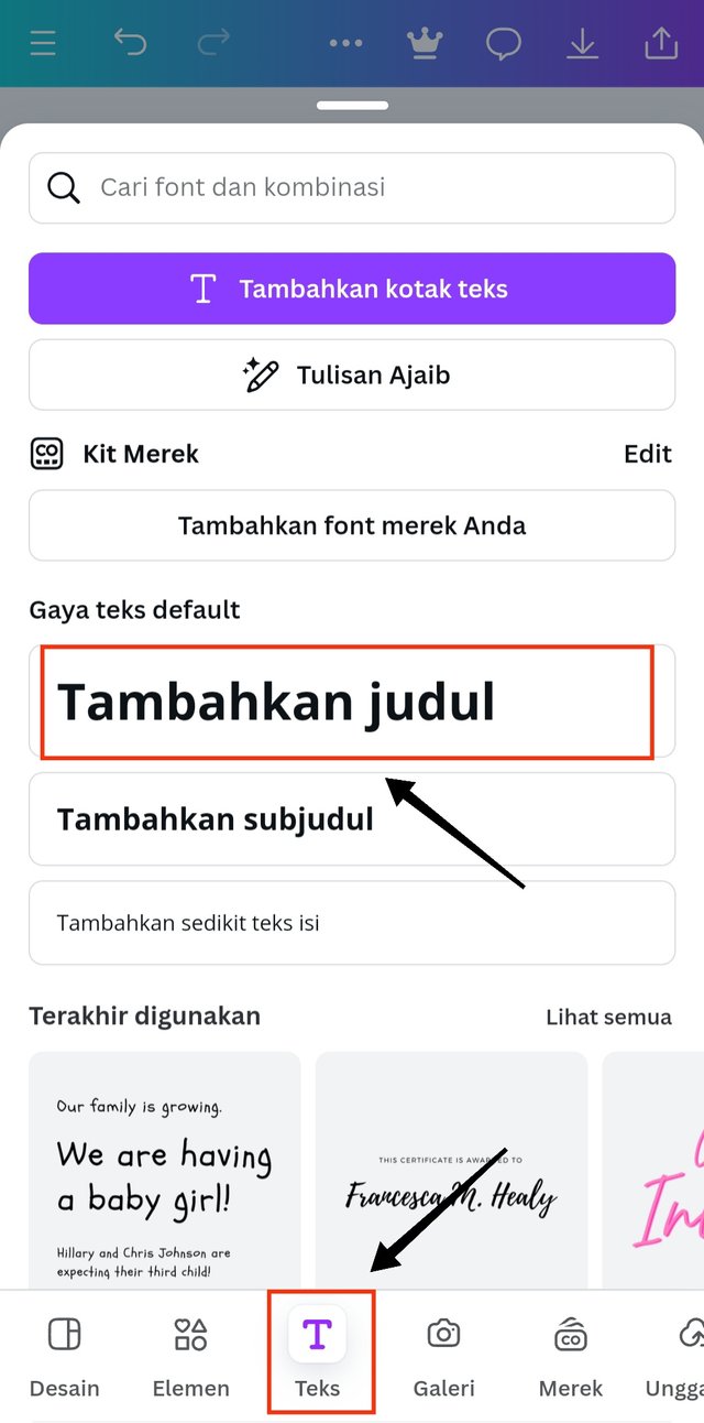
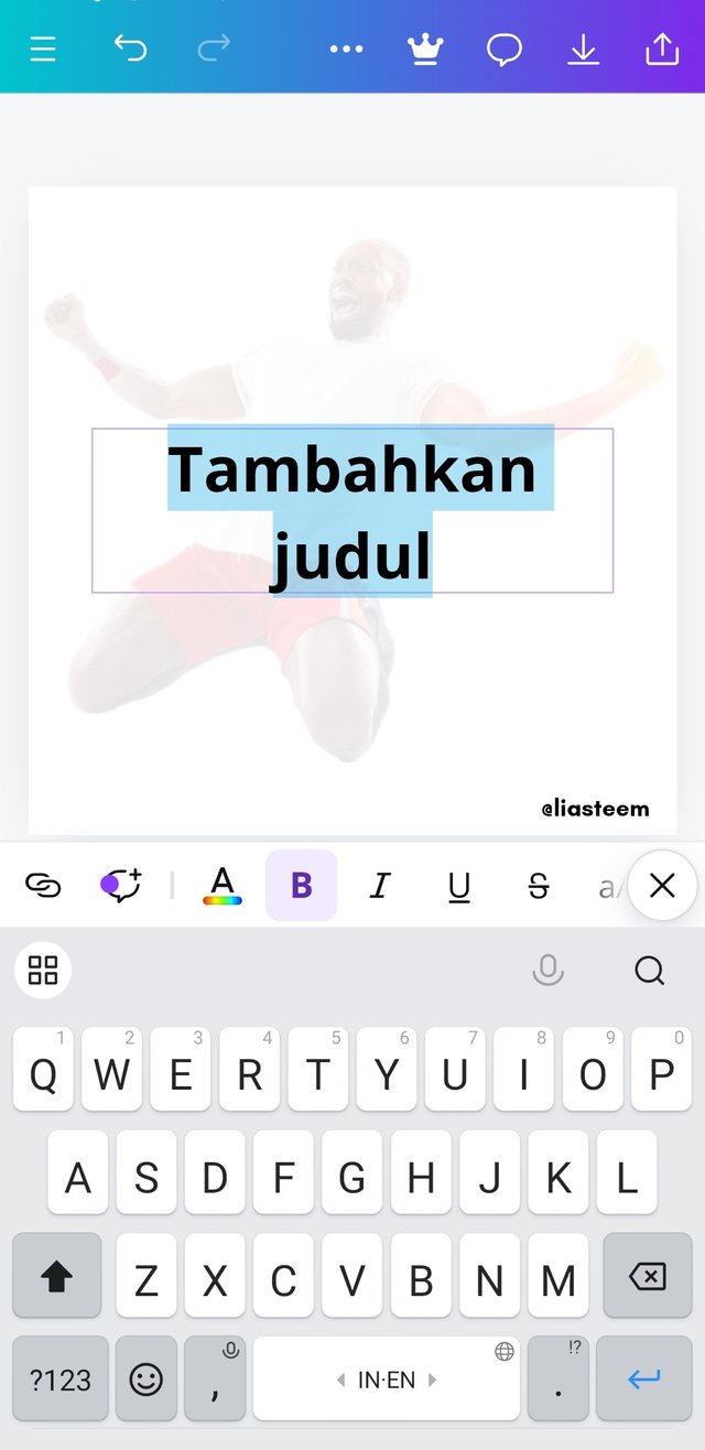
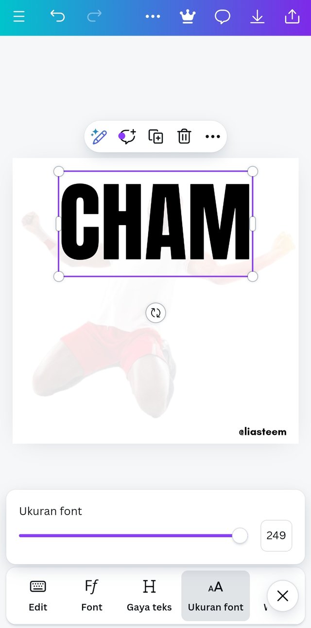
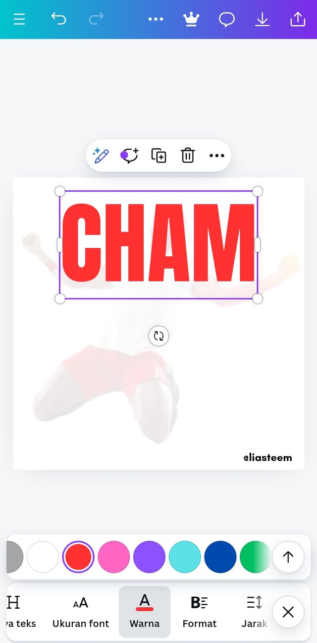
- after the background image is in the right position, then it's time to enter the first word in the assignment sheet ("CHAM"). I click the "Text" option Then select "add title", the text box will automatically appear and I type the word "CHAM" in capital letters. I then enlarge the writing with font size 249. And I click the "color" option And choose red as the color in this assignment.
Step 4;
 |  |  |
|---|
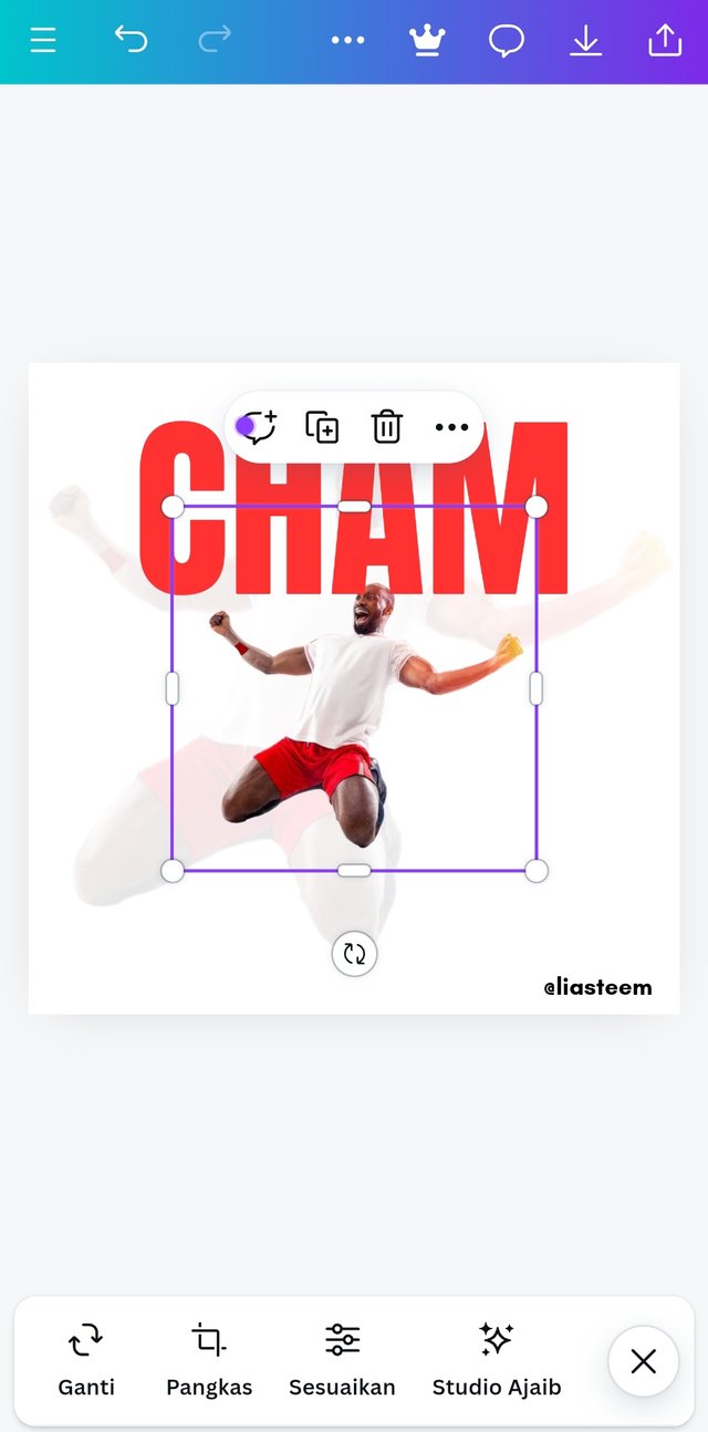
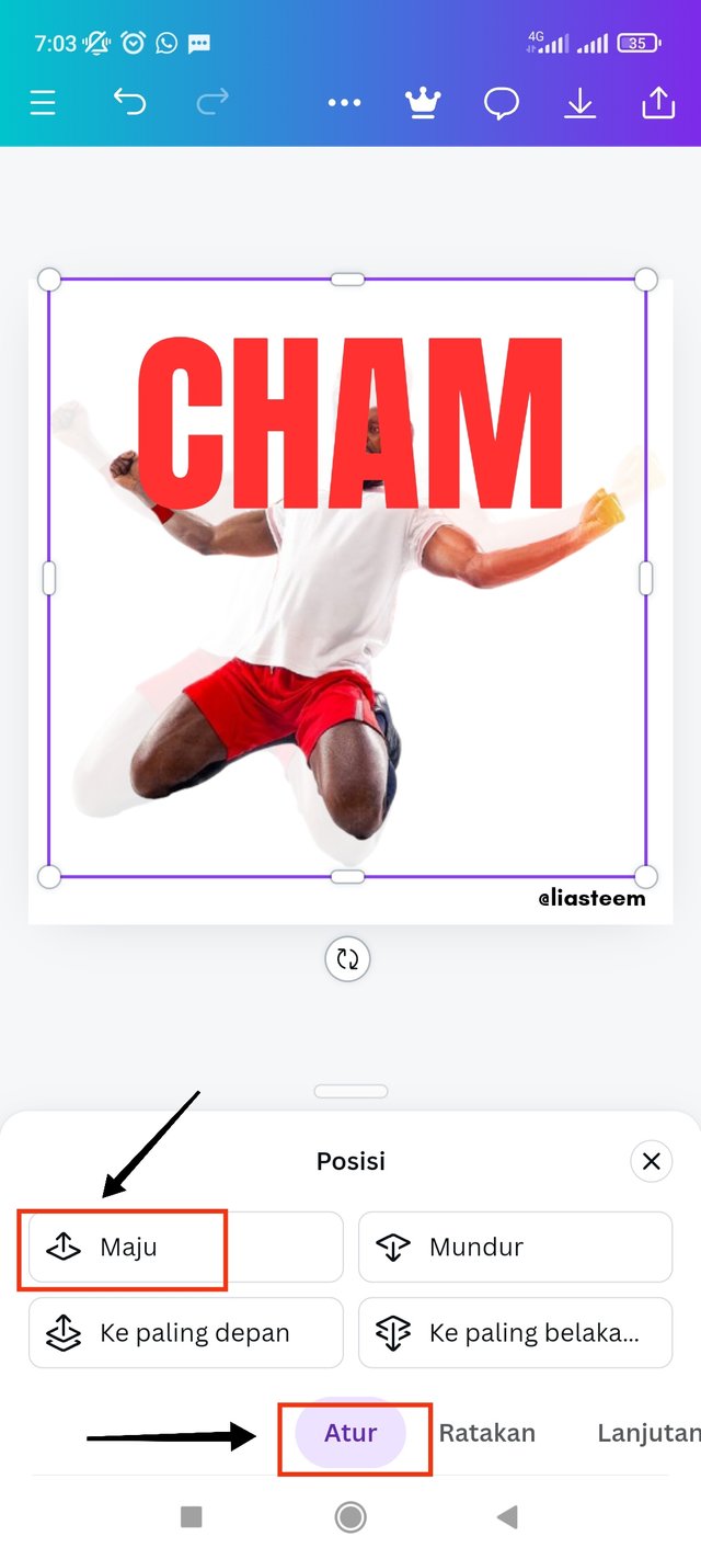
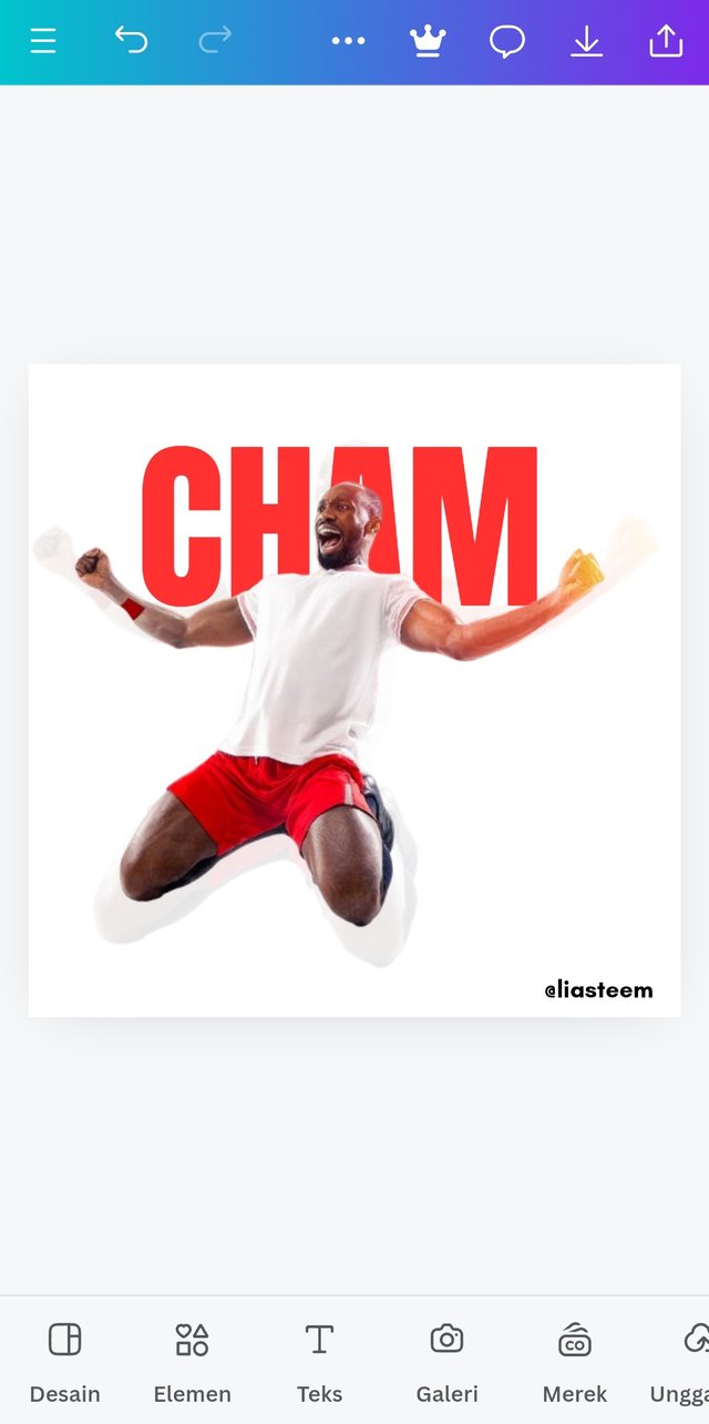
- after adding the first text, now I add the same main image as the background image with the image addition method. Then I enlarged the image to 1000 x 1000 wide. After that I took the "position" option Then selected the "forward" option And the image will automatically move up and the text below.
Step 5;
 |  |  |
|---|
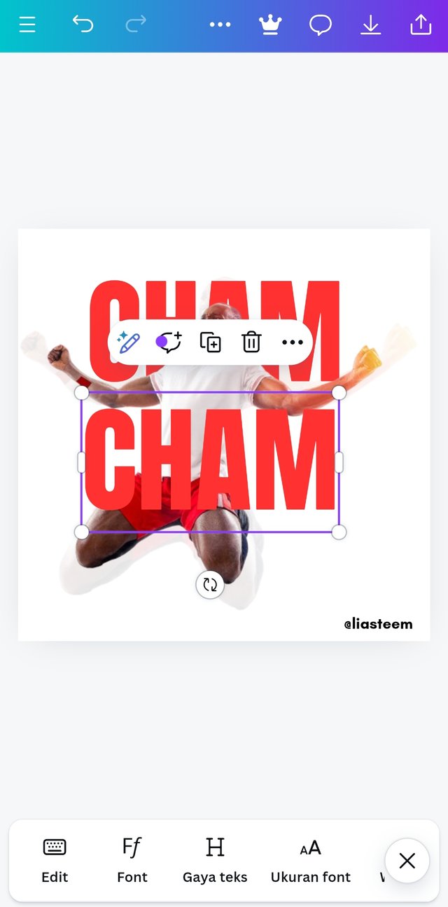
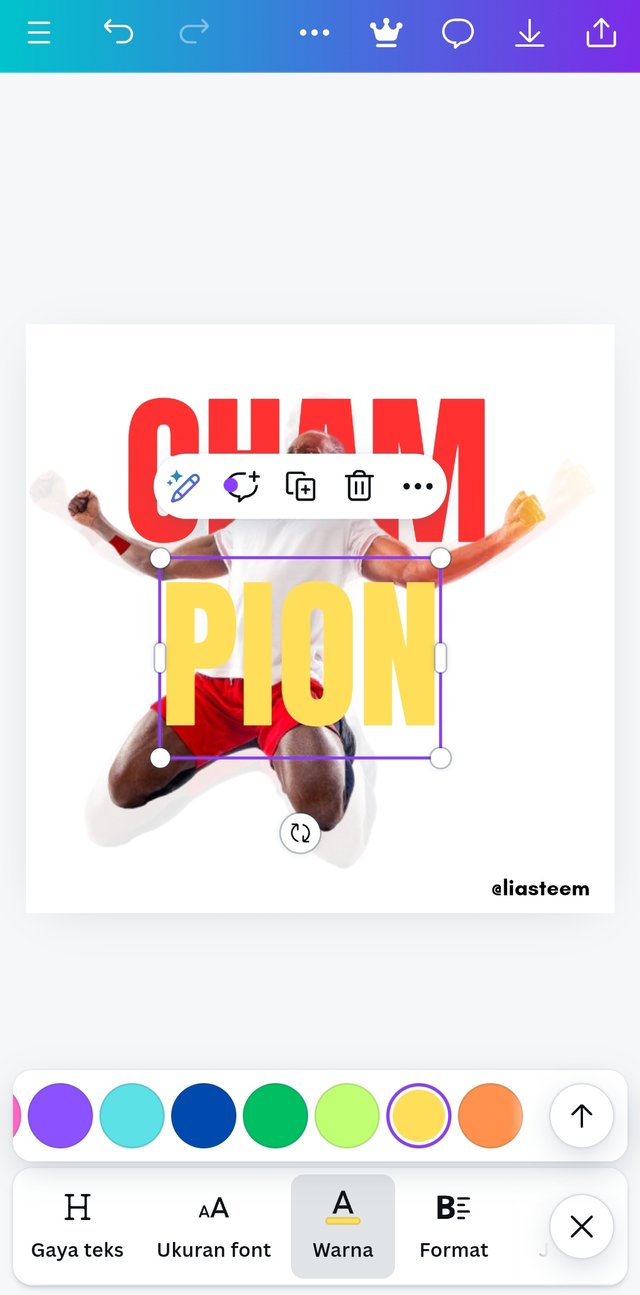
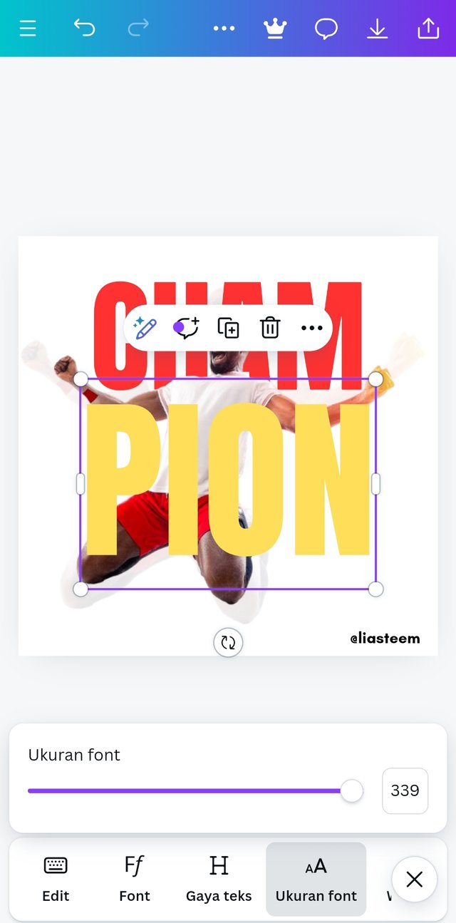
- I then added the second word "PION" with the "Duplication" method. I duplicated the word "CHAM". Then I changed the word to "PiON" And set the text size to 336. Then I changed the color to the most appropriate yellow color.
Step 6;
 |  |  |
|---|
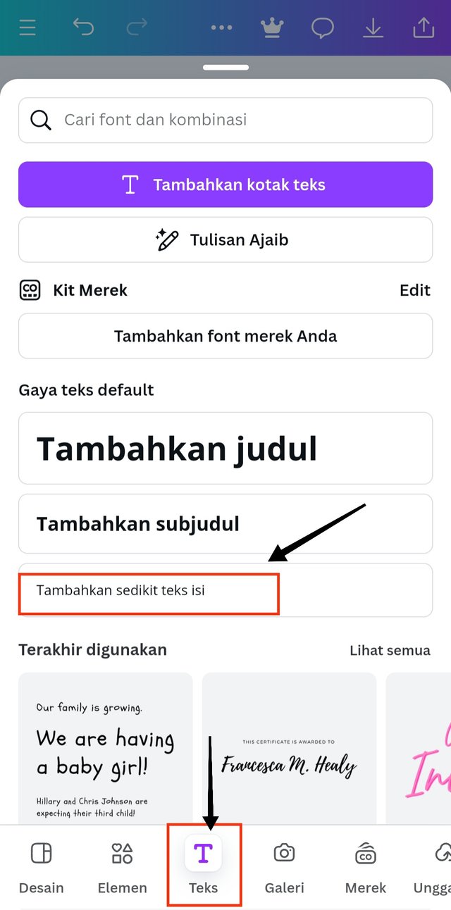
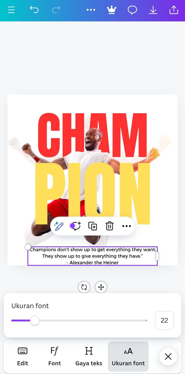
- I added a quote from "Alexander the Heiner" With the method of adding text and I selected the "subtitle" option. I used the text "Montaser Arabic" with a font size of 22.
 |  |
|---|
Briefly talk about the principle you are engaged in your design.
The first principle is balance. I use this principle to organize all images, shapes and also text. This needs to be done to help distribute the weight evenly in this design.
the second principle is Emphasis: This principle is used to make certain elements in this design stand out, and which ones do not stand out so that the image will look better in 2 similar designs.
the third principle is color combination. This is very important because the image will be more lively and neater by having good and appropriate colors.
the fourth principle is Element Spacing. This aims to build a strong relationship and unity between the text elements that I use.
the fifth principle is Hierarchy. This is useful for highlighting titles, adding shapes to frames, maximizing colors & strategically positioning key messages so that the image looks absolute.
Thanks to the teacher @lhorgic for this extraordinary knowledge, if there are any shortcomings and mistakes I will be very happy to receive all your input.
I will invite my friends to this course @paholags @eliany @dasudi

Gracias por compartir tu participación con nosotros. Hermoso tu diseño me gusto mucho. Exitos.
¡Holaaa amiga!🤗
Que buena práctica realizaste y, la frase que empleaste para acompañar el diseño, va muy acorde al trabajo que venimos realizando en cada una de las lecciones de esta dinámica.
Te deseo mucho éxito en la dinámica... Un fuerte abrazo💚