Learn With Steem: Here are 5 Tips to make the images in your post look great!
Introduction
Images make your posts look great when properly used. Many new users make efforts to use images that project the information they wish to share in the post. I have however noticed some mistakes that newbies, including some old members make while using images. So I decided to share these 5 tips that have helped many bloggers on Steemit to do well in their publications.
So in this article, we will learn:
- 5 Important tips on use of images in your publications
Without wasting much time, lets start right away.

5 Important tips on use of images in your publications
We will start with some important tips when it comes to use of Images in your publication
Tip 1. Use your own images: A content creator, you should be using your own images or texts as much as possible. While you are allowed to pick images only and provide the source, you cannot properly be a content creator when more than 50% of your work is other people's work. I want to let you knwo that once you join Steemit, you have become a photographer. Capture images wherever you are. Capture everything, even images that you do not wish to use anytime soon. When you have a large library of images of your own, you can easily pick what you need when creating content.
You may not be able to use your own images all the time. Then feel free to pick some images from these royalty free stock image sites:
- https://pixabay.com/
- https://www.pexels.com/
- https://www.freepik.com/
- https://unsplash.com/
- https://picjumbo.com/
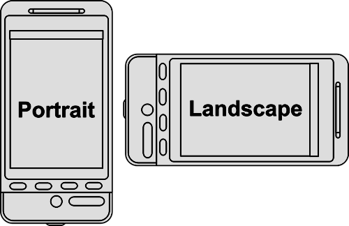
Tip 2. Your Thumbnail (First Image on your post) should be in landscape: If you want your post to look great in preview mode, make sure your thumbnail or the first image on your post should be in landscape orientation. The landscape orientation, the width of your image should be longer than its height. As such, the whole image will be visible in preview mode.

From Wikipedia
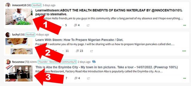
Now check this screenshot below from SteemALive community page. Notice the 3 thumbnails highlighted:

From SteemAlive Page
For Image 1, Notice that in preview mode (i.e when the post was not opened yet), some portions of the face was cut off. Thats because the image has protrait orientation instead of landscape.
The same problem for image 2. Only image 3 has all the portions of the image visible. Because it is in Landscape orientation. So always make sure your thumbnail is in landscape orientation.
Tip 3. Retouch your Images: You need to make sure your images are bright, clear and look great. I normally edit my images. You can increase the contrast or even the brightness. You can resize you images so they do not appear too big inside you publication. You do not need to be a professional graphics designer to do all these.
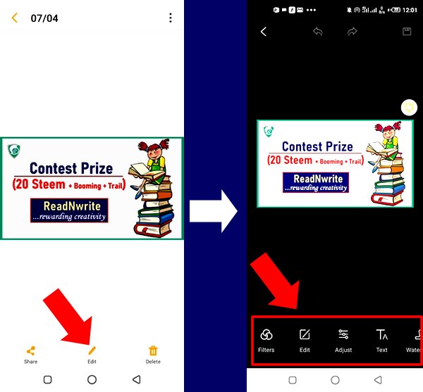
Your smartphone comes with an app that will help you do basic editing like managing brightness and contrast, cropping your images, etc. Just open any image and select the edit function and you are ready to tweek your images through many settings. Play and learn until you master how to get your images to look great. Check the illustration below.

Tip 4. Your Thumbnail Should match your post title: This is very important again for your publication to be of superior quality. Your first image should be descriptive of your post title. So if the title of your post is: How to prepare a nice vegetable soup, the first image should be either a vegetable soup or some of the ingredients. It should not be your selfie at the beach, or a picture of city traffic. Basically make sure that there is a direct link between your first picture and the title of your post. Otherwise, you will end up confusing your readers.
Tip 5. Do not use too many Images: When you make posts, be sure to use at least one image in the post. However, do not use too many images. There is no hard and faast rule about how many images to use in a post. It all depends on the length of your post. However, the number of images should not be more than the number of paragraphs in the article. When you have too many images in a post, it becomes a distraction and makes the appearance of your post look bad.

Conclusion
Images make your published content look great when used in the right manner. An image not only beautifies the post, but also sends a message across to the ready. If you follow the 5 tips above, your images would be the best and your publication will look great.

Thank you for contributing to #LearnWithSteem theme (#learnwithsteem , #tutorial, and #lesson). This post has been upvoted by @tucsond using @steemcurator09 account. We encourage you to keep publishing quality and original content in the Steemit ecosystem to earn support for your content.
Regards,
Team #Sevengers
This tutorial is a treasure to me in particular. I appreciate it so much, after all it is all geared towards getting optimal result in the interest of the blogger in particular and the steemit community as a whole
Thank you for reminding us the need to use good image in our post and where we can get free image for our post.
It is timely reminder
Checking the rules
Checking Post Quality
Thank you very much for this teaching. I have leant how to beautiful my pictures by editing it first.
Good evening, thanks for this little tutorial.
I always find it difficult to get free image, this post is what i needed. Thank you @focusnow
Sourcing for images can be quite challenging. This has been helpful.
Yes @focusnow,it is really good to use good images on our post and especially the first one.
Thank you for giving and reminding us about it.
I will sure heed tp these, i know ots going to improve the quality content of my post