SEC20/WK1: Introduction to Graphic Design and Principles
Question 1: What is Graphic Design? Briefly describe your understanding of graphic design |
|---|
After studying the given course and studying some articles I can understand that graphic design is a process to convey information through visual design or text.
In ancient times we can see that many stones were painted depicting a certain meaning or message in life, that was one of the works of graphic designers at that time.
But now technology is growing, conveying messages and information can be done by using technology to produce visual works of art, this is what is called graphic design.
So, graphic design is a job to design an effective visual message or information. In addition, graphic design is not just to make something look good, but it is very important how the information message can attract the attention of many people and is easily accepted or understood by anyone who sees it.
In particular, graphic design is the work of how to simplify a complex information so that it can be formed in a visual art that is easier to understand. This is a special challenge for graphic designers.
Question 2: Choose three principles of Graphic Design and talk about them based on your level of understanding. |
|---|
There are many principles in graphic design, but here I will explain three principles that I think are the most important. Let's learn the principles below:
1️⃣ Contrast
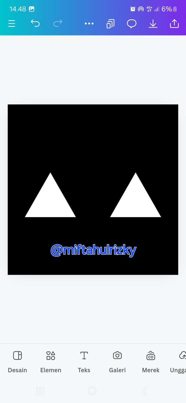
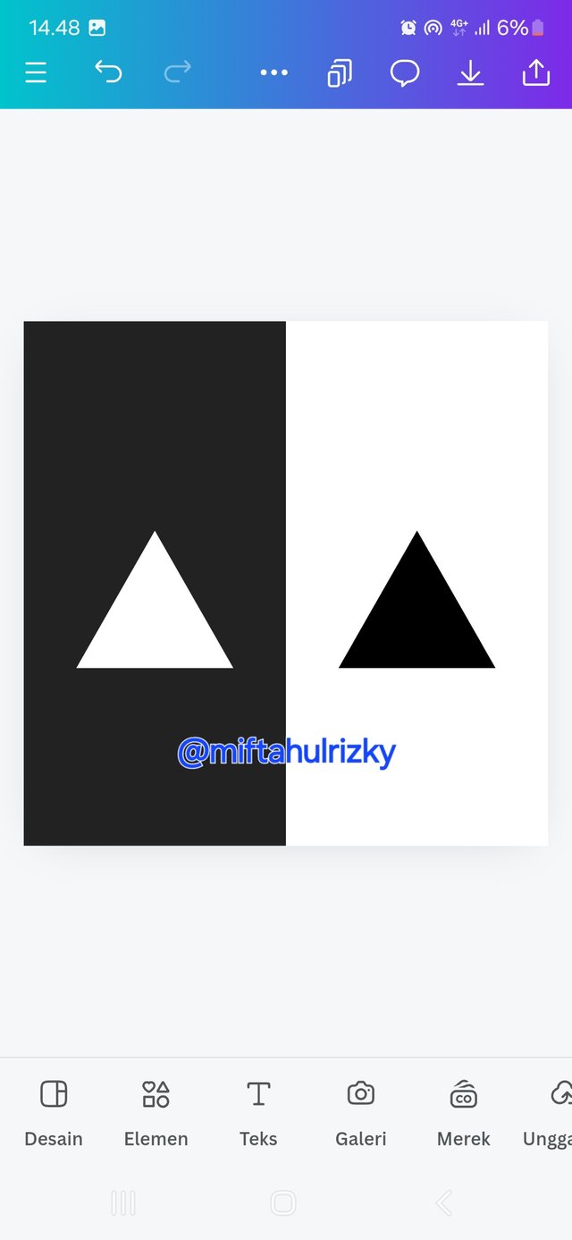
Something is considered Contrast when it has a noticeable color difference in an object and its background, understanding the mix of contrasting colors is also very important because it will be easier to convey the message of information. Let's find out some important indicators so that we can create a contrasting design:
- 🔲 Dark and light colors: For example, black vs. white, black and yellow, creating a black text on a white background, or vice versa. The combination of one color with another color so that it has a real color difference. You can take a look at the examples shown below.
 |  |
|---|
| Example of a design with black and white contrast, Source on canva.com 👉 |  |
|---|
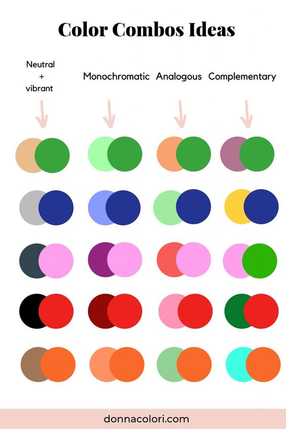
🌈 Complementary colors: The combination of these two colors is a blend that always creates an interesting effect. The most suitable combination of two colors when combined with each other is as follows. Such as red and green, blue and yellow, or purple and yellow. The combination of these two colors can create a design result that is more pleasing to the eye.
🌨️ Warm and cold: to create warm and cold colors, I usually use red and blue or orange and green.
2️⃣ Emphasis
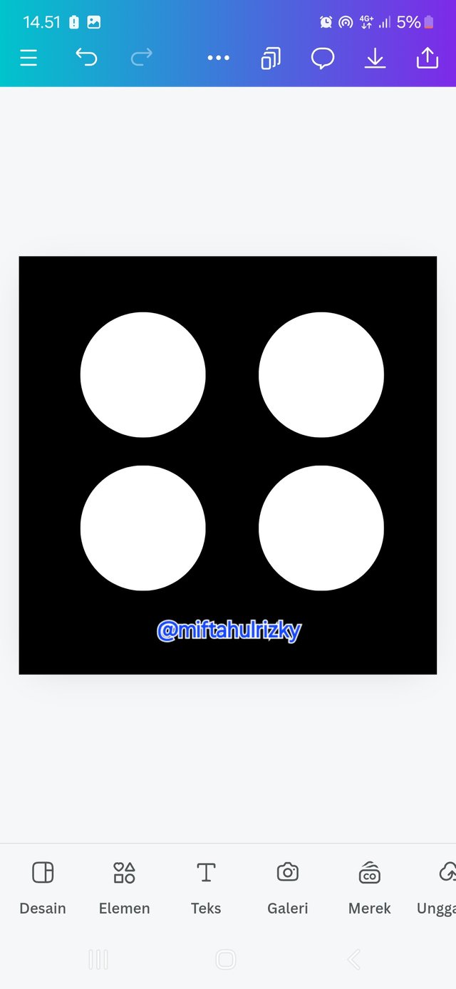
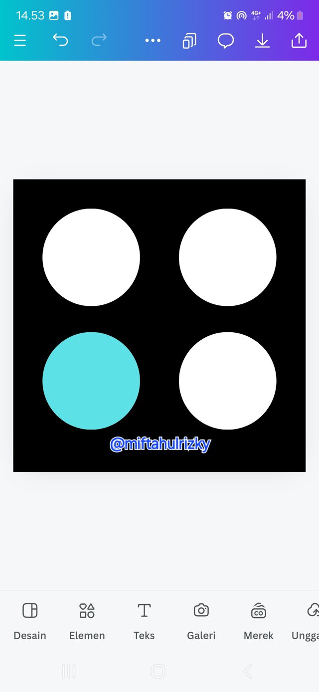
The next principle is emphasis, this principle is no less important because it aims to signal and attract attention for many people to know the message to be conveyed. This can be done by making the desired object different from other objects.
 |  |
|---|
3️⃣ Balance
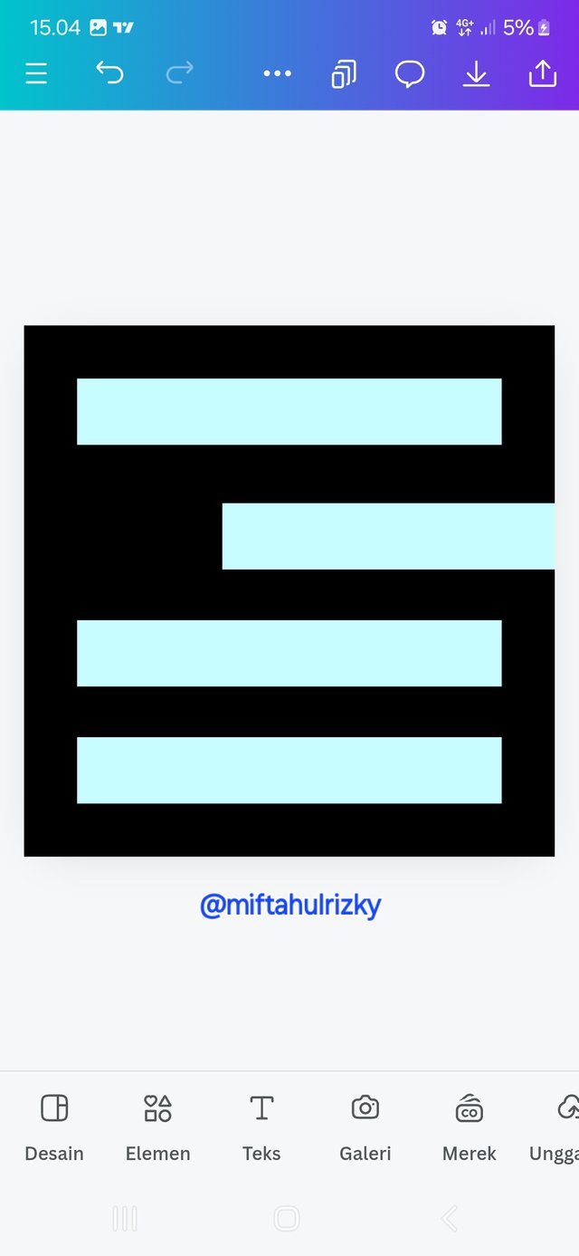
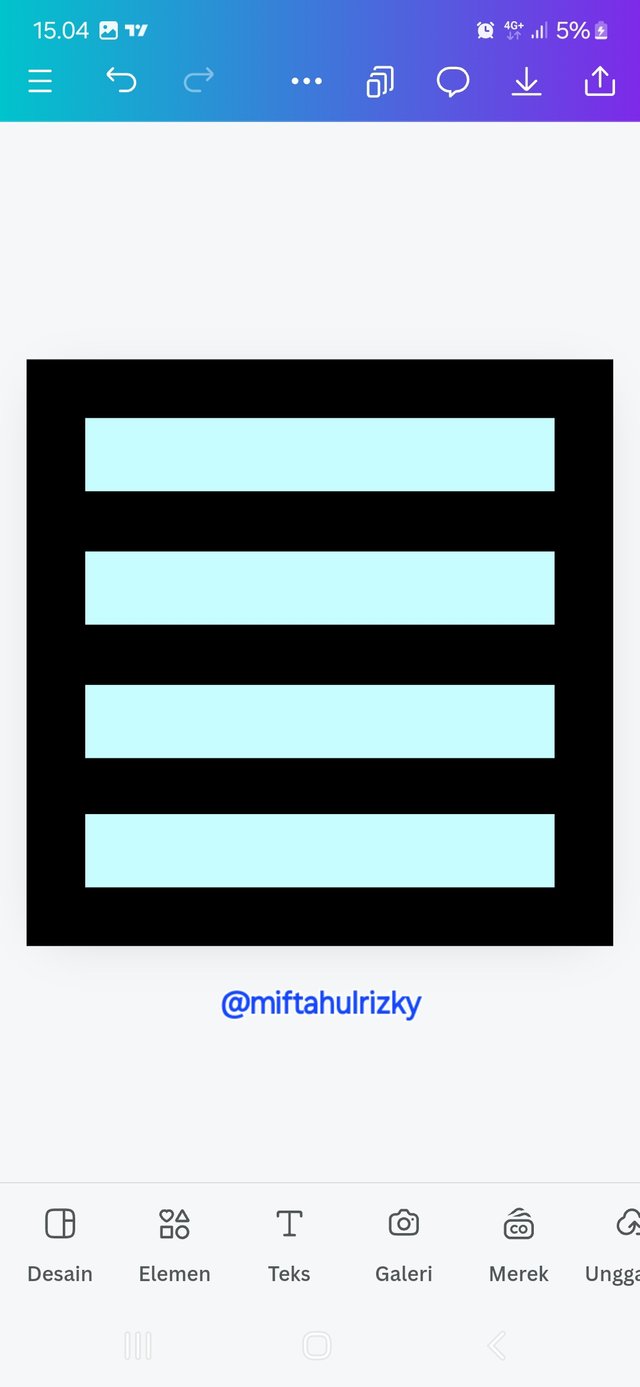
The next principle is balance, this principle is very important so that an object can fit between one another, such as forming an object that is the same, determining a parallel and straight layout, determining the same distance between one shape and another, and others.
 |  |
|---|
Question 3: Show practically how to create the graphic image below.
👇 Open worksheet and define size
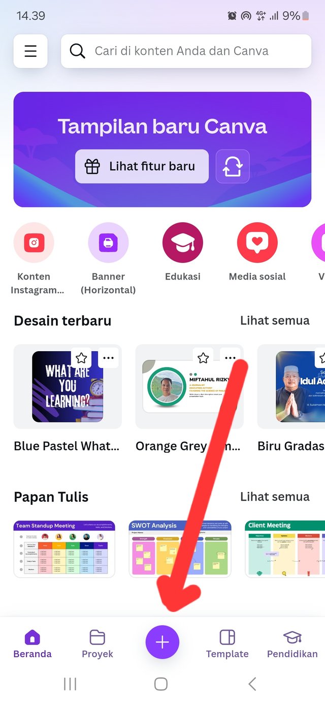
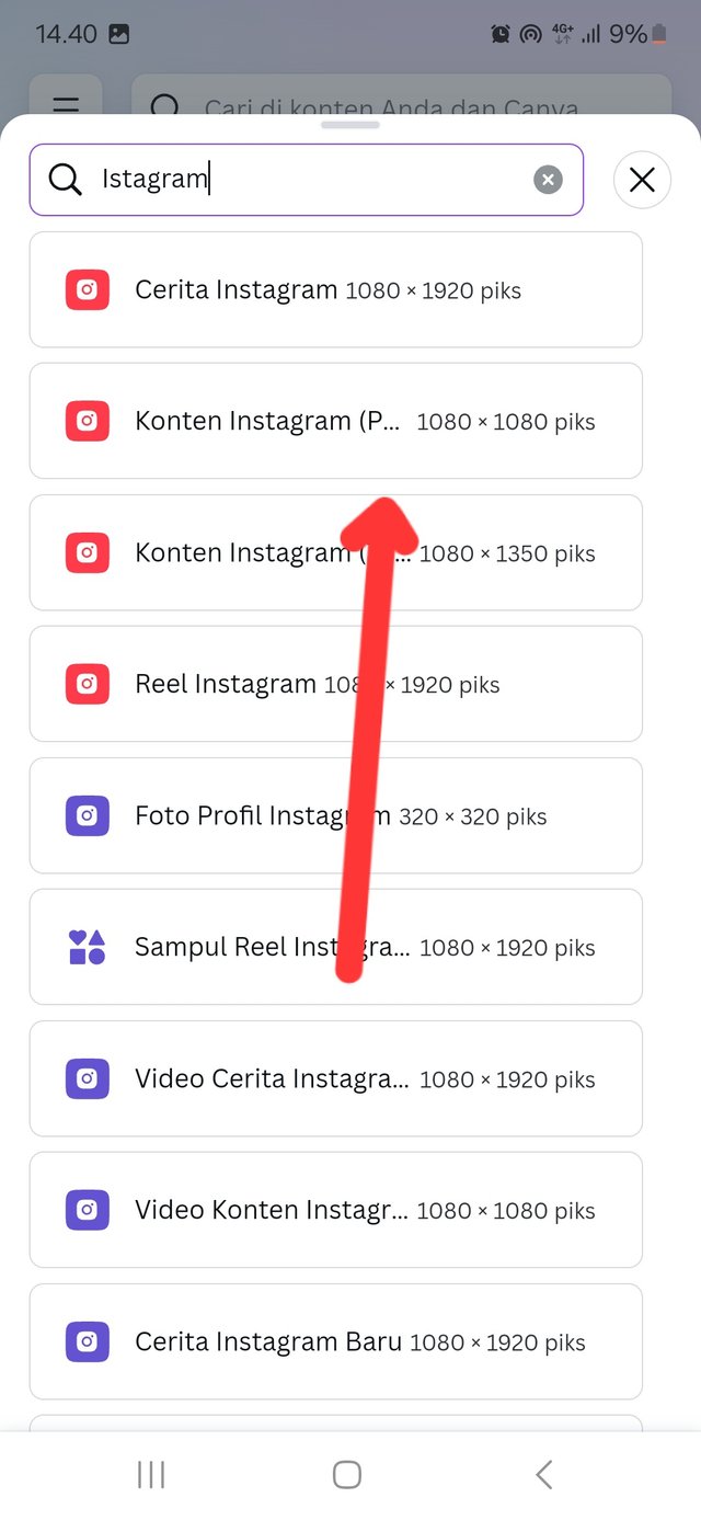
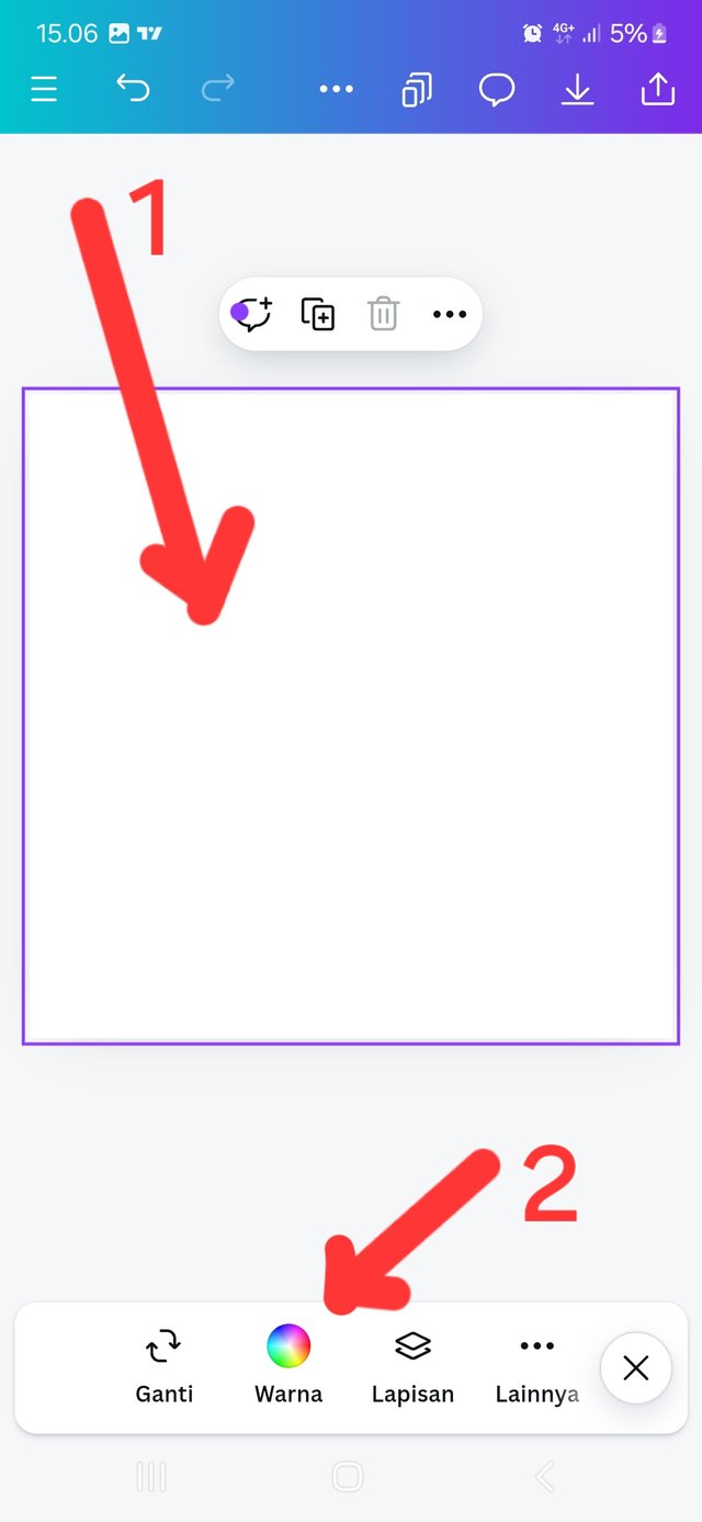
In this course we are given the task of creating a predefined shape. The first step after opening the canva application, select the ➕ menu at the bottom of the center, see step 1. Then select the Instagram content menu which is 1080 x 1080 Piks, see step 2. Then we will be in an empty worksheet.
 |  |  |
|---|---|---|
👇 Changing the background appearance
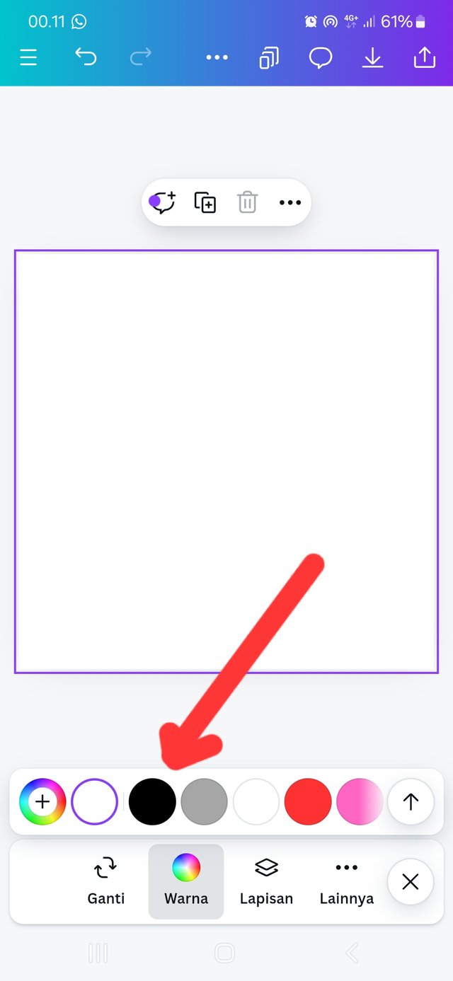
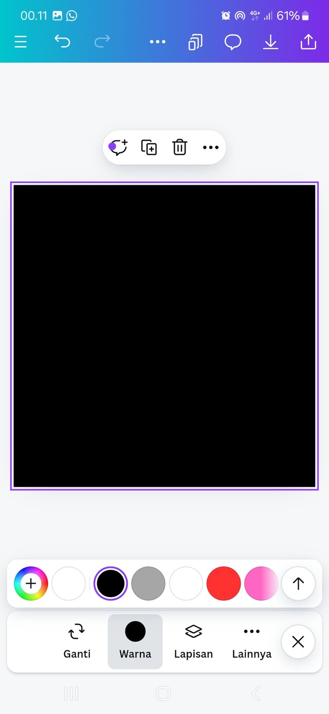
The next step we will change the background from white to black, the first step is to tap once on the worksheet section, then at the bottom select the "COLOR" menu. see step 3. Then various color options will appear, then I choose black, see step 4. The result is that the background page has been successfully replaced.
 |  |  |
|---|---|---|
👇 Add Element, change color, and duplicate
Next step we will add a circle element, look at the menu at the bottom and select "ELEMENTS," next step select the circle, see steps 5 and 6.
The circular element has been successfully added, our next task is to select the "COLOR" menu and then replace it with white, see steps 7 and 8.
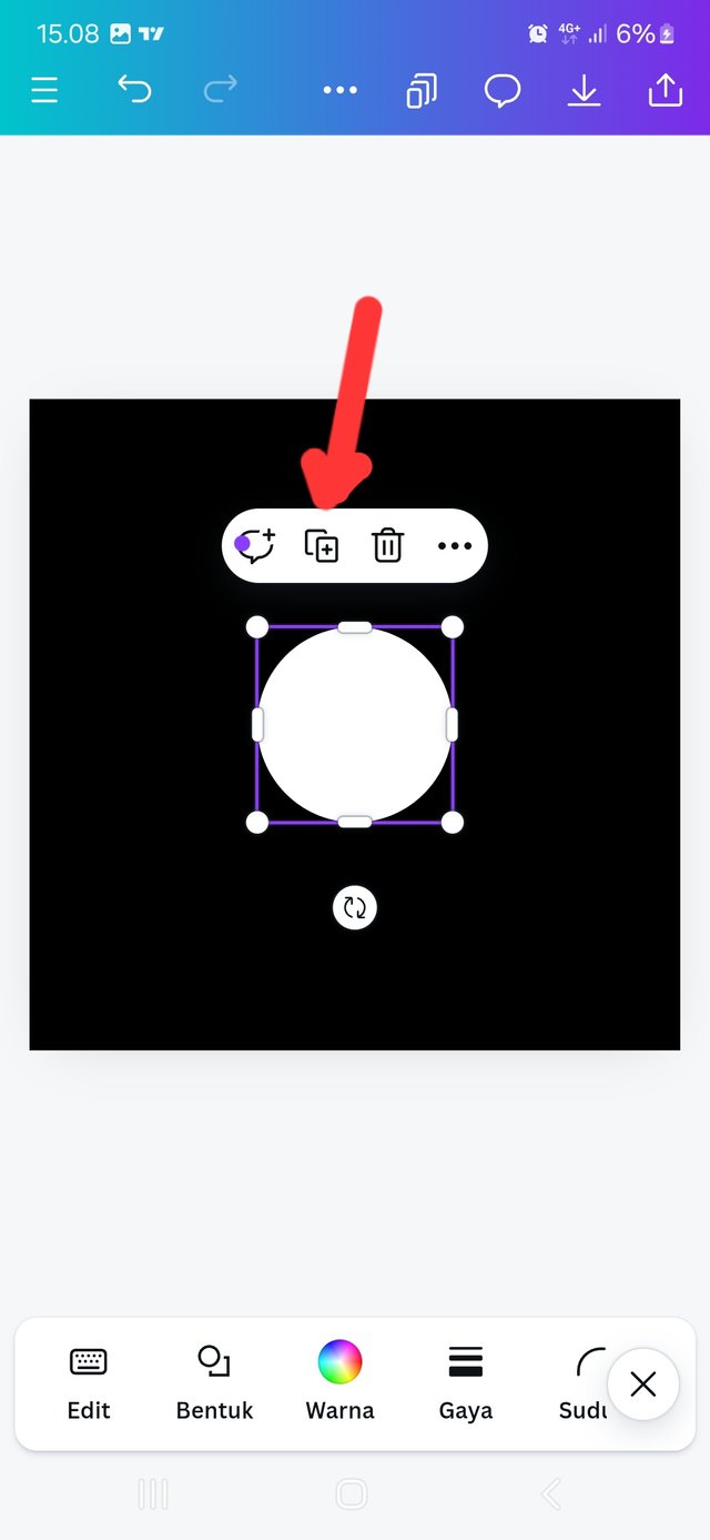
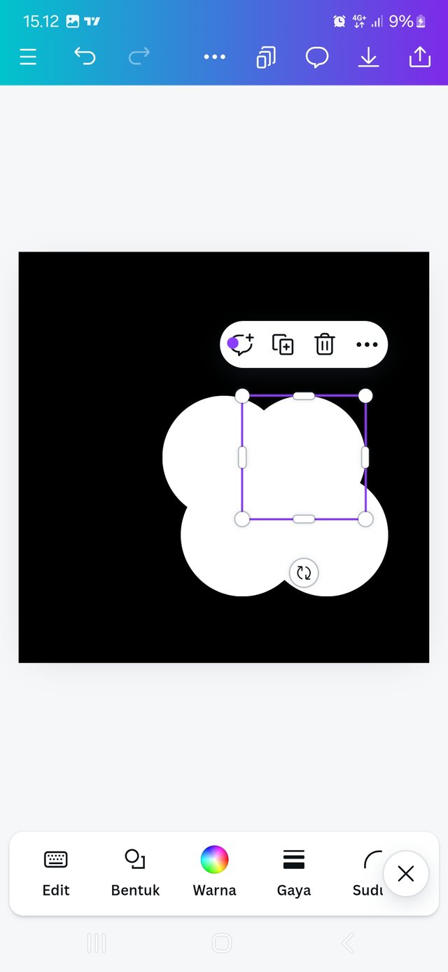
The next step we will duplicate or multiply this circle shape into several parts, it's quite easy by selecting the "COPY," menu. see step 9 and 10.
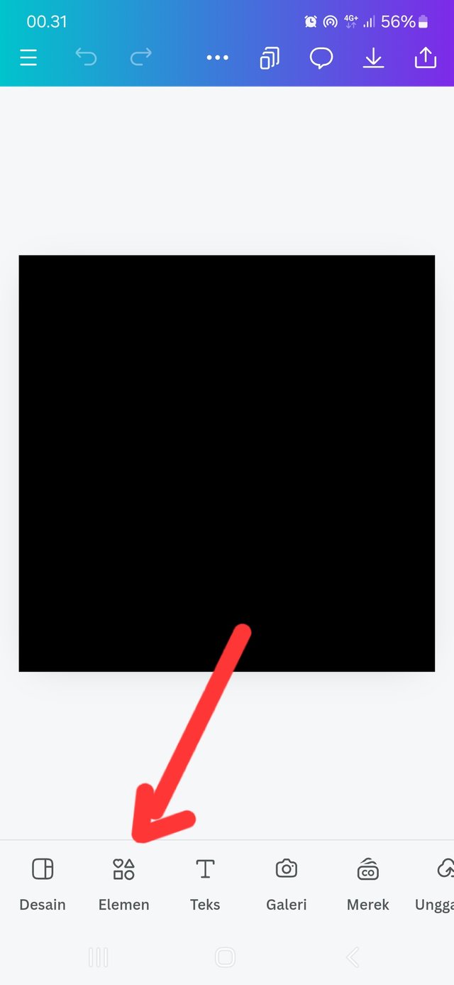 | 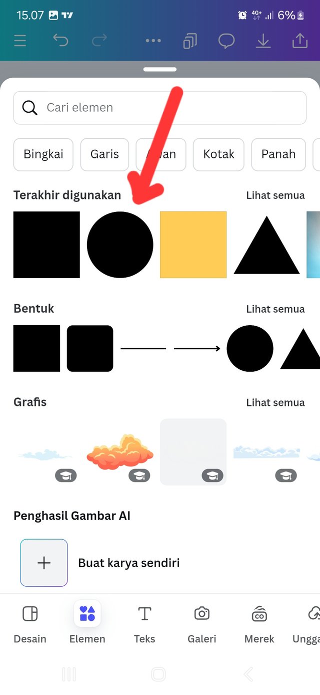 | 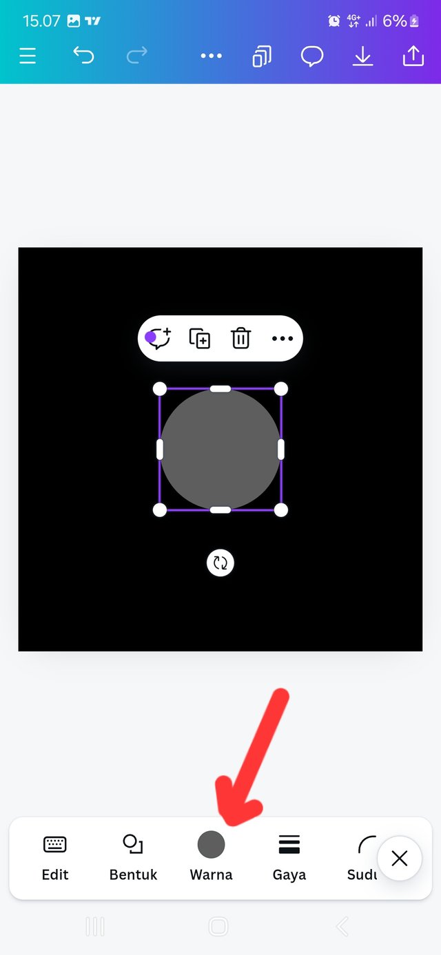 |
|---|
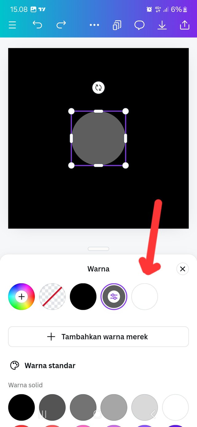 |  |  |
|---|
👇 Set the layout and emphasize it
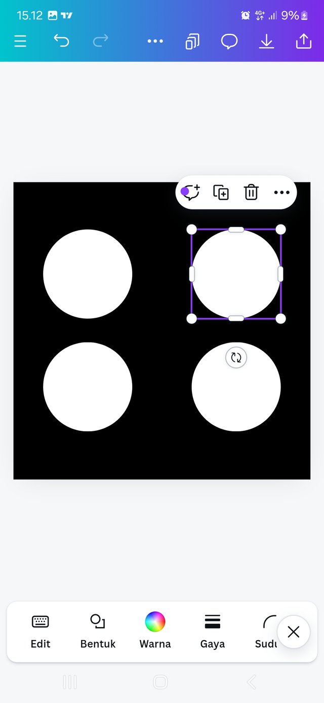
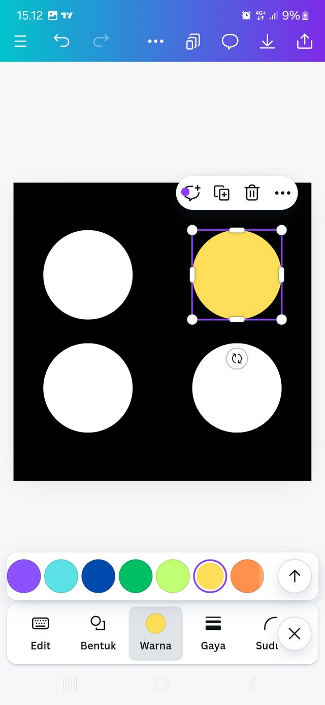
The next step we will arrange the layout to make it suitable, slide the circle shapes one by one in the appropriate direction as determined in this course, the next step we will give emphasis to one of the selected circles by giving it a different color, select the yellow color see steps 11 and 12.
 |  |
|---|

Thus this article, I hope it is useful and inspires all who read it.I also invite you to participate in this contest. @lil.albab @irawandedy @sriiza
Thank you for reading this post, don't forget to comment.
terimakasih banyak telah mengajak saya untuk mengikuti SEC ini. bagus sekali cara anda menjelaskan step by step grapick design
Butuh beberapa hari untuk menyiapkan tugas ini, hufht.
luar biasa usaha anda dalam mengikuti SEC ini
Upvoted. Thank You for sending some of your rewards to @null. It will make Steem stronger.
Sangat bermanfaat karena saya baru-baru ini sangat tertarik dengan graphic design. Thank you so much.
Mari berpartisipasi dalam kontes yang sama
Terimakasih sudah mengajak saya, semoga saya bisa berpartisipasi.
Hello @miftahulruizky thank you for participating in this week's lesson. We have assessed your entry and we present the result of our assessment below.
Feedback:
• You have clearly defined Graphic design the way you best understand it and I appreciate the effort you put into it.
• Your selection on the principles of design is nice coupled with your comprehensive explanation. You did a good job delving deeper into the principles, It also cool to see that you used corresponding visual of these principle to explain your points which is quite commendable.
• Finally, Your practical looks really nice in it presentation, well detailed and comprehensive. In all, you did a good job. I hope you keep up with the energy level. Weldone.
Regards
@lhorgic❤️
Terimakasih banyak atas penilaian anda pak