SEC20/WK6: Graphic Design Hands - On practical 3
Greetings |
|---|
Hello Friends!
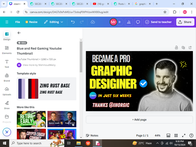
How are you all? I hope that you all will be fine and enjoying. Today is the last session of the Graphic Designing course which is being instructed to us by @lhorgic. I am very thankful to him for this act of kindness shown by him. I should admit that from this course I have learned a lot of things. Being a Graphic Designer I can now make an attractive thumbnail for my Steemit Posts which will give an attractive look to my post. Also, I want to request Steemit and Ihorgic that if possible kindly instruct us on the Advanced course of Graphic Designing then. As you are a professional Graphic Designer you know a lot of things about Graphics so kindly help us to learn that. Because we want to learn like in this Advanced course you can tell us some tips and tricks regarding Graphic Designing and also some shortcuts which will help us to make a thumbnail in less time and much more. From this course, I have learned a lot of things (saying honestly). Making thumbnails is now very easy for me just because of this course. This is the last lecture of this course and in this, we have to celebrate our Graphic Designing course by making a Professional Thumbnail. I have made but I hope that you all will like this because it takes about 3 to 4 hours just to design the thumbnail also my dedication. Now I have also gotten Canva Pro which will help me more to make thumbnails on Canva. So now I am gonna discuss the steps that I have done while making the below thumbnail. So let's get started.
As usual, first of all, I opened my Canva but at that time I was using Canva Pro, so when I opened Canva then I clicked on the YouTube thumbnail. I have clicked this size just because the size of the Steemit thumbnail and YouTube thumbnail is the same up to some extent that’s why I use this size for all of my Thumbnails that I used in Steemit posts. Then I selected a white Background.
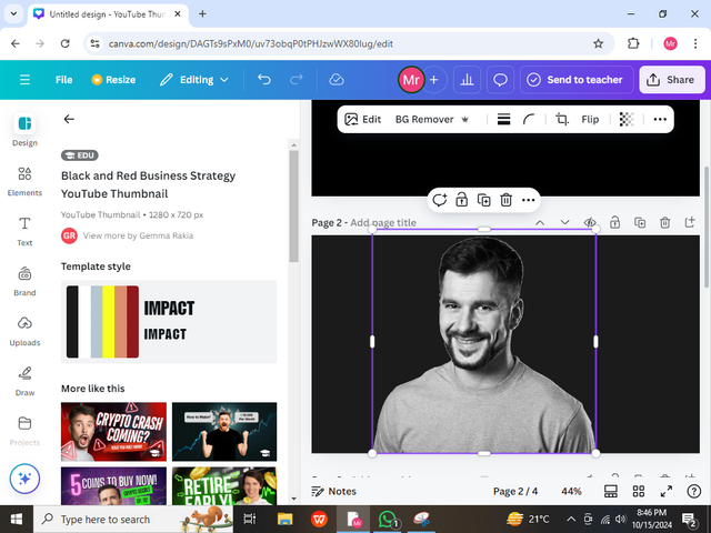
In this step, I get a free image and then remove a background. I have removed the BG from this image in Canva first time because I am now using Canva Pro. I also change the background color from white to black because in black I can see the image more clearly also it looks very attractive and cool.
.png)
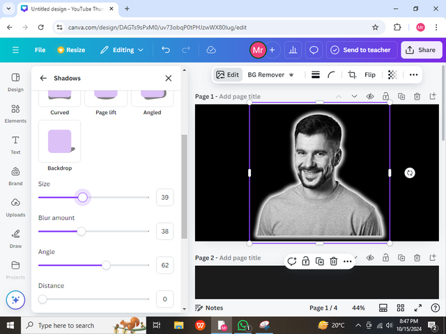
In this step, I have edited the image by adjusting intensity, brightness, and much more. Also, I outlined my image in white color but it did not look very good so I think I should blur it then when I blur it it looks very good and unique. Then I adjust the size according to the image.
.png)
In this step, I have searched for the glow effects in the Elements section of Canva. From there I chose two glow effects first one yellow and the other one blue. From this, you all will wonder why I do that but from this, I will lower the transparency of both of these glow effects and then send it backward then I will adjust it according to the image and then I will group it.
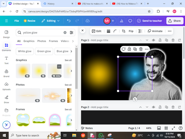.png)
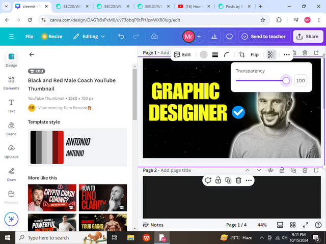
In this step, I am done with the image and you can see it, Looking good. Then I adjusted it according to the size of the Thumbnail. Now It was time for the text so for about 10 minutes, finding the right and attractive text was very challenging but after some time I came to this text which was looking very good. I keep the color of this text yellow with the size of 121 and then adjust it accordingly.
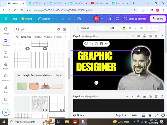.png)
Now I was thinking about what should I do more, then suddenly an idea came into my brain to add a tick emoji. So then I get this emoji with a blue color and then add this into the thumbnail and adjust it according to the thumbnail. I have put this icon with a designer which gives a good look.
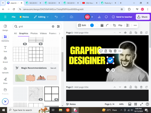.png)
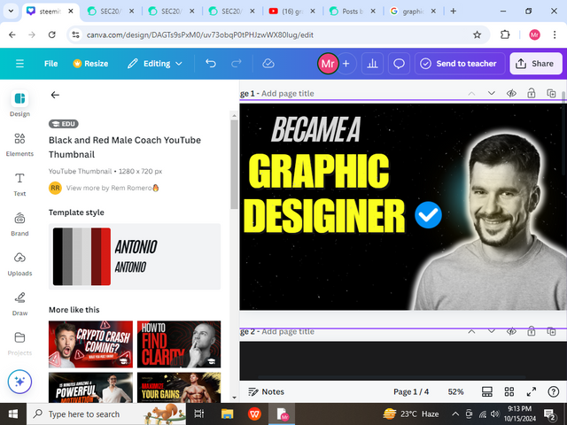
Now I was searching for some cool effect for my Background so I found a black image with dots. I have added this to my thumbnail and put it behind all the layers. It also had a great effect on my thumbnail and then I increased its transparency from 34 to 100.
In this step, I added another text in which I wrote Became A Pro and I adjusted it above the text of Graphic Designer and gave it a grayish color. I have also italic it.
.png)
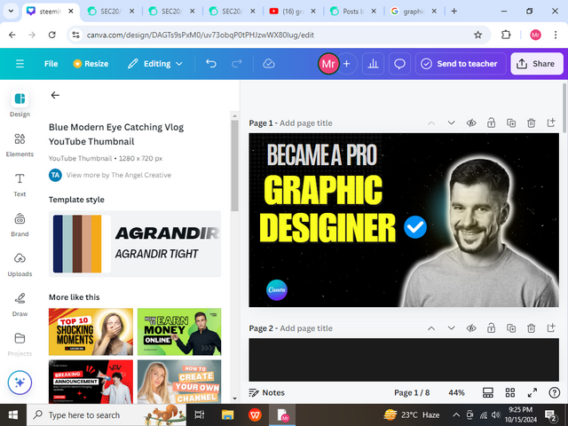
In this step, I made some changes in the previous text which I used like removing it from Italic and writing it straight, and then Bold it which gave a better effect than the previous one. Also, I have downloaded a Canva logo then added it to the thumbnail and adjusted it.
.png)
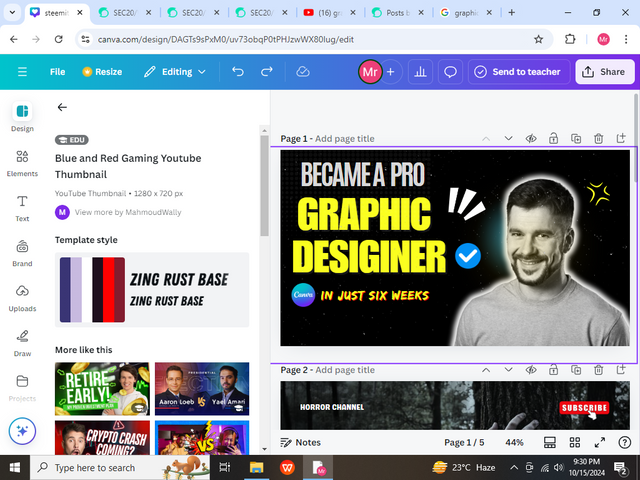
In this step, I have also written In Just Six months with a good font in Canva and adjusted the Canva logo with it. It had a great effect because it meant that within 6 weeks I had learned Graphic design.
.png)
In this last step, I have added another special font with a reddish and white color combo and wrote Thanks @Ihorgic because as we know he is our instructor and helps us to learn Graphic design that’s why I thanked him in my thumbnail. I have also added another element and adjusted it above the head of this human being. Color it yellow which shows that this person is very intelligent and has a big brain in the sense that he learns graphic design very well.
.png)
Final Look |
|---|
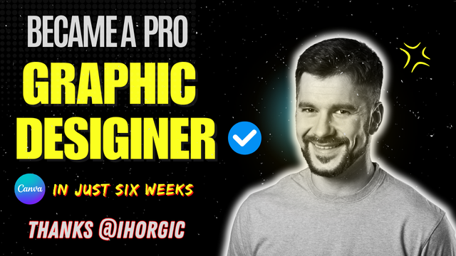
It was my presentation. I hope that you all like this. I would like to thank all of you for reading and stopping by my post. In this thumbnail, I am also engaged with a lot of principles like the Combo of colors I have used it very well in this design which you can see. Hierarchy and element spacing are also the principles which I engaged with. I also balanced my thumbnail and aligned it perfectly that time. I have discussed all the principles in detail in my previous post once. I hope you like my final look. Thousand of Thanks to Dear Ihorgic who help us to learn about this great course.
Stay Blessed |
|---|
I would like to invite @hamzayousafzai @kouba01 and @irawandedy to show their design skills. I hope that you will participate and I will be glad to see your Design. Best Wishes
Thank you so much @chant for this.I am highly obliged!
Hello @muhammad-ahmad thank you for participating in this week's lesson. We have assessed your entry and we present the result of our assessment below.
Feedback:
Let me start by apologizing for the late review, we had a little power outage here yesterday.... I also want to appreciate you for coming this far with me on this six weeks course and also commending you for the effort put into this practical, I love the outcome of your step, your design looks cool.
I only noticed that the spaces in between your elements seems to be too much. If you close up those gaps, you would get a better result.
In all, you did beautifully well and I must commend you for a job weldone, thanks for appreciation message, I wish I could do more in this limited period of 6 weeks, but then am glad I could still dish out value. Thanks for staying through the whole process.
Regards
@lhorgic❤️
Thank u so much dear for the great review. I am highly obliged.