👨🏼💻 #Proposal-86: Share Your Thoughts 📢
👉 VIEW THE UPDATED NAVIGATION 👈
I can barely believe it's been 2 weeks since my last update and I feel like it's been a very successful period.
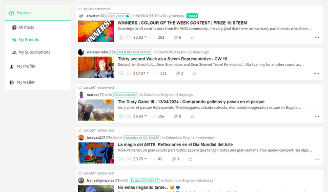
I've been using the updated navigation for this entire period - on both my Desktop and Mobile devices which has really helped me to iron out a few niggles and get a good feel for its usability.
During this period, I've also refactored some sections of code to make them easier to understand and therefore more maintainable. In the process of doing so, I've reduced the navigation JSX file to just under 460 lines of code (including a handful of comments). For a bit of context, my previous update had 480 lines with less functionality and the Profile Header has 560.
I'm of the opinion that the code is structured in such a way that somebody else could pick it up and understand what it's doing without too much difficulty - I didn't think this when I last updated you.
So tell me Gorilla, what have you done?
1. Sticky Navigation on Desktop
This is something that I've been wanting to implement for a while and put off until the end. The simple solution of adding a CSS class of Position: sticky was perhaps optimistic and didn't work (presumably due to overflow declarations elsewhere which I didn't want to risk changing).
So I had to go "old skool" and implement a solution using JavaScript. In simple pseudo terms, I had to check the starting position of the navigation, see if the user had scrolled beyond it and then pin it to the top. When the user scrolls up far enough, unpin it. Of course, it wasn't as simple as this as I also have to check the window height and if the window is shorter than the navigation, I'd pin it to the bottom when scrolling down, and top when scrolling up. I also included transitions so that the navigation doesn't "jerk" as you switch between each scenario.
One thing that I felt was important with the implementation was avoiding the introduction of a scroll bar just for the navigation (which would've been an easier route) and the additional effort required was well worth it in my opinion.
I only completed my first implementation a few hours ago and in using for that short time, have made it a lot smoother. Whilst this is a subtle change, it's the difference between noticing something happen and not - and I believe that if you notice a User Experience, then it's probably not good enough.
You can view this for yourself by visiting this link:
https://condenser-web-r64jisicxa-od.a.run.app/@the-gorilla/posts
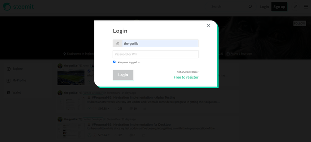
2. Log In Overlay
Previously when a user wasn't logged in and they selected "My Profile", they would be redirected to the Login screen (https://steemit.com/login.html). Whilst this was functional, it was inconsistent with the experience if you clicked on the little pen icon to write a new post.
So I reviewed my implementation and implemented the Modal Overlay which also feels like a subtle but valuable improvement.
3. Other Bits
As I mentioned in my previous update, I needed to tidy up parent components and update the right sidebar - both of which I did alongside a general code tidy.
Whilst I've tested numerous scenarios and edge cases, it's possible that there is a scenario that I've not catered for.
Everything should work smoothly for scrolling up and down, navigating through pages and resizing the browser window - with the navigation pinning and switching between Desktop and Mobile view as things are adjusted.
What Next?
I'm nearing the point where I can submit this implementation to GitHub for higher powers to accept or reject. Whilst I'm fairly confident in its robustness, I'd greatly appreciate it if you can help me to get more eyes looking and using this update...
👉 VIEW IT HERE 👈
Then, my plan is to write a long, detailed post explaining the code, which I can reference in a comment within the component. This will allow the coders amongst you to review what I've done and anybody working on Condenser in the future will know where to look (and know who to ask if they have any questions).


I was just about to make my final changes, but after seeing your update, I had to test it first :-))
Very good interim result.
I think that's very good. In the past, I have often had to scroll all the way up again to select a different navigation point. Alternatively, I would have suggested a "scroll top button". But the sticky navigation is a better solution.
The button would be useful in the mobile version.
What else I have noticed:
Absolutely! Very good!
Do I understand correctly: You want to make a PR for the Condenser for this interim status regarding the navigation?
We should agree on this, as I would also like to submit a PR after a few changes in the Condenser. However, the frontend would only be the second step for me, as Hivemind has to be migrated by the Steemit team first. Of course, I don't know how long this will take.
Nice progress! I like that I can switch APIs between steemit and steemitdev on your site. AFAIK, that's still not working on Steemit. I also like the general feel of the left-hand navigation (caveat, see below ;-), although it will take some getting used to.
Besides that, the only things I notice after a quick visit are that (i) I'm not sure whether I like it that if I'm in a post and want to scroll through my subscription list, the post scrolls with it. Intuitively, I was expecting an independent scroll capability in the "My Subscriptions" section. Also, my bottom community seems to be getting cut in half by "My Profile" in the subscriptions section:
I'll try to use it for a while and let you know about any other observations.
Question about the ToS... Presumably, every site that runs condenser doesn't want to apply the same terms of service. I wonder if that should be in the .gitignore file or what other mechanism can be used to maintain website independence for that file(?).
It feels really good to me, I will use it extensively and report back if I notice anything negative.
Really great work, I'm looking forward to your further ideas.
A quick note for all those who have tested the frontend before, if the dark mode disappears in newly opened tabs or after reloading, simply delete the old cookie.
Cool, thank you t👍🏼
Congratulations Gorillah!!!
And thank you. I was nearly absent during your work. Excuse me, I was ill for about 6 weeks.
I know you know all the changes done are barely needed and all the Steemians will be thankful for this urgent cosmetics rescue. Beside all the unseen needed cleanings in code.
You should know, this was not my private maintheme when I supported your proposal. I' m far away from layout. I am dreaming to have fundamental changes and news in advanced functions. Very needed is a better unrestricted editor.
I am very tensed for the future part of your work, now. In the case you will do it at all. I expect to see a bundle of functional innovations, in the future of frontend. Did you ever think about?
I am convinced the owner of the Steemit Inc. will proof and accept your changes of the Steemit code. The official introduction day of your code should be a fest on blockchain.
I hope that you're feeling better and more healthy now.
My initial expectation was a relatively light touch approach with the design but feedback from my 1st post was very much "No. Do more.". So with implementing a new navigation, I've had to go deep into the code, creating a new component and definitely push beyond my comfort zone. Because of this, the idea of functional innovations doesn't fill me with the fear that it would have done 2 months ago. So we'll see where this Proposal takes us 🙂
I very much hope so. I'm proud of what's been produced and it feels like a significant improvement to the site but I also fear that there's a silent mob waiting to spring to life and lynch me.
I don't know anything about a silent mob. The characteristic feature of the mob is that it shouts loudly. Most of the lynch mob switched to another blockchain (don't say its name).
Your uncertainty is probably just a bad feeling, a strange resonance of bad times from loud-mouthed speakers whose only achievement has been to jump on the blockchain early enough to rake in small fortunes.
Ha ha. I guess it's like a silent disco in that respect then!
🙂 I hope so. I think it's also the feeling that I've pushed myself outside of my comfort zone and there will be better coders than me, ready to "critique" my work. Before long, I'll have to share the changes so that other coders can sense check it before I submit it to the Condenser repository on GitHub.
You're the one who did it. That's the first point working very strong for you. You did it in public and you are the one who won the proposal race.
Now it's time the other coders to check up your work. If they will do it, be happy. Maybe you will get some hints. Be happy. Maybe you will get no resonance and your coding will be ignored. No problem, the work can go on. But they paied for your work. Something will happen now. So stay tensed, but relax. I don't know how to do this but you will find a way to become a real leader of the pack.
You're growing to be member of the silverbacks. I'm pretty sure.
You may have to look into this comma, beside profile
Thank you - That's a bizarre one. I don't use that icon for "My Profile" any more. Does that happen when you refresh the page?
I have refreshed the page. I just tried it as at the time I made the comment. You can see screenshot time is west African time
Does it still do it? Does it look like that on any other pages?
I've looked through the code and there's no obvious reason for the comment or old logo to appear. I've also tried to access the URL (https://condenser-web-r64jisicxa-od.a.run.app/search?q=Zekanem) and can't replicate what you're seeing.
I should also have said thank you for taking the time to look use it. Do you like the changes compared to the existing steemit.com?
Yes I do like it.
I have a question though which might not be within your power or what do I know.
Why don't we have inchat function on steemit.
I believe that's what social media is all about or is that what we get with blockchain backed social media?
Cool, I'm please that you like it. I found where the extra comma and incorrect icon came from so I've fixed that now.
I don't know the reason behind there being no inchat functionality. Most people just use Discord 🤷🏼♂️
Okay thank you
This post has been featured in the latest edition of Steem News...
I am interested in this world of steemit, I continue to try to be someone who is in the middle, but currently I am still in the learning stage, please help with guidance, enthusiasm for successful work together