👨💻 #Proposal-86: Change Log - Community Banner & Settings
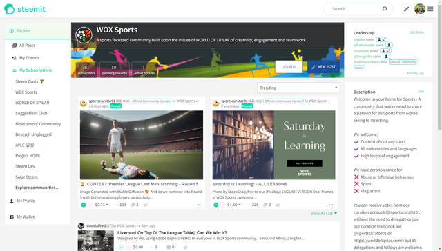
In this post, I'll be documenting the code behind the newly introduced community banner as well as the Community Settings page where the community's Avatar and Profile images are set.
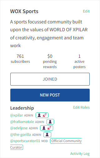
All of the information displayed in the banner (other than the images) is already existing functionality that appears in the right hand column.
The only content that has not been moved is the Leadership Team.
On wider devices, the ability to Edit the community settings, User Roles and View the Activity Log appear in the Right Hand colum and when this column disappears for narrower screen widths, these appear in the banner. Previously, an alternative component (CommunityPaneMobile.jsx) would be included for narrower screens which the new banner has superceded, making it no longer necessary. (I have removed reference to it from within the code, but not deleted the file from the repository.)
PostIndexLayout.jsx
The removal of the CommunityPaneMobile.jsx reference is a good place to start:
PostsIndex.jsx
In order for the new CommunityBanner to be visible, a new component is included within the PostsIndex page which only appears when the user is in a community.
Since the page title will appear within this banner, I have removed the title from the area below and configured it to only appear in non-community scenarios.
Since the CommunityBanner appears outside of the existing content area (the articles__header div), a wrapper div was added which is closed at the end of the code block (I don't think a screenshot of this is necessary 🙂
As is customary, I tweaked the imports to remove an eslint warning, as well as importing the new CommunityBanner component.
CommunityBanner.jsx
Cover Image
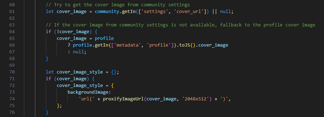
The cover image for the community is stored within the community's settings (more on CommunitySettings.jsx later) and if this is empty, the code falls back to looking for a cover_image in the @hive-xxxxxx profile.
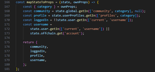
This means that the community needs to be retrieved from the Global State, as well as profile information for the category currently being viewed.
The category is a property that is passed to the component when it is included (see earlier screenshot).
You can see in the above code that the community settings are accessed first, if null, then the profile information is accessed.
The URL retrieved is then sent to Steemit's existing proxifyImageUrl function to secure it before displaying to screen.
Avatar Image
The avatar image follows the same idea, with a slightly different implementation due to the ability to take advantage of the existing Userpic component.
The above is the attempt to retrieve the image from the CommunitySettings and the below displays how this is rendered to the screen with the fallback option.
Title and Description
Following the Avater, the community title and description are displayed, both of which are retrieved from the Community's stored state.
Roles and Settings
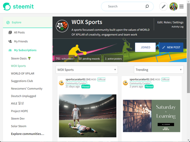
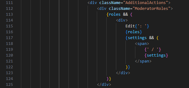
For narrower views, the Roles and Settings appear together with the approach from the existing CommunityPane component used.
Activity Log
Similar to the above, the Activity Log and Not Safe For Work (nsfw) elements were also duplicated from the existing CommunityPane component.
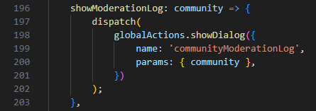
Just as in the CommunityPane component, this calls the handleModerationLogCLick...
...which subsequently calls the showModerationLog from the globalActions store.
Subscribe
The Subscribe functionality has been migrated from the CommunitPane component and uses the SubscribeButton component.
New Post
Once again, this functionality has been migrated from the CommunityPane component;
with the addition of a pencil icon to jazz things up a little more. Although if I'd known how awkward it was going to be to align the pencil image, I probably would've gone with a little less jazz.
The inclusion of the pencil required the addition of a pencil.svg file and inclusion of this in the Icon.jsx file.
Selecting "New Post" checks if the user is logged in (using standard Steemit practise), showing them the login if not and redirecting them if they are.
Community Stats
The final piece of the banner is the community stats and once again, the functionality is predominantly migrated from the CommunityPane component.
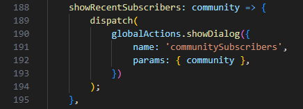
The subscribers section uses the migrated handleSubscriberClick function...
...which uses the function from within the Global Actions:
The numberWithCommas function is another which is called from another existing location (app/utils/StateFunctions).

CommunityPane.jsx
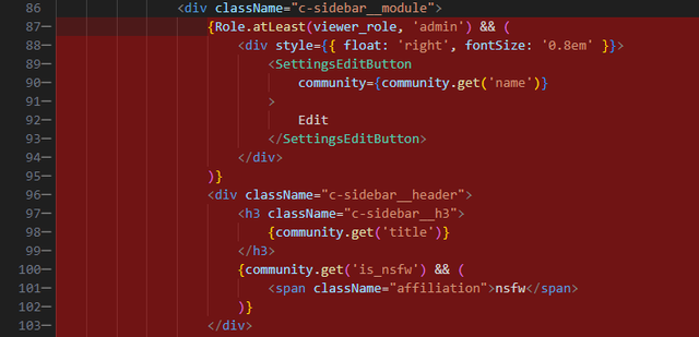
Having discussed a lot of migrated content above, it makes sense to now highlight the code blocks that have been removed (and reiterate how they related to the above).
As a result of the migration, some imports were no longer required:
As well as the lack of requirement for some of the variables / functions within the render methos:
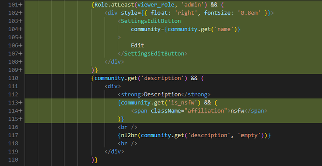
Whilst the "settings" (we call it "settings" but the text displayed says "Edit") button has been migrated, this only displays in the banner for narrower screens so this has been repositioned in the CommunityPane.jsx file to sit alongside the "Description" title. As has the "nsfw" label.
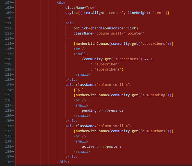
Migration of the "Subscribers", "Pending Rewards" and "Active Authors" (note that I didn't mention earlier - I removed the proliferation of inline styles which is generally bad practice).
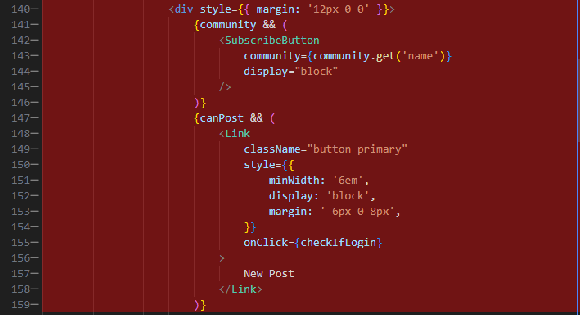
Migration of the "Subscribe" and "New Post" calls to action:
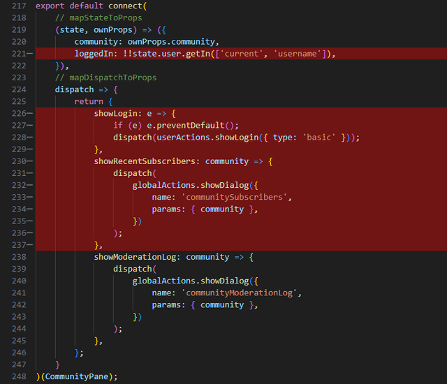
And finally, the migration of some of the Redux Setup:

CommunitySettings.jsx
The addition of the functionality for a Community's Avatar and Cover image upload uses the same approach as the Profile image upload to ensure consistency in user epectations and experience. This means that a progress / error area appears above the image upload area as well as the ability to drag and drop an image into the form field.
The Dropzone component needed to be included in the imports and the asynchronous image upload uses the Redux UserActions (more on this later) (and as ever, I tidied up any unused imports)...
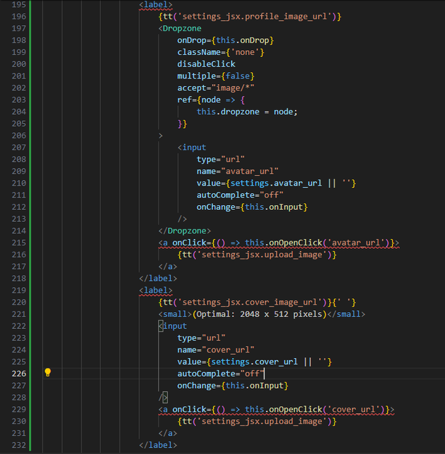
This implementation allows for 3 different options for the user to upload their image:
- Drag and drop
- Typing of text
- Operating System File Selection.
1. Drag and drop
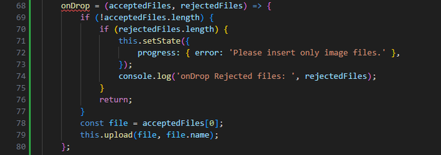
This is achieved by the aforementioned Dropzone component which calls the onDrop fuinction. This function is identical to that used in Profiles.
However, the upload function differs.
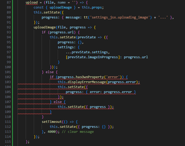
It still uses the uploadImage logic from the Redux "UserReducer" (that we imported earlier)...
...but uses a different implementation to update the screen (as mentioned before, the different coding approaches on each page).
The if (progress.url) code block handles when the image has been succesfully uploaded - clearing the "progress" state and updating the "settings" state.
The else code block handles 2 other scenarios - the first of which is if there's an error during upload (if (progress.hasOwnProperty('error')) ) and the second (i.e. no error) indicates that the upload is still in progress and updates the screen accordingly.
2. Typing of text
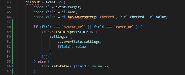
This is handled by the onInput function which also handles the existing field's inputs.
Unlike the other fields, however, the Avatar and Cover images are saved in Hivemind within a "Settings" identifier so they're handled slightly differently.
3. Operating System File Selection
File selection is handled via the onOpenClick function which is the same as that used in Profiles.
Page Submission
Upon submit, the approach currently in place loops through each of the variables stored in the state and submits them to the Redux "Payload" - this differs to the approach used in Profiles. Because we store the image upload progress information in the state, we need to ignore these when preparing the payload.

SettingsEditButton.jsx
Having mentioned the payload, it's important to realise that the CommunitySettings component is called via the "SettingsEditButton" component which is initiated when a user selects "Edit" next to the Description (or "Settings" on narrower screens). (Explaining this component change before the settings screen might have been confusing.)
This is where the structure of the information is defined and passed to the CommunitySettings component. This required the addition of the Avatar and Cover images, reflecting the structure within Hivemind.
These changes have been pushed and are now available on my development branch.

If any of these changes require further explanation or you're a future developer that has any questions, then please leave a comment below.















This post has been featured in the latest edition of Steem News...