👨🏻💻 Condenser: Documenting Steemit.com CSS Structure
Well, it happened. SPS Proposal #86 has been approved and work has begun to Modernise the Steemit.com Interface...
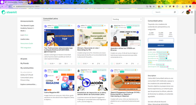

🙏 Thank You
I have to start by thanking all of you for your support in getting us this far. This feels like the start of something significant for Steemit and with the excitement, I also feel a great sense of responsibility and pressure. This responsibility and pressure is down to the knowledge that this is the first DAO funded project for many years and if all goes well, then it might pave the way for others to follow.

Let's Get Started
Whilst the temptation is to smash out some code and make things look different so that you can see progress, I said from the outset that I want to get the foundation right. I want to document as I make progress so that others can pick up Condenser and the work that I'm about to do and say "Yeah, that makes sense. Simples."
As outlined in the original Proposal, Stage 1...
...would involve documenting the structure of steemit.com - identifying what source code is used in each page and the associated CSS files. Steemit.com's "all.scss" file imports approximately 70 other .scss files which needs understanding.
I've broken this down to 3 sub-stages:
(a) CSS File Structure - Identify what CSS Files there are, document their hierarchy and where they're imported.
(b) Sitemap - Identify all of the pages that are present on steemit.com. This could also reference other (sub)domains like steemitwallet.com without detailing their structure. (This could lead to the production of a sitemap.xml to support Search Engines.)
(c) JavaScript File Structure - Certainly the most daunting of the Stage 1 tasks - this will look at each of the cards, elements, modules and pages to see where each component is used to produce a file hierarchy. For example, the Announcement element (app/components/elements/Announcement) is included in the Header Module (app/components/modules/Header) is included in App.jsx.
Part (a) is now complete and documented below.

src/app/assets/stylesheets/app.scss
(Not to be confused with src/app/App.scss)
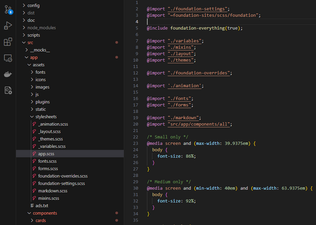

This is the parent Stylesheet which imports additional generic and specific stylesheets.
It also sets some generic styles for the site.
I'll look at these imports...
Foundation Framework
@import "./foundation-settings";

@import "~foundation-sites/scss/foundation";

@include foundation-everything(true);

@import "./foundation-overrides";
The ~foundation-sites/scss/foundation imports another Steem Git Hub repository (https://github.com/steemit/foundation-sites.git).
I quickly realised that this repository is a copy of the Foundation Framework which is a less commonly used alternative to Bootstrap.
The inclusion of this Framework came as a bit of a surprise because the original developers didn't take advantage of some of its features (tabs, grids, etc.) but it's important to know that this Framework's in use as I might be able to take advantage of some of its features later... I may also come across some styles that have been defined here, rather than in one of the Steemit stylesheets.
@import "./variables";
This file defines the colours to be used various text, borders and the primary font.
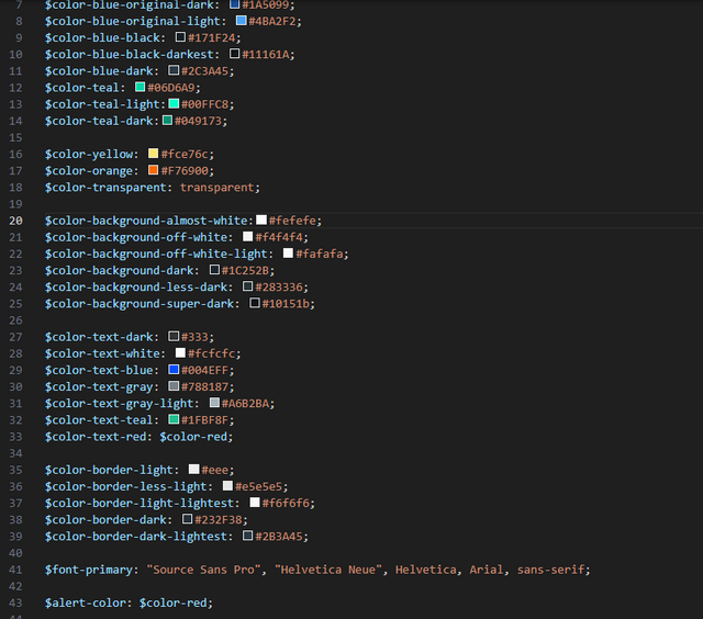

Some of these values aren't used and I see limited value in the existence of this file. But it exists, so let's leave it to continue existing.
@import "./themes";
Where some colours were defined in the above CSS file, they're used here.
Within this file, 3 themes are included:
- original
- light
- dark
It doesn't appear that theme-original is in use any more and we'll be familiar with light and dark modes from the menu.
I wonder if there's interesting potential here for some users to screw around with some colours in their own Profile Settings section although I see very little value in this.
@import "./mixins";
This is a pretty cool stylesheet 🤓
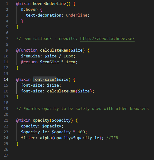

The font-size function which calls the calculateRem function converts a fixed pixel size into a relative size - which is far better for a responsive design. So for those of us who think in pixel sizes, we can continue to do so and mixin will convert it into an accessible value for me.
@import "./layout";
This file defines the break points for the site (the resolution at which we choose to adapt the display):
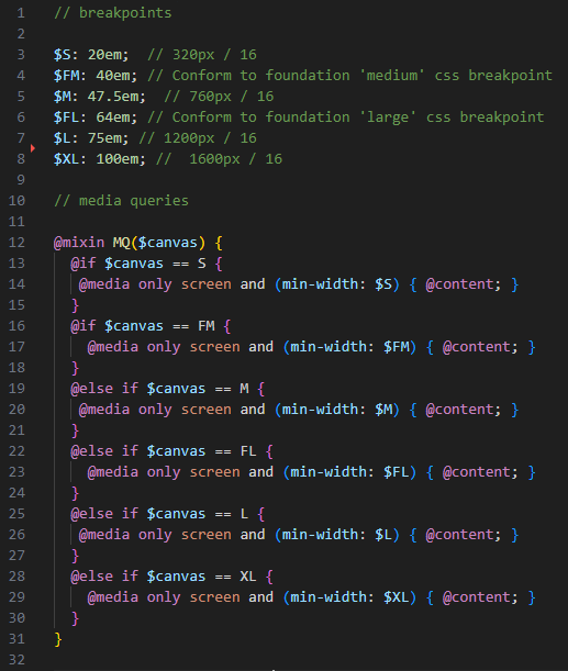

It's important to note that the sizes are defined by "min-width" meaning that if we want to do something different for each resolution, the smallest resolution must be declared first so as not to override it.
This information will also be important when looking at how many columns to include in a grid layout at each resolution.
@import './animation';
Animation parameters - Not a lot to add 😊
Even less to add about ./fonts - it's an empty CSS file.
@import "./forms";
Various settings for form components.
@import "./markdown";
Key stylesheet components (headings, etc.) are defined in this file.

@import "src/app/components/all";
Ok... one of fundamental concepts behind reactJS is the idea of components - a self-contained module that encapsulates a piece of UI, its behaviour and its styles.
My expectation was that each card, element, module and page would have their own dedicated stylesheet and indeed, they do. But my expectation was also that the stylesheet would only be included at the card, element, module and page level... which they are not.
all.css imports every other stylesheet.
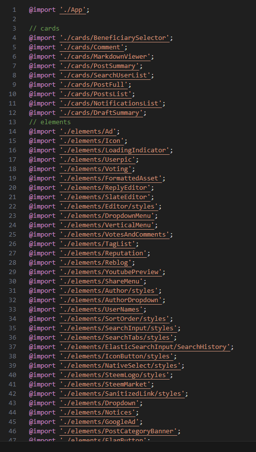

Which means that all stylesheets are loaded with the initial page delivery and separated out into their relevant component which should help to make maintenance and updates easier.

I hope that you found this interesting and useful. The break points in the layout.scss file as well as the use of the Foundation Framework are probably the key discoveries for me and the points that I'll return to as I continue to develop the site.
CSS File Structure


Congratulations on the successful proposal! It is really nice and above all hopeful to see that this has been brought back to life after such a long time.
I can understand the pressure you are feeling now. But I also think that nothing is eaten as hot as it is cooked - so people will certainly understand that a project like this takes time. Anyway, it's great that you're doing it.
Good luck and I wish you every success!
Thank you 🙂 I'm hoping that the community will be patient as this will take time. Hopefully soon, I can start making some changes and submitting code fairly frequently so that everybody's happy and can see some progress.
Thank you for your first report ... one of the reports that is worth reading ;-)
I would like to be able to view your reports on the matter in one place. This would be possible with a unique tag and your account.
For example, via my search with @the-gorilla and #proposal-86:
https://moecki.online/search?tags=proposal-86&author=the-gorilla
Are you planning to use a specific tag for your reports?
I hadn't really thought about it - I was planning to index all of my Condenser-related posts though, so that a future developer will hopefully get the help that they need.
Since you and @denmarkguy have picked up on it though, it makes a lot of sense for me to use it for all proposal-related work🙂
An index post would of course be an additional help. It can then also be used for categorisation.
First of all, a huge congratulations on the fact that the proposal was approved! I'm very glad to see you got the thumbs up from a couple of really big stakeholders. After all, you're doing something that will benefit all!
Also, big kudos to you for taking this very structured approach to the project, with thorough documentation that will serve others in the future.
Also... really god usability to use the #proposal-86 tag as (hopefully) a consistent point for content discovery purposes, for those who want to easily bring up the whole history of the project.
Really looking forward to watching it all unfold!
Thank you... it's extremely tempting just to start coding (and I couldn't help myself by fixing this bug whilst seeing what interface related issues had been logged already) but I know that if I spend a week (or however long it takes) to investigate and document things, life will be a lot easier later.
I am very happy for you and for the trust that has been placed in you! I wish you every success with the project!
Thank you 🙂
Awesome work mate
You can have the rest of the day off :)
No rest for the wicked!
This is SO exciting!!!!! Steemit comes alive once more!!! Whoop Whoop! Congratulations again @the-gorilla and I wish you all the best with the actual work!
Thank you... it's a lot of work... step by step we will get there 🙂
Wishing you all the best!!!! I have no doubt it is a HUGE amount of work, but it is going to be fantastic once rolled out!!!
Ps. Will this new "face" have a scheduling option?! Asking for a friend kekeke :D
I’ll do my best 😊
Unless I find the scheduling functionality hidden in the code and turned off., that’s something I’ll probably be leaving to somebody else!
Cool beans :) Had to ask! :D All the best again!
Congratulations… this will be very good for Steemit.
Best of Luck
Dont forget to add chat button in new UI