👨💻 #Proposal-86: Communities Update
I really don't know where the time goes - it's been 2 weeks again since my last update and it's been a fiddly couple of weeks continuing my work on the communities page.
Pinned Posts Carousel
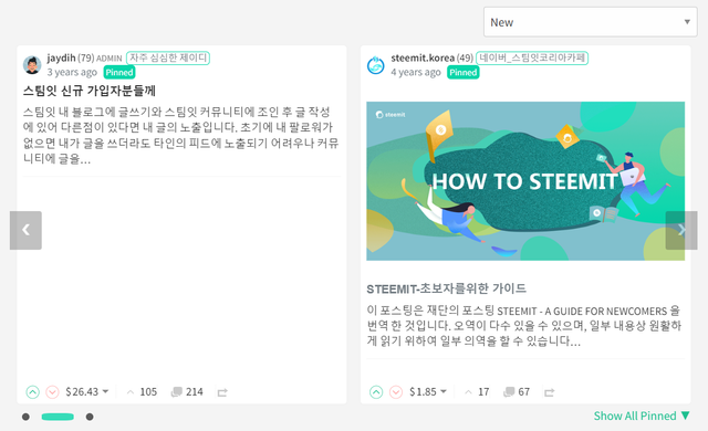
I'm now happier with how the carousel is looking, having followed @moecki's suggestion of fixing the image height as well as its width. This gives the carousel a better feel with fewer, large areas of white space.
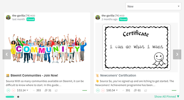
In the same way that the existing list view crops images, the carousel will also crop longer images and where an image is shorter, it will be centrally aligned with white space above and below (this looks better than top or bottom aligning).
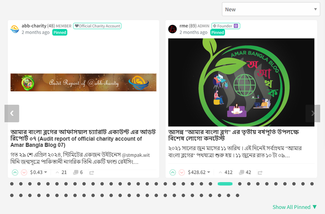
The titles will always be aligned with this approach.
I didn't adjust the number of characters returned for the body text - there's code which crops the text after a full word in the list view which would be of detriment to that view.
Pinned posts that don't have an image won't look as good - similar to how a post in list view doesn't look as good as one which does.
Community Cover Image and Avatar
A community's cover image and avatar is pulled from the @hive-XXXXXX account and not from a community's curation or other account. If you would like your community to be more visually appealing, this is the account that will need updating.
The item that I was least happy about in my last update was how the "Activity Log" and Moderator functions were being included in narrower resolutions. I knew that these somehow needed including within the community banner but struggled to get my head around how to do this without it feeling overly cluttered or looking out of place.
Once again @moecki suggested resizing some elements to assist with this and whilst this helped to make the design work a bit better - it didn't quite solve the problem, especially at the most challenging 760px resolution.
The solution that I opted for isn't too different from how the existing steemit.com handles it:

With (in my opinion) a clearer separation of items:
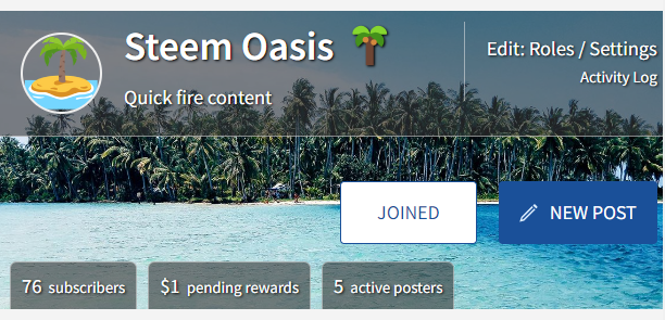
The above is the "worst case" 760px screen width and below is the absolute worst case with longer text and no image:
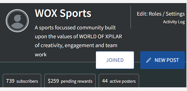
This is definitely an edge case as in general, it would look more like this:

Or like this (once the images have been updated):

Drop It Like It's Hot
I've also included the fix for bug #3919 (raised by @steemchiller) to reintroduce "Hot" into the Sort Order.
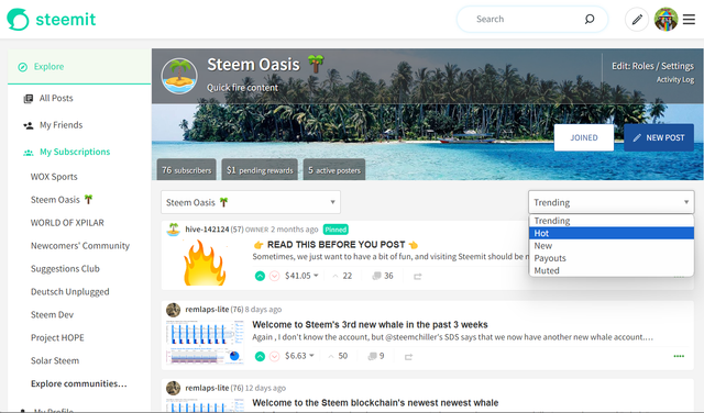

I'm much happier with how this is looking now and feel that it's ready for more rigorous testing.
I've been having RCP issues both locally and on my test servers so it's best to access the test site through a user's profile, rather than directly to the root page. If the steemit page template loads and not the body content, waiting for about 10 seconds and then refreshing tends to resolve the problem.
https://condenser-r64jisicxa-ul.a.run.app/@the-gorilla/communities
I'm also interested in hearing suggestions for other enhancements that can be made to the community page. I'd like to adjust how "New", "Trending", etc. are displayed but want to do this as a separate piece of work due to its impact across all pages where this is included.


the-gorilla's Alternative Steemit Interface
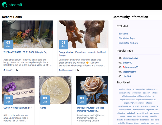
In case you didn't know, I've created an interface to help you find content that you're interested in more easily.
Posts by voting bot users, abusers and spam tags are hidden and you can search by multiple tags - allowing you to find the content that you're interested in more easily.
👉 Launch Alternative Steemit Interface 👈

the-gorilla's Club Status Tool
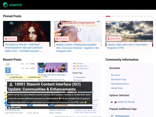
I've also created a tool to help users review their club status - showing them where their power's coming from, how much they're powering up, transferring out and who they share a wallet with amongst other things.
Please use it wisely.
👉 Launch Club Status Tool 👈

Great! I like it when it's hot but not too hot to touch. Choosing the tag #steemit as example was hilarious, but it seems to have worked nevertheless... ^^
😢
We will need a filter function at some point to be able to exclude bot-voted posts from trending and hot. Maybe also create an extra category for those posts. That could make even the tag #steemit interesting to watch again.
Da gab es mal einen Ansatz :) #BBBS
https://steemit.com/hive-127586/@peppermint24/s5ix2c
That would be good - I did that on my interface but it involves manually updating a "bots list" and periodically checking who has delegated to users on that list. Trying to do it real-time was very resource intensive.
Do you have a better idea on how to do that?
I guess the only performant way is to implement the logic in Hivemind to have it return the data as needed. We won't get around managing a bots list, but I think it wouldn't take that much effort to add new (relevant) bot accounts once in a while.
Best solution would be to have the list stored somewhere on Github (or even inside the blockchain) in an externally reachable text file or so to allow other data services like SDS to consume the same data too.
I also think that would be the best solution as long as the frontend gets the data from Hivemind. This would also be easy to implement, because the vote rshares from the post data are used for this. This allows the rshares to be assigned to the voters. The filter could then be applied when adding all rshares for the trending and hot score.
The bot list on Github would certainly be easy to solve. A readable list on the blockchain would be more challenging. I don't have any ideas about that now...
I don't think that would be hard. Someone could make a dedicated account and store the list in custom_json operations whenever there's an update, then the front-end could just check the account history.
More challenging would be to decentralize the updates using some logic like Twitter's "Community Notes" logic so that no single person would need to maintain it. That would require some sort of UI software and a more robust protocol for the custom_json ops, and the front-end would have to scan the entire blockchain for updates. Obviously, hivemind would be better for that purpose, but I don't know how likely we are to get traction for hivemind updates.
This would be too late in the front end. The entire calculation would then have to be performed again and the order queried again... Hivemind is already the right choice, as the relevant score is already calculated there.
A custom_json operation would have the advantage that no additional API requests would be required, as certain custom_json operations are processed by Hivemind anyway. However, like you, I see the effort involved in securing this handling against "attacks" or only accepting it from a specific account (for example @steemitblog). Then there is the question of where/how Hivemind stores the data.
But quite feasible...
This leads me to the thought that there is/was something similar for beem. The account @fullnodeupdate contains (in its profile) data about RPC nodes and their performance. Unfortunately, these are no longer updated on Steem. However, this alternative also requires further checks to ensure reliability.
Ergo: Changing the score calculation with a static (code-based) list should not be difficult. However, the implementation of a dynamic list must be chosen wisely. We will have to discuss this further.
Yes, that's exactly how I thought we could solve it. The existing trending and hot algorithms could still be used and the botted rshares would just get subtracted before calculating the score with the total rshares left.
I've heard something like @the-gorilla doing holiday and you solving it in Hivemind and taking his 30 SBD daily for a while... ^^
I like it when you and @moecki use words like "easy" when discussing something that I've not looked at how to do yet 🙂
@moecki - I'd welcome a break (not for too long though 😉) if you'd like to take over for a bit (or split the work time). Ping me on Discord if you think that you've got time 🙂
The first impression is very good. I still have one or two suggestions for the community page, but these have already been mentioned elsewhere. For example, that the description is also available in the mobile view (perhaps to expand, as I have also implemented on https://moecki.online/hive-146118).
About the "Hot" selection:
I had wondered why I hadn't noticed this before... until I realised that I mostly read the feed, and the dropdown field doesn't exist there.
I'm not going to ask how the "Hot" entry could disappear...
Sorry I hadn't replied to your comment in the last post, but I was a bit developer lazy after my hike ;-)
Now I have to see that we get the profile and cover picture into the account @hive-146118 for the display in your new DU community page. I'm sure @chriddi will agree :-) I have the keys to change this.
LOL, this task was the first I was thinking about while reading this post. Glad, you wanna do it… 😁
Wir haben gar kein Cover-Image. Vielleicht läuft uns da mal ein passendes Bild über den Weg...
Edit: Nicht wundern, ich habe bei der Gelegenheit mal die fälschlicherweise dort eingegangenen Beneficiaries an @deutschunplugged überwiesen bzw. per Powerdown und Withdraw Route umgeleitet. Dann hängen da nicht noch irgendwelche Token rum...
Ich gucke mal. Profilbild ist aber klar, oder?!
Hä? Wer acht denn sowas?!
Jo, ich könnte jetzt versuchen, es herauszufinden... aber ich hatte das noch im Hinterkopf, dass wir uns mal darum kümmern müssen. Ist aber auch erst wieder in den Vorderkopf gerückt, als ich den Kontostand gesehen hatte. Ich meine fast, dass es der Frosch bei seinem ersten Versuch mit DUBby war...
Ja, das Profilbild habe ich schon übernommen.
Stimmt! Ich bewundere dein Gedächtnis... 😊
Hi, I have been seeing all you are doing and I really like what I see.
When you have time I would like to request to do something in the user’s profile.
Check for example the current one with Reddit one together. I feel that now without the navigation bar the separation between the posts and the profile is too aggressive.
Maybe you could do something with this!
Continue the good job.
Hi @alejos7ven, thanks for your feedback.
I covered this briefly some time ago.
In particular, I spent quite a lot of time looking at Mobile Design Patterns.
Interestingly, my preference at the time was as you suggest (which was the Sky Sports example).
When experimenting though, the connection between the navigation levels felt appropriate and also interestingly, Sky Sports have also followed my design approach and updated their site too.
It's not a closed book - the current version is ready to be launched and whilst I've had good feedback during testing, it'll be interesting to see what the wider community thinks.
This post has been featured in the latest edition of Steem News...