You are viewing a single comment's thread from:
RE: 👨💻 #Proposal-86: Hide Resteems on steemitdev.com
I have also deployed it on moecki.online to test it.
If I notice anything, I'll let you know.
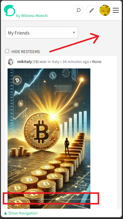
The position of the checkbox seems a bit misplaced to me. Especially on the mobile site, the box seems somehow lost in this position. Could it perhaps be positioned next to the dropdown field? But I don't have a really good idea right now either.

I've been wanting to tell you something for a while:
Can you see the line at the bottom of the screenshot (outlined in red)? It is permanently visible on my page. Can you reproduce it?
The line is located exactly above the PrimaryNavigation. I had a look at the developer console. There is a border that is displayed:

I've wondered about the positioning of the "Hide Resteems" too. There's normally the "Order" dropdown in the area that you've highlighted which might be a bit confusing if something else appears there instead.
I've wondered about a longer term solution of introducing a "filters" bar or "options" for when additional functionality becomes available (if that happens)... regardless, I notice that the spacing could do with some adjustment.
I'll have a look at the 1px top border... I've got a feeling I've removed that style in a previous release. If you take a look at the PrimaryNavigation.scss file, this section should look like this (lines 13 to 18):
This is it...
https://github.com/steemit/condenser/commit/0da5aa368f902cde01a02e36d6992a08e4875cc5
I removed that line with the communities release:
True, but not in the "feed" view.
That's a good idea. I would also favour that. But these would have to be quickly accessible. Clicking through to the profile settings would be too much.
Oh, that's right too! After your hint I saw that the line came back in one of my later merges... don't ask me how that happened. So the fault lies with me :-D
I agree. My current thinking with that is for a show/hide panel that's within the context of the feed. I've just looked and it appears that peakd do something similar already.
I'm currently implementing the "Pinned Carousel" for mobile devices so will postpone thinking too much just yet 🤯