You are viewing a single comment's thread from:
RE: 👨🏼💻 #Proposal-86: Navigation Implementation for Desktop
the screen where it's not as visible as you'd like?
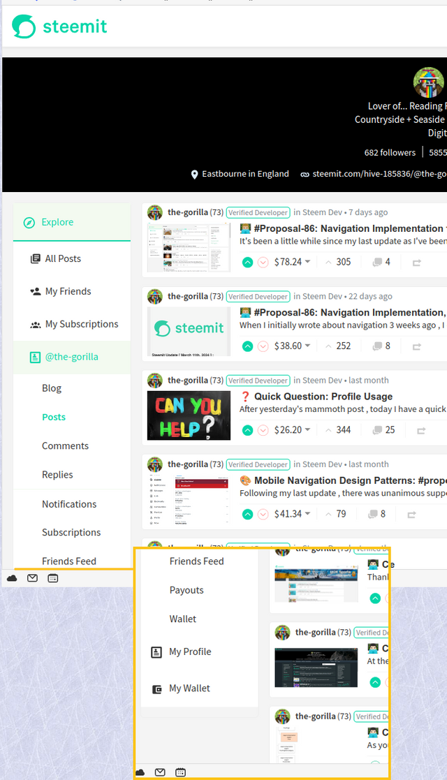
The area framed in yellow is outside the visible area for me. My screen has a resolution of 1920 x 1080 px.

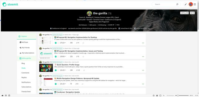
This is what my entire screen looks like, browser window maximised:

to entice people into thinking that they can earn mega-bucks
Haha - yes, that would be possible! Clicking on "age" has become a habit for me, after a change I might accidentally switch to "trending" :-)
I've had a play with it and uploaded a revised version (with an updated implementation in an individual post view). I've tried to be careful not to reduce the white space by too much so that it doesn't feel squashed.
My Profile is now visible for most profiles, except for gorillas, which take up a lot of space :-)
I have a long description which I think contains the maximum number of characters so mine is probably worse case scenario🙂