You think they did this on accident?
This was so bad it almost seems like it was on purpose!
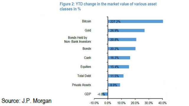
JPM was at it again with their Bitcoin "Research" comparing the performance of different asset classes.
It was nice of them to include bitcoin, though they got something very wrong, can you see what it was?

(Source: https://twitter.com/DocumentingBTC/status/1367843471248285696/photo/1)
How about the scale?
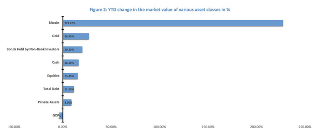
So bitcoin returned 10x gold but the blue line is barely longer?
Yea it should look more like this:

(Source: https://twitter.com/DocumentingBTC/status/1367843471248285696/photo/2)
I guess that was a little harder to fit on their page though...
Stay informed my friends.
-Doc
Just like geography used to be manipulated to show different scales, it allowed for scare tactics, or the opposite when one wanted their soldiers to go all out thought he terrain was a lot different, much longer distances and the likes, than the truth.... Nice catch there.
Namaste :)