Introduction to Logo Design Principles

A logo is a visual representation for a brand, organization, or entity. It is designed to identify and distinguish itself from others while communicating its values, mission, and describing your brand. Its a simple graphic icon that creates recognition and memorability.
| Discuss Logo design based on your understanding about the topic. |
|---|
A logo often constitutes the first impression people have of a brand, making it a crucial investment requiring a lot of dedication and attention.
To create a logo that stands the test of time and communicates the intended message to the public, a lot of attention must be paid to detail, which includes colour, alignments, typography and and the message. It must embody the brands value while taking into consideration the target audience and market trends, anticipating how the logo will be perceived across various platforms, cultures, and time.
Most importantly, the principles for creating an effective logo must be taken into consideration, whoch are:
- Simplicity
- Memorability
- Originality
- Timeless
- Balance
- Versatility
Types of Logos:
A logo can be designed in various ways. Once it is done right, it establishes the brand identity, builds recognition and loyalty
Wordmark
This is a text-only logo like the one used by Google and Facebook, they only use words without any symbol or icon. Other good examples are the CNN, Yahoo and Coca-Cola logos. When such logos apply the concept of simplicity, its easy to remember them like CNN, Sony and Microsoft.
Letterform
Letterform logos are a type of logo that uses either a single letter or a few letters to represent a brand or organization. The IBM logo is an example of a Monogram Letterform logo, using the initials from the company name, while McDonald's M focuses on the first letter, making it easy to remember.
 The M for McDonald
Iconic
An iconic logo is a symbol-only logo where the symbol is a graphical representation of the brand.
A good example of such is the apple in the Apple logo, the swoosh for Nike and the bird for Twitter.
These logos are unique and distinctive. They are not clumsy. Focusing more on visual storytelling.
 The apple iconic logo
Combination mark
A Combination Mark logo combines a symbol or icon with little text, typically the brand's name. Some excellent examples are Burger King and Adidas, which are easy to recognize.
Emblem
An Emblem logo is a type of logo that features some text surrounded by a symbol, shape, or icon, often creating a crest or badge-like design. In this category, we have logos from Starbucks, Harley-Davidson, BMW, and UPS.
| Discuss extensively the role and impact of logo to a brand. |
|---|
A company's logo plays a vital role in representing the company's brand identity, values, and message.
A good logo enhances brand recognition, establishing the brand's visual identity such that it is easily recognizable and memorable.
Logos also makes it easy to differentiate an hp from a dell laptop. Based on this, I am more attached to hp when compared to Dell, showing that we can develop some emotional connection to a logo. That is why hp has more market in Nigeria. We here are just attached to it. I would readily buy a nokia for a phone, if not a Samsung, but definitely a Samsung for a TV and a toyota for a car.
Nokia 3310 was durable and has linked nokia to consistency and the Nokia logo once was a household name in phones.
The effects of a wrong logo
Just imagine waking up to see that your church has changed its logo to what we have below,
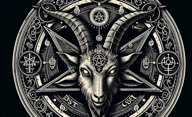 the effect of wrong logo
You can imagine what could happen if a hospital would use a tombstone as its logo.
The same is true with poor design, a logo that is inconsistent or not having a logo that clearly distinguishes your product.
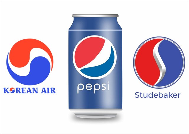
Studebaker, Pepsi, and Korean Air
The three logos above look a lot similer, someone could easily take one forvthe other, they all use the same colour scheme, red, white and blues in the same order. They are all in a circle. They are not too unique lacking some amount of originality.
| Explain and demonstrate visually the do's and don't when it comes to logo design. You can do more research to be outstanding and kindly ensure not to use my specimen logo. |
|---|
Simplicity
A good logo needs very few elements. Do not dump too much details on the logo; a contact card will carry those details.
Memorability
Using a simple play on words like Hairspital in place of hair hospital makes the hole logo and brand memorable. It is a hospital for your hear
Allow your Logo breath
There should be some amount of free space around your work, not allowing things to swallow up the main logo. The ratio of the text element to the graphics must be ballance and not nesseseryly equal.
| Design a simple logo with the knowledge you have gotten from this lesson by assuming that a client gave you a job to design for his brand (business). |
|---|
- Load the canva application
- Select the canvas size for the graphics
- Select element
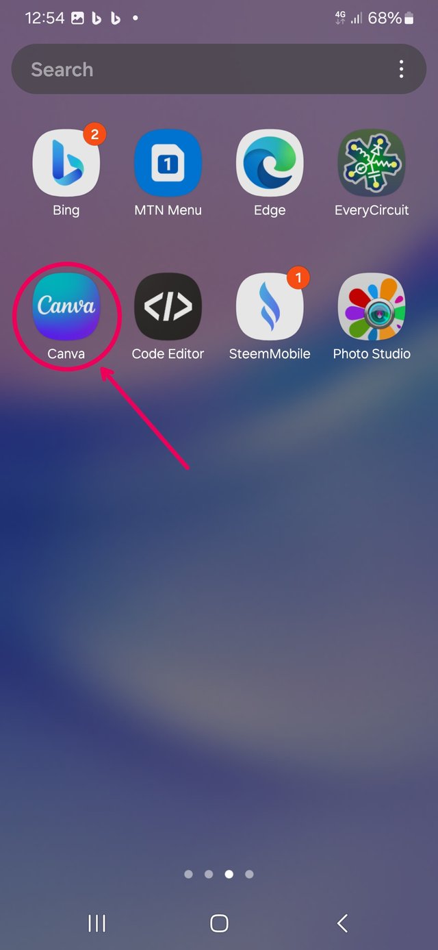 | 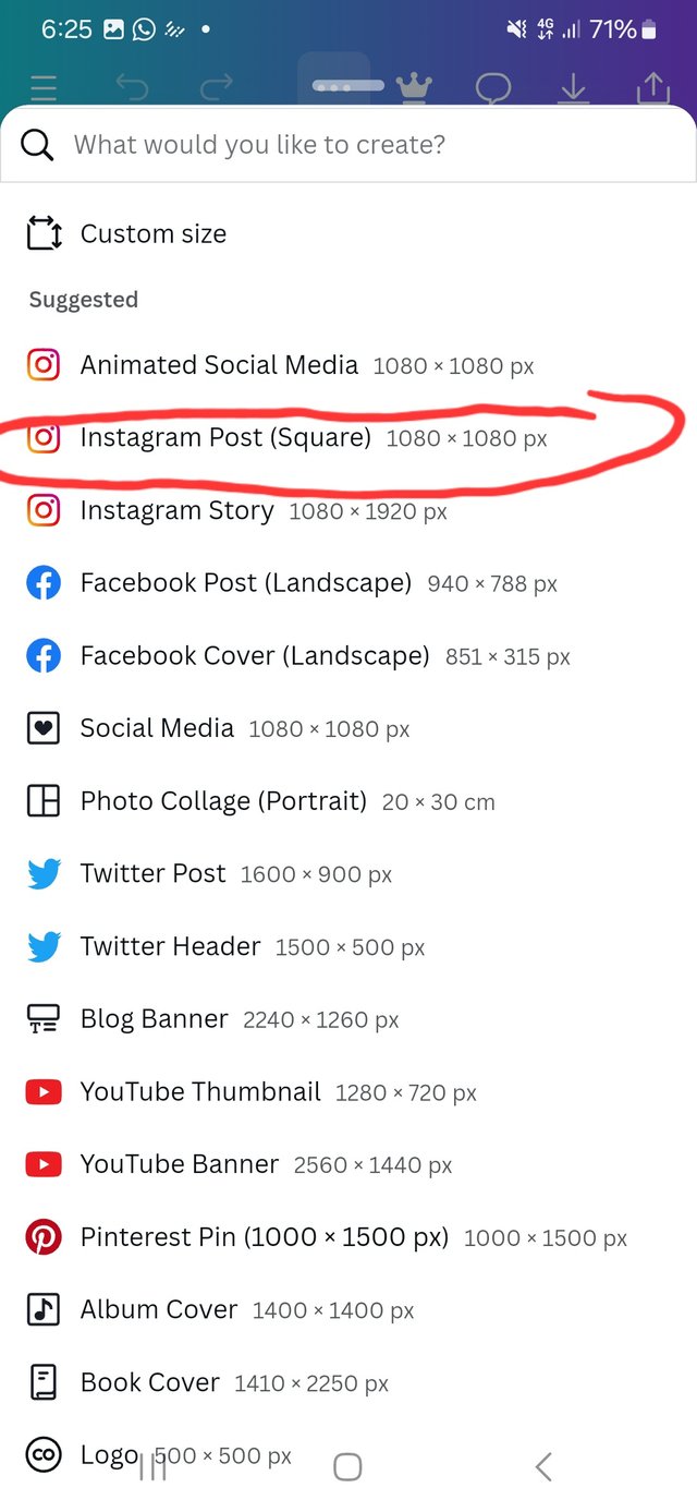 | 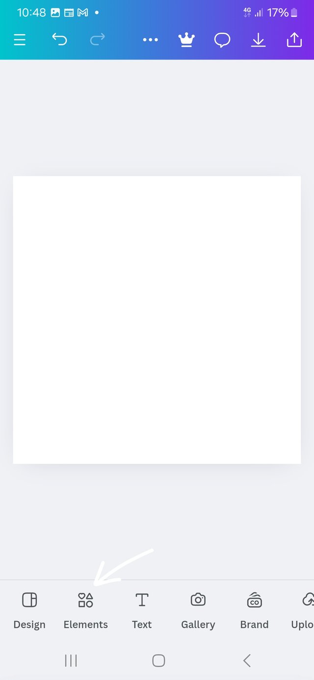 |
|---|
| Loading Canva | select size | select elements |
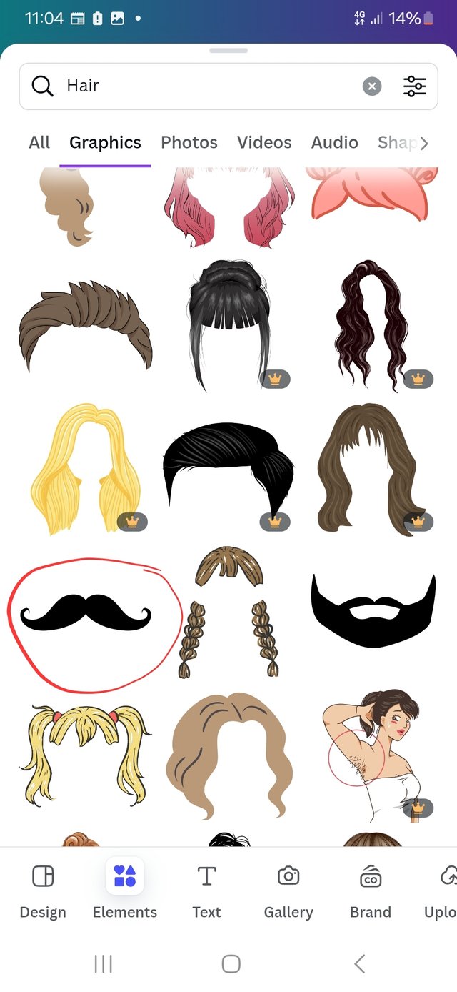
- Search for hair
- Select the hair you like
- Select text
- Type in Hairspital ( hair hospital )
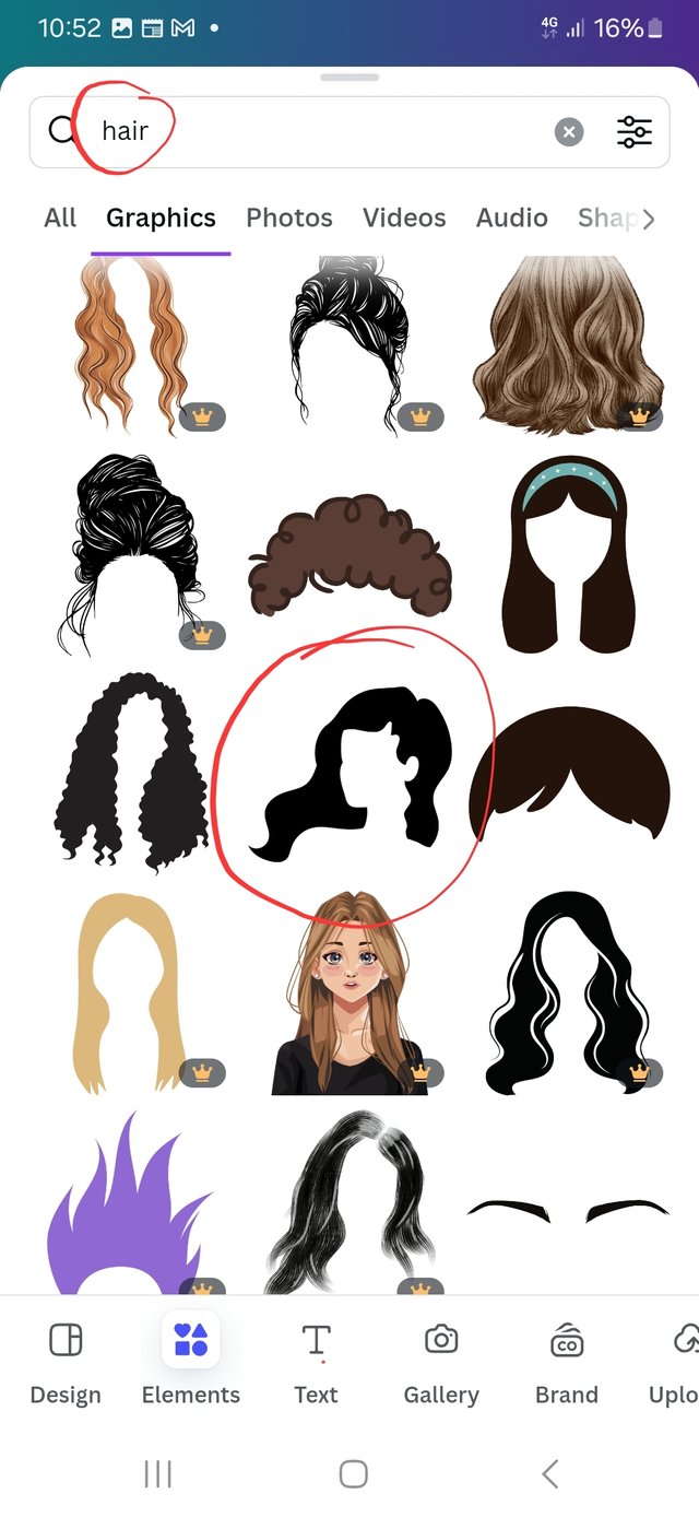 | 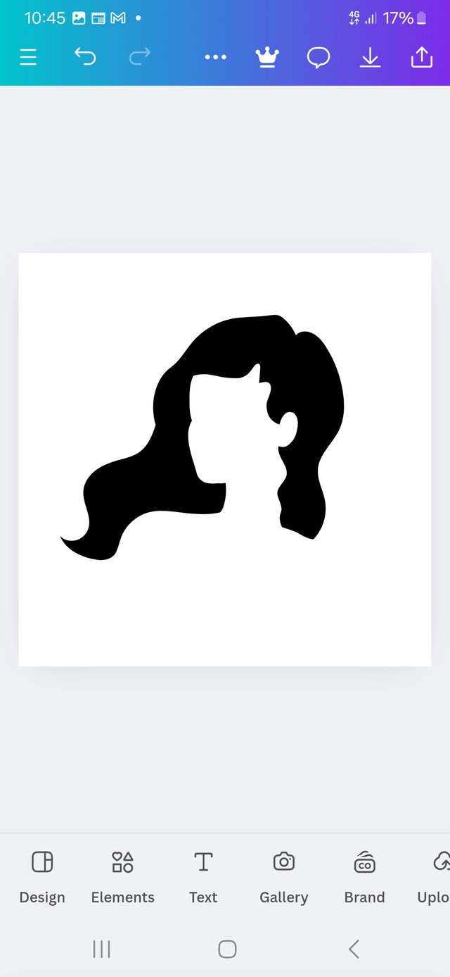 |  |
|---|
| type hair | select hair | Enter text |
- More formatting on the text
- Add a line element and make it white
- Place it across the Hairspital
- Goto element - hair - moustache
 |  |  |
|---|
| type draw line | format text | hair element |
- Use the moustache to add coils to hair
- Add it to strategic points
- Now logo is simple and finished
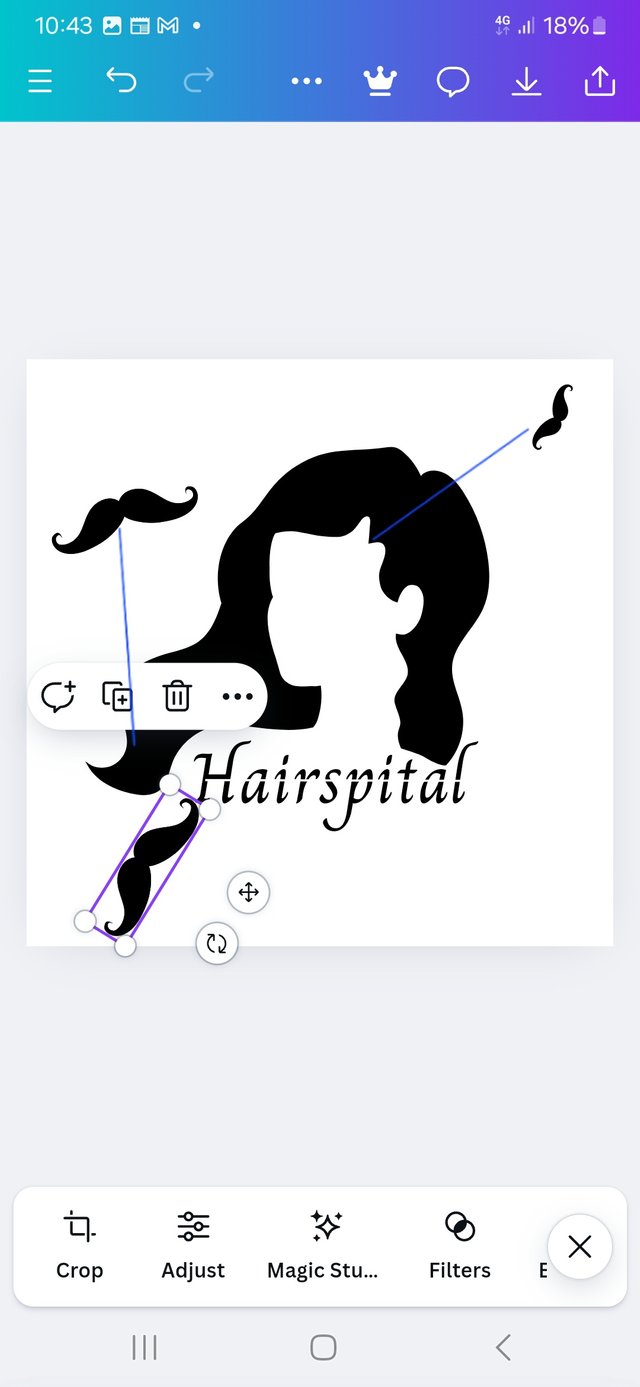 | 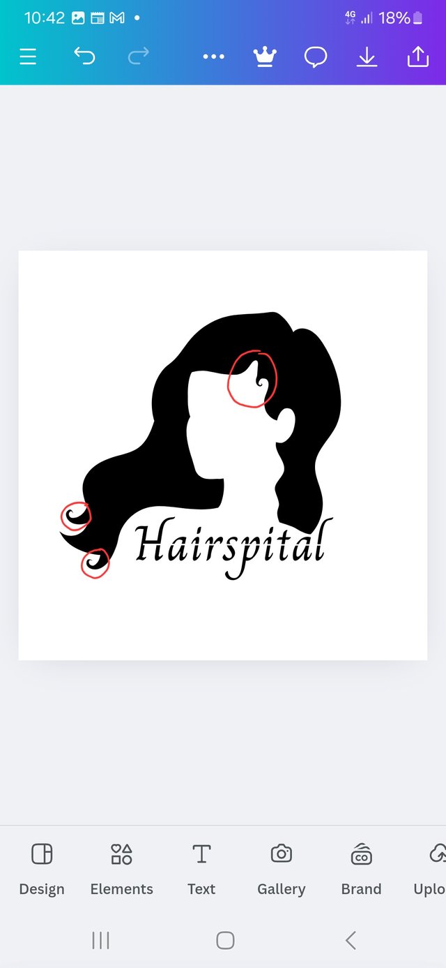 | 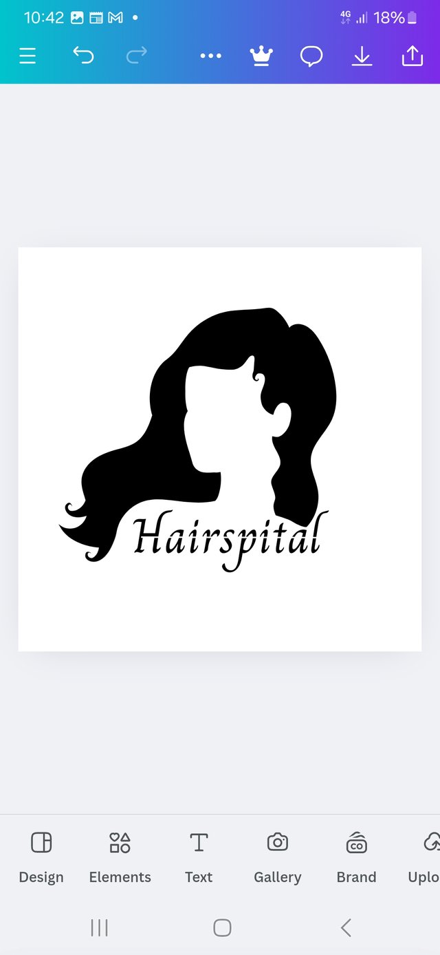 |
|---|
| Edit hair | Edited hair | Final Product |
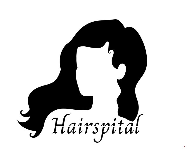
| The outcome of your design should clearly tell what kind of brand/business organization you designed for. Also do well to be well detailed in your design |
|---|

This logo is made out of a combination of both text and graphics. The text reads Hairspita a combination of the word hair and hospital suggesting that this is a place where you get your hair treated.
The graphic element supports this as it shows a female figure with beautiful long curly hair.
Whenever the word hospital is mentioned, you will remember Hairspital.
Each time you see a woman with long hair, your mind will take you to hairspital.
It is a simple three sylabic word, hair-spi-tal with the last two feeling like one.
I would strongly suggest the name Hairspital be used as the business name.
Conclusion
Stepping into a new chapter with logo and being determined to follow this up and get the best out of it. @bela90, @udyliciouz and @okere-blessing are invited to join us in exploring the exciting features of the canva app.
 Saturday, November 9. 2024

 CNN
CNN Coca-Cola
 the effect of wrong logo




https://x.com/manuelhook41759/status/1855252875774984543
Your writing inspired me to design better logos. A logo creates a connection people make with the brand. Well done. Good luck for the contest.