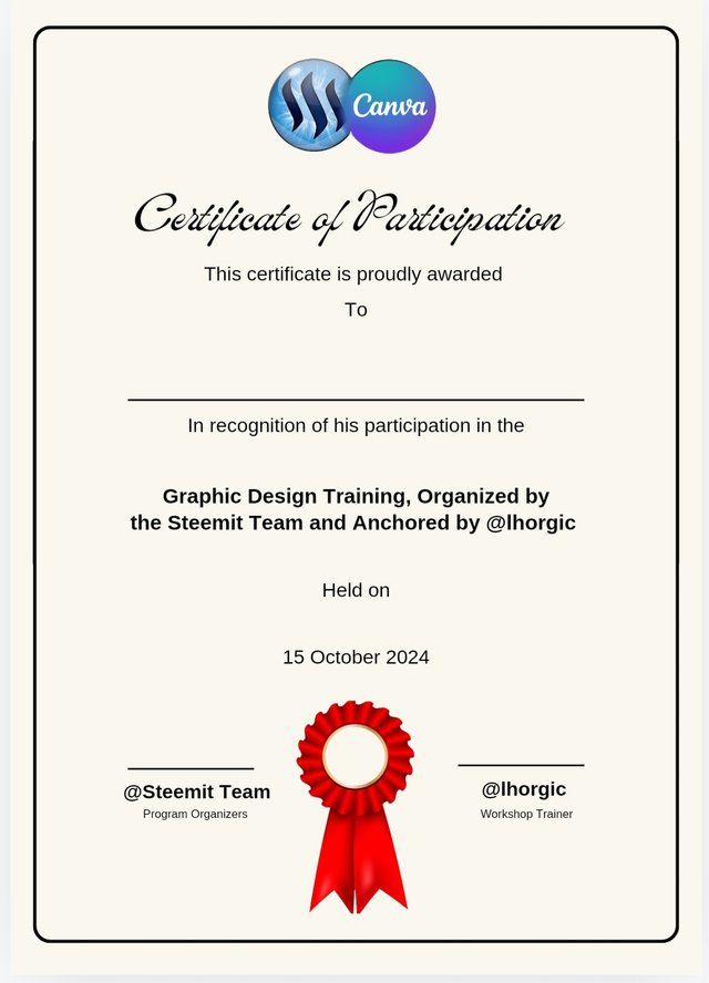
Certificate of Participation

Homework Task:
As I embark on Week 6's homework task, it feels like a comprehensive final examination in graphics design, it is definitely a test of the skills I have accumulated over the past five weeks of training. Presenting a nerve-wracking challenge that pushes the boundaries of my creativity and imagination, probing the depths of my innovative potentials in Graphic Design.
The Homework task question has the semblance of a blank canvas, an open ended question that allows a broad range of creative expression. and at such, it took a while to settle on a certificate design, with a combined logo, acknowledging the guidance of my instructor and the organizers of this enriching learning experience.
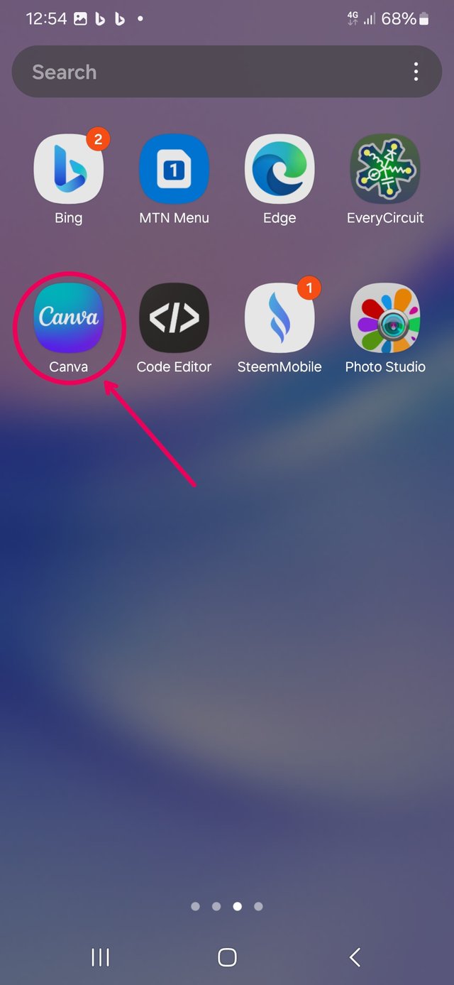
loading Canva.
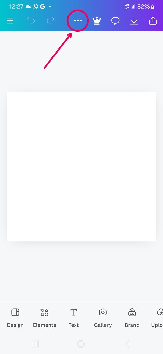
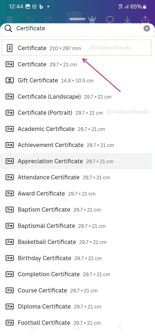
I started by loading the Canva app, and then I selected the 3-dots to open the menu. At this point, I selected a custom size for a portrait certificate.
210 x 297 mm.
Select the creat new design button
 |  |  |
|---|
| Loading Canva | select the menu | Select 210 x 297 |
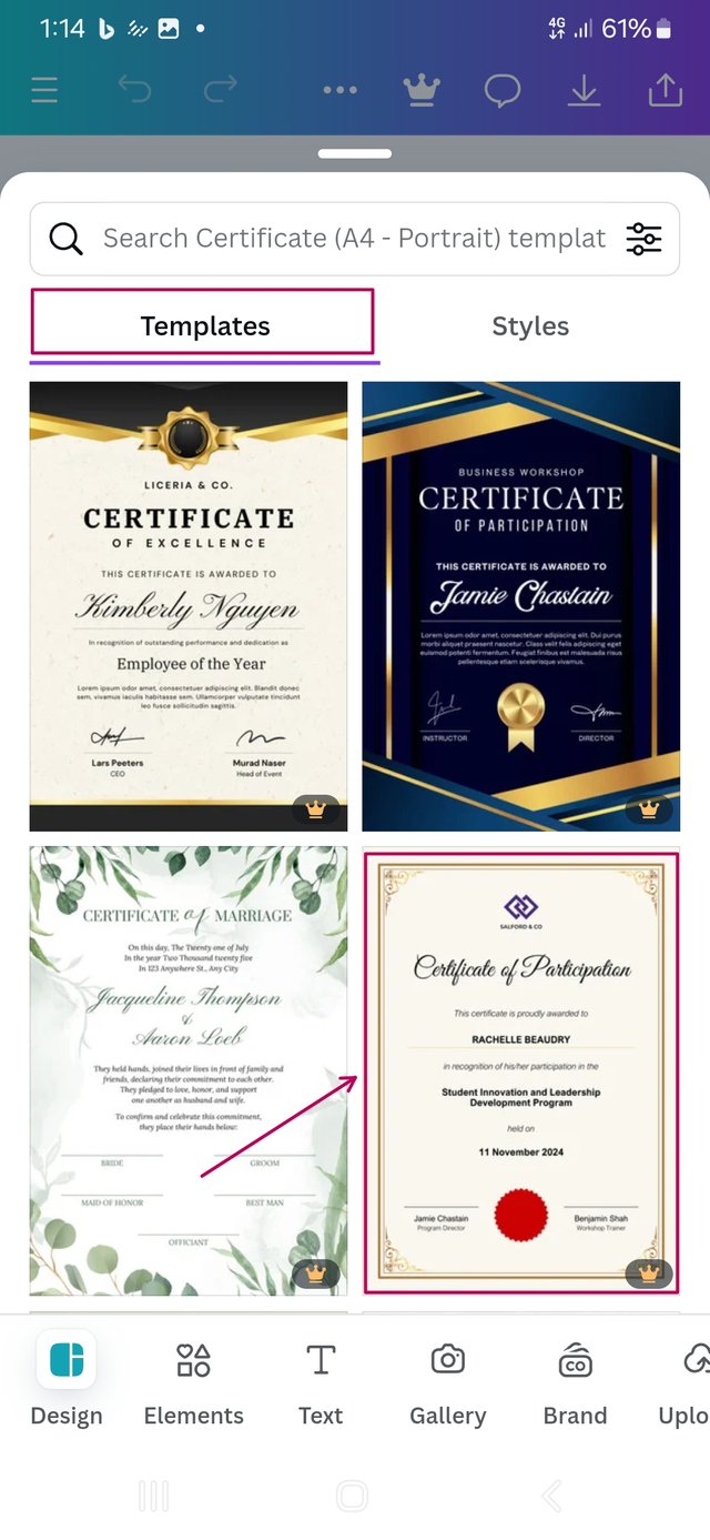
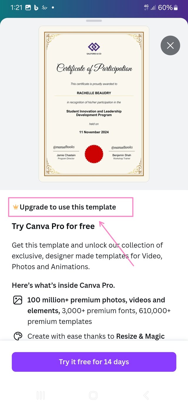
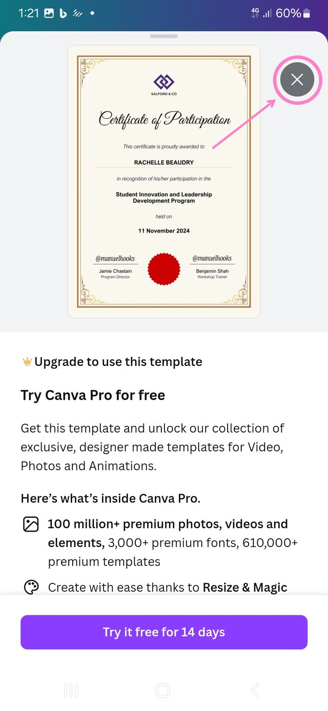
An interesting template was displayed, but it was not useable due to the version of Canva I am using.
 |  |  |
|---|
| Preferred sample | Needs upgrade | Cancel |
I had to cancel and create my design from scratch. Starting with may logo.
Collecting logo
I loaded Canva and took a screenshot of its logo.
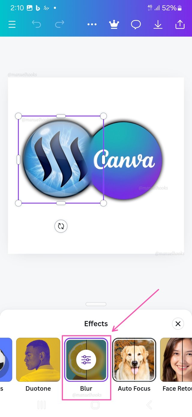
Got the Steemit logo and extracted the background from both logos. And used the blur function of Canva, then fused both logo.
Blurring was nessesery at the point that got joint to make the two logos intergrate smoothly. The idea behind the design is the message that steemit is in collaboration with canva.
At this point I was working with my fingers crossed, hoping that no-one comes up with the same design and post it first.
Back to the 210 x 297mm layout
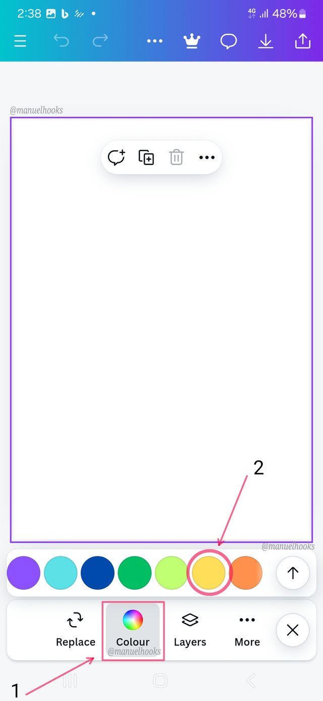
I selected the blank canvas and changed its colour to the #faf7ee hex colour code, making it look more official. I used the code extraction method you taught us.
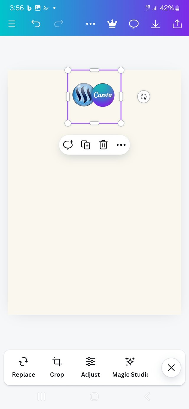
Inserting the logo at the centre for good symmetry and balance.
The #faf7ee hue will give me a good contrast with the black text for emphasis.
Text Entry and Alignment
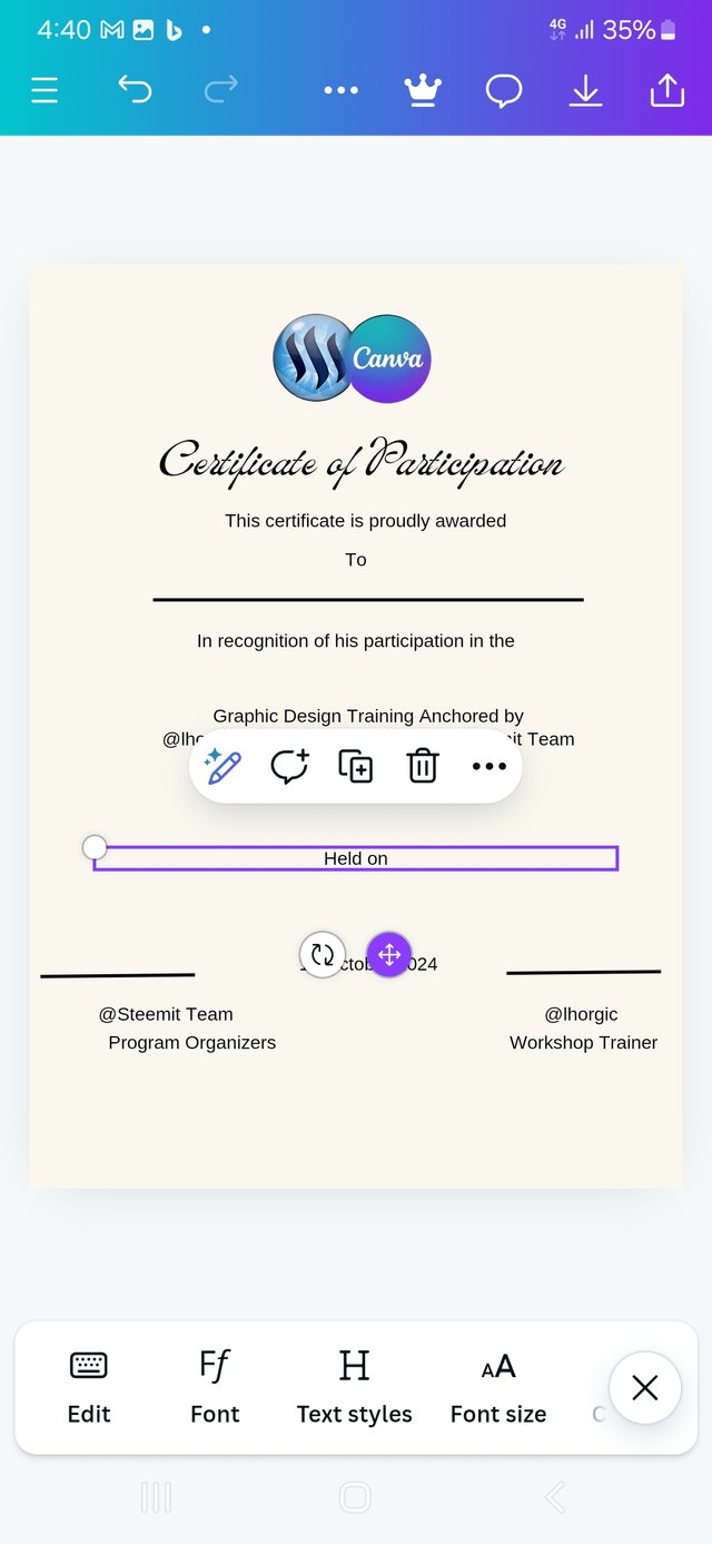
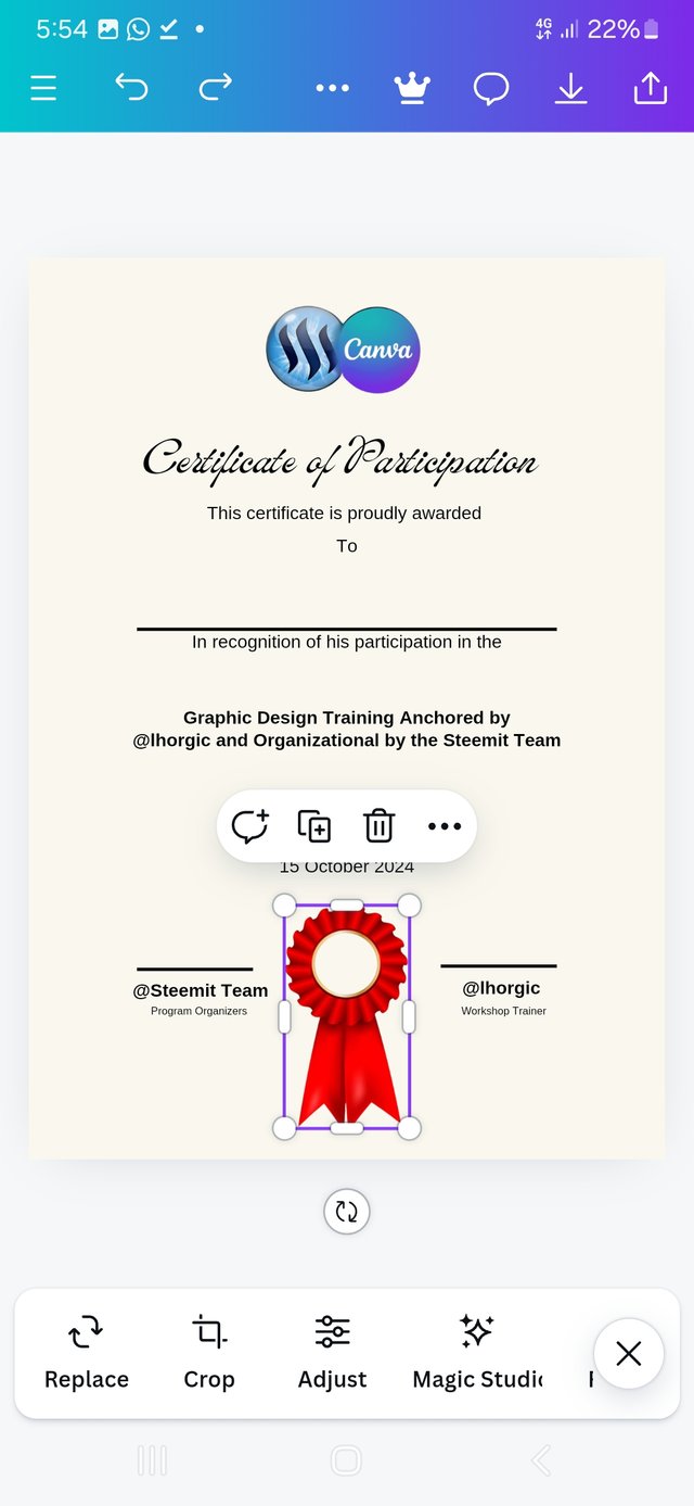
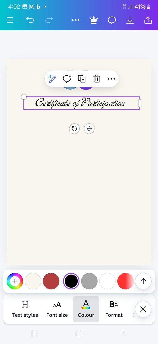
At this point, I decided to type in all the main text, adjusted the font and size.
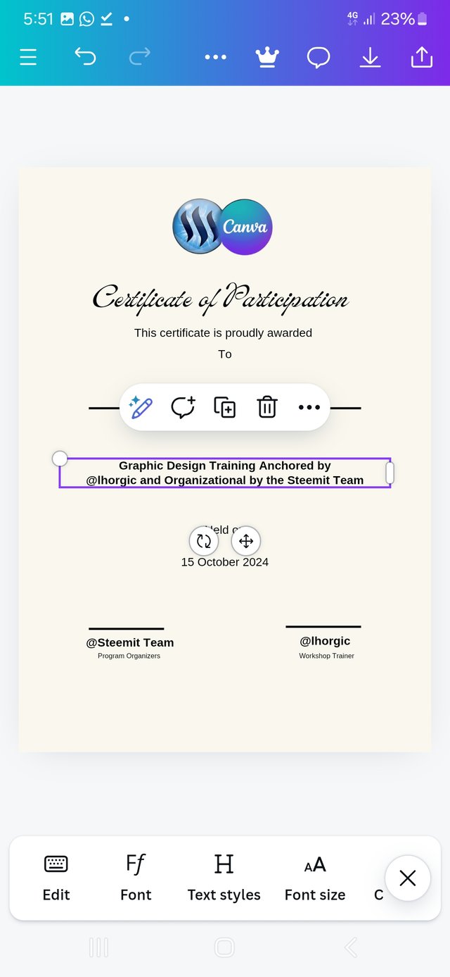
I also adjusted its alignment and arrangements, holdind on to the concept that simple and elegant is better than clumsy.
 |  |  |
|---|
| Text Entry | Text alignment | insert Seal |
This is when the open-san calligraphic text started to attract attention and stand out.
And my goal was to keep it as simple as passible.
Adding a Frame
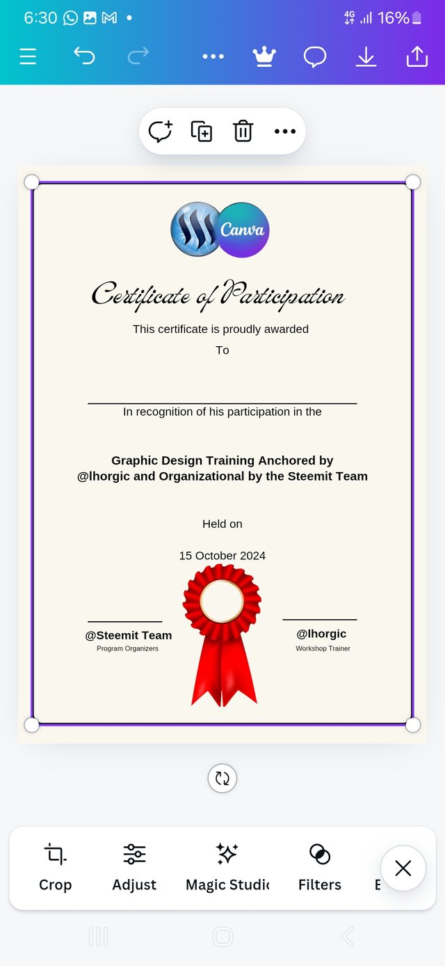
It is time to add a frame. At this point I went to elements and got a rectangle to use as my frame.
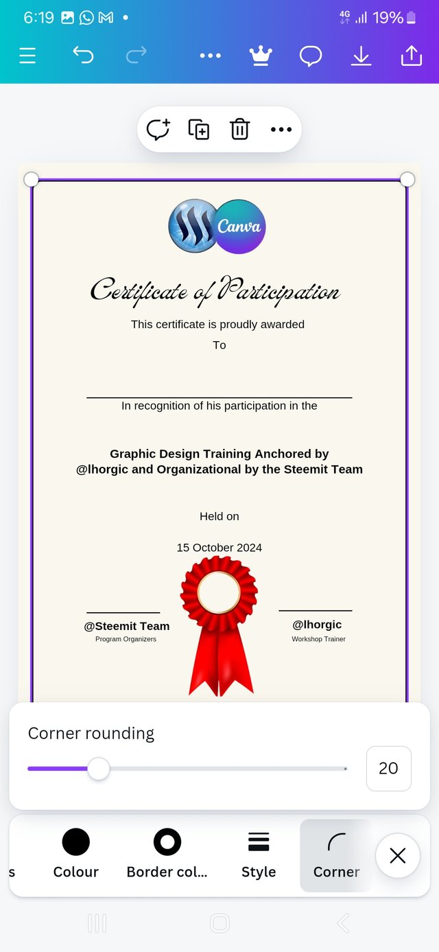
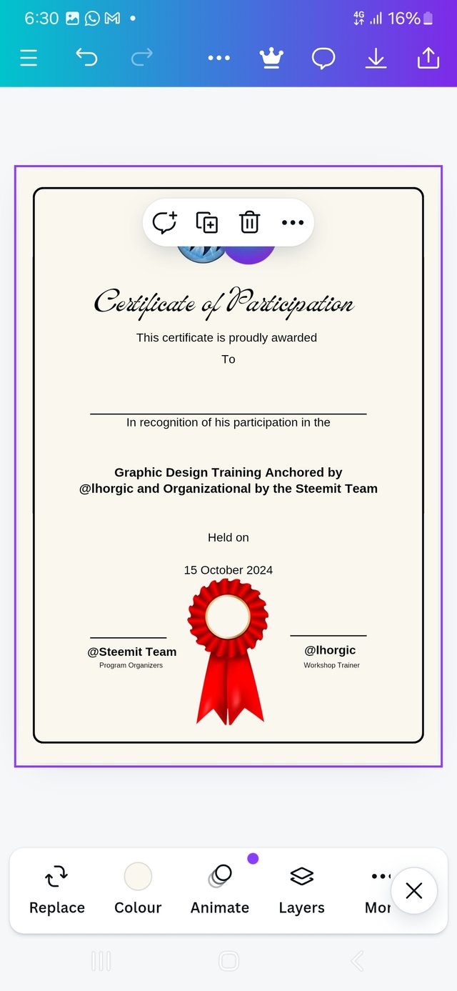
The frame has a square edge so I neede to round it a bit.
 |  |  |
|---|
| adding frame | Adjusting edges | rounded edge |
Final look
After the final proofreading and correction
I realy fell in love with this design at this point, but I will have to add my username to it and you will have to sign it for me.
Below is my final design with my username waiting for your endorsement.
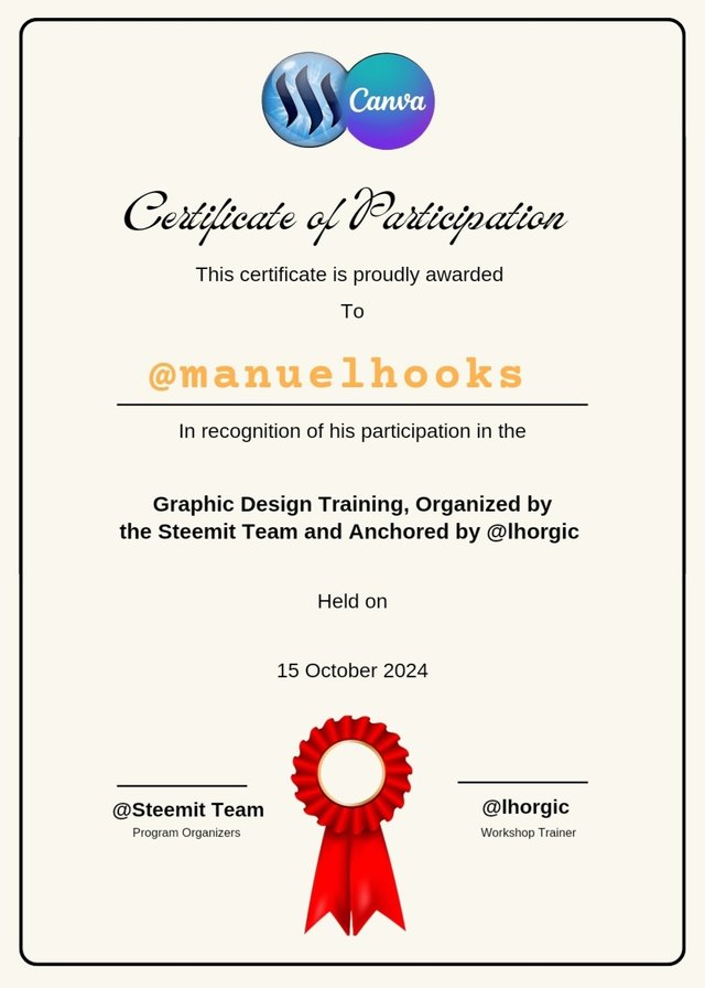
This is another success for me. At the end of this exercise, I feel I am making progress in my graphic lessons.
Precautions
I made sure my design was not cramped up, keping a lot of free space around the elements.
I used diffrent font sizes to create a kind of Hierarchy among the main items and the sub items. Certificate of Participation takes the highest font size at 44 points.
In terms of colour combination, I used #faf7ee as background and contrasting it with solid black #000000 for text and the seal stood out with an #f00001 red. The awardeestood out with a #ffb24d hex orange hue.
To achive a good mesure of balance, I used a center alignment on both text and other elemnts. Depending more on the auto snap feature of canva for proper arrangement.
Conclusion
This week's assessment was another a hard nut to creak. I am happy I made it to the end. Every great thing requires great effort. At this point, I am inviting @bela90, @udyliciouz and @okere-blessing to join us in exploring the exciting features of the canva app. Many thanks to my instructors for a job well done. I am here because you thought me well.
 Friday, October 11. 2024





Hello @manuelhooks thank you for participating in this week's lesson. We have assessed your entry and we present the result of our assessment below.
Feedback:
Let me start by appreciating you for coming this far with me on this six weeks course and also commending you for the effort put into this practical, I love the outcome of your step, your design looks cool.
I love what I see already and of course, am gonna endorse the certificate and I hope the steemit team does the same giving you an approval upvote..lols.
Yeah! I noticed the statement below which could have been a typo error "...organizational by the steemit team", am not too good in english language but do you think it should be the above or "organized by the steemit team"...
In all, you did beautifully well and I must commend you for a job weldone, thanks for appreciation message, I wish I could do more in this limited period of 6 weeks, but then am glad I could still dish out value. Thanks for staying through the whole process.
Regards
@lhorgic❤️
Thank you for highlighting that error, it has now been corrected on the last two samples.
https://x.com/manuelhook41759/status/1846256422117396500
Upvoted. Thank You for sending some of your rewards to @null. It will make Steem stronger.
Congratulations! - Your post has been upvoted through steemcurator06
Curated by : @rosselena - Selective Team