Typography and Practical Application.

Discuss your understanding of Typography.
Typography is an anphabet fashion show where words are styled for maximum impact. It involves aligning and arranging letters and text with the aim of making our message clear, readable, and visually appealing to our reader while convaying the right emotions.
The concept of typography covers the way text is aligned, arranged, and the amount of spacing used. It includes chiose of lettering, fontface, type, style, and size.
Research 3 other typeface categories not captured in this lesson. Talk about them and also give a visual representation of the typefaces.
Besids the serifs, sans-serif, script, and slab serif fontface discussed in the main lesson. There are other fontface like the calligraphic, formal scripts, decorative, blackletter, geometric sans, and typewriter.
Calligraphic:
This type of font looks like an expressive handwriting carfully written with a flat-tip calligraphic pen. It results in some parts of the font being slimmer than others, with curves and fluid connections between the letters. Common examples of calligraphic fonts are:
Mistral, Ballerino, Romantic, Alex Brush
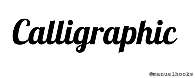 this Calligraphic font is called Lobster
Formal scripts:
These are cursive and elegant fonts that look like calligraphy but are often used for invitations to weddings and formal writing as they are more structural and traditional in nature. They are an improvement of some traditional calligraphic styles.
Some common formal scripts are Greyhound Script, Balmoral, Fling
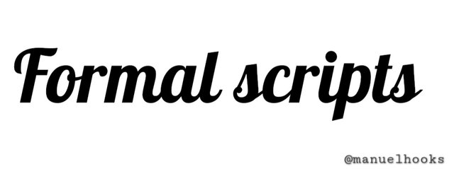 This formal script is called Dancing Script
Decorative:
These type of font are also called display fonts, which are often used for short text as they are often hard to read. Some examples are Cuba and Morris Troy. In the example below, i am using a decorative font called vintage rotten
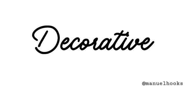 This Decorative font is called Vintage Rotten
Demonstrate your understanding of typography as presented in the lesson.
[Calligraphic]
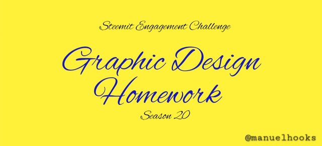
| S/N | Item | Answer |
|---|
| 1. | Typeface/font used | Alex Brush |
| 2. | BG Colour Hex used | #fff13a |
| 3. | Text Colour Hex used | #1618b9 |
| 4. | Alignment used | Center |
fonts in the calligraphic family are often very pleasant, with its curvy looks and pinkish-blue colour(#1618b9), the text contrast well with its digital yellow background identified as #fff13a. The beautifullybright yellow invokes a good feeling, perfrct for an invitation to a party or any good news.
[Formal scripts]
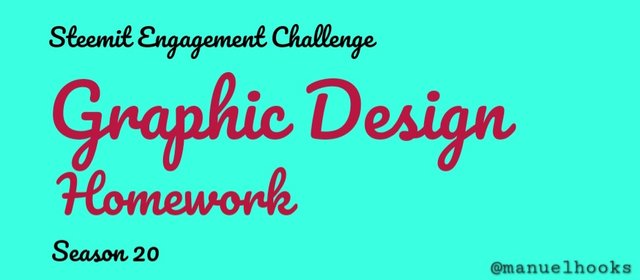
| S/N | Item | Answer |
|---|
| 1. | Typeface/font used | Pacifico |
| 2. | BG Colour Hex used | #3affe1 |
| 3. | Text Colour Hex used | #b9163d |
| 4. | Alignment used | Left Alignment |
Contrasting loudly as a hot red text with hex code #b9163d on a cool green background coded as #3affe1, the Pacifico font belonging to the formal script family with a left alignment will make a good mix for children related content
[Decorative]
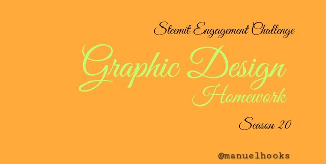
| S/N | Item | Answer |
|---|
| 1. | Typeface/font used | Great Vibes |
| 2. | BG Colour Hex used | #ffaa3a |
| 3. | Text Colour Hex used | #c1ff72 |
| 4. | Alignment used | Aligned Right |
The background colour is orange, better described as #ffaa3a. It contrasts well with the text colour that has a yellowish-green-hue identified as #c1ff72. The text is from the decorative fontface family and is specifically identified as Great Vibes with a right Alignment. It will make a very good contact card carring only a name and a phone number.
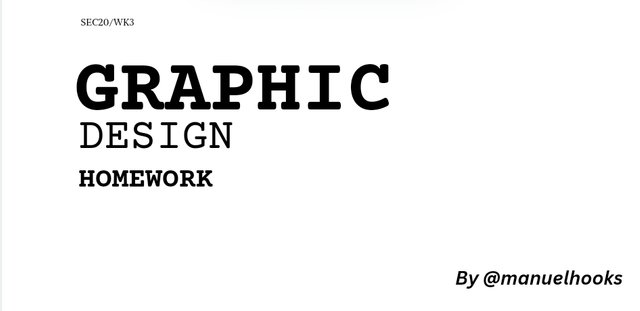
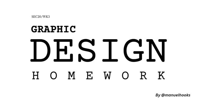
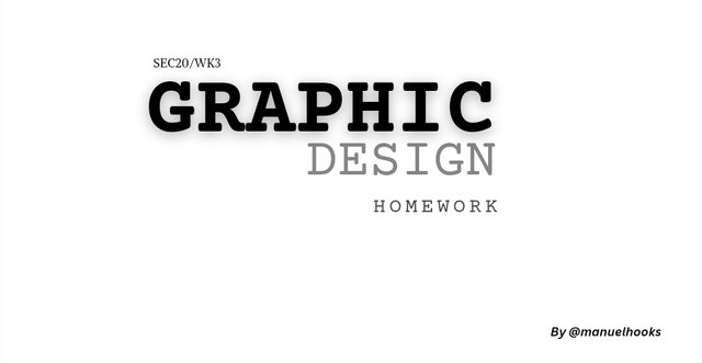
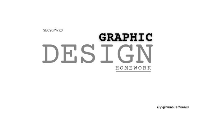
I love this font that looks like the work of a manual typewriter. Typewriter fontface has a lot of font under it. Below are designs made mainly of the typewriter fonts.
| S/N | Item | Answer |
|---|
| 1. | Typeface/font used | Courier Prime |
| 2. | Font Style | Bold |
| 3. | BG Colour Hex used | #ffffff |
| 4. | Text Colour Hex used | #000000 |
| 4. | Alignment used | right, center and left |
Conclusion
This weeks lesson has better explained the concept of font, font type, font style and fontface. This area had always been blurry with a hue of confusion. I am inviting @udyliciouz, @eliany and @dequeen to join us in exploring the facinating abilities of the canva app, following this interesting lessons...
#graphics-s20wk3 #burnsteem25
#steemexclusive #learnwithsteem
#nigeria #club5050
 Wednesday, September 25. 2024

 this Calligraphic font is called Lobster
 This formal script is called Dancing Script
 This Decorative font is called Vintage Rotten


Upvoted. Thank You for sending some of your rewards to @null. It will make Steem stronger.
Thank you for publishing an article in the Steem4nigeria community today. We have assessed your entry and we present the result of our assessment below.
MODs Comment/Recommendation:
Wonderful post presentation, this is good for every learner, this challenge has been useful, the write up designs and the fonts look beautiful.
Remember to always share your post on Twitter using these 3 main tags #steem #steemit $steem
Hi, Endeavor to join the #Nigeria-trail for more robust support in the community. Click the link Nigeria-trail
Guide to join
¡Saludos amigo!🤗
Te confieso que desde que comencé a utilizar Canva, me pregunto por qué al momento de diseñar utilizamos muy poco las fuentes de la caligrafía ya que, suelen ser hermosas y un diseño que tenga esta tipografía, proyecta mucha elegancia.
Te deseo mucho éxito en la dinámica... Un fuerte abrazo💚
TEAM 4
Congratulations! Your post has been upvoted through steemcurator06. Good post here should be..My Twitter link 👆
https://x.com/manuelhook41759/status/1839547320905396428
Great job! 👏 I love how you explained typography as an "alphabet fashion show." The comparison really brings out the artistic and stylistic aspects of font choices. The visual representations of calligraphic, formal scripts, and decorative fonts add depth to your explanation, making it clear how different fonts suit different purposes. 🎨 Keep exploring typography's fascinating world!
Oh this your entry is understandable, thank you for inviting me to the contest, wishing you success 👍
Greetings dear friend, thanks so much for the invitation, your post is self explanatory and your typography presentation is unique, I wish you success in this engagement challenge.