SEC20/WK5: Graphic Design Hands - On practical 2
 |
|---|
Hello champions! Yes am referring to you. I celebrate you for coming this far. We are in the fifth week of our lesson and of course am amazed at the result seen so far. I believe by now majority of us on the platform will agree with me that any dedicated mind can do graphic design. Once you set your heart on it, you would surely achieve it.
The beautiful feedbacks from my student are indeed soothing. Am not afraid to refer to 70% of them as Graphic Designers and of course I would be raising the bar this week even as I challenge them into putting their amazing skill and knowledge into work.
We would continue with our pure practical which started last week. Like I mentioned earlier, this week would be a bit different in the sense that I won't be showing you how I achieved my result. I would only show you the result and then you go figure out how to achieve same with accuracy and precision using your Canva App/Software. This is to test how much you have followed the lesson up to this point.
Let's not forget that our design tool for this course remains CANVA. You can apply the lessons learnt on other design tools of your choice for your own personal use but not for this homework task. I think this is clear enough.
Just before I go into the homework task, I would like to reiterate area which border around graphic design principles where most of the student have been missing it in their practical. Highlighting these areas will help them improve in this task and subsequent ones.
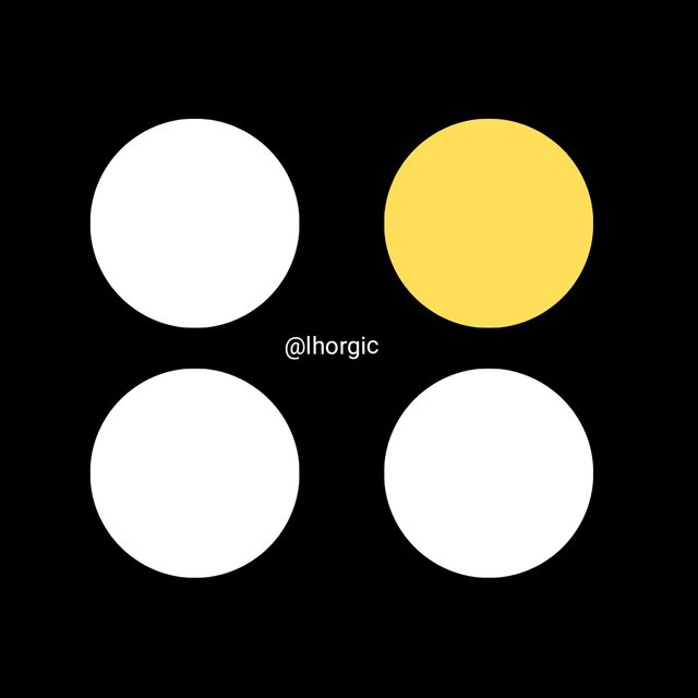
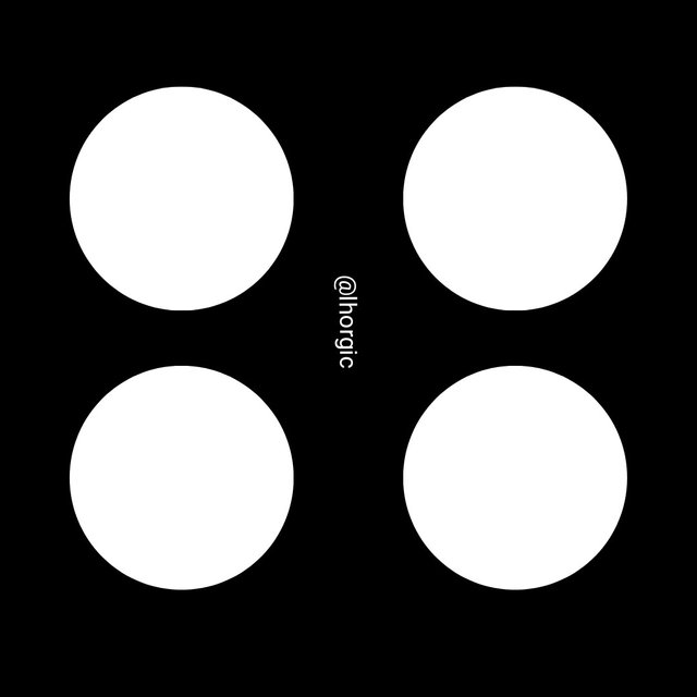
• Emphasis: This principle is used to make certain elements in our design stand out and unique from the other. It can also be used to make an element less obvious depending on the way you decide to use it. This principle helps subject your viewers eyes in such a way that it makes them see or acknowledge your emphasis.
 |  |
|---|
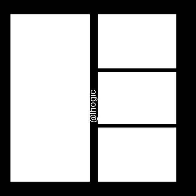
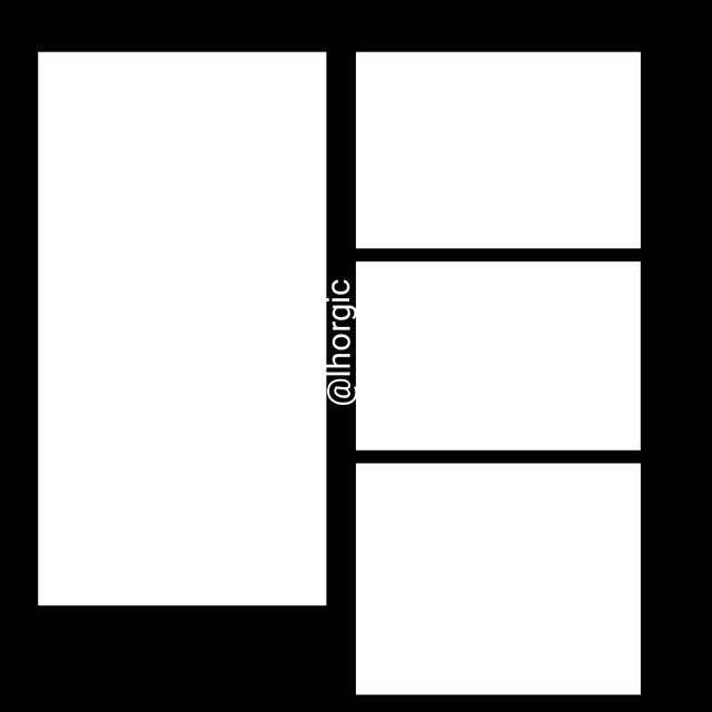
• Balance: The principle of balance in design helps to distribute weight evenly in a design. Graphics element such as our shapes, images, text are carefully distribute equally in a design layout such that none of the side of the layout is lopsided, overweighted or underweighted.
 |  |
|---|
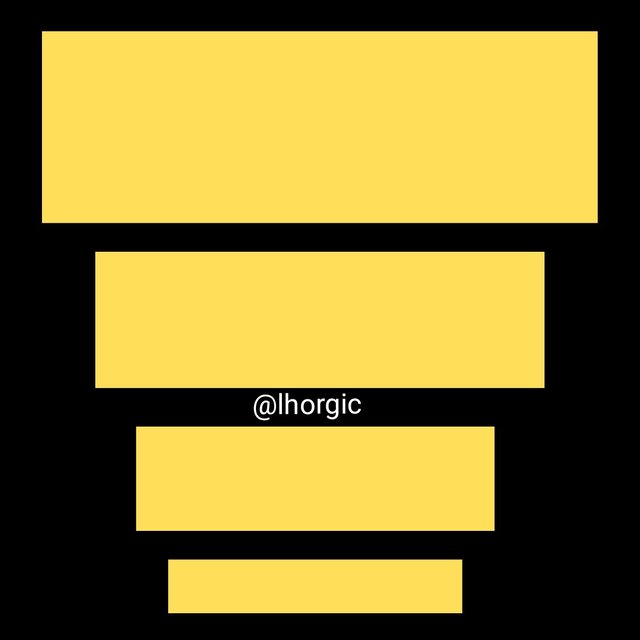
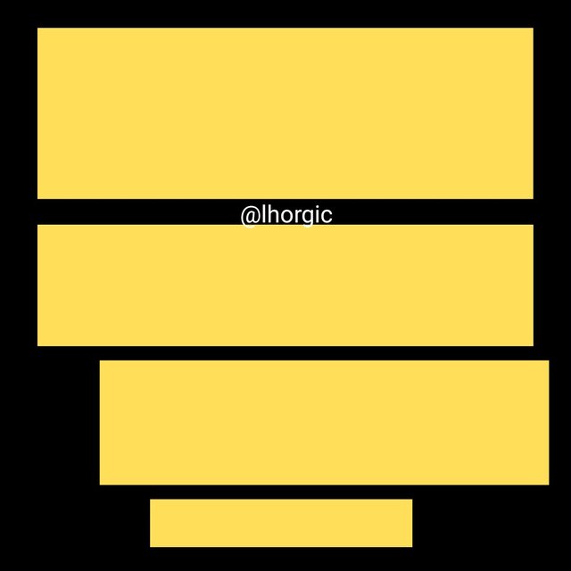
• Hierarchy: The principle of Hierarchy is key, it helps point the eyes of our viewer to your element in the order of their importance.This method uses dominance and priority via giving extra weight to certain elements. I.e highlighting titles, adding shapes to frame, maximizing colours & strategically positioning key message.
 |  |
|---|
• Avoid Edge to Edge: this is when your elements are too close to the edge of your workspace. It could be either to the right or left, top or bottom, this is not ideal. However there are exceptional cases of elements touching these part but they are done skillfully
 |  |
|---|
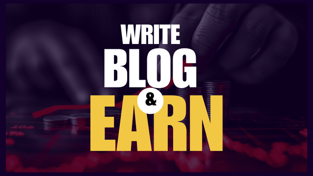
• Element Spacing: I have seen student with wrong spacing of element, it's just so obvious that one can see how disjointed or disunited the elements are which in turn make their design less appealing. There should be a strong connection and unity between your element, especially your text element.
 |  |
|---|
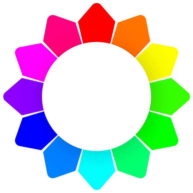
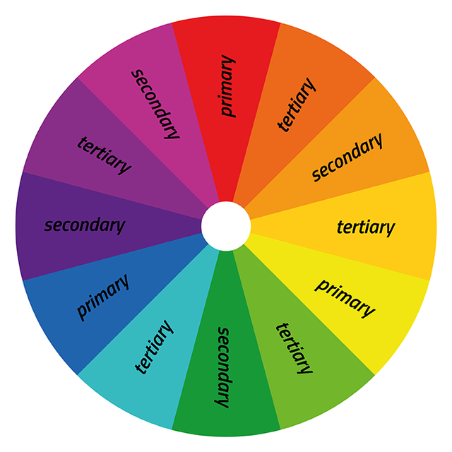
• Colour Combination: We also need to work on our colours, Some of us have not been utilizing the lesson on Colour theory where the subject about colour was simplified and trashed completely. Let's make use of the various colour scheme to carefully select our colours from the colour wheel.
 |  |
|---|
• Design Size & Dimension: Choose a moderate size for your design. Sometimes the information we want to put in our design informs our choice, if you have fewer information, go for smaller size/dimension and vice versal.
Sometimes the purpose and where the design will be displayed also determines, this is the reason why social media platforms like YouTube, Instagram, facebook have their Canva size. We can't alter them, we can only use our expertise as graphic designers to adjust our elements to fit perfectly into their template size.
• Foot Note about Design: Many of us have also failed in this aspect. To show how much you understand, you should take your time to talk about how you achieved your design. This includes the principles you engaged and how you engaged it, the colour (hex), alignment and every other vital things used to achieve the result. This is usually a plus.
 |
|---|
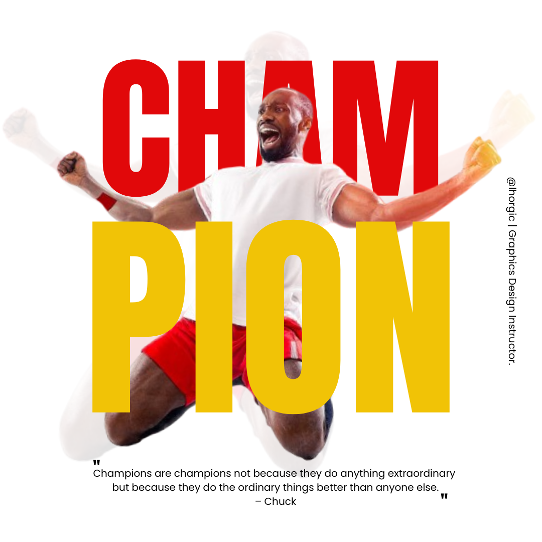
• Replicate the design above. Let's see who comes close...smiles. "skillfully" spicing up your design is also welcome but ensure it doesn't become the reason your design ends up looking unappealing.
• Endeavour to use the same colour in the sample design. You've been taught how to get/extract colours from objects and elements,kindly apply the knowledge to get your colours.
• Change the quote used below the design and use your own motivational quote for champions.
• Be as detailed as possible showing every procedure.
• Briefly talk about the principle you engaged in your design.
| Free Image for your use |  |
|---|
• You title should be "SEC20/WK5: Graphic Design Hands - On practical 2"
• You can publish your homework task anywhere you deem fit and in any language.
• You're are to use the special tag #graphics-s20wk5 among other relevant tag like #country and your #steemexclusive.
• Plagiarism/AI generated content will not be tolerated. The penalty would be absolute disqualification.
• You're encouraged to continue with your club status, however it will not be taken into account for your grading & assessment.
• Invite 3 of your friends and don't forget to leave valuable comments on their posts.
• Use the burnsteem25 tag only if you have set the 25% payee to @null.
• Feel free to upvote and resteem this post if you want to.
• Participation schedule is between Monday, October 7th , 2024 at 00:00 UTC to Sunday, - October 13th, 2024 at 23:59 UTC.
Outstanding Students will be rewarded with a sumptuous upvote for participating. A total number of 5 entries would be selected to get this compensation weekly from SC01 & 02
However, kindly bear in mind that upvotes are not guaranteed just for making an entry.
Regards
@lhorgic❤️
Hi @lhorgic please I want to ask; should we show and write about our own steps?
Absolutely...just the way I demonstrated in my last class. Kindly also ensure you follow all the rules.
Alright, thank you
https://steemit.com/hive-147599/@goodybest/sec20-wk5-graphic-design-hands-on-practical-2
¡Holaaa amigo!🤗
Por acá te comparto mi participación en la dinámica: https://steemit.com/graphics-s20wk5/@paholags/sec20-wk5-diseno-grafico-practica-2
My entry : https://steemit.com/hive-103393/@walictd/sec20-wk5-graphic-design-hands-on-practical-2
My entry
https://steemit.com/graphics-s20wk5/@impersonal/sec20-wk5-graphic-design-hands-on-practical-2
My entry : https://steemit.com/graphics-s20wk5/@pea07/3wsfzu-sec20-wk5-graphic-design-hands-on-practical-2
My entry
https://steemit.com/graphics-s20wk5/@rafk/sec20-wk5-graphic-design-hands-on-practical
MY PARTICIPATION
https://steemit.com/hive-147599/@arinaz08/sec20-wk5-graphic-design-hands-on-practical-2
Here is my entry
https://steemit.com/hive-109435/@memamun/sec20-wk5-graphic-design-hands-on-practical-2
Here's my participation:
https://steemit.com/graphics-s20wk5/@hudamalik20/sec20-wk5-graphic-design-hands-on-practical-2