Graphic Design made simple (G101) #Lesson 2
 |
|---|
Hello dear friends...or should I use the word student? Lols... I won't be wrong you know, smiles.
Welcome once again to our beginner's graphic design class.
I want to believe we got value from the last class, trust me this lesson is also loaded with a lot of stuffs you would find interesting. If you missed the last lesson,just relax, you would find the link just below this post.
Let's get started.
Introduction
Principles of Graphic Design
Terminologies in Graphics Design
Yea! Welcome once again so in today lesson we would be looking at what I call the principles of graphic design. Almost everything in life, if not all has principles guiding it. The purpose of these principles is to the end that maximum result is achieved when followed thoroughly.
It make things very easy and very comprehensive such that the result gotten when following can be reproduced any day anytime.
Graphic design also has principles guiding it. Those beautiful design you see all around are product of these principles.
I also deemed it fit to add to today's lesson relevant terminologies in graphic design because they will keep reoccurring as we move on in this class. It is then expedient we get familiar with these terms before we delve fully into the deep of this program.
Let's look into the principles I have highlighted in this section and kindly take note of the graphic representation of each of these principles. What you see there is only used to communicate the points. By the time we start design proper, you will see how all these will play out perfectly.
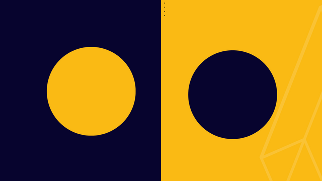
- Contrast
 |
|---|
The principle of contrast is used to create visual interest by highlighting the difference between your design elements. I.e the colour of the background for your design should be different from the element so that they can sync or harmonize.
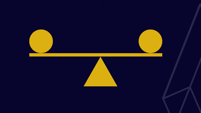
- Balance
 |
|---|
This is another principle a graphic designer should also adopt. The goal of his principle is equality in the positioning and arrangement of element in a design work. Arrangements are done systematically (symmetrically & asymmetrically).
 |
|---|
Inability to arrange appropriately will give viewers a lopsided view. A balance scale just as seen above give us a clear picture of what the principle of balance is.
- Emphasis
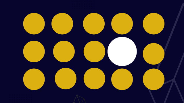
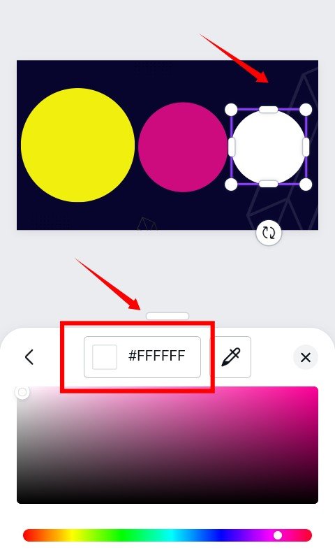
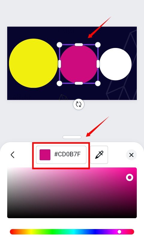
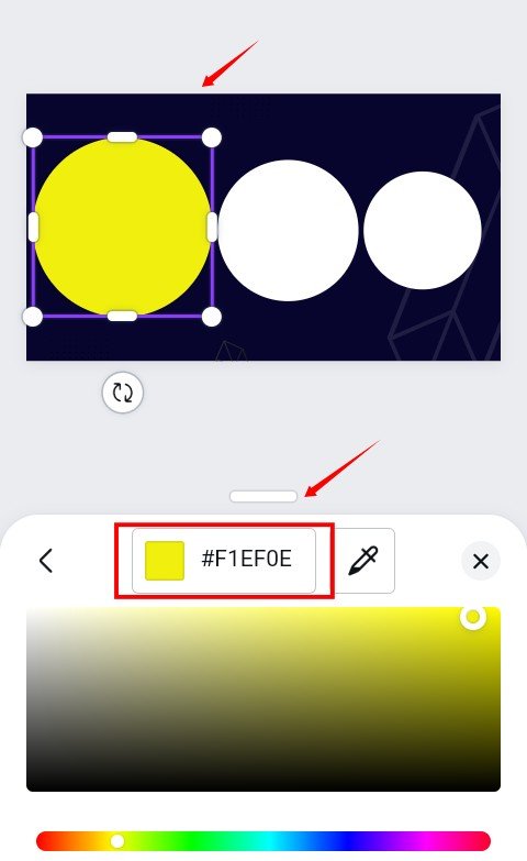
This principle of emphasis is just as the name implies literarily. It focuses on highlighting or giving special attention to a particular element via size, contrast, colour etc. In the graphical representation above,you can see that the white stands out both in colour and size.
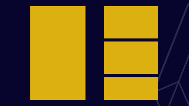
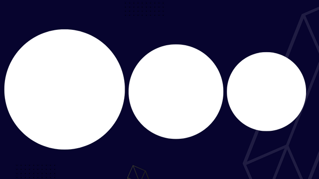
- Scale/Proportion
Scale can be referred to as the relative size of different elements or objects in a design when compared. What it does in a graphic design is to create visual hierachy among the elements such that viewers eyes can be guided on what to look at and in what order. This help to reveal element in order of importance.The principle also helps to break down design into portions.
 |  |
|---|
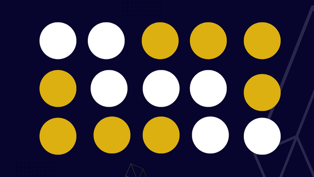
- Repetition
This principle helps to unify your design in the sense that relevant elements used in a design are repeated consistently. Take for example the use of bullet point to itemize point in a write up. Using bullet points and asterisks at the same time to itemize a point would break this rule.
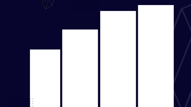
- Movement/Rhythm.
 |
|---|
This is the use of recurring elements in such a way that the eyes of the viewers are directed to the focal or important areas. There are about 5 types of rhythm. They are random, regular, alternating, progressive and flowing.
- Unity/Harmony.
 |
|---|
This principle is used to arrange element in a design work in such a way that all part or piece of element used still makes a whole regardless of the number or size of the element.
- Hierarchy
Hierarchy is a basic principle in design and it talks about how
Types (your text) are priotised. The aim of typography is to create some kind of coordination and direction in design in the sense that it direct your eyes to what should be seen first before the other.
 |
|---|
You must have seen this in most article and designs. Emphasis is given to certain element of text in a design work using biggers font size or bold fonts such that you see them first before seeing others. By heirarchy, you get the message in a design in order of importance.
Having discussed the relevant principles in graphic design, we would be looking at terminologies in this section.
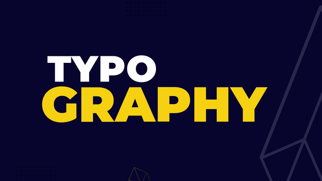
- Typography
 |
|---|
Typography can be referred to as the style and manner of presenting types (text/word). I can also say its
art of arranging your types, in such a way that makes it readable, clear or legible, attractive and appealing to those who see it. Let me prepare you upfront, as a graphic designer you will have to interacts with types everyday of your life.
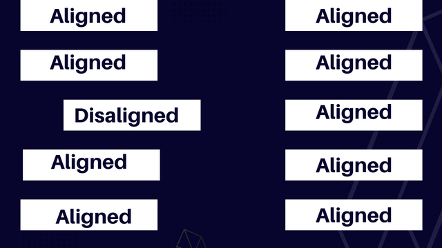
- Alignment
 |
|---|
Yea! This alignment is not different from the knowledge you already have about it. The only thing is we are trying to relate it with graphic design. Alignment talk about the way different elements are arranged in a in a design work. This also includes the type/fonts. Alignment goes a long way in making your design look presentable and balanced.
- Body Copy
This is the information you want to pass across especially when you have alot of information in your design work. This is not really the heading or title, it is the other vital message which the heading or the title talks about. Although for effective communication in graphic design, avoid too many information. That is why a website is created. Learn from big brands.Their designs are always straight to the point.
- Character
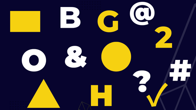
This are simply letters, numbers, punctuation mark or symbol that makes up your design work.
 |
|---|
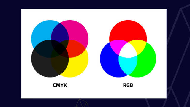
- CMYK
I would have love to discuss this when we get to colours as a subject but then I think it's cool I say few things here.
Each letter in C-M-Y-K stands for the following colours, Cyan, Magenta, Yellow and Key (black). This colour mode is used by graphic designer when the design work is to be printed while RGB a brother-like colour model is used when printing is not involed. RGB are for displays.
 |
|---|
- RGB
RGB is a colour model just like cymk. The letter also denotes colours just like the other. The R is for Red, the G for Green and the B for blue. This is the colour model you use when your design work is not to be printed. You use this colour mode when you only want to use it for displays or when you want to design a digital app . The colours model is nice in that is glows brighter even when combined.
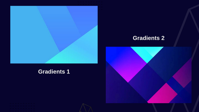
- Gradient
Gradients or colour gradients as it's fondly called can be defined as a gradual and smooth transition from one colour to the other. For example you can see a deep blue fading slowly into a sky blue or red into an orange and so on. Gradients can be in liner, axial or radial form.
 |
|---|
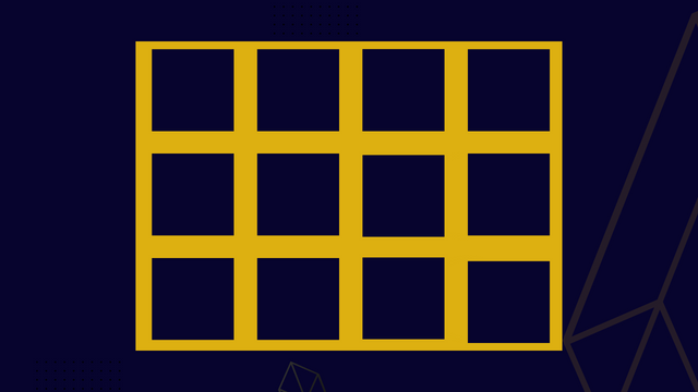
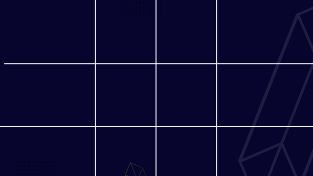
- Grid
This can be defined as some horizontal and vertical line which serves as guide for accuracy and structure in design. If you're new to design, you will need to follow grid so as the allow to place your characters, elements , picures, text or what where is should be in all accuracy. In a nutshell it give your design structure.
 |  |
|---|
- Hex
Hex is a word that denotes the number "6". Well if you're familiar with mathematics, this should not be strange. Just like we have octagon, pentagon, decagon and the like, we also have hex-agon.
 |  |  |
|---|
Hex is a six digit code used in naming or representing colours in graphic design. We have different types of colours which are beyond the primary colours we have and we can only identify and distinguise them them using Hex.
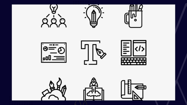
- Icon
Icon is not a new word, it a common word and it also has a place in graphic design. Icons are image that are used to represent actions,thought or object in a graphic work. Example are as seen below.
 |
|---|
You can see an example of icon above. In graphic design,we try as much to minimize too much text by Introducing all of these. As a graphics designer, you only need to ensure that your icon is communicating in clear terms.
- Pixel
You must have heard of pixel if you're familiar with designs before now. The word "Pixel" is coined form two word, 'picture' and 'element'. It is referred to the smallest unit of colour on a computer. Generally all images are made up of several pixel coming together to make up the image, each indeed look small but very important and relevant.
- Stock Photo/Images
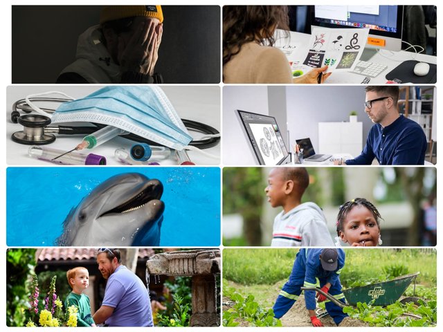 |
|---|
Graphic design also uses images in passing it messages. For example, you want to create a design for students learning, you will need an image of students portraying the idea. Images speaks volumes when it comes to design. Stock photos are licensed image that cut across every sphere of life but you can look out for free images online using sites like unsplash, pixabay, and the like...
- Raster
Raster are also known as bitmap images which are made up a certain numbers of pixels. One notable disadvantage of rasters is that when resized or blown up beyond proportion, it becomes blurry. You must have experienced this before when trying to zoom out an image. The reason is because it a raster image.
- Resolution
Resolution is used to measure how quality an image is not on screen or on print. It's is generally generally believe that the higher the resolution, the better he quality of the image. That's why we hear things like high resolution and low resolution. It is measure in dimensions I.e 1080×760, you must have seen something like this before.
- Thumbnail
Thumbnail in graphic design can be likened to a rough sketch or a skeletal work which gives you the mental picture of what you hope to achieve with your design. It helps determine the layout of a design
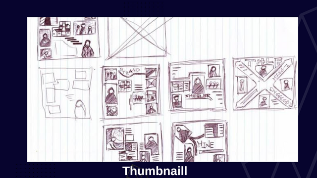 |
|---|
As a beginner, you would need this as it gives you direction and reduces the confusion. One of the headache a designer goes through is what kind of design he should do for a project. He has to conceive an idea and pen it down before working on it using a graphic tool.
So at this point I think it expedient I wrap it up here, trust me there are hundreds of terminologies in graphic design but I won't like to bore you with all of that, I only tried to highlight few relevant ones. If you would love to take this up as a pro then you will need to give yourself wholly to this.
Now am about to do something I do not naturally do and that is tagging, am always careful about it but it seem I've got no choice here than to mention some amazing users who have asked to be tagged when lessons are released. They have also shown interest in this class.
It is my pleasure to mention the following users @franyeligonzalez @fonjougiresse
@ruthjoe @xkool24 @sahmie @chukwu10 @badmus-official
If you missed the previous posts on this beginners class, kindly check them out here.
| G101 introduction post | Lesson 1 |
|---|
Gracias!
Graphic Instructor
@lhorgic♥️
Cc: @ubongudofot.
Wow what a great lesson i have learnt a lot from this looking forward for more lesson to be teach
Am glad you learnt something from this lesson. This is just the tip of the iceberg, you will be seeing more as time goes on. Just keep tab on this space.
Please which app are we using to learn this
Any design app is fine if you understand the principle. If you're using canva or pixelab then we are good to go. Canva especially.
Have been waiting so long for the lesson,I think you should be giving some assignments to us so that you can be sure that we understand the lesson,or you can equally contact @ngoenyi so that you can be our graphics teacher over there in @steemkidss community 🙏🙏🙏🙏🙏🙏🙏.
Cc.
@ngoenyi
@ihorgic
Smiles... Thanks for the awesome feedback. I will look into what you have said and get in touch with mama when am set. I believe she would love the idea as well.
Yeah,it will be appreciating if it eventually happens.
.
Hola querido amigo, vaya, la lección te quedó muy bien, he aprendido mucho este día, siempre podemos ser mejores, me gustaría mucho poder aprender de formar profesional sobre el diseño, es una excelente profesión.
Muchas gracias por tu tiempo, hay muchos detalles, son muchos términos que no conocemos, pero que siempre podemos visualizar en cada imagen, marca o trabajo que vemos. Las imágenes te quedaron muy bien.
Saludos ☺️😃
Thanks dear friend, am glad you took out time to check this lesson out in detail. I trust you're getting value, more will be dropping as we proceed.
Greetings friend @lhorgic I saw your mention yesterday but was too tired, so I preferred to read it when I will be steady and calm. This is a lesson not to joke with.
Smiles... I started this to help users, I can't be joking with it😃 .These lesson takes time to put up. Thanks for your encouraging comment.
Thank you so much boss for the lecture. I must say you are doing well, putting so much effort and time into this, seriously, it's not easy.
Boss I have a question from your lecture..
Would it seem to me that hierarchy and emphasis seem like similar terms from your explanation. Can you give me a difference between them?
There is a slight difference between both even though they work hand in hand. Emphasis aims to make something stand out so it can be noticed while hierachy aims to arrange things in order of importance. For example...
A newspaper comes with catchy headline which come in a Bigger fonts (i.e size 20) then other sub-headlines/heading (i.e size 16) and then followed by other information in smaller font size (i.e 14), the writer has priotised with this arrangement how he wants us to follow the article,this is hierachy.
Emphasis is then introduce to those headlines by making it very bold (ctr+ b) or adding colour to it i.e red, to make it more visible and distinct from every other info typed in black.
I hope this explanation is clear enough?
Wow! This is very extensive yet deep explanation. I understand better now.
Thank you so much boss
TEAM 5 CURATORS:
This post has been upvoted through steemcurator08. We support quality posts anywhere and with any tags.
Curated by: @goodybest
Thank you so much @goodybest. Your support is much appreciated.