My Logo Design Concepts for IKOT EKPENYONG PEOPLE'S FORUM.
Greetings dear friends of this amazing community! How are you all? I wish for all of you a good health, abundance prosperity, success, and divine favour in all that you do. I remain yours truly @kingdouglas from #Nigeria. I'm excited to be here once again to share with you my Logo Design Concepts for IKOT EKPENYONG PEOPLE'S FORUM. I hope you'll take a moment to read, enjoy, and perhaps find it meaningful enough to share your thoughts and upvote.
As a designer, I was excited when I was contracted to take on the challenge of creating logo designs for the IKOT EKPENYONG PEOPLE'S FORUM. The goal was to craft a visual identity that would represent the organization's values, unity, and connection to the community.
DESIGN 1
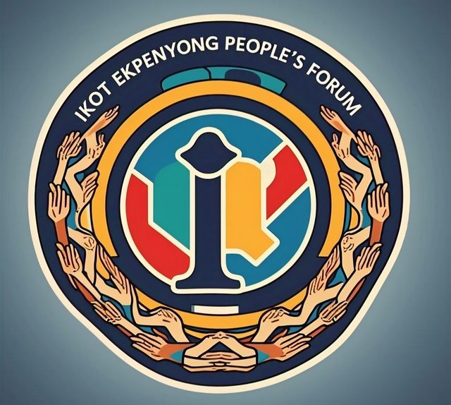
The first design concept features an emblem that incorporates elements of unity and togetherness. The logo consists of a circular shape, symbolizing wholeness and completeness. At the center of the circle is a letter I, which symbolized the first letter of the association's name. Round the circle is the intertwined hands, representing the bond between the people of Ikot Ekpenyong. The colour scheme is a blend of blue, red, orange and yellow, signifying trust, harmony, and growth.
 My Logo Design Concept My Logo Design Concept |
|---|
DESIGN 2
The second design concept takes inspiration from the rich cultural heritage of Ikot Ekpenyong. The logo features a stylized colours of a traditional Akwa lbom hut, paying homage to the community's roots. The hut is made by blue and green colours, with intricate patterns that reflect the area's unique cultural identity. The colour scheme is a warm blend of earthy tones, evoking feelings of warmth, comfort, and tradition.
 My Logo Design Concept My Logo Design Concept |
|---|
DESIGN 3
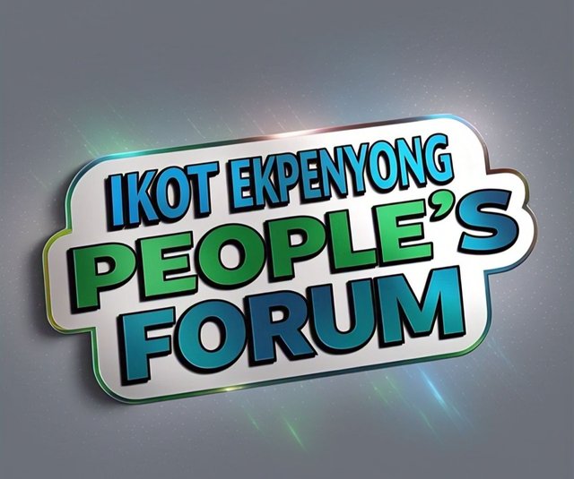
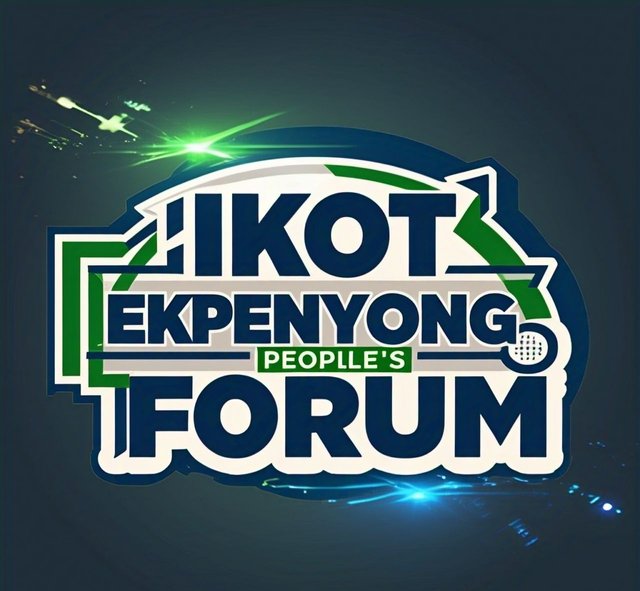
The third design concept focuses on the idea of a people's forum, emphasizing the organization's role as a platform for community discussion and engagement. The logo features a navy blue writeup and lightening , with background coming together in a circular formation. The color scheme is a vibrant blend of navy and green colours, representing diversity, inclusivity, and energy.
 My Logo Design Concept My Logo Design Concept |
|---|
DESIGN 4
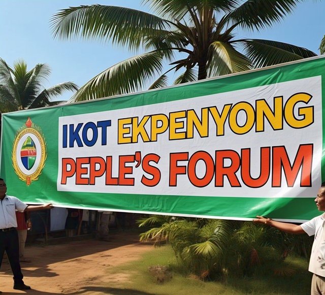
The fourth design concept incorporates an iconic symbol that is unique to Ikot Ekpenyong. The logo features two people holding the Forum's flex banner in front of palm trees, paying homage to the community's agricultural heritage. The colour scheme is a soothing blend of blue, yellow and red, evoking feelings of serenity and tranquility. Each of these design concepts offers a unique perspective on the IKOT EKPENYONG PEOPLE'S FORUM's values and mission. I believe that one of these designs will resonate with the organization's vision and help establish a strong visual identity for the community.
 My Logo Design Concept My Logo Design Concept |
|---|
Thank you for publishing an article in the Steem4nigeria community today. We have assessed your entry and we present the result of our assessment below.
Your logo designs are all beautiful and breathtaking, but the third looks too good to be true. I appreciate it so much. I am sure the owners loved the work you did for them. Keep doing what you know how best to do!
Remember to always share your post on Twitter using these 3 main tags #steem #steemit $steem
Hi, Endeavor to join the #Nigeria-trail for more robust support in the community. Click the link Nigeria-trail
Guide to join