"SLC21/WK3: Logo Design - Part 2
Hi esteem designers student, i believe you're all enjoying your ongoing lecture and I am. It's actually a new week and a new but continuation of the previous week course, my teacher says that there's a need to deepen his student mind about logo and I'm here to benefit from this very course of his.
I've come to acquire some deepen foundation of logo from the little I've learned this week. Talking of the types of logo, I've discovered the nine types of logo and their unique roles they play when it comes to the selection of logo design. Let's fetch out the types of logo, when to use and not use them.
Discuss about each of the logo types we have and then talk about conditions when such logo should be used and when not to be used for a brand. You can do a little research to aid you. |
|---|
In the world of logo design, we've got numerous types of logo and their important, understanding the types of logo would definitely widen our mind hence helps us the create a logo for the right brand, the types of logo includes:
Wordmark logos |
|---|
This type of logo is simple in it's nature because it is a Typography or text base logo design. Wordmark logo can be easily detected because of the fact that a designer can only create them by using a particular font or typeset.
When to use and not use. |
|---|
If you truly want to discover the uniqueness of wordmark logo, it is best you use it for a brands like Microsoft, coca cola, Toyota, Disney and etc, remember wordmark logo are always simple in nature therefore it is recommended not to use wordmark logo in designing complicated logo.
Monogram or lettermark logo. |
|---|
This type of logo is a bit related to wordmark logo, we can sense this type of logo by using an abbreviation name of a company to produce a logo, for instance; instead of British broadcasting corporation, you make short the name by using the abbreviation BBC.
When to use and not use. |
|---|
This type of logo is best used when creating a single name brand. for example; X, BBC, and etc. in a situation where a long word logo like the wordmark logo is needed, it is not recommended to use monogram logo as it will abrupt the logo.
Brandmark, pictorial or iconic logo |
|---|
As the name implies, this type of logo is made up of an image, icon or symbol. In this type of logo, text isn't needed, you only use a symbol or image to represent a particular brand or company.
When to use and not use. |
|---|
While this type of logo is recommended for creating a brand or company icon, it is not suitable for creating logo that requires words or tagline and etc.
Abstract logos |
|---|
Here is another logo design similar to brandmark logo but got a bit differentiation. Abstract logo is a type of logo that are made from shape and colours, you identify a company logo by either colour or shape, it is called "abstract" because it illustrate a multiple concept in a design yet they communicate a brand or company identity.
When to use and not use. |
|---|
Nike, sportyfy and Pepsi shape and colours are all examples of the types of logo to use abstract logo, therefore abstract logo shouldn't be used to create a logo that contains wordmark or monogram logo.
Mascot Logos |
|---|
This category of logo design only focus on using mascot characters to design a logo. This type of logo are often exaggerated human caricatures, they can be animated and characters like animals or object can be used to create this type of logo.
When to use and not use. |
|---|
when it comes to mascot, it should be acknowledge to use it specifically on creating animated or human caricature logos therefore creating of abstract logo or emblem logo and etc using mascot strategies should be forbidden.
Emblem logos. |
|---|
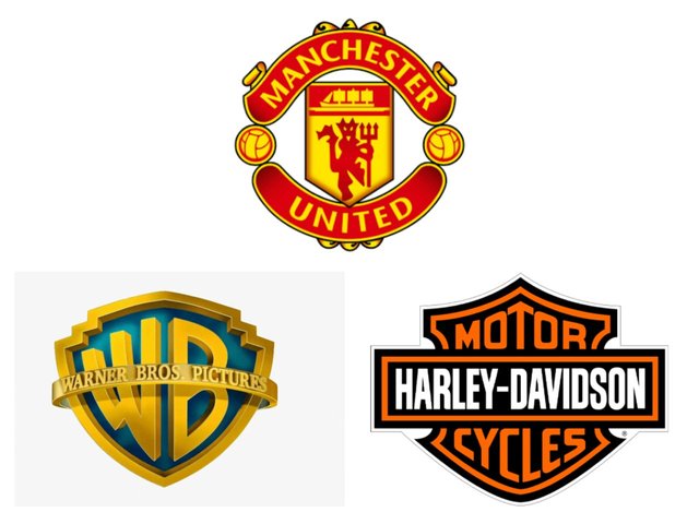
emblem logo is typically a type of logo that combine words and elements together to create appealing logo. We usually see a logo with a text surrounded by, this is actually an example of emblem logo, it is always classic and attracted when carefully made.
When to use and not use. |
|---|
football team logo, university logo and etc are all brands that emblem logo should be considered the best option therefore emblem would look fussy when we used to create a modern design or whatever.
Combination logos. |
|---|
you just have to understand the name before processing your work. This type of logo is about the combination of both wordmark, monogram and others in a single logo, you just have to make your decision wisely on which types of logo you wish to combine together.
When to use and not use. |
|---|
this type of logo can best fit long name brands and applying images, therefore since one of the disadvantage of this logo is inflexible, it is recommended to not rush while creating this type of design.
Ambigram logos. |
|---|
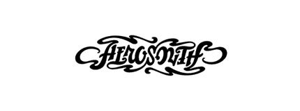
This type of logos are always graphical. It's actually a type of design that pronounced a text not as presented but in such a way that it changed the direction of the original text. This type of logo can be read upside down or right side up and are design by professionals.
When to use and not use. |
|---|
Ambigram logos is perfect for creating a crafty logo design, therefore it is recommended not to use it for logo types likes monogram, brandmark and etc.
Pick any two (2) of the Logo types discussed and then practically demonstrate how to make them, showing your detailed process. |
|---|
With my little understanding of the course, I lay my focus on creating a wordmark logo as my first Logo design, the task is to create two designs from the already discuss logo type. Let's go.
Step 1
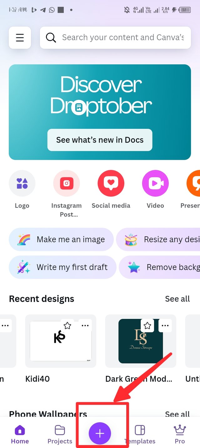
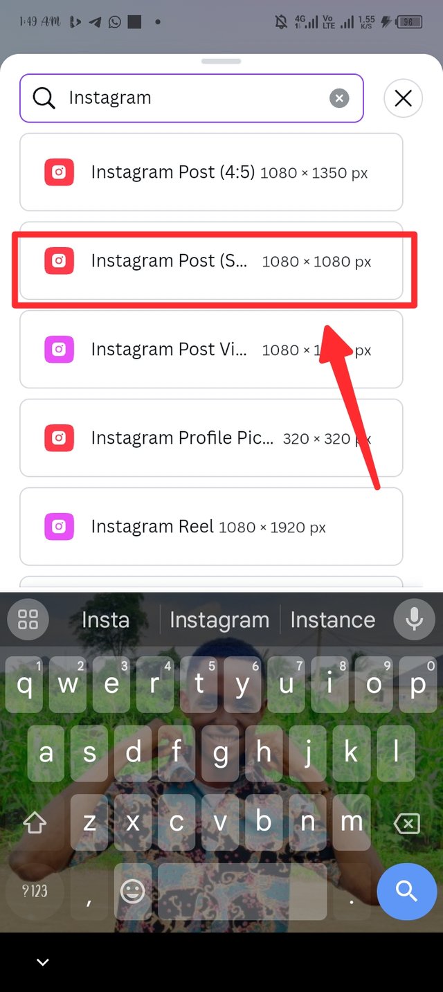
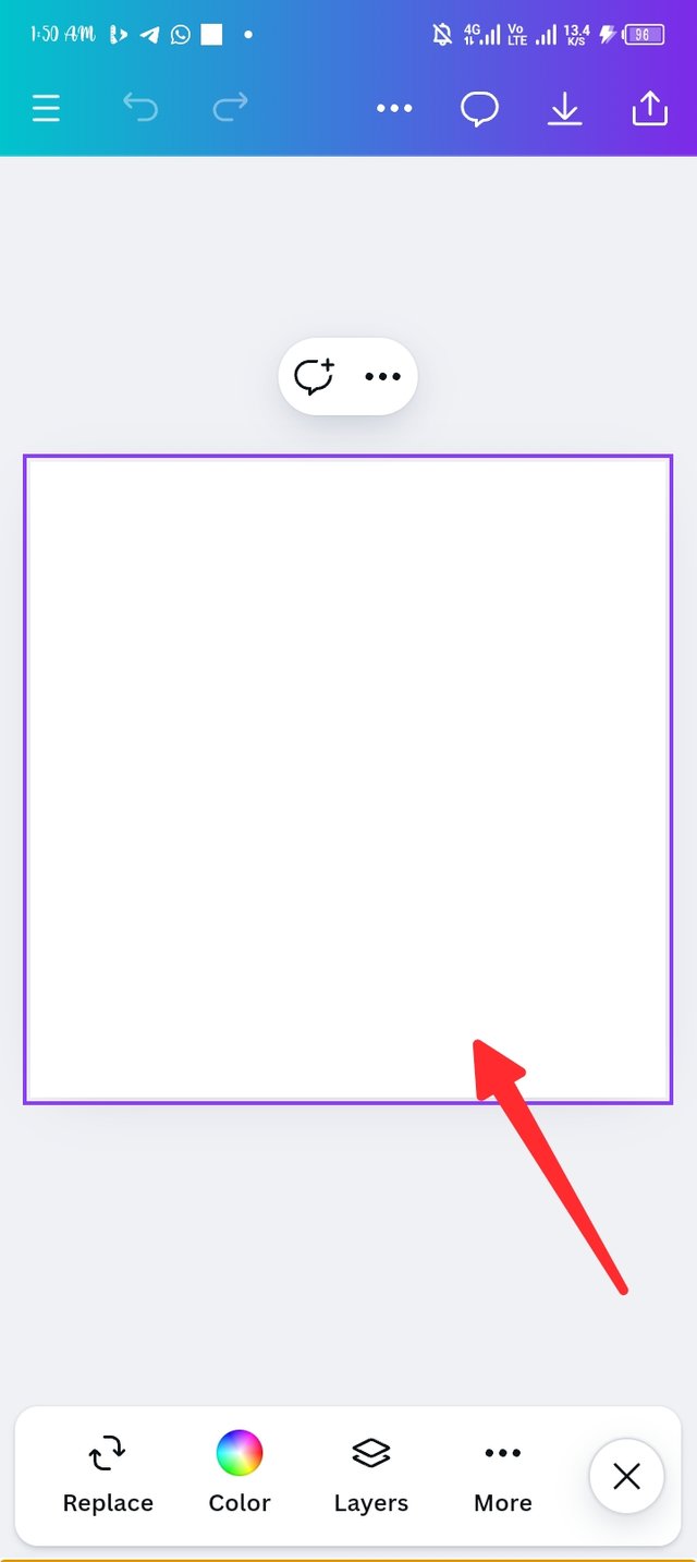
I launch my canva application and locate the plus button which is colour purple, i click on it and another page pop up where I search for my work space. I searched for memu 17x17 landscape and it pop up, there i have my workspace as seen in picture three.
 |  |  |
|---|
Step 2.
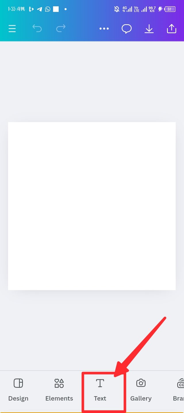
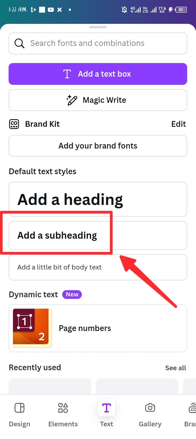
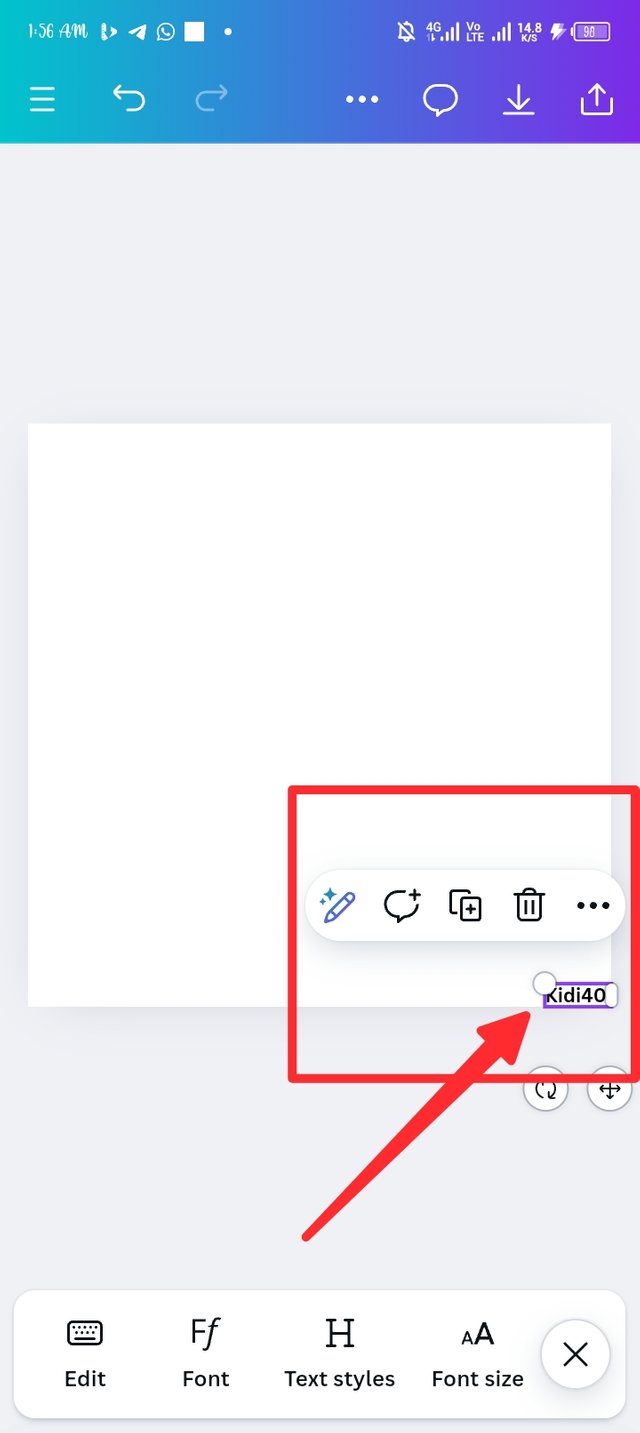
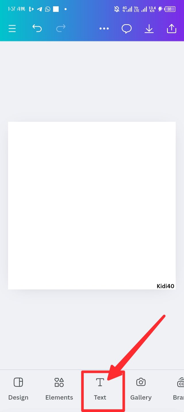
I'm this space, i consider creating awareness of evidence that I'm the one specialized on the work. To add my username to the workspace, i click on text and it pop a page that contains different text, i click on add suhheading to add my username, i then shift the name to the end corner of the work space.
 |  |  |
|---|
Step 3.
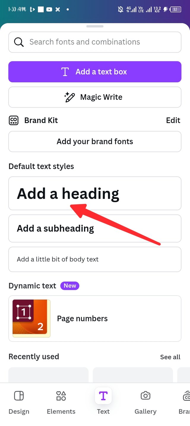
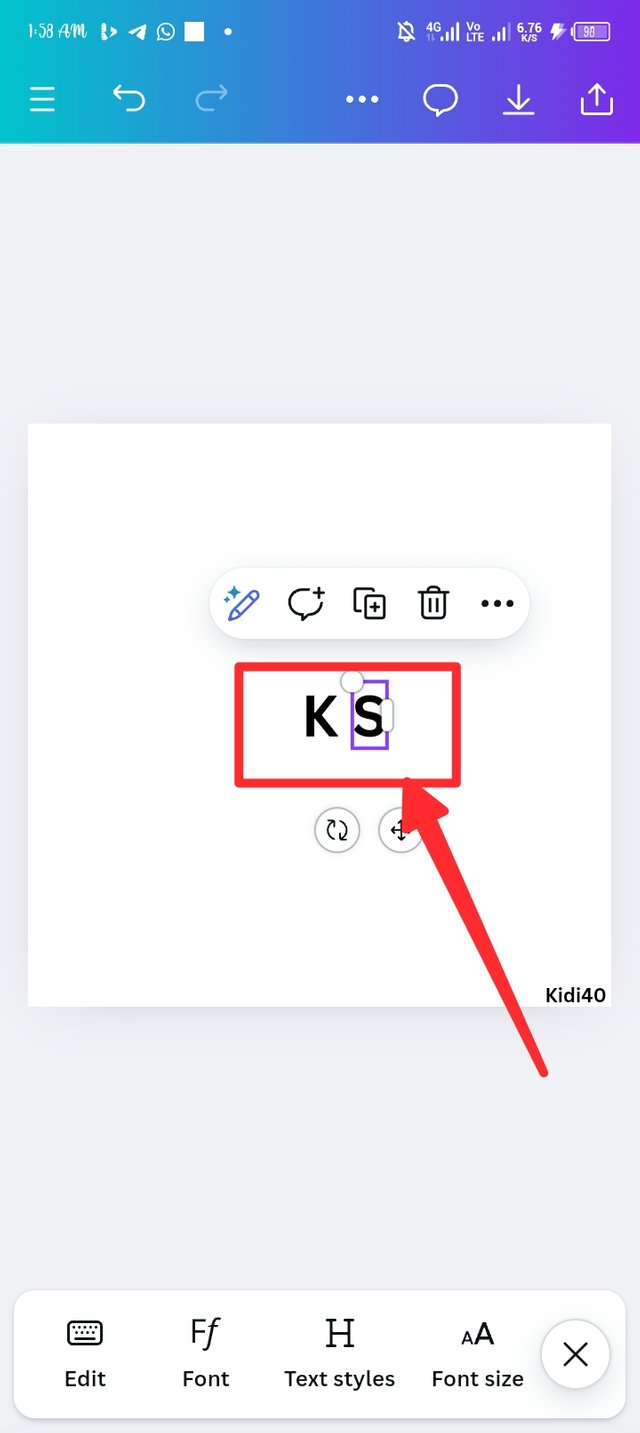
I repeat the same strategy of adding my username but this time around, I made used of adding a heading as seen in the picture 2. I first of all insert upper later K, i repeat the adding text strategy again with the same add a heading to insert another upper letters which is S
 |  |  |
|---|
Step 4.
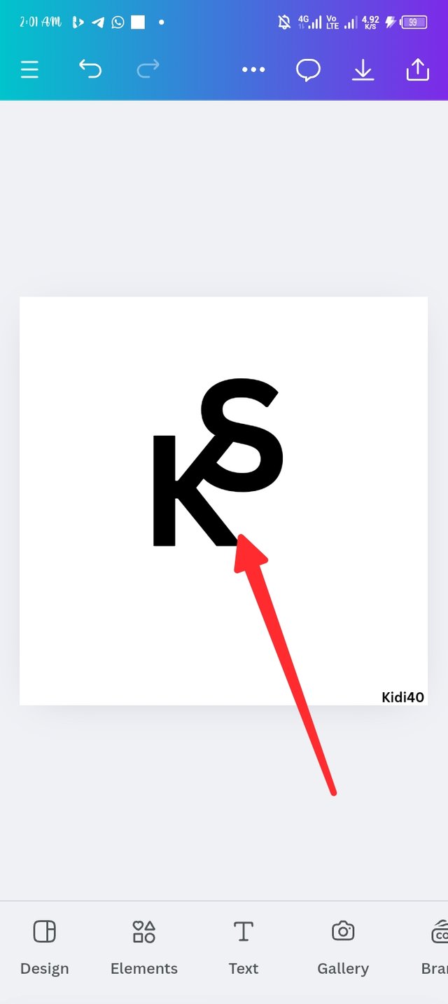
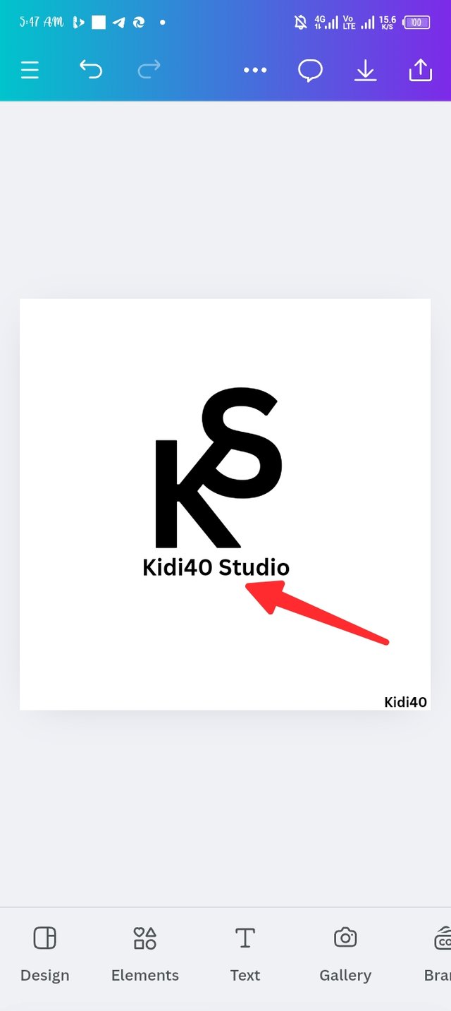
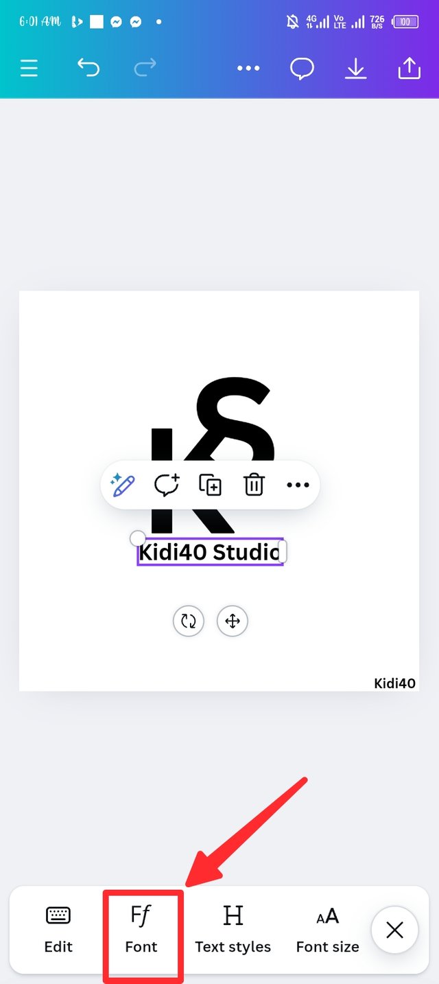
After adding the letters in step three, I took enlarging the letter to achieve a particular taste of mine, then i position the K letter downward while the S is position at the upper edge of the K. I then repeat the adding text method again but this time I used the add subheading to breakdown the KS as Kidi40 Studio. I'm picture three i introduced a font icon, let's check it out.
 |  |  |
|---|
Step 5.
Here is change the natural font and typeset to a new authorized one, i first start the innovation on kidi40 studio as I made used of the tangerine font and the bold typeset, i then change the KS using Ekushey punarbhaba font. I didn't forget to enlarge the text after the new change.
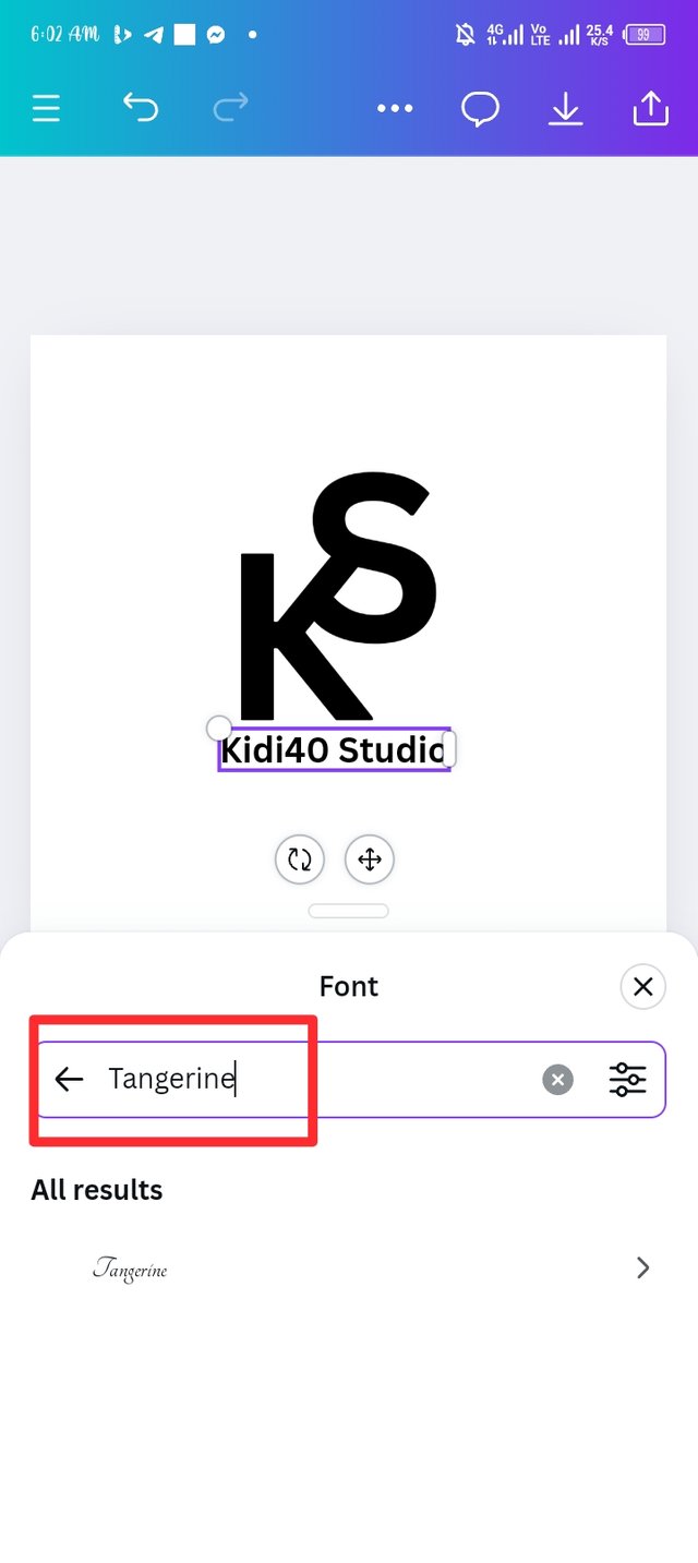 | 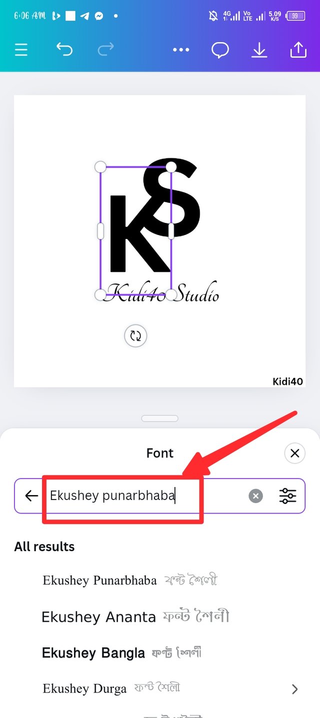 | 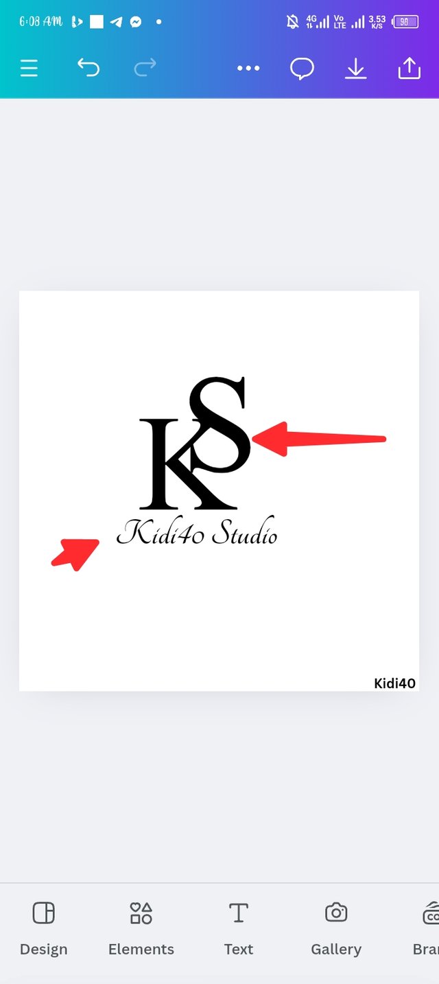 |
|---|
Step 6.
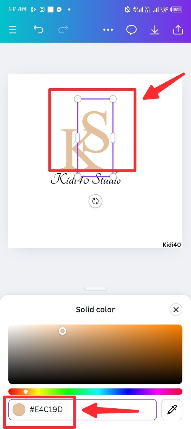
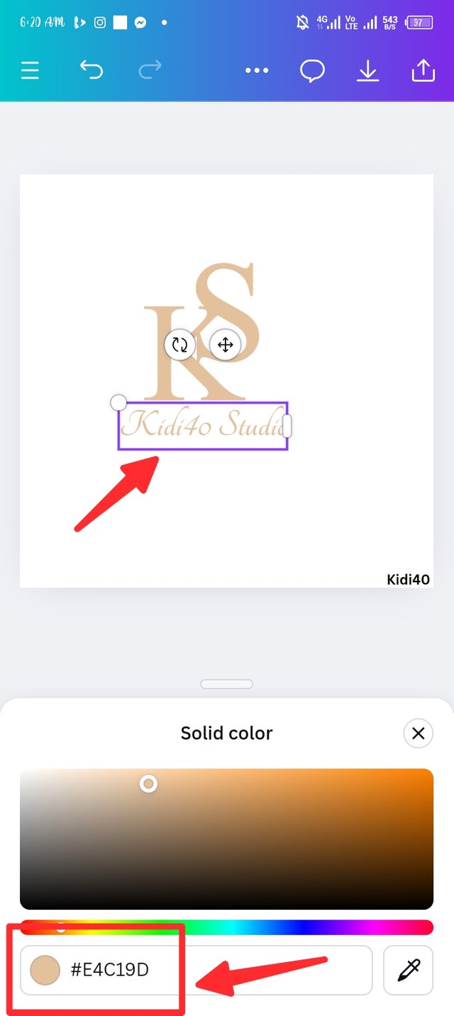
In this step 6, i consider introducing the colour icon and I use the colour wheel to add my colour. I deleted the natural colour hex and insert mine which is #e4c19d. Note that I'm using the same colour hex in both the abbreviation and the breakdown of my text.
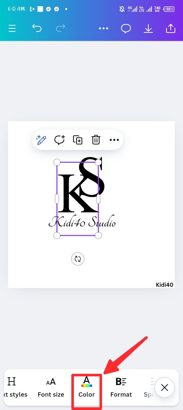 |  |  |
|---|
Step 7.
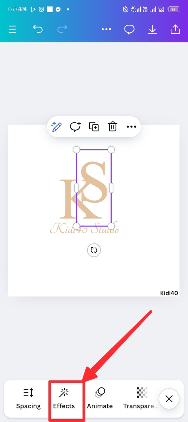
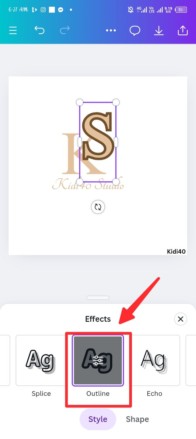
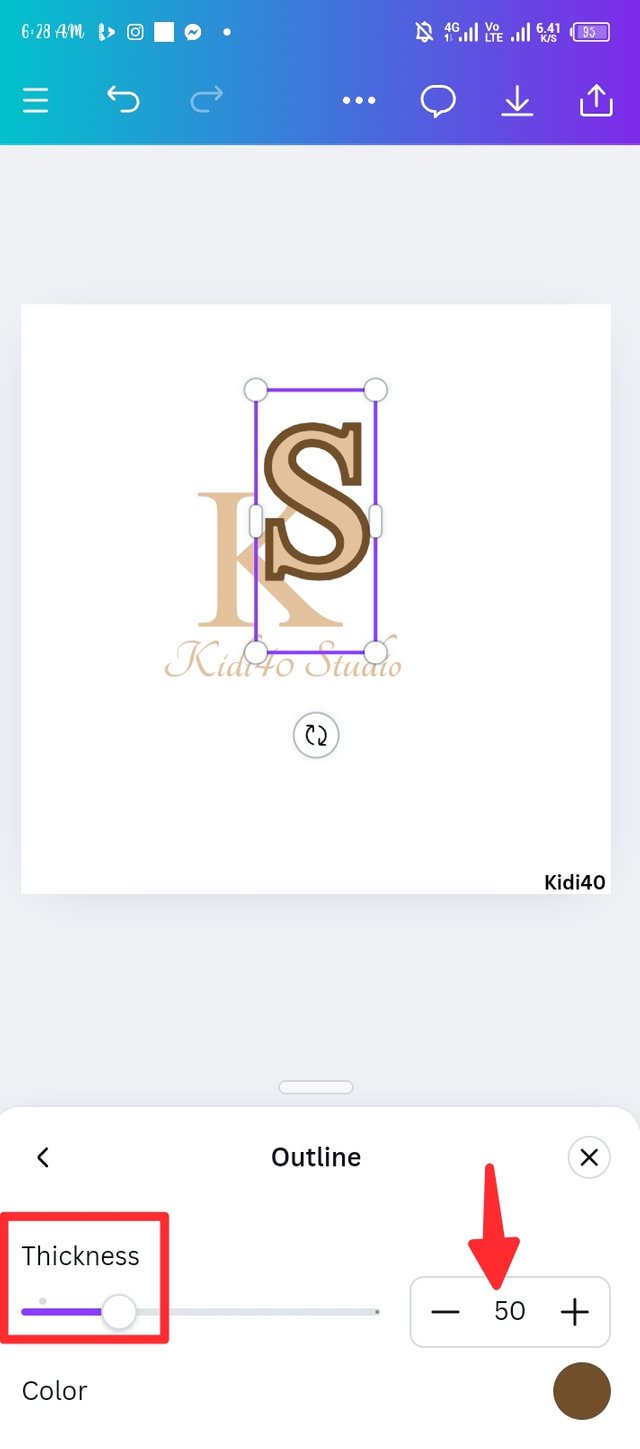
I introduced the effect button to upgrade my text, we have different types of effects but I choose the outline effect to add weight to the text, using the slider my weight remains at 50 percent as seen in the third picture.
 |  |  |
|---|
Step 8.
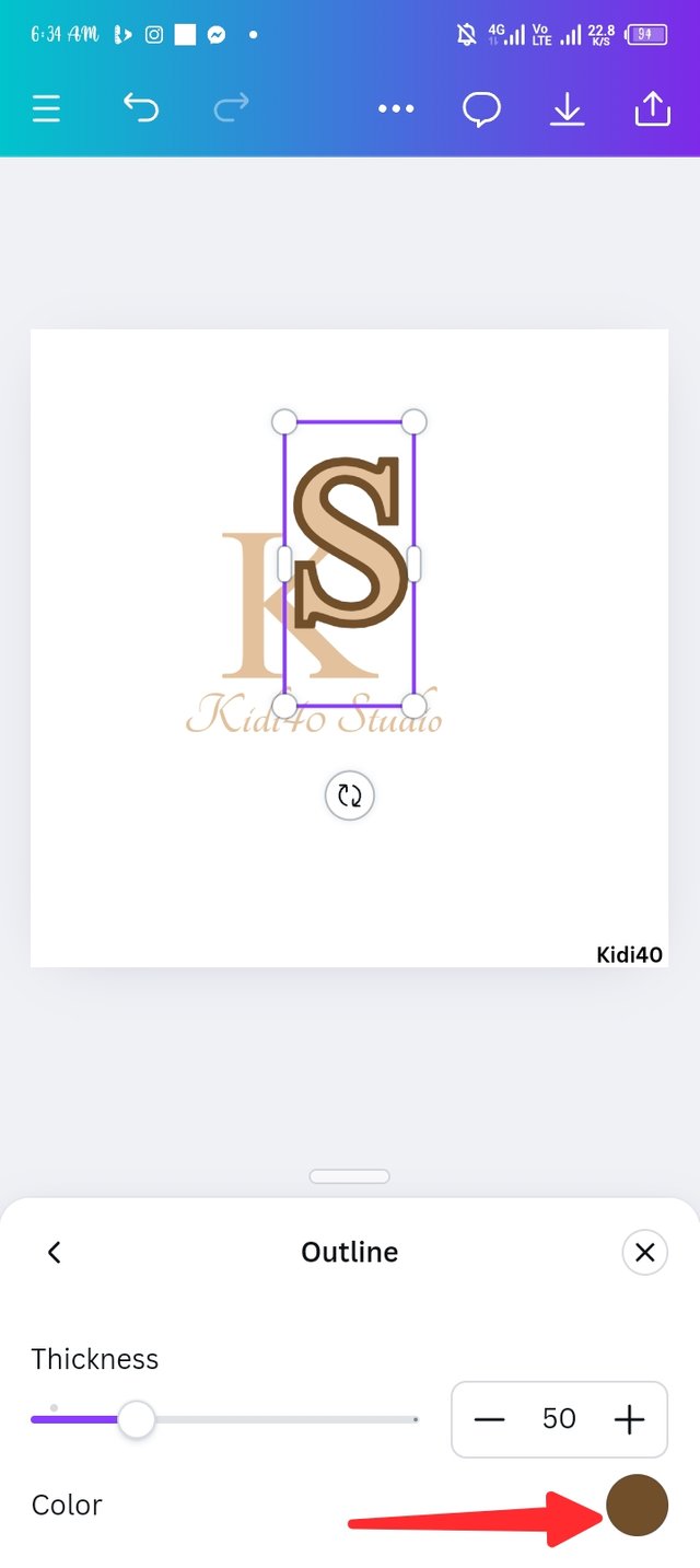
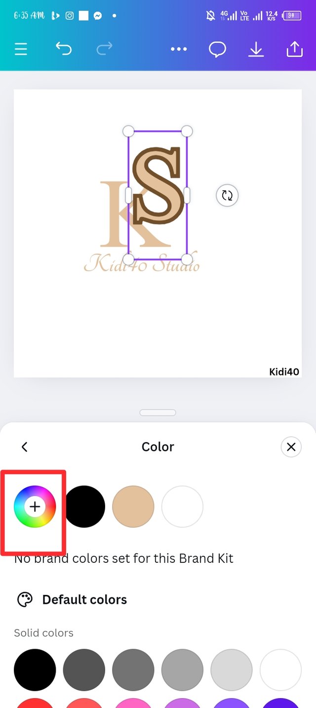
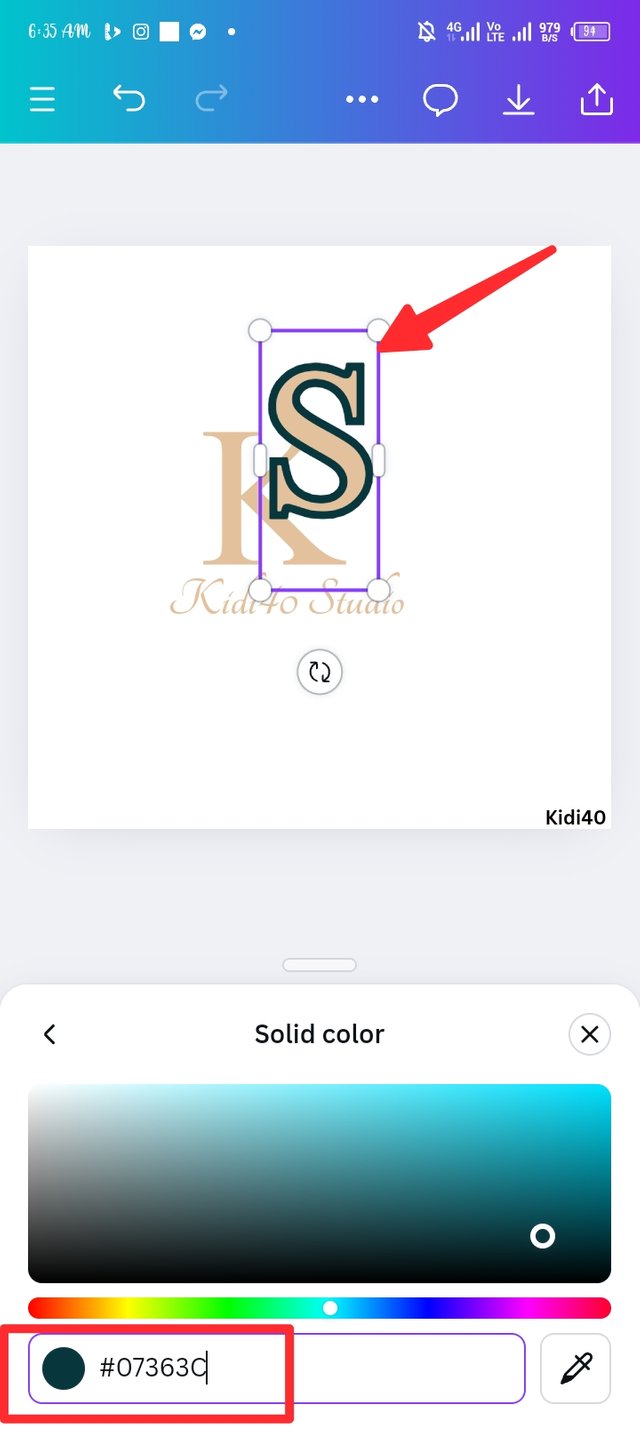
Still on effect page, there's a colour icon at the down end of the weight percentage, i click on it the change the weight colour to a new one, i then use the colour wheel to insert a new hex code which is #07363c a dark green colour. You can no notice the constant change of the weight in uppercase S, you need to notice that the weight is only apply on uppercase S while K remain natural.
 |  |  |
|---|
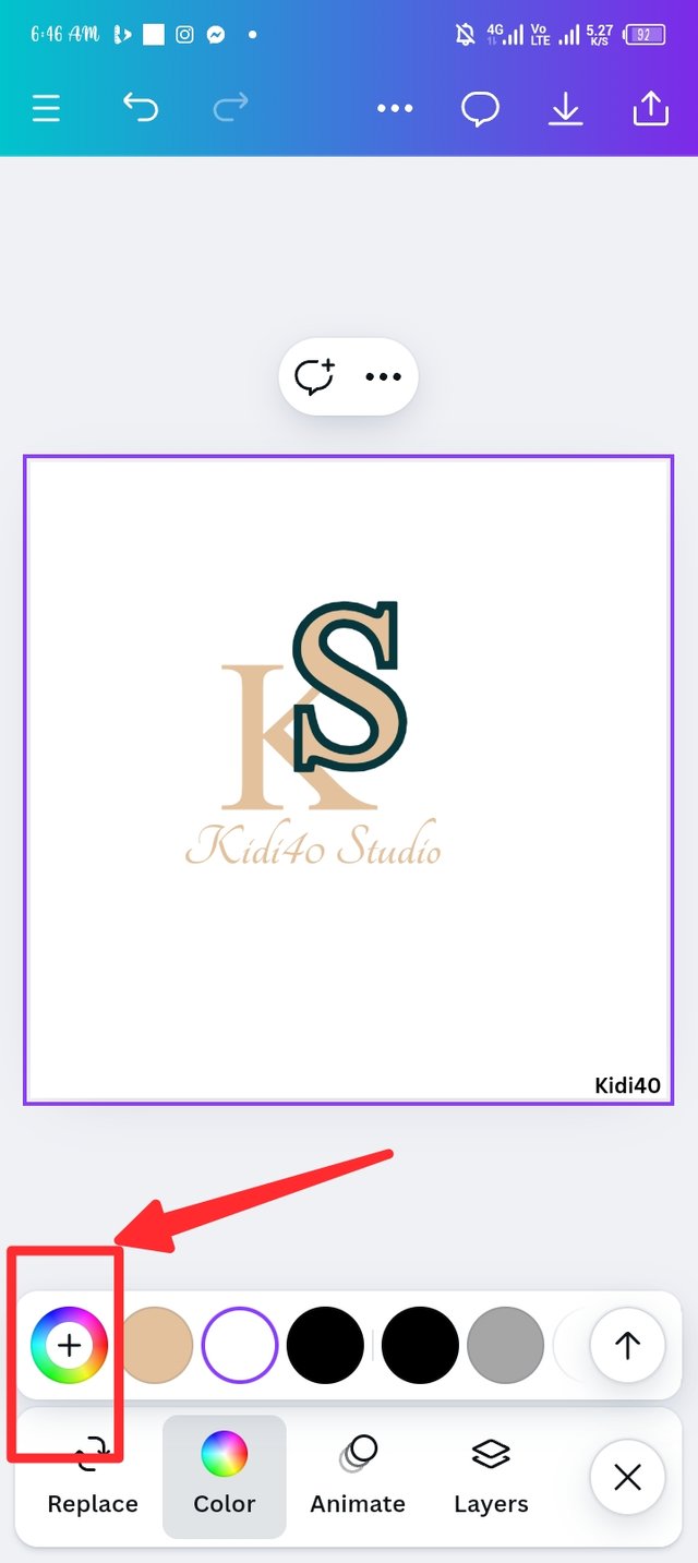
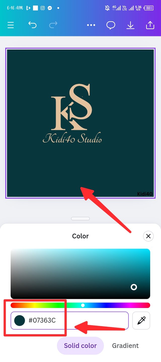
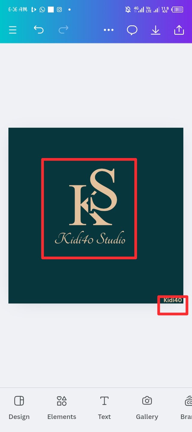
Step 9.
Here comes the step where I finally apply colour to my background. I repeat the whole process of adding colour to a design, colour wheel isn't exceptional as I use it to generate the colour colour I used to add weight in my uppercase S. So I noticed that my logo was one sided, there i try shifting the logo to the center as seen in the third picture. I also changed my username originally colour to orange brown color the same colour I used in my main text.
 |  |  |
|---|
Final steps.
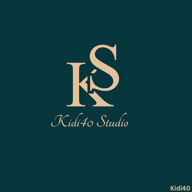
| Logo Design 2- combination logo. |
|---|
Step 1.
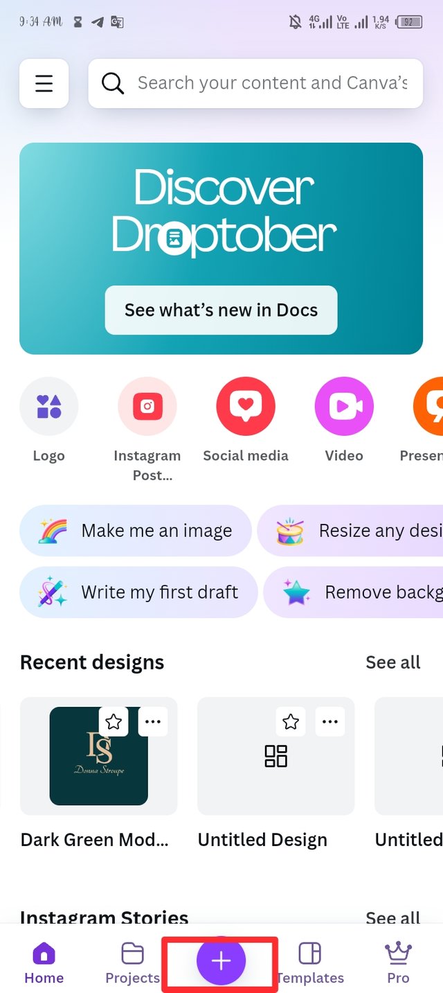
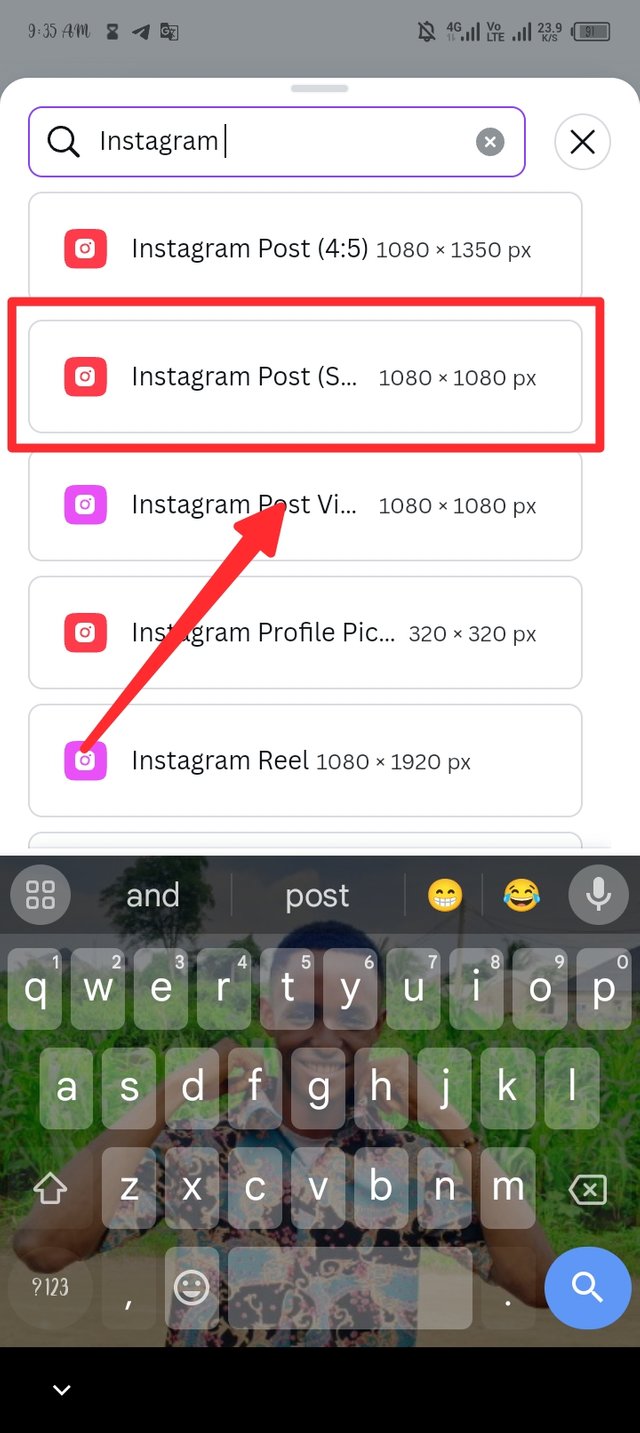
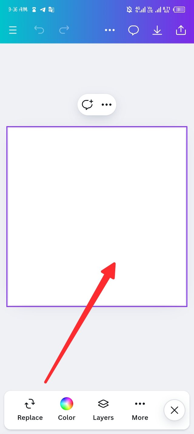
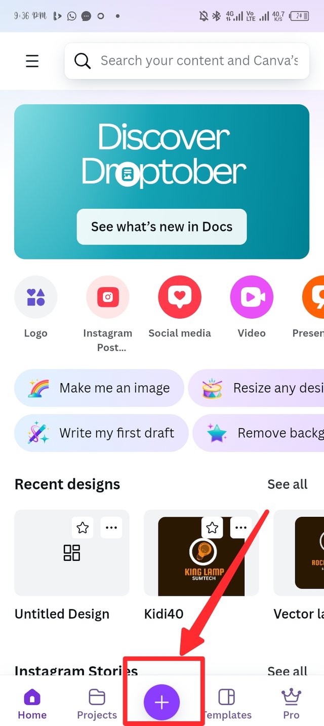
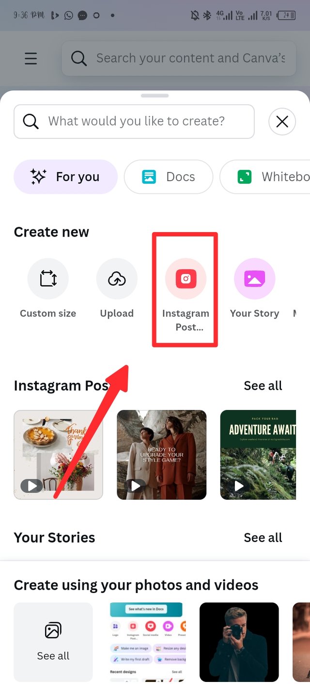
I launch my canva app for the second time and access the plus button, my first mission is create a workspace that will fit my design. So the Plus button lead to page where I search for a workspace and Instagram post is in my agenda. As you can see I clicked on the size 1080x1080, there i have my workspace ready.
 |  |  |
|---|
Step 2.
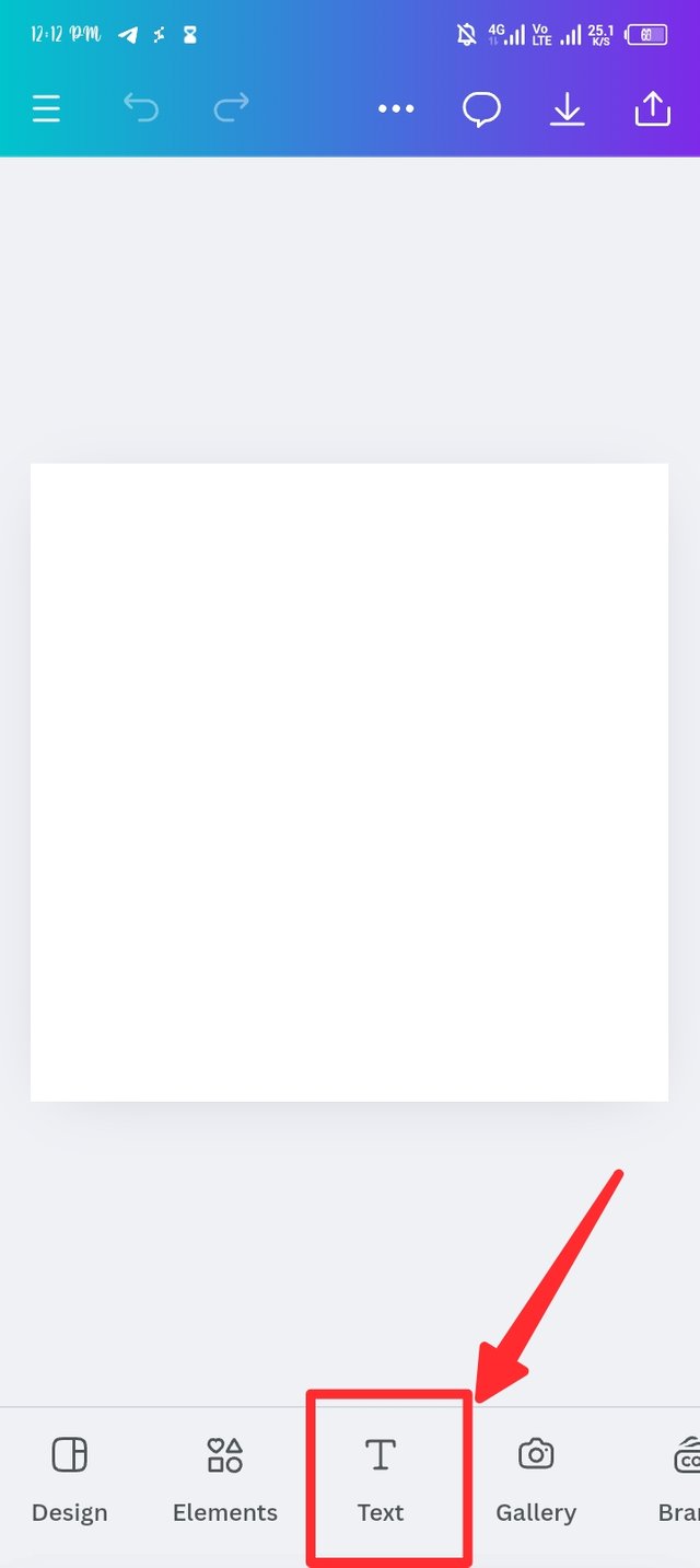
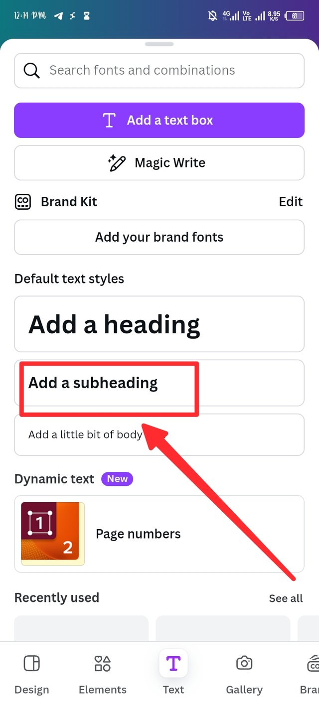
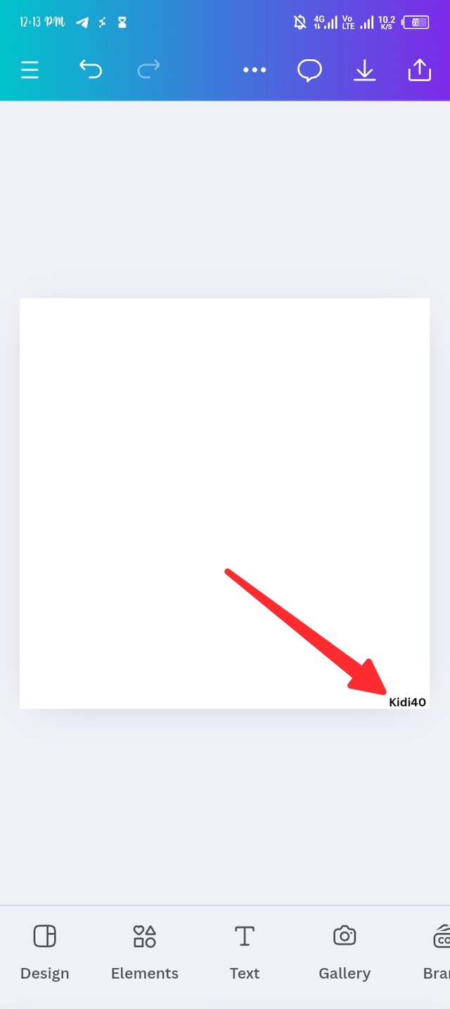
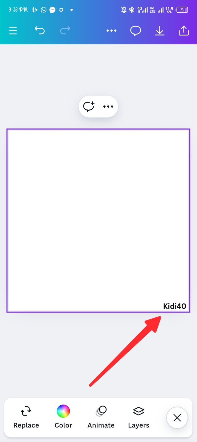
Next on my agenda was to add my username in workspace as an evidence to prove that I'm the one at work. The text button is the third button after element and I click on it to select add a sub heading and then insert kidi40 as seen in the third picture.
 |  |  |
|---|
Step 3.
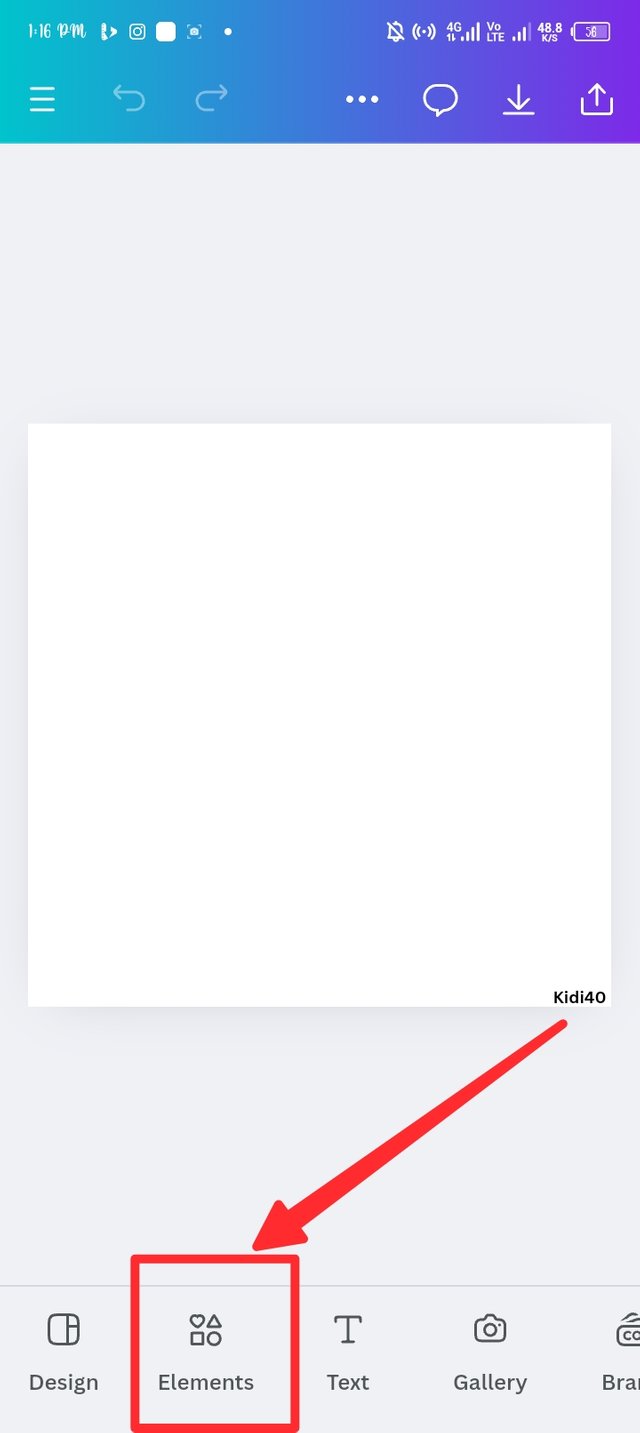
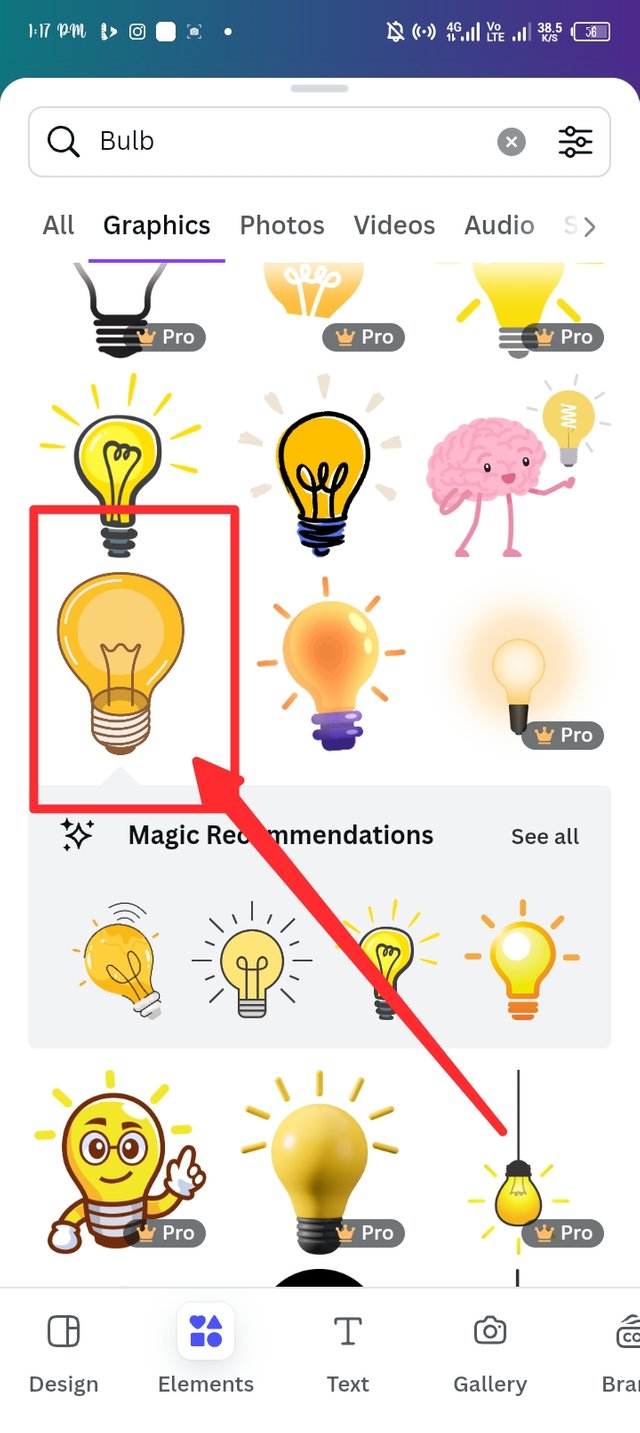
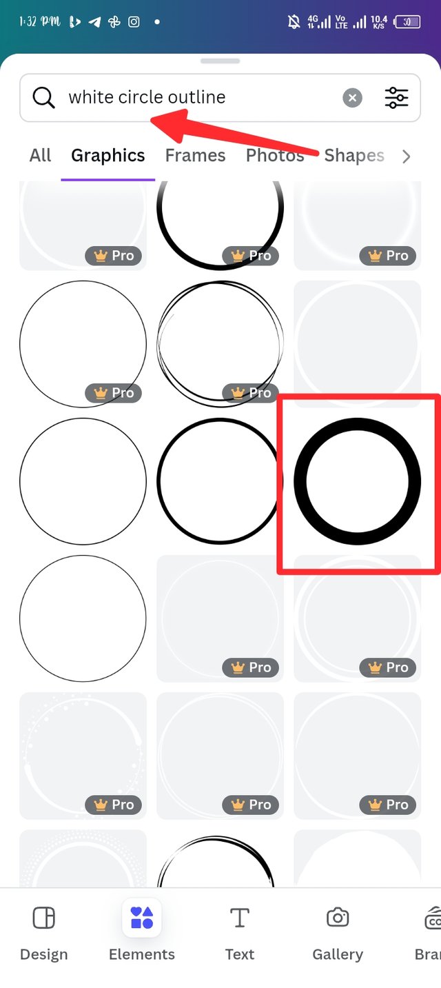
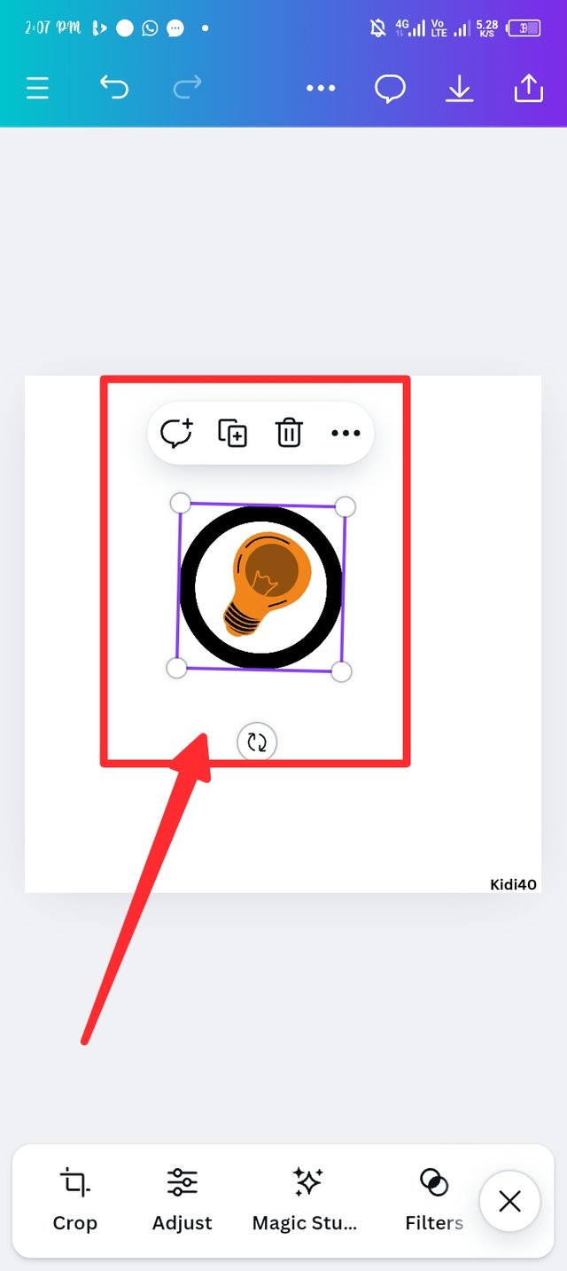
In this step, i lay my focus on applying an element that best describes my brand. I explore the element page and search for a bulb and i have it display in my workspace. I repeat the element adding method to search for a white circle outline, what i got was a black weight circle outline and i select it. Let's see what I got in step 4.
 |  |  |
|---|
Step 4.
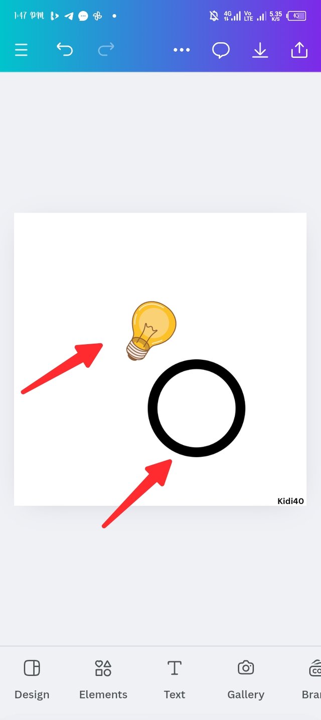
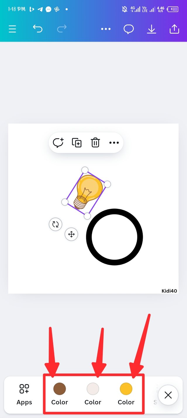
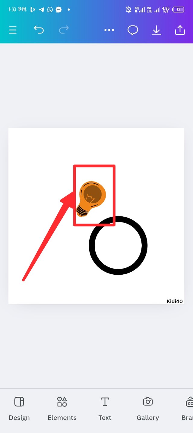
In picture one, you see the two different elements I applied to my workspace, the bulb and black circle outline. I'm not satisfied with the original bulb colour so I took to changing it using the hex code #2b1802 and #000000. Now you can see the new invented build with a new colour.
 |  |  |
|---|
Step 5.
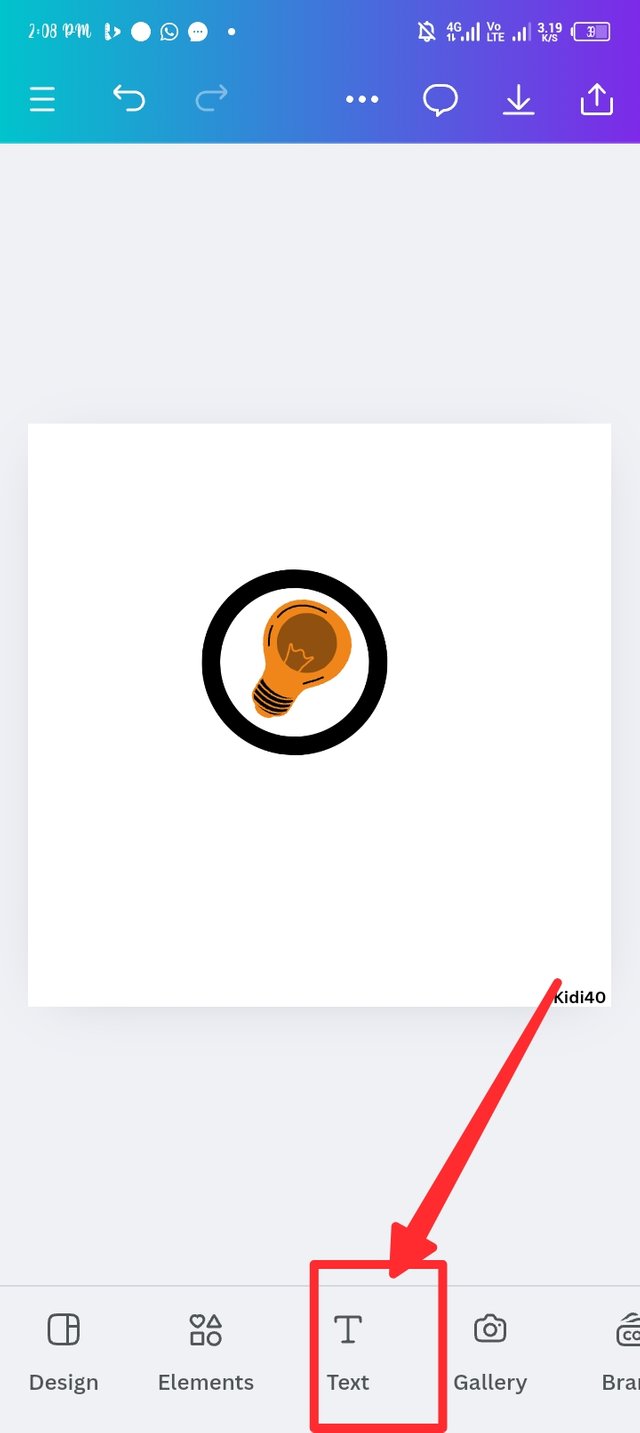
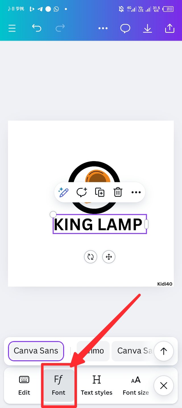
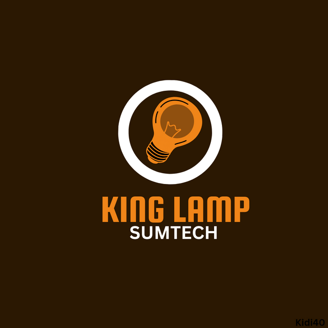
In this step, i use the White circle outline to circle the bulb, that's generate a logo but since I'm creating a combination logo, i still have more to do. In picture two i intrude the text button and select add a heading to insert king lamp using upper case. In picture three, i also intrude the font button
 |  |  |
|---|
Step 6.
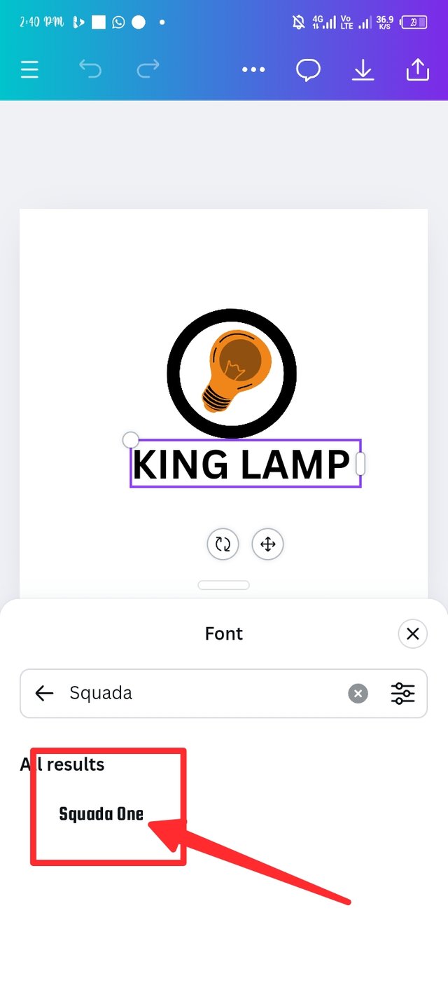
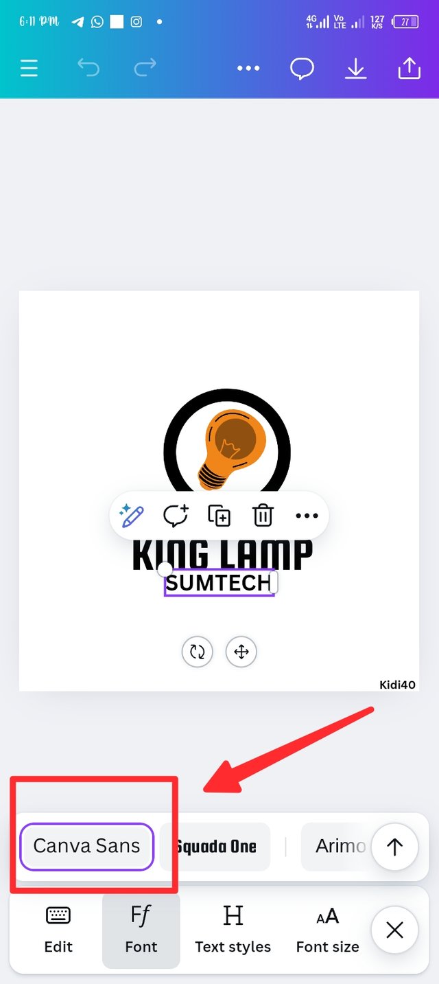
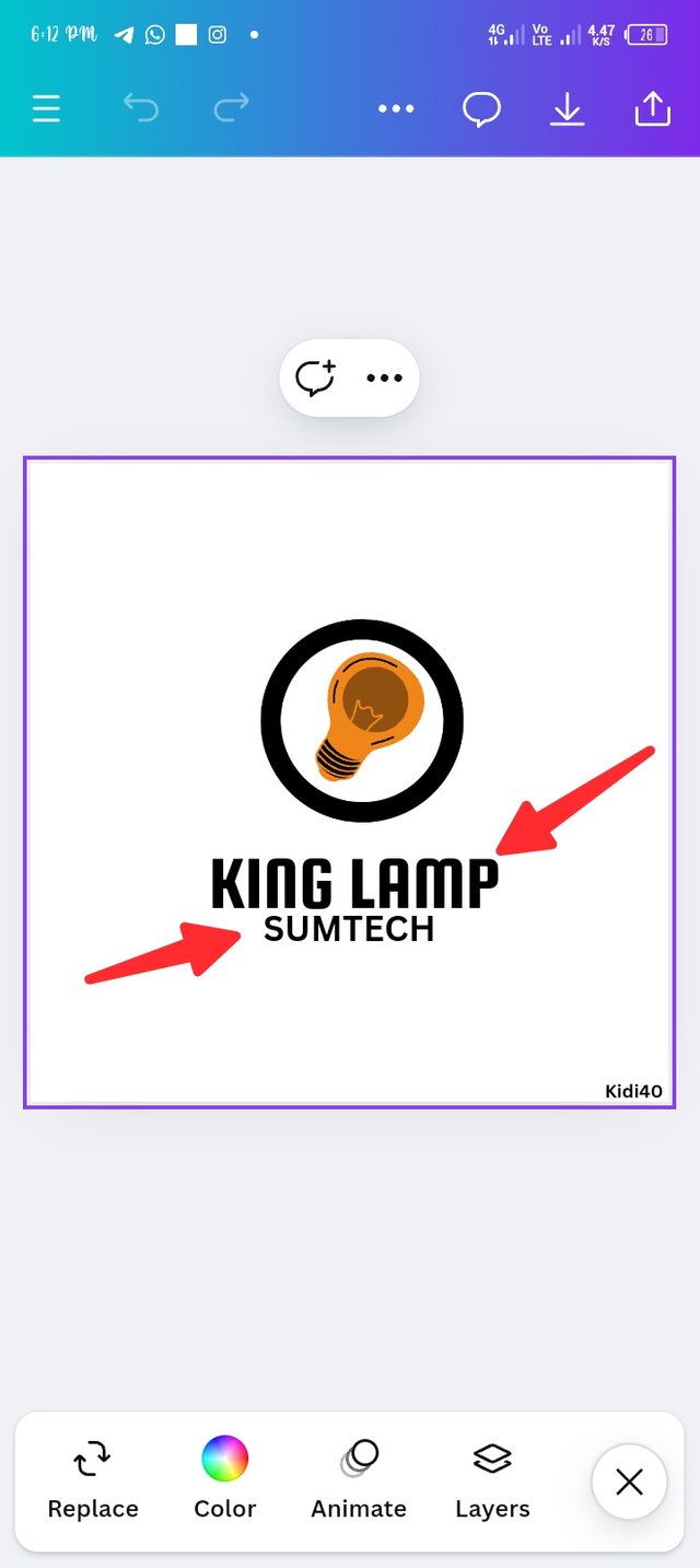
In this step, i try changing the original font, squada font is the best option to me and I'm making use of it as seen in picture-1. In picture 2 I repeated the adding text method to insert sumtech as my slogan, i use the default font which is canva sans as seen in picture two. In picture three you can notice the outcome of my text and the font.
 |  |  |
|---|
Step 7.
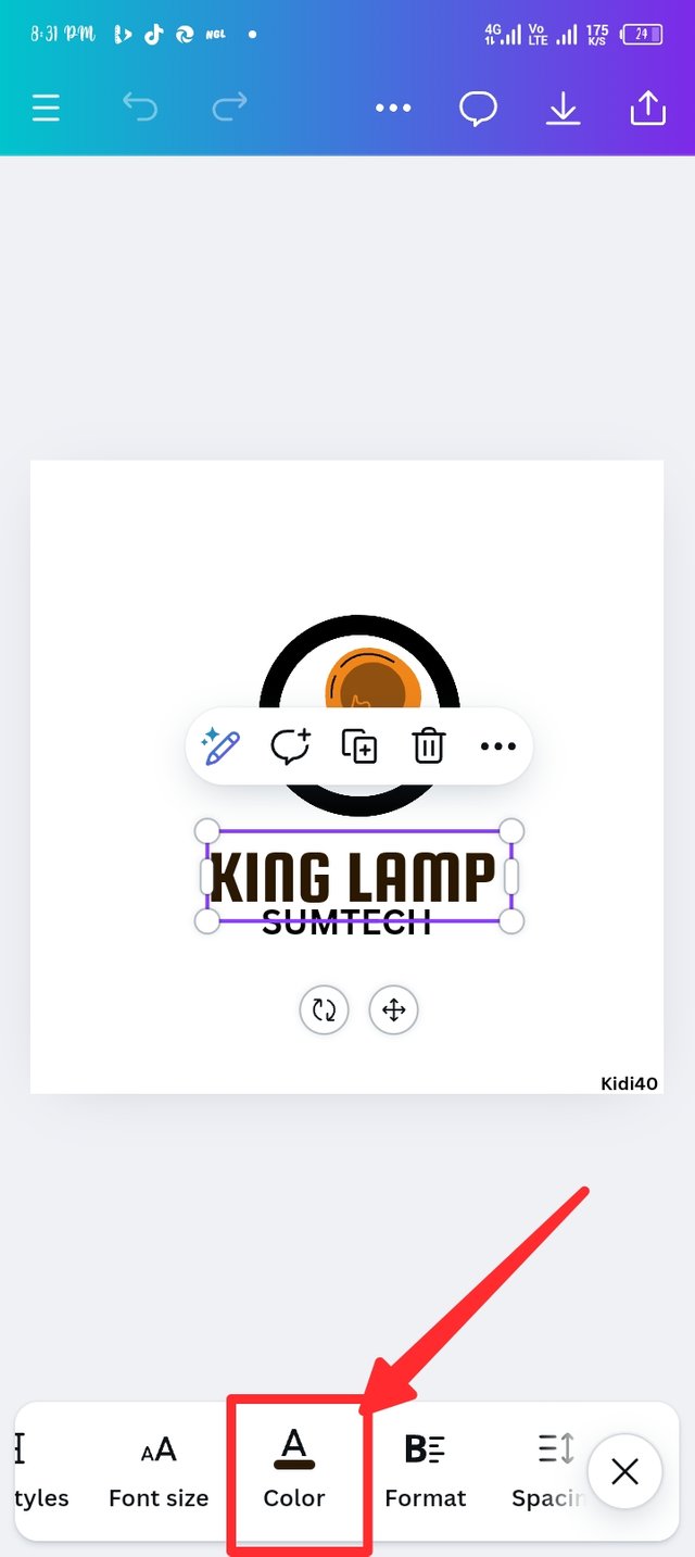
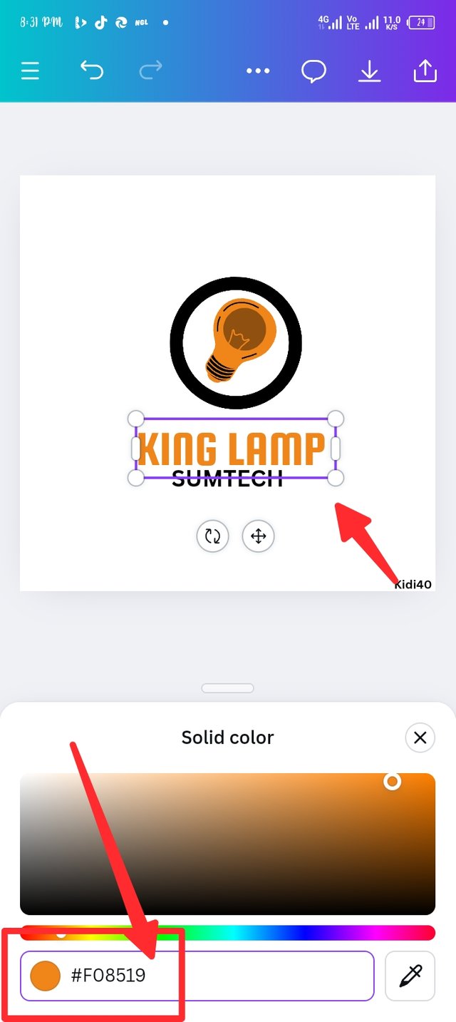
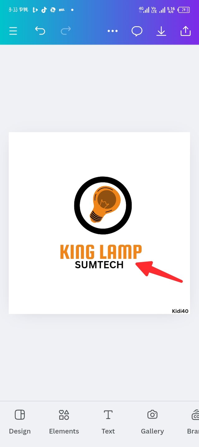
In this step, i finally introduced colour to my logo. Here are the steps, i first set my cursor in the lamp king and select colour, the natural colour was black so i change it by using the colour wheel, i insert my hex code which is #f08519, this hex code provide a vibrant orange colour, picture three shows the outcome of my design.
 |  |  |
|---|
Step -8.
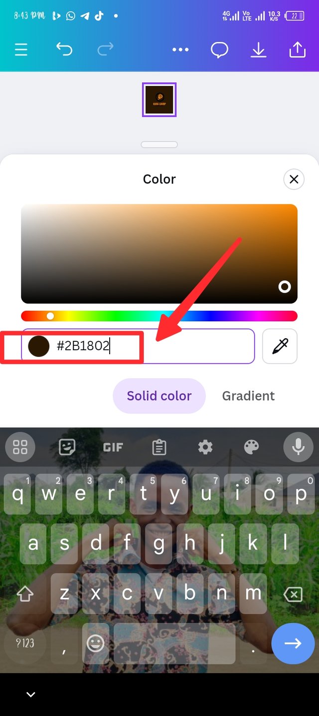
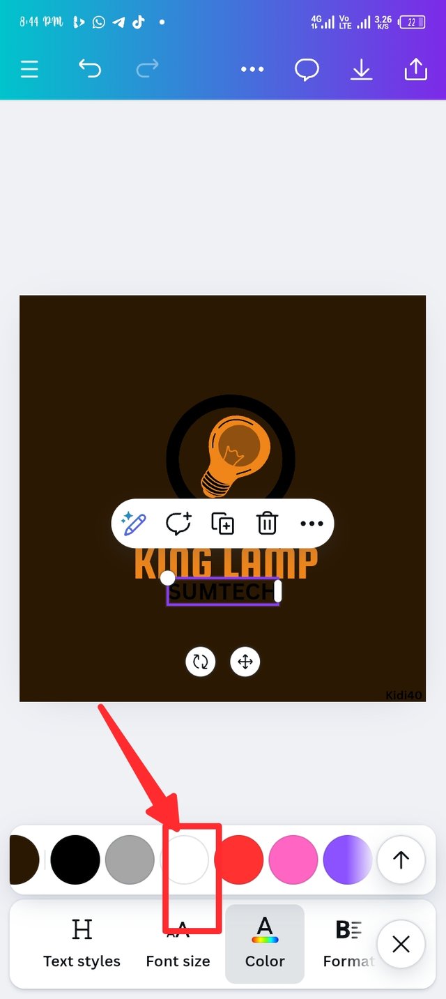
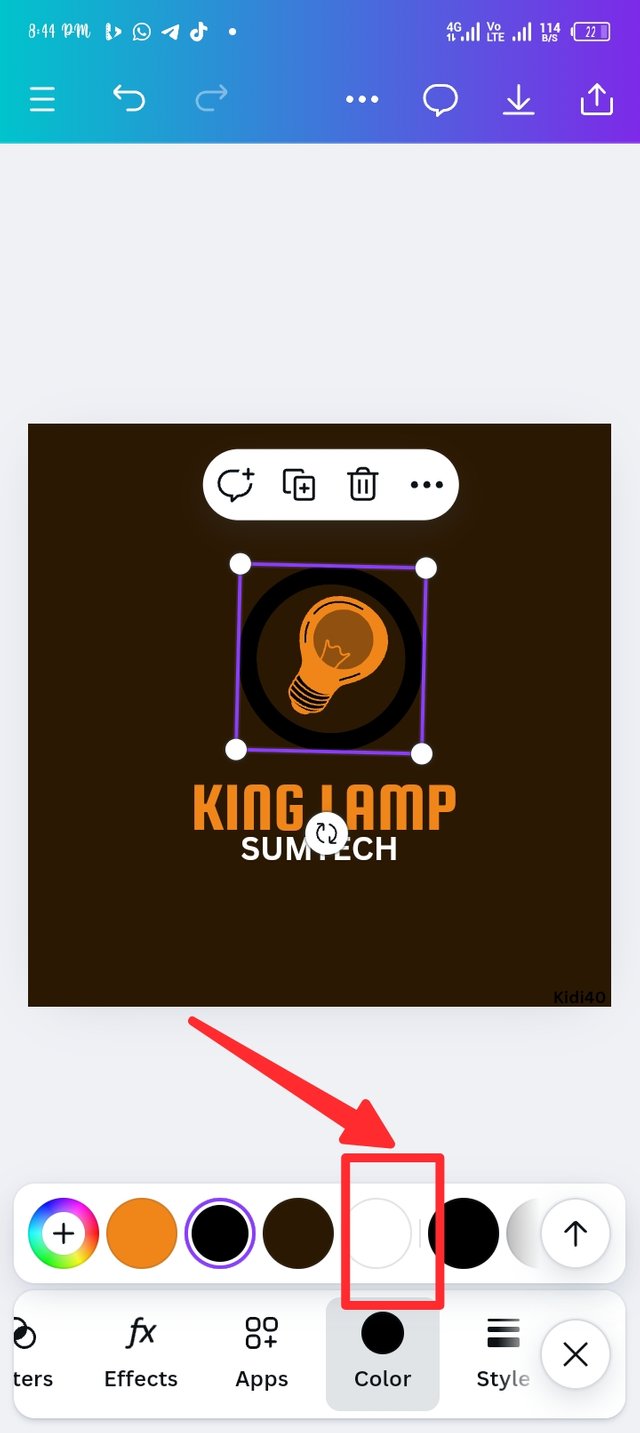
I finally come to the point of changing my background colour, as seen in the previous screenshot, the background was white, now I changed it to deep brown, you can see the reflection in picture two. Still in picture two, i change the sumtech original colour from black to white, you can see the reflection in picture three. Still in picture three, i change the black circle outline color to white, let's see the outcome in the last design.
 |  |  |
|---|
Final step.
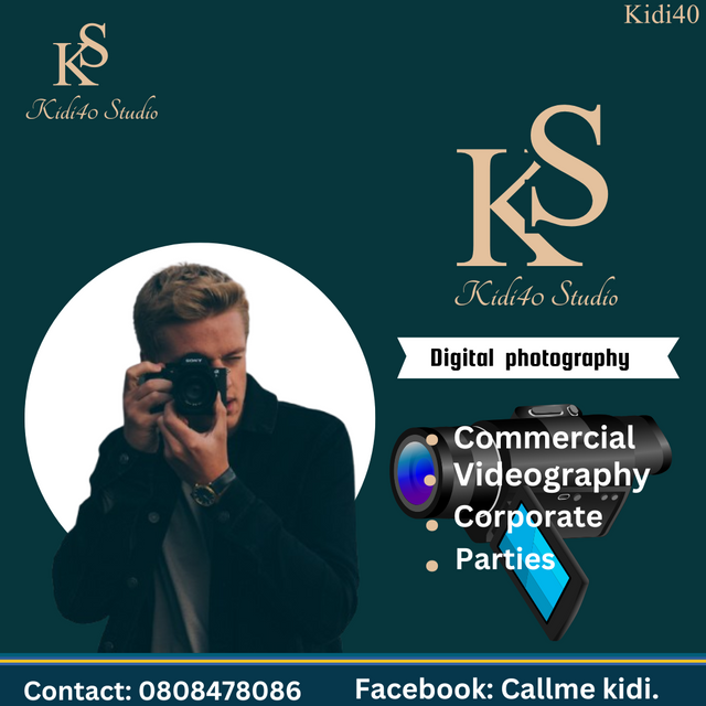
Design a simple flier for your brand and then strategically place one of the logo you made in the flier. |
|---|
Step 1.
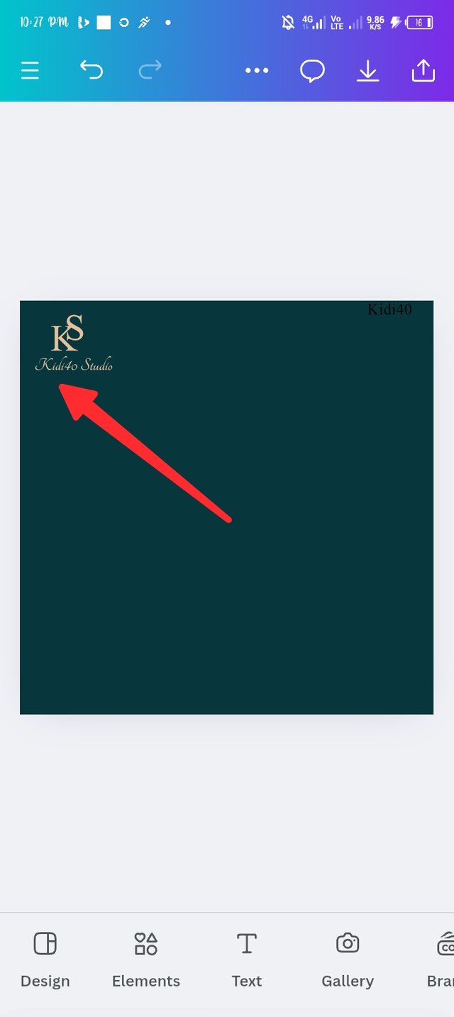
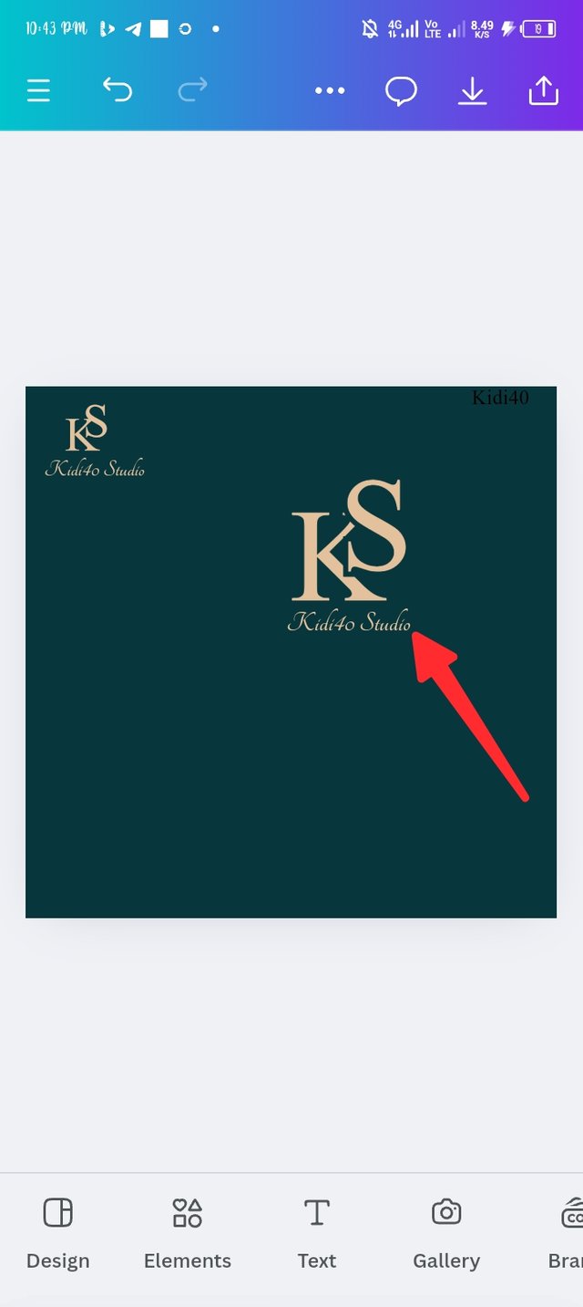
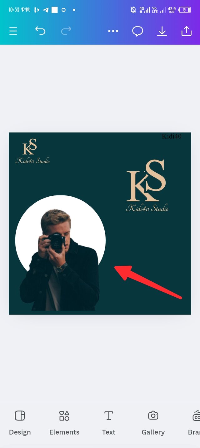
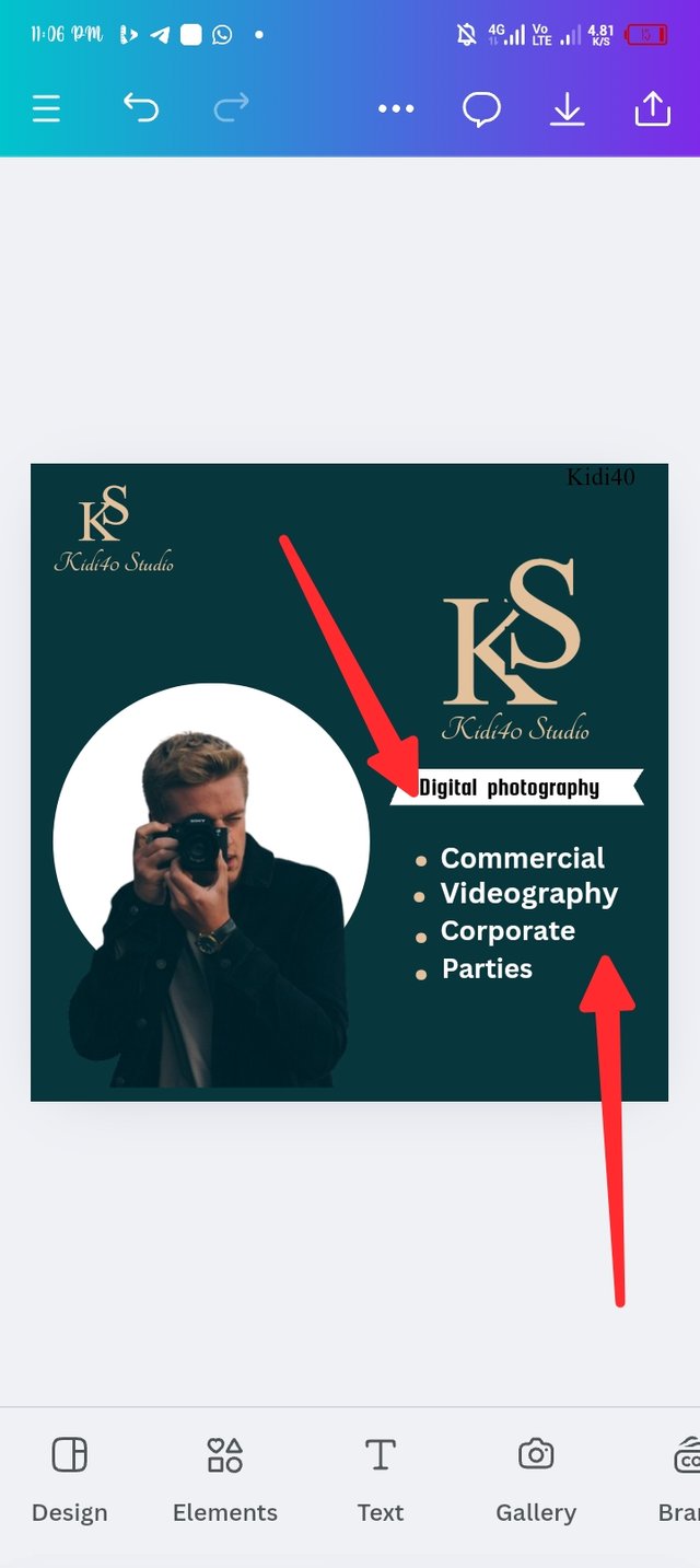
 |  |  |
|---|
Step 2
 |  |  |
|---|
Step 3.
 | 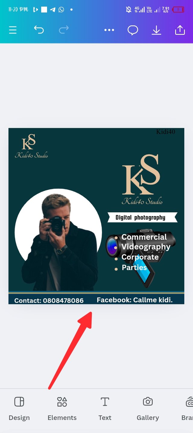 | 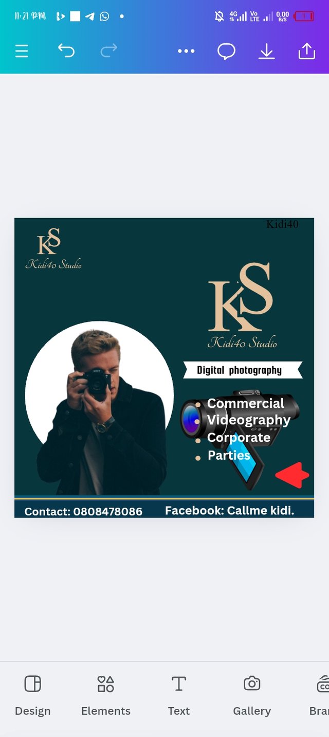 |
|---|
Final step.

Principle involved in creating the logos and flyer |
|---|
Emphasis, you can clearly notice how I engage emphasis in the design by making use of different colours such as *colour hex #e4c19d, #07363c and etc.
Hierarchy, looking at the text you can notice how I engage hierarchy, for instance the size, colour and brightness of my design are all vibrant and appealing.
Rhythm, I also engage the rhythm principle as the text are well organize and they all rhythm together, for instance, my logo in the right and left are all rhythm.
I wish I have time to more on this principles.
In conclusion, creating a logo that looks appealing requires a careful consideration and time. Understanding the types of logo is very crucial as it would help to create an appropriate logo that best describes a brand.
| I'm inviting @goodybest @alli001 and @kouba01 to join me in this engagement challenge. |
|---|
Cc: @lhorgic.
Screenshots are all mine. |
|---|

Best regards KIDI40 |
|---|
