SEC20/WK3: Typography and Practical Application.
Design by me, edited on canva.
Felicitations my dear coursemate, i believe you're all doing good and you're all experiencing a swift sleep especially with the falling rain. It's yet another week to continue our graphic design class with a fresh new phase of graphic design theory.
Discuss your understanding about typographic |
|---|
Typographic as the name implied is a unique strategies of arranging words in a design to capture the eyes. If we separate typo from graphic, it becomes the opposite definition; meaning that a typo can be seen in a graphic design if a careful consideration isn't taking into account.
Applying typographic in a design donates to an easy understanding, convey a message without distractions and make a particular design looks communicated and professional. At the same point, a design can look unattractive, misunderstanding, unorganized and eyesore if typo graphic is found.
In short, the same typographic that has the potential to promote a particular design can also disqualify a design if the basic principles like the hierarchy, alignment, White space emphasize and others are being ignored and the elements such as the font/typeface, style, colour amd others are been misused.
Research 3 other typeface categories not captured in this lesson. Talk about them and also give a visual representation of the typefaces. |
|---|
There's a whole lot of typeface in graphic design or should I say, typographic that when apply to a design, it looks charming and luring. In this aspect, I'll tour you guys on some various typeface.
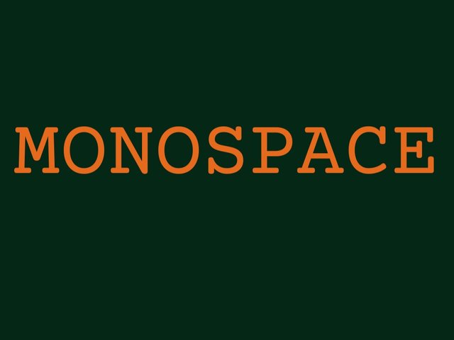
MONOSPACE.
Monospace typeface is a kind of typeface that has the same width for each or all letters, just like the name implied; it doesn't jam-packed instead it has some space that keeps each letter outstanding and in a uniform manner, it has some little extension at each edge that looks familiar to the slab serif typeface. examples of monospace typeface are courier prime, space mono and more. Sample is below.
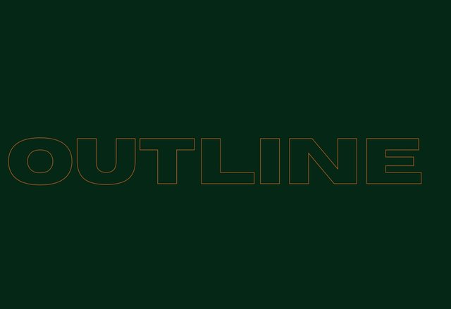
OUTLINE.
Outline typeface is naturally different from typeface, it has the hollow lines that formed a letters. Outline typeface looks like a sketch, the lines are very thin; most time the outline typeface is usually used for highlight purpose. Examples of outline are horrow, neoneon, brixton outline and more. Sample is below.
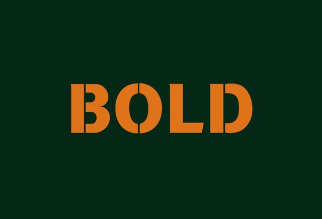
BOLD.
This is a typeface that has no extension but comes with a block or bold letters just like it's name implied. This type of typeface can be easily distinguish in a design because of its bold and high enhance visibility, because of this quality; it can be seem amd recognize even in a far distance. Example are aerospace bold, berry bold and more. Sample is present below.
Using a specific type face in a design requires a careful consideration because misusing these typeface can trigger the uniqueness of a design withdrawing communication which is among the importance of typographic.
Demonstrate your understanding of Typography just like I have done with my four example using the following guidelines below |
|---|
| TYPOGRAPHIC -1. |
|---|
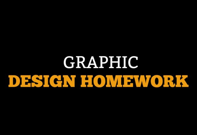
| SN. | ITEMS. | ANSWERS. |
|---|---|---|
| 1. | Typeface/font used. | Slab Serif/ Bitter, chunk five. |
| 2. | Colour Hex Used. | Background=#000000. Upper body= #ffffff. Lower body= #ef9d10. |
| 3. | Alignment used. | Center Alignment. |
| TYPOGRAPHIC -2. |
|---|
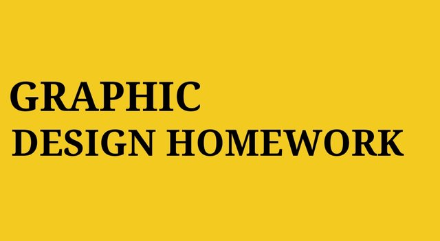
| SN. | ITEMS. | ANSWERS. |
|---|---|---|
| 1. | Typeface/Font Used. | SERIF/ Droid Serif. |
| 2. | Colour Hex Used. | Background hex code= #f3ca20. Upper And Lower Font Hex Code= #000000. |
| 3. | Alignment Used. | Left Alignment. |
| TYPOGRAPHIC -3. |
|---|
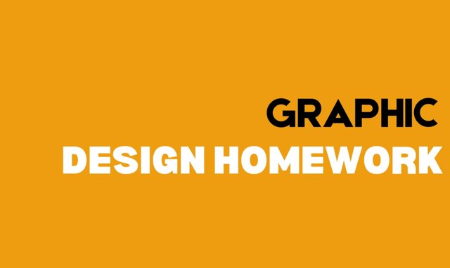
| SN. | ITEMS. | ANSWERS. |
|---|---|---|
| 1. | Types Face/Font Used. | San Serif/ Upper Font= Etna San Serif. Lower Font= Bernoru Font. |
| 2. | Colour Hex Used. | Background= #ef9d10. Upper Font= #000000. Lower Font= #ffffff. |
| 3. | Alignment Used. | Right Alignment. |
| TYPOGRAPHIC -4. |
|---|
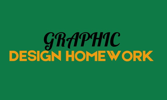
| SN. | ITEMS. | ANSWERS. |
|---|---|---|
| 1. | Typeface/Font Used. | Upper Font= Script. Lower Font= Sans Serif. |
| 2. | Colour Hex Used. | Background= #0e7a46. Upper Font= #000000. Lower Font= #ef9d10. |
| 3. | Alignment Used. | Center Alignment. |
In demonstration, taking a look at the typographic, one can easily spotlight the differences between the four designs and the principles of graphics design which we learnt in the previous class can easily be recognized.
For instance, it's easy to detect hierarchy in typographic -1 as the visual elements such as Typeface and font in different variant are all in actions. The three colours deployed emphasis.
Unity is also visible as they all look organized and supported.
Alignment is also spotted as the four design are been organized in different corners, from center alignment to left and to right alignment all in different corners of the design.
I adopt the white or blank space principle from the first class lecture. The typographics as seen in the pictures aren't jam-pack instead they keeps little space to each other.
I also implement this week course in design number 4. The typeface and font Script and Sans Serif are mix to produce the magic.
In conclusion, applying the different typographics in a design requires mindful attention while learning the concepts. I've been able to discuss typographic, typeface and font categories amd lastly produce the typographics the best way I can. I believe I'm following and paying attention to your course tactically.
Cc: @lhorgic.
| I'm inviting @bossj23 @patjewell and @goodybest to join me in this week Lecture. |
|---|
Designs are made by me through canva. |
|---|

Best regards KIDI40 |
|---|
Upvoted. Thank You for sending some of your rewards to @null. It will make Steem stronger.
Your post has been rewarded by the Seven Team.
Support partner witnesses
We are the hope!
¡Saludos amigo!🤗
No me queda la menor duda de que, la fuente Monospace es una de las consentidas por las personas que realizamos diseños jajaja y, no es para menos porque esta tipografía le da ese toque fresco e innovador a nuestro diseño evitando así que, las personas que tengan acceso a él, disfruten leer el contenido.
Te deseo mucho éxito en la dinámica... Un fuerte abrazo💚
This post has been upvoted/supported by Team 7 via @philhughes. Our team supports content that adds to the community.
Thank you @philhughes for the support, i really appreciate.
Thank you for sharing your post with me. You have explained well how you've put typography to the test.
I just love this learning course, as we can make use of it every day of our lives, especially here on Steemit.
Thank you for the invitation.
Let's keep on learning!
Thanks for stepping by with a kindly comment, of course learning is an everlasting process we keep learning even at old age.
Good evening Grandma, been a while.
Indeed! (•ิ‿•ิ)