"SEC20/WK1: Introduction to Graphic Design and Principles."
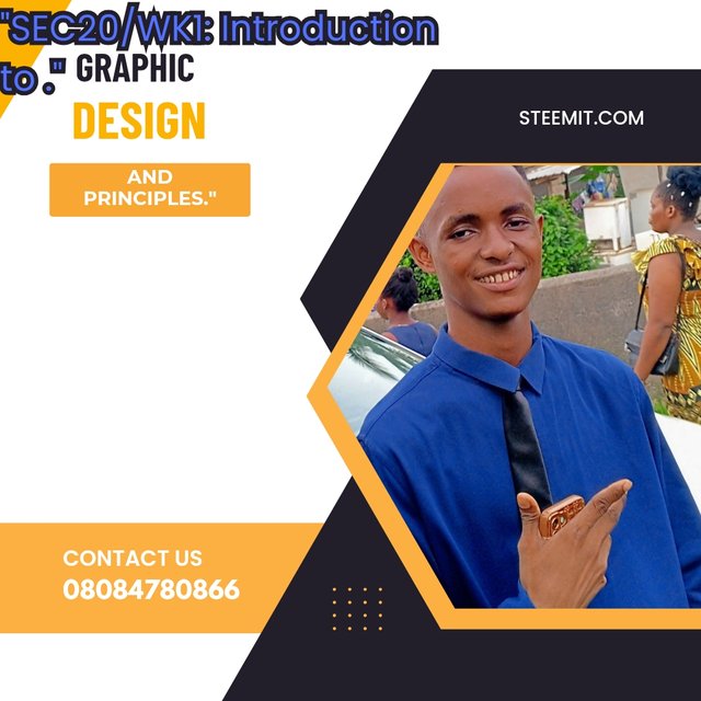
Design by me, edited on canva.
Let's assume you're exploring steemkids and parents community, then you encounter a whole lot of posts without pictures, you'll surely feel discomfort because they all look one style.
Now assume your going to a wedding ceremony, then you noticed that all the people's around are wearing a colourless and non-design outfit, you'll look confused right?
What about reading a chemistry textbook with no images, the whole stuff would probably not be understandable because there's no diagram to convey the plain text into a simple understanding.
In the above three situationship, with a normal sense of humor; one can easily understand that the whole world evolved graphic design and we can see it on almost everything the eyes can see. But what's graphics design and how does it works? This post will cover it all.
What is Graphic Design? Briefly Share with me your understanding about graphic design |
|---|
The word Graphic is originates from a Greek word Graphikos. In the Greek dictionary, Graphikos simply means writing or drawing. Conveying this idea, we can sight that graphic is an art that portrayed an object, for example drawing, painting and so on.
Design is a visual communication, it reflect on every the world can produce. When applying a specific design in an object, it rebrand the object, beautify it outlook, making it extraordinary. Design is what changes the world from ancient to modern.
Compiling graphics and design together, you can see that it aesthetically involves combining ideas and messages to produce something impressive and extraordinary, this involves creating or branding of Fliers, Shirt, Posters, Billboard and lots more.
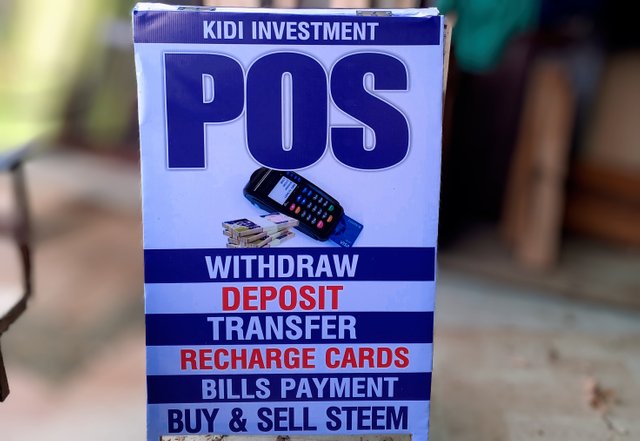 | 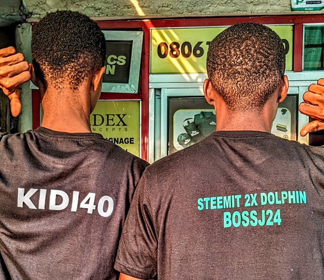 |
|---|---|
| POS business poster. | Branded shirt. |
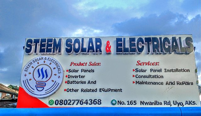
Billboard .
From the above pictures, we can see the beautiful and magical realm of graphic design, it add extra value to an objects and makes things look beyond expectations. Now look at the pictures, what are the visual techniques seen in the designs?
We can see colours, written words or typographic, images, hierarchy and more. Applying these techniques in a design produce something worth sighting. Honestly speaking, graphic design makes our world colourful and beautiful.
Pick any three of the principles of Graphic design and talk about them based on your level of understanding . |
|---|
Principle bring discipline and so it does in graphic design, structuring design using the right and appropriate principles gives a specific design an outstanding look. Adhering to my instructor, my three chosen principles of graphics design are as follows.
- Rhythm
- Balance
- White space.
| RHYTHM. |
|---|
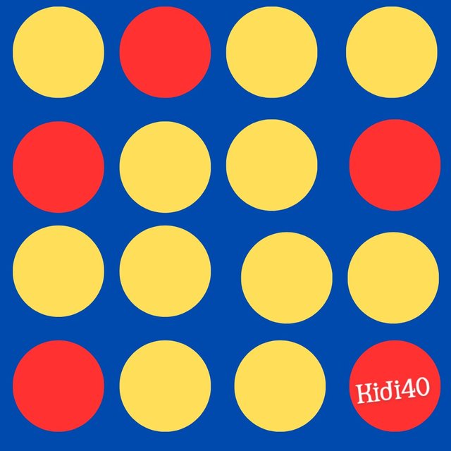 |  |
|---|---|
| Picture-A.❌ | Picture-B.✅ |
Rhythm is really crucial when it comes to positioning different elements in an organize and logical state. Rhythm restore sense of harmony into a design and it also creates visual flows, familiarity that can be guide through composition.
Picture A doesn't implied the principle of rhythm and we can see how it is been scattered. Picture B is the real design that applies the principle of rhythm, **the elements are well organized, the visual flow is visible and the elements are familiar. Picture B is purely design because the principle of rhythm s apply.
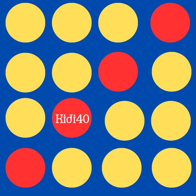
| BALANCE. |
|---|
 |  |
|---|---|
| Picture-A ✅. | Picture-B. ❌ |
The balance principle in graphic design is a technical and visual way of arranging or constructing all the edges of an elements in a design equally. It makes a particular design to look decent and well organized.
We can see the difference between the two pictures, picture A emphasize on how a design is equally aligned, neat and decent when applying the balance principle, meanwhile picture B says loud on how a design looks when the balance principle is been ignored, the design is visually unappealing and cluttered.
| WHITE SPACE. |
|---|
In a technical observation, a graphic design needs a white space to produce it's magic. Don't be confused with the word White space, it's a blank space theat are found in every design; there's nothing like colour restrictions, any colour if a designer choice is respectfully acceptable.
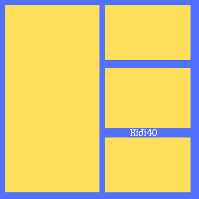
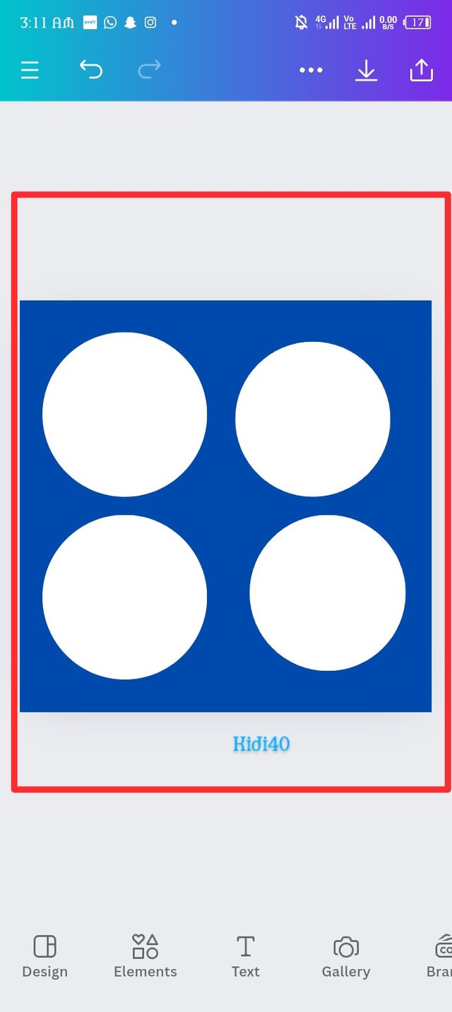
Practically show us how to make the graphical image below. |
|---|
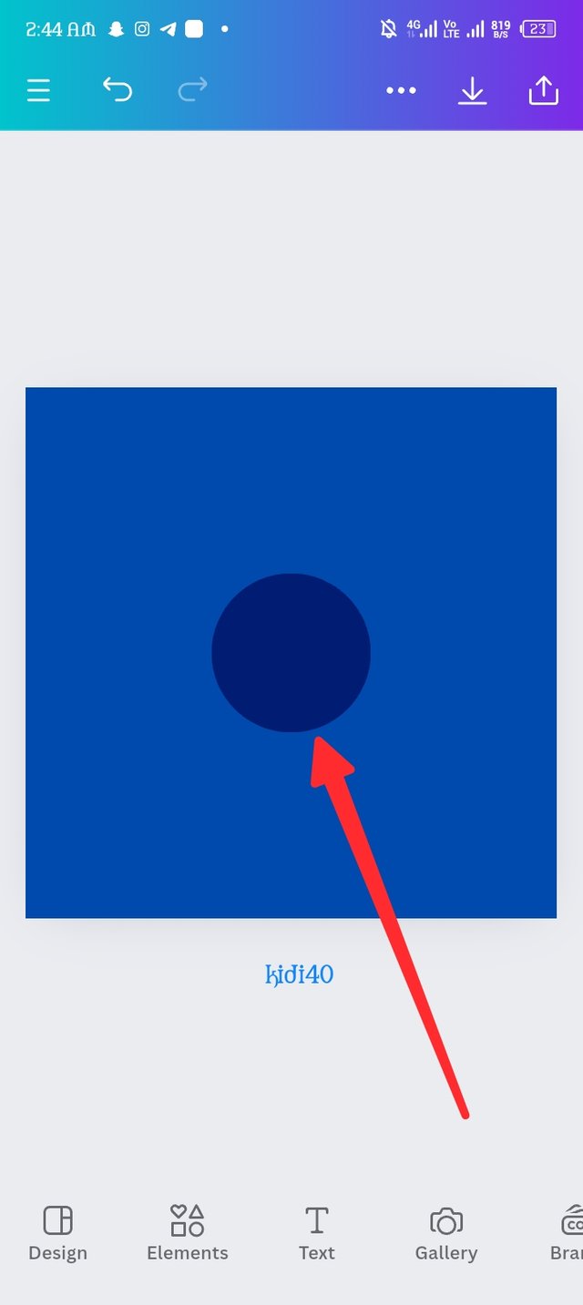
I believe the image wouldn't be easily made without a good graphic and design planning and a better tools like Canva application. It's actually my first time using canva for this I'm thrill to try my best.
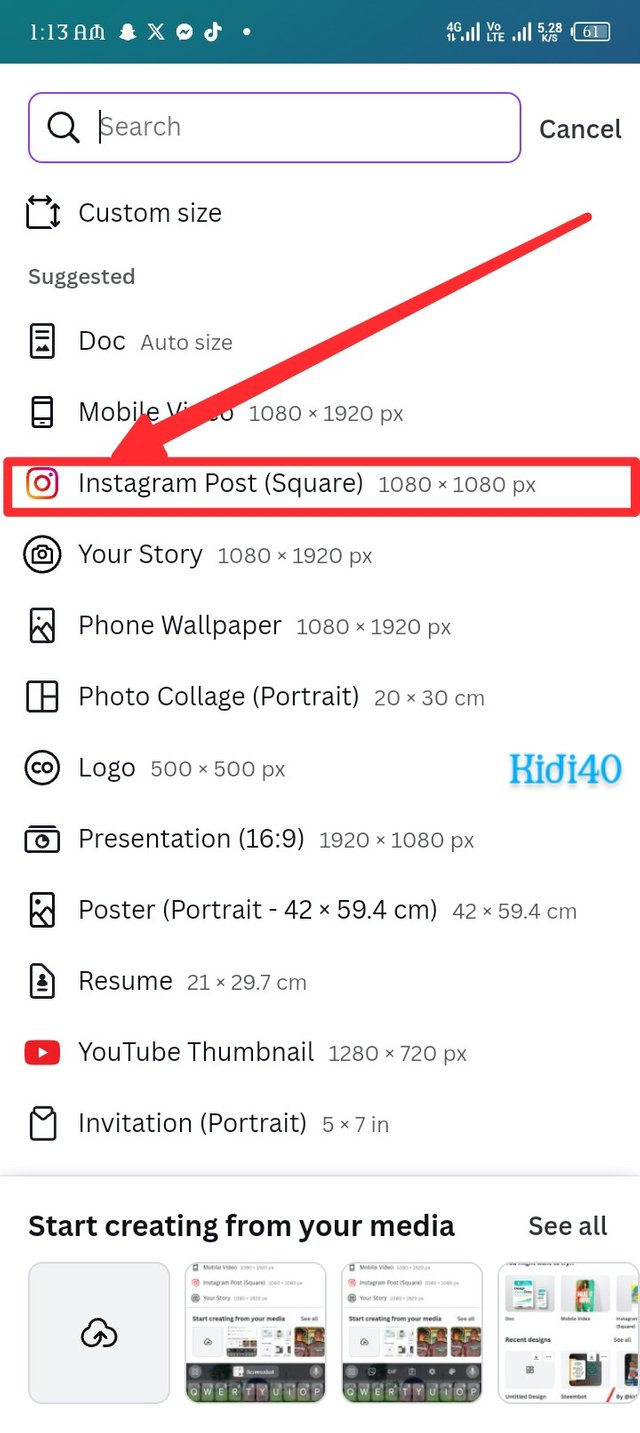
So i begins my journey by locating the canva application in my phone and launching it, it has a very beautiful interface with a great design. So i focus on the plus icon which i square red with a pointed arrow, a brand new interface appear and it consist of different sizes of design but i choose Instagram post (square) 1080×1080 p×. There's a new blank page with a square shape that appears immediately i choose Instagram post (square) 1080×1080 p× so i keep going.
 |  |  |
|---|---|---|
| Picture A. | Picture B. | Picture C. |
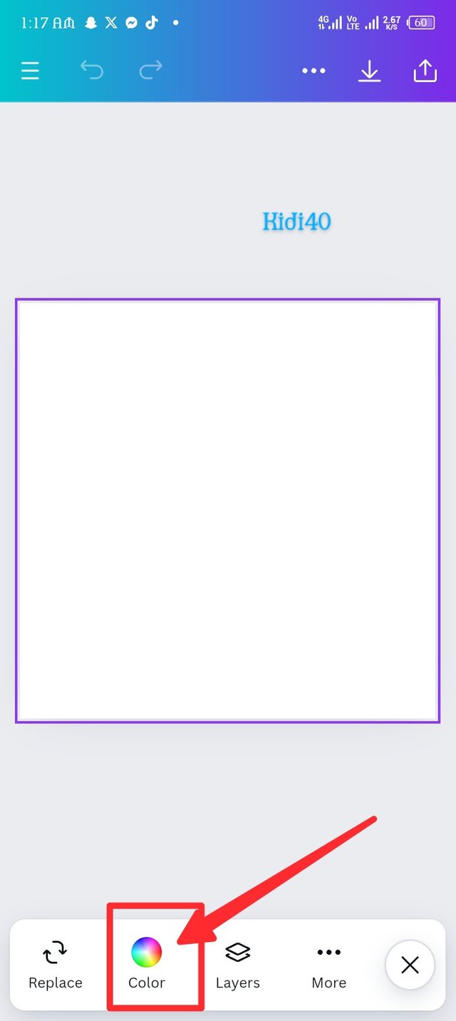
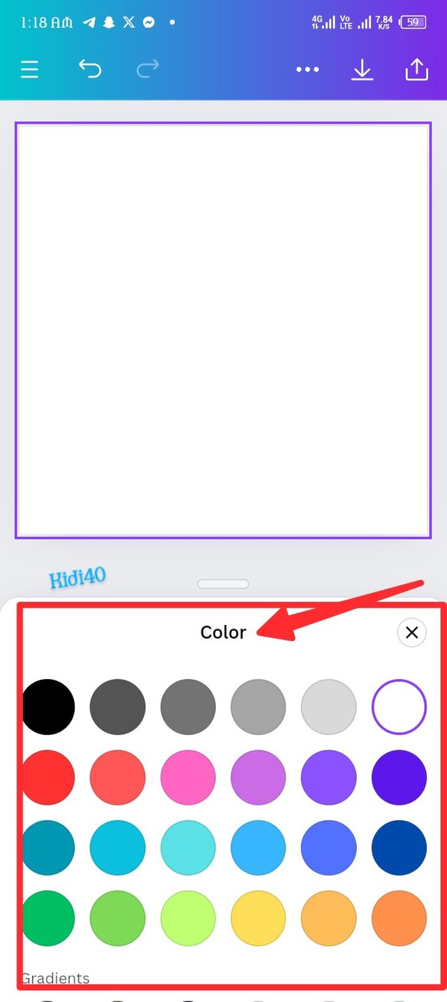
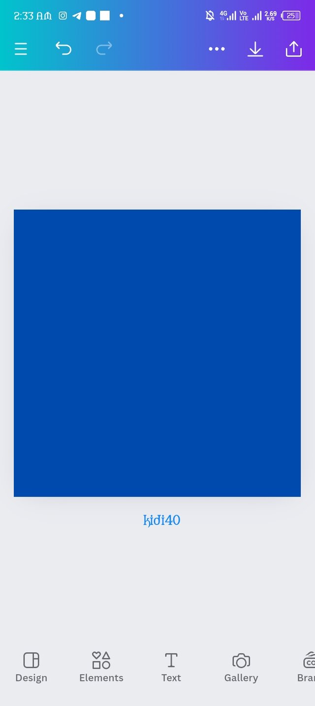
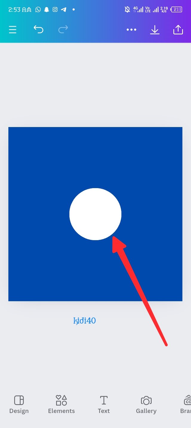
There's a button labeled color in the ending side of the layout which i click and it opens a couple of colours, i make my choice by click on my favourite blue; this change the whole layout from white to blue. Now that I have my layout in blue, the main deal is about the start.
 |  |  |
|---|---|---|
| Picture A. | Picture B. | Picture C. |
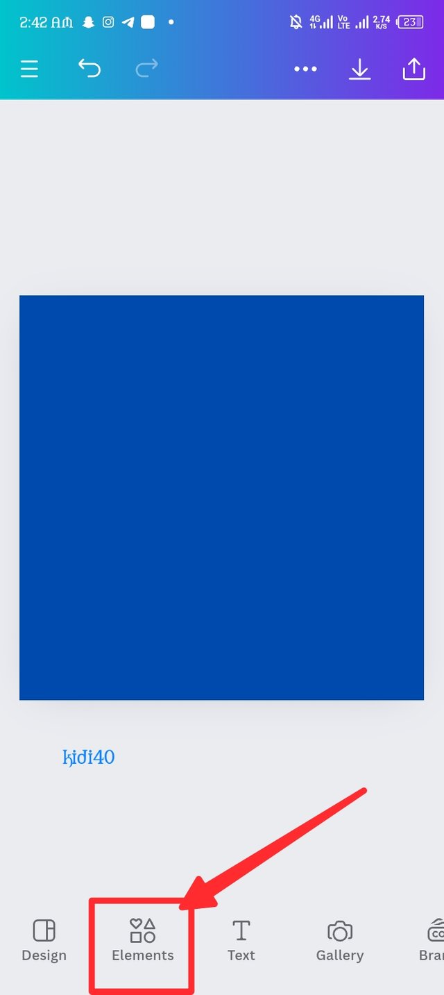
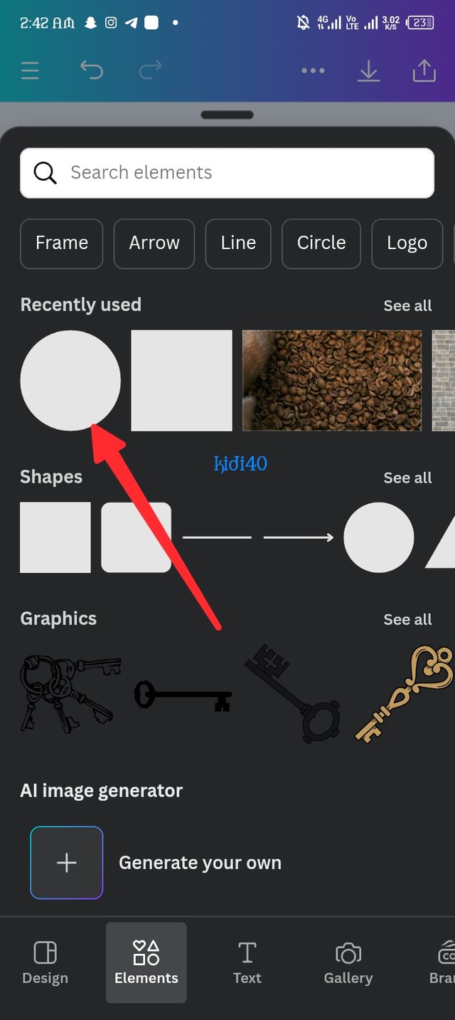
As an attentive student, i carefully focus on how to bring in the elements to create the magic. So I look down on my screen and locate the element button, i click on it amd it open a new Page which is full of several elements. So I choose my element, in the third image my element has been reflected on my board.
 |  |  |
|---|---|---|
| Picture A. | Picture B. | Picture C. |
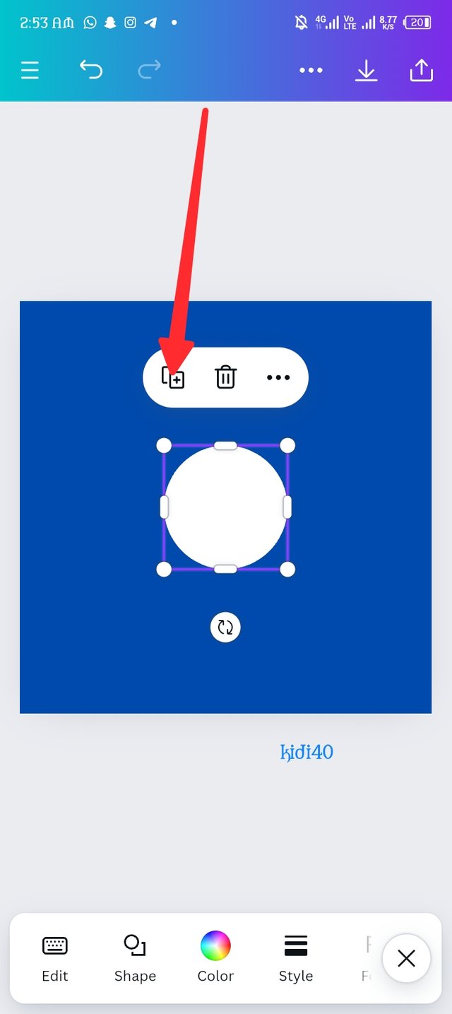
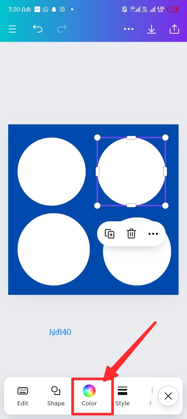
Because the elements isn't visually oriented, i decide to change the color to white so it can be visually attracted. The white color is here but how will I get my four element? Okay, there's a Plus sign in Picture B i click on it, the elements are now duplicated into four shape as seen in Picture C.
 |  |  |
|---|---|---|
| Picture A. | Picture B. | Picture C. |
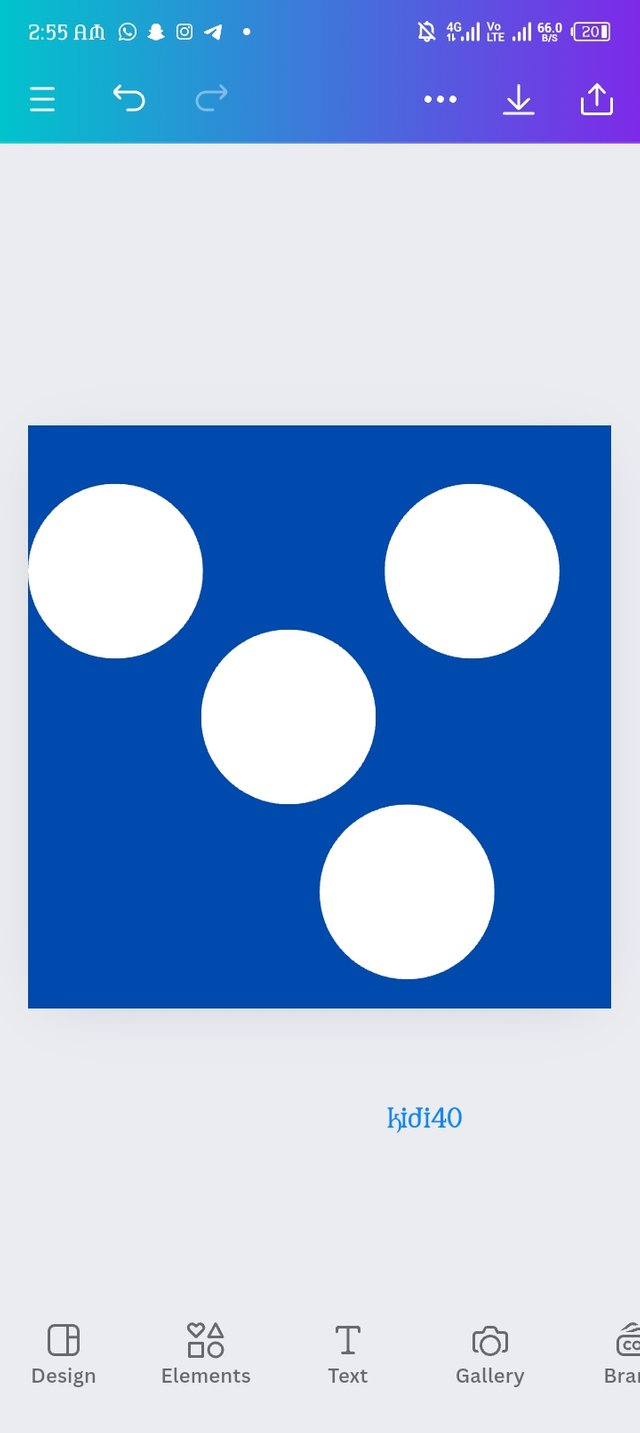
It's an arrangement hour now. The four elements are all scattered so i arranged them so the can be align. So I add the yellow color by clicking on one of the four circles elements and different options display of which one is color as seen in picture B. I hurriedly repeat the same process of adding color but this time around, I choose yellow and it appears, picture C says it all.
 |  | 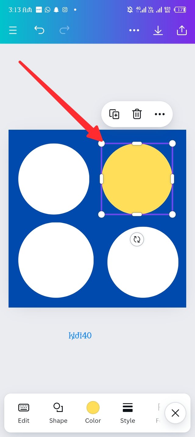 |
|---|---|---|
| Picture A. | Picture B. | Picture C. |
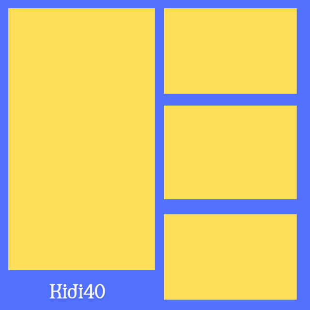
In every planting season, there's always a reaping season which farmers harvest what they sow, I've planted my design so it's time to harvest what i design by downloading the design i made. Let's see what the final design looks like.
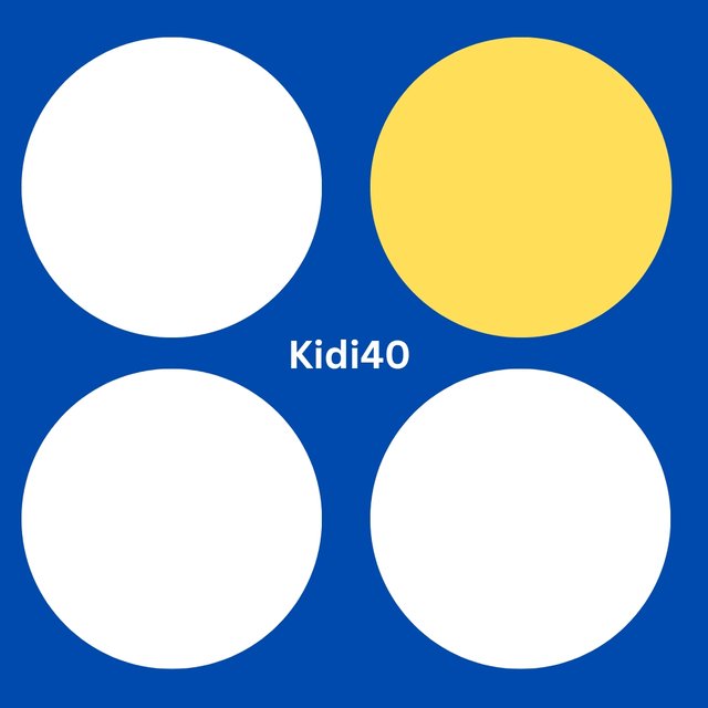
Design on Canva.
I've create something beyond my expectation, an extraordinary design that visually lure attention. Hi corper @ihorgic, I'm done with my assignment, please access and discipline me in where I made wrong. I'm very thrill to say thank you for guiding me create something I never knew I'll design today.
| Because of the love i develop for this subject, I've extend my invitation to @alli001 @goodybest and @saintkelvin17. |
|---|
Screenshots are all mine. |
|---|

Best regards KIDI40 |
|---|
Upvoted. Thank You for sending some of your rewards to @null. It will make Steem stronger.
Congratulations, your post has been upvoted by @scilwa, which is a curating account for @R2cornell's Discord Community. We can also be found on our hive community & peakd as well as on my Discord Server
Felicitaciones, su publication ha sido votado por @scilwa. También puedo ser encontrado en nuestra comunidad de colmena y Peakd así como en mi servidor de discordia
You've made an unexpected graphic design here, what will happen if you're consistent in this for the next six months, you can equally become a graphic designer 😁. I love your graphics, thanks for the invitation.
Thanks for your comments, learning makes perfect and i believe as Time goes on, improvement will surely come. Best wishes 🤞
Hello @kidi40 thank you for participating in this week's lesson. We have assessed your entry and we present the result of our assessment below.
Feedback:
• You have clearly defined Graphic design the way you best understand it, even with a practical life example.
I appreciate the effort you put into it.
• Your selection on the principles of design is nice coupled with your comprehensive explanation. It cool to see that you used corresponding visual of these principle to explain your points which is quite commendable.
• Finally, You're practical looks really nice in it presentation, although you produced something completely different from what you were asked to do, I understand you wanted to stand out, having understood the topic so well but then let's stick to the task first then we can freestyle after doing what is required of us. In all, you did a great job. I hope you keep up with the energy level. Weldone.
Regards
@lhorgic❤️
Hi teacher, thanks for your lovely assessment and for the correction. Next time I'll stick to the given task, I'm eagerly waiting for next season..😊
Your presentation is awesome, I never knew kidi40 has a pos machine, that's amazing, you have shown us a post very exceptional to prove your understanding of the concepts, I am attracted to dark background and I saw your contact on the first image, if I am so much engaged and decide to give you a design to make my preferences is a dark background, though all colour have their meaning, the printer work in graphics design is captivating especially the steemsolar sign post