Summary of my involvement to Communities that is now getting released to Steemit.com
View this post on Hive:
"We're beginning to roll out communities. Stay tuned for updates. " says the notification banner on https://steemit.com/ 🎉🎊🥳
Congratulations and thank you @roadscape and his team at Steemit Inc. for the hard work during those last months. The Steemit frontend is now powered with a critical features allowing us Steemians to create communities for our content creators.
As a community developer, I contributed with small code changes some of which have a big impact on the project.

Light relooking of Steemit.com
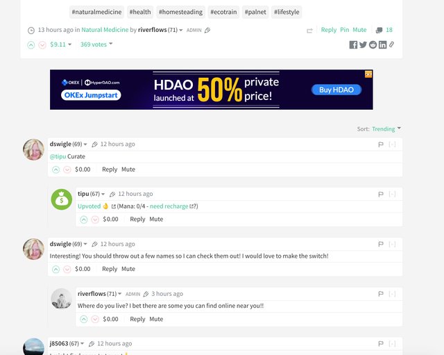
This is the first important change I added to the Condenser. I've previously redesigned the comment section of a blog post view to make it more readable. With this next relooking, I went relooking the comment section a bit further to add more contrast and make each comment block stand out and even more visible.

As you can see, I've introduced a different background color from the background of each comment blocks. That creates a bit more contrast for readability and separation. The post article above the comments has also been restyled to make it as wide as the comment for nicer view, however the effective width of the article was not changed as to not mess up with the layout of existing posts.
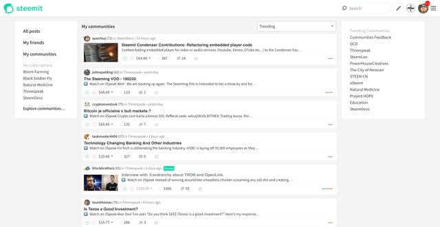
As you can see on the top screenshot, the feed list has also been redesigned to align with the new look of the comment section. Each post summary block in the feed list is now more compact, allowing display of more posts in the list. This has been worked on multiple times thanks to the feedbacks from @roadscape and @therealwolf.
Pull request: https://github.com/steemit/condenser/pull/3426
Author dropdown
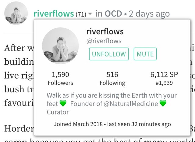
I revamped the author drop down to make it load asynchronously after page load, this allows the Condenser to fetch more data related to the author.

Pull request: https://github.com/steemit/condenser/pull/3522
Multiple image upload and drag-and-drop like GitHub
Another nice feature I added is for the post editor. You can now upload multiple images at once and you should still be able to continue writing your post and the images will get inserted where they should be instead of right in the middle of what you are typing, just like in GitHub. This was requested here: https://github.com/steemit/condenser/issues/2832
Drag and drop is now also supported.
Pull requests:
- https://github.com/steemit/condenser/pull/3622
- https://github.com/steemit/condenser/pull/3376
- https://github.com/steemit/condenser/pull/3638
Other minor changes
- Fix broken styling on the post preview before an ad in the post list
- Add some basic css for the slate editor
- add the loading indicator on the community index page
- Make design of communities list consistent with feed list
- Adding links to posts, comments and payout from profile menu
- Only show Follow button in user profile banner when we are sure
Vote for my witness

On Steem, Witnesses are playing the important role of providing a performant and safe network for all of us. You have the power to choose 30 trusty witnesses to package transactions and sign the blocks that will go in the Steem blockchain. Vote for me via SteemConnect to help me do more useful projects for the communities.
I thought communities was accomplished the last week from Justin Sun and his TRON team. Is it not true?
lol
Thanks for all you do @quochuy!
My pleasure
Oh how I missed notifications - nice to know when someone comments back or tags you 🙂
Yep definitely important.
We should implement proper browser push notifications on the Condenser too.
absolutely fantastic update!
This has renewed my excitement in the future of the platform by 110%. communities are fantastic and make it so much easier to find and filter to the places of personal interest.
Notifications have long been a feature that we have needed and so happy to see them arrive.
I love the multi-image upload and drag and drop feature but yet to test them myself.
well done team!
Thank you :-D
Great Call with the comments ! It's totally better !!! and for the rest of the update I am still discovering, great works thanks a lot !
upvoted !
Thank you.
Posted using Partiko iOS
Except the UI (btw those paddings are not possible, it gives a bad feel), I really appreciate what you made! Keep up the good job man.
Thanks for the feedback. Some paddings were done a certain way due to other requirements but I’m sure things will get improved progressively now that Communities is out.
Posted using Partiko iOS
Very good achievement! Go ahead with those favorable initiatives. Thank you, @quochuy.
PS: I tried to vote you as a witness but something is wrong with SteemConnect that doesn't recognize my active key. I'll try another way.
Thank you.
Try https://steemitwallet.com/~witnesses
Posted using Partiko iOS
Thanks @quochuy! :-)
Thanks for your help with the PRs
Posted using Partiko iOS
New and improved design is better than previous one also ading community's feature is also very helpful and cool, great work keep it up @steemit developers team I really appreciate your efforts
Yep, great work from all devs involved
Posted using Partiko iOS
Great update and nice work! You back in Ausland yet? I was actually near your work today and thought about you straight away :)
Thanks dear. Yes, I'm now back to Oz. Working from home at the moment, will return to the office soon.
Great job @quochuy.
I wonder if “tag search” implementation is doable. It would be cool
Maybe, to be investigated
Posted using Partiko iOS
Potentially with Hivemind. I will ask around
Posted using Partiko iOS