Full Analysis Dashboard | 7/11/24 | 10% beneficiary to steem-nation
Assalamualaikum everyone. I hope all of you are fine and enjoying a happy life. I am working on the project. This project is the most detailed analysis I have ever done. I took data from the Internet because when I practice on any project, Kaggle is the best source for the data set.
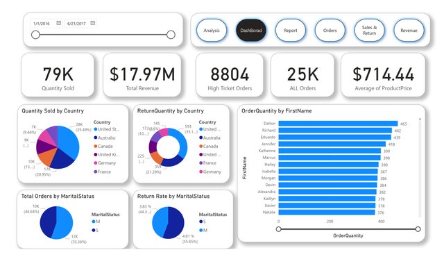
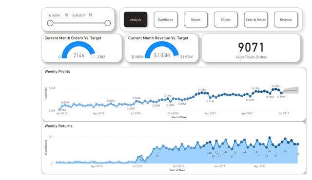

This will be the class project that I have done before the end date. The main thing is this data has a worldwide range. You can see in the above picture I have these data set files. See the first pie chart for which country has the highest quantity sold. The beside this there is a donut chart that mentions the return orders. This is a part of any business. The main key for any business is its writes audience. I have made 2 pie charts for quantity sold and also return by marital status. By this chart, you can change your audience and boost your sales.
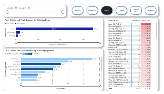
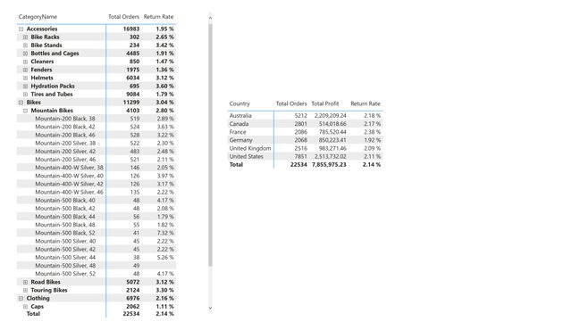

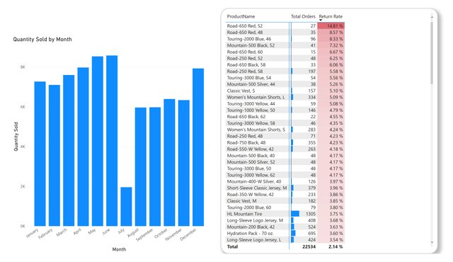
These are some major techniques used in this report. I use a drill-down approach to more clearly visualize data and easy to understand. This page has more details page for this dashboard. These are important charts in every DashBoard. They help to specify things in little time. They have a beautiful representation. All the charts are responsive to each other. When you click one chart you will see strands will be changed along the product or city.
Thank you for reading this blog.
Regards:
@ahsaniqbal24