SEC S19W3 || Animation, Transition & Transform (HTML5+CSS3)
Exercise 1: Text Graphics and Animation.
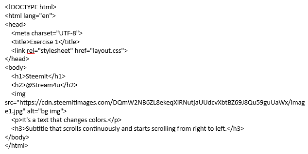
Created web page file "Index.html" with following HTML code.

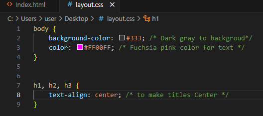
In layout.CSS file;
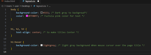
- Apply a dark gray background to the entire document and fuchsia pink text color by default, center the titles.
In this section, we will apply the dark gray background to our whole document. For text color fuchsia pink by default. Also will make all titles at the center point.
Code Input
Outout
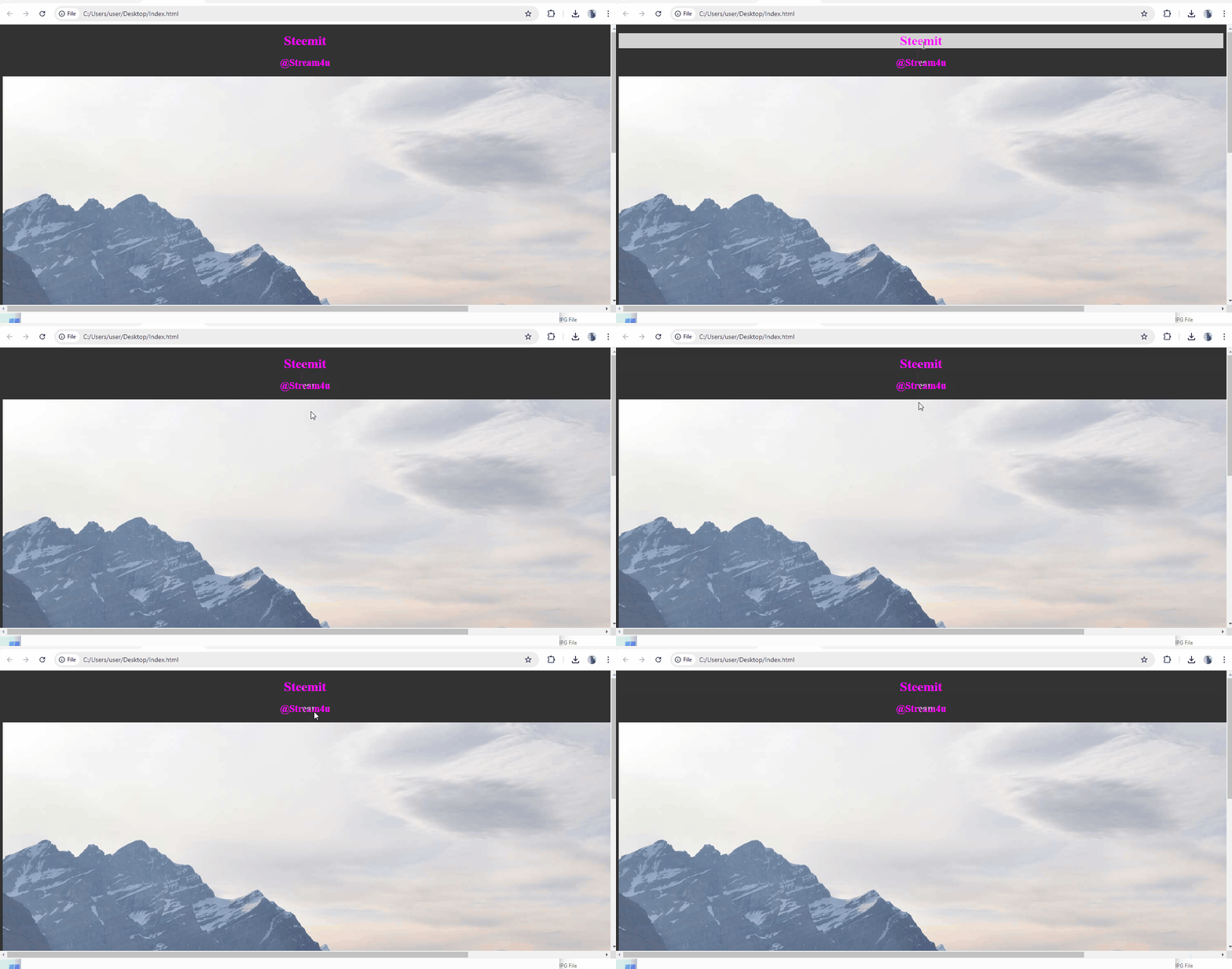
- Apply a light gray background When you move the mouse cursor over the page title.
In this section, we will apply the light gray background when mouse cursor move over the main page title which will be heading 1.
Code Input
Outout
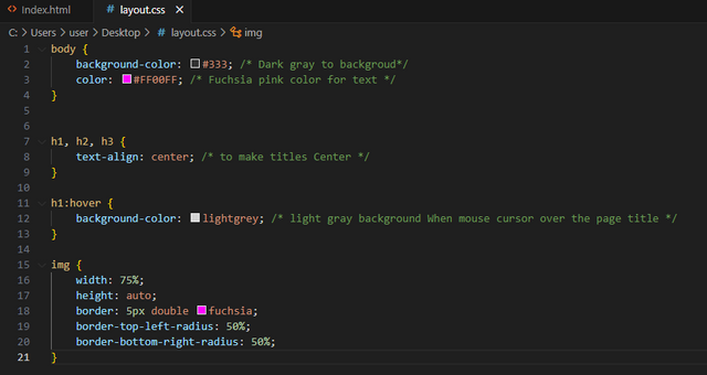
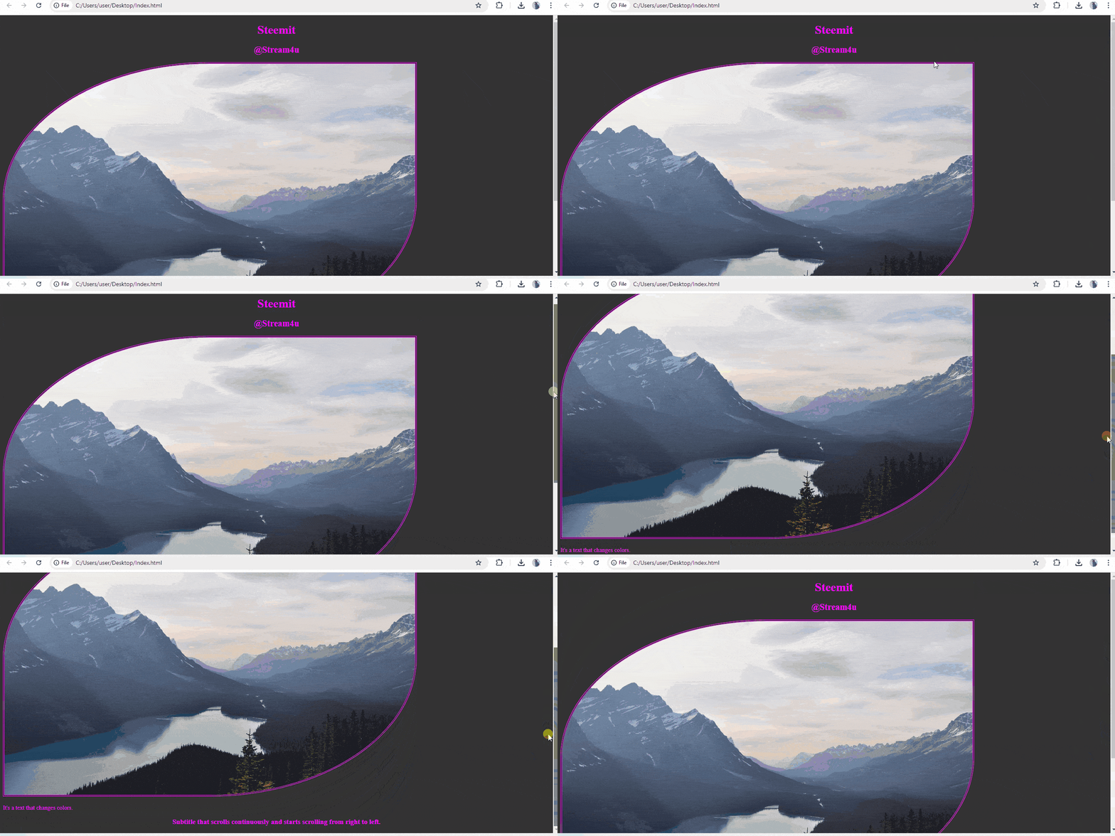
- Apply a double fuchsia color border to the image, an image width of 75% and an automatic image height and rounding of images by 50% in the top left and bottom right corners.
In this section, we will apply the double fuchsia color to image border with image width of 75%. Image height will remain automatic. Will make image rounding with 50% in the top left and bottom right corners.
Code Input
Outout
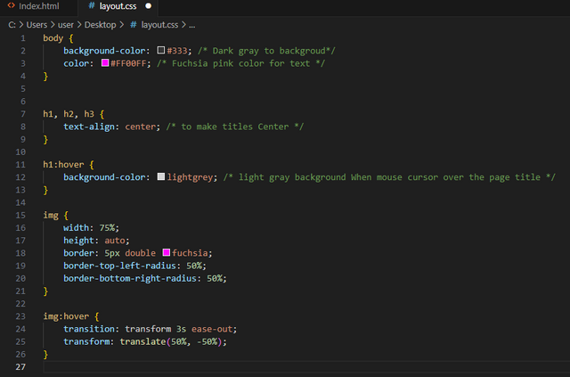
- When you approach the mouse cursor over an image a transition is triggered allowing you to move its rounding towards the top right and bottom left corners. This transition has a one second wait before triggering. It lasts 3 seconds and is fast at the beginning and decelerates at the end.
In this section, we will move image towards the top right and bottom left corners when mouse cursor on image.
Code Input
Outout
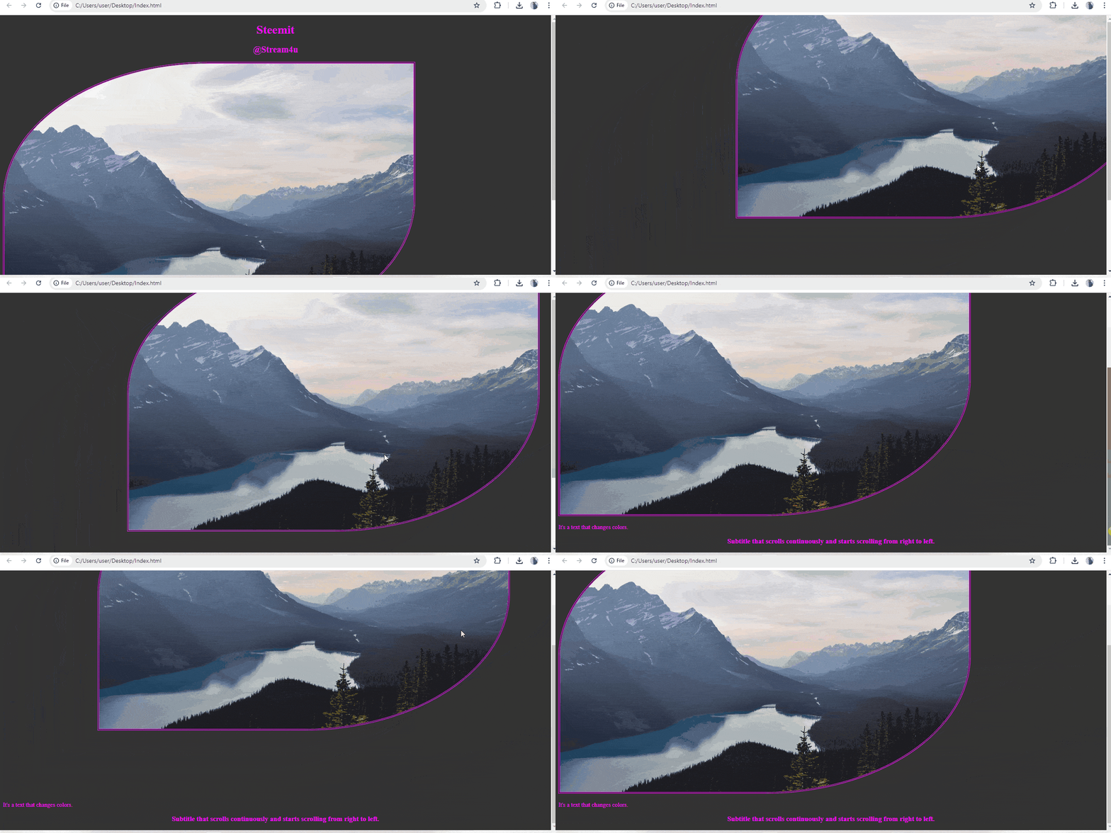
- an animation is performed for the text. It consists of changing the font color and the background color.
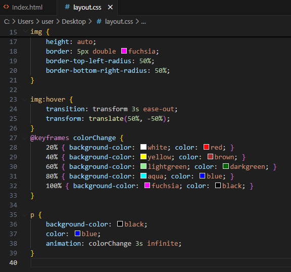
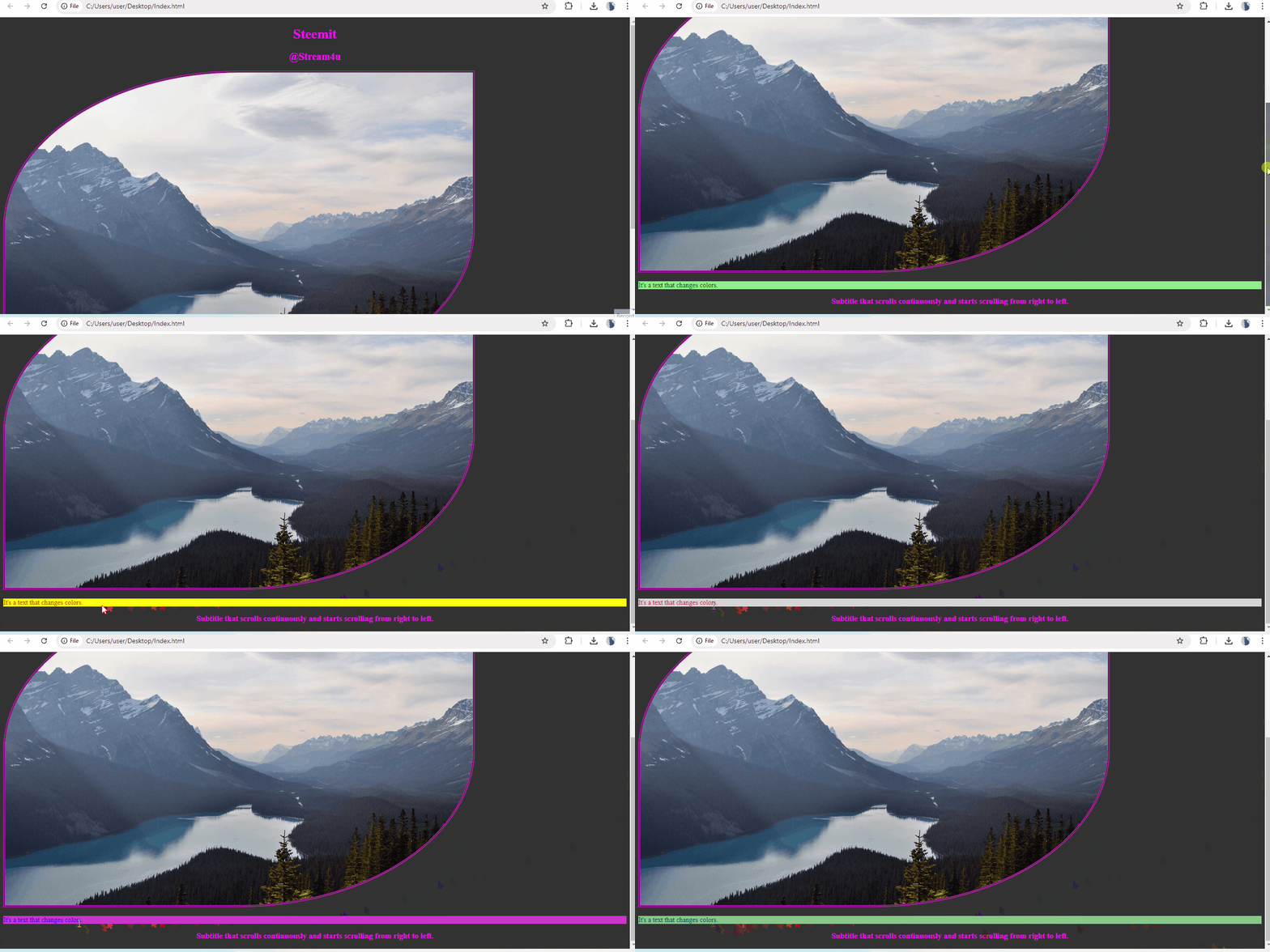
In the initial state the paragraph has a black background color and a blue font color. The colors (background, font) change in 5 animation intervals respectively as follows: (white, red) → (yellow, brown) → (light green, dark green) → (aqua, blue) → (fuchsia, black ). The animation lasts 3 seconds and loops alternately infinitely many times.
As our default color for text was blue and its background color was black. In this section we will change the color for text and its background with different colors and these colors will changes every 5 animation intervals respectively. Also, these changes will remain in loop with never ending time. In these 5 animation intervals we will change the color for text and its background like follows;
Code Input
Outout
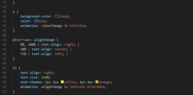
- An animation allows you to change the alignment of the last title. The title is initially right aligned with a yellow color shadow and an orange color shadow, font size equal to 150%. The animation allows you to change the alignment in three intervals as follows: right then center then left. The animation lasts 1 second and loops alternately 30 times.
In this section, we will change position of our last text which is heading 3 (h3), the position will change from Right to Center and then Center to Left.
To change this text position, we will use "@keyframes alignChange" which will assist us for changing the text position at specific time interval. The font size sill set to 150%.
In Text graphic, we will give shadow color to text Yellow and Orange. We will set this text position change animation in loop with no end time, means it will continue change the position.
Code Input.
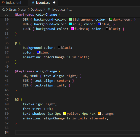
Outout
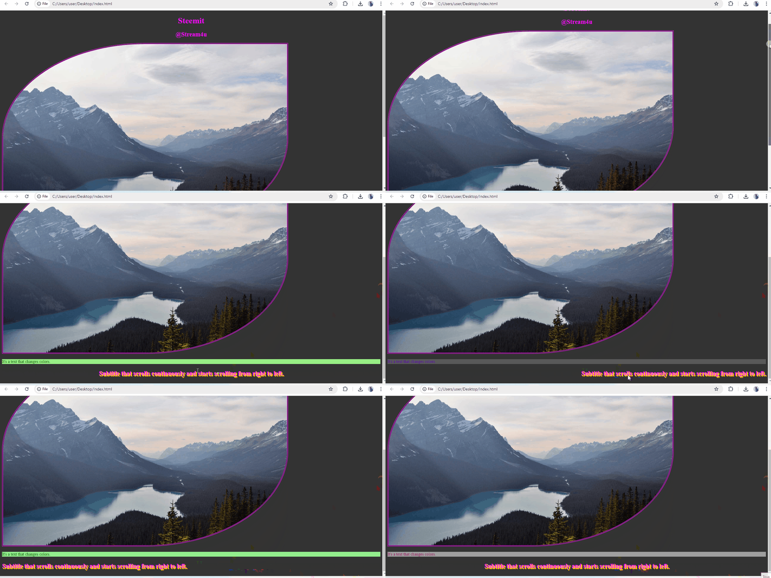
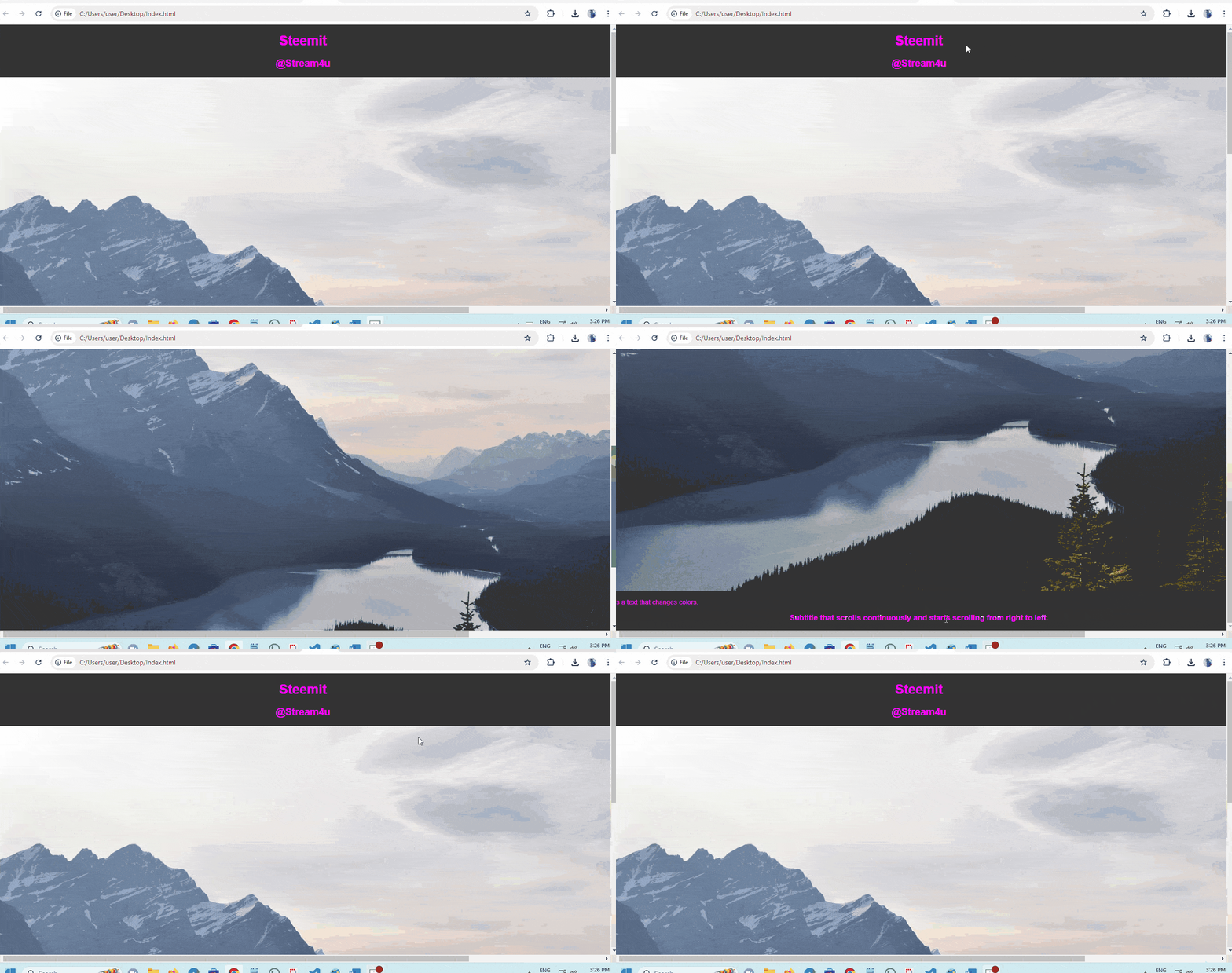
Screen capture of completed pages in the browser.

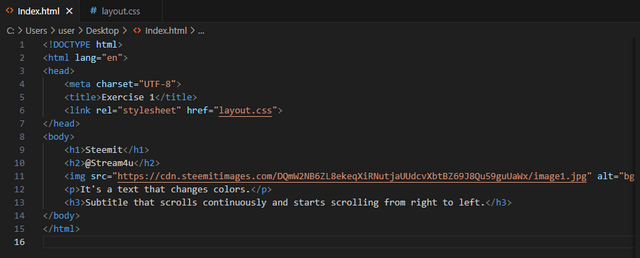
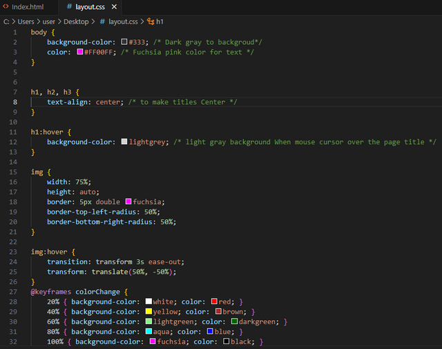
Screen captures of the HTML and CSS source code.
- HTML Source code
- CSS Source code
Exercise 2: Create an image gallery in HTML5 and CSS3.
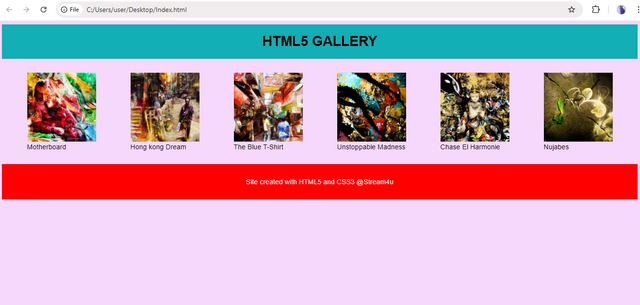
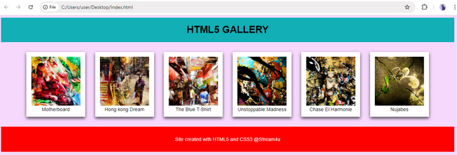
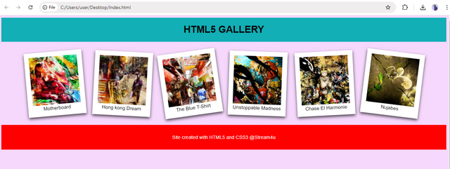
- Create the structure of your page so as to have the following result (this screenshot is also in the archive in better resolution) :
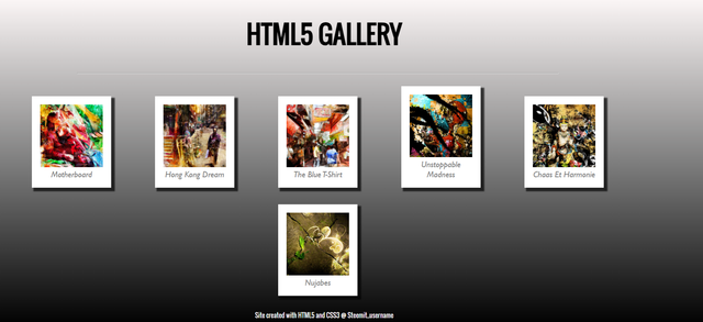
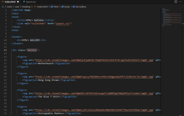
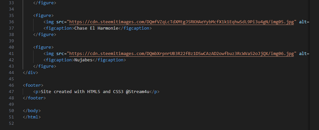
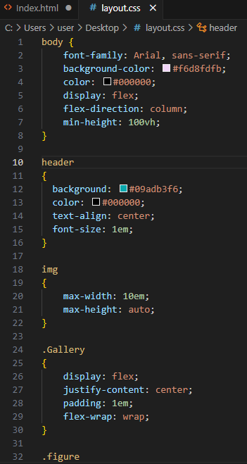
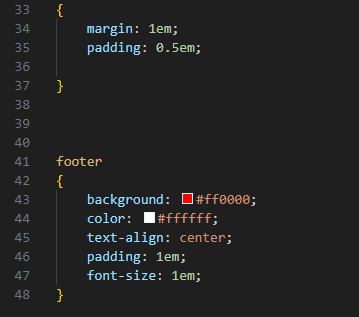
In this section we will use 6 different images and align them horizontal with gap difference between each image. Along with it, we will add header and footer and also apply color to them.
Code Input.
HTML
CSS
Output
- CSS Shading
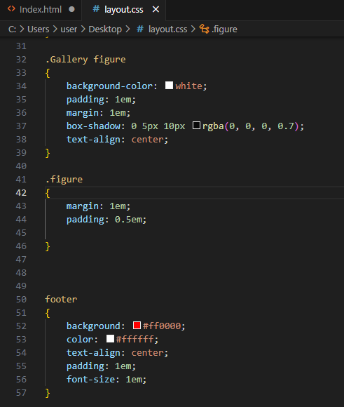
Apply a shadow to your thumbnails to obtain a Polaroid effect. CSS3 makes this possible thanks to the box-shadow property. Based on the box-shadow documentation, create a black shadow of 70% opacity offset by 5 pixels and with a gradient.
In this section, we will apply the shadow to each images with box-shadow.
Code Input.
Outout.
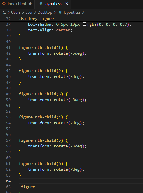
- CSS Rotation
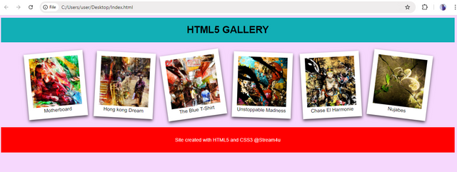
Apply a rotation to your thumbnails. Using this pseudo-class and combining the rotation angles, give a random look to the placement of the thumbnails.
In this section, we will apply the random rotation look to each image.
Code Input.
Output.
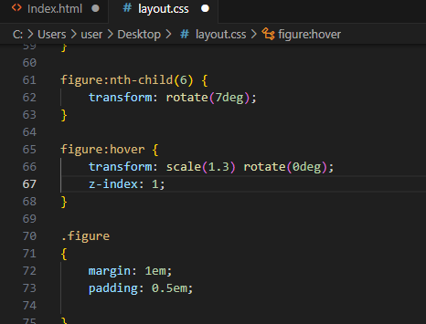
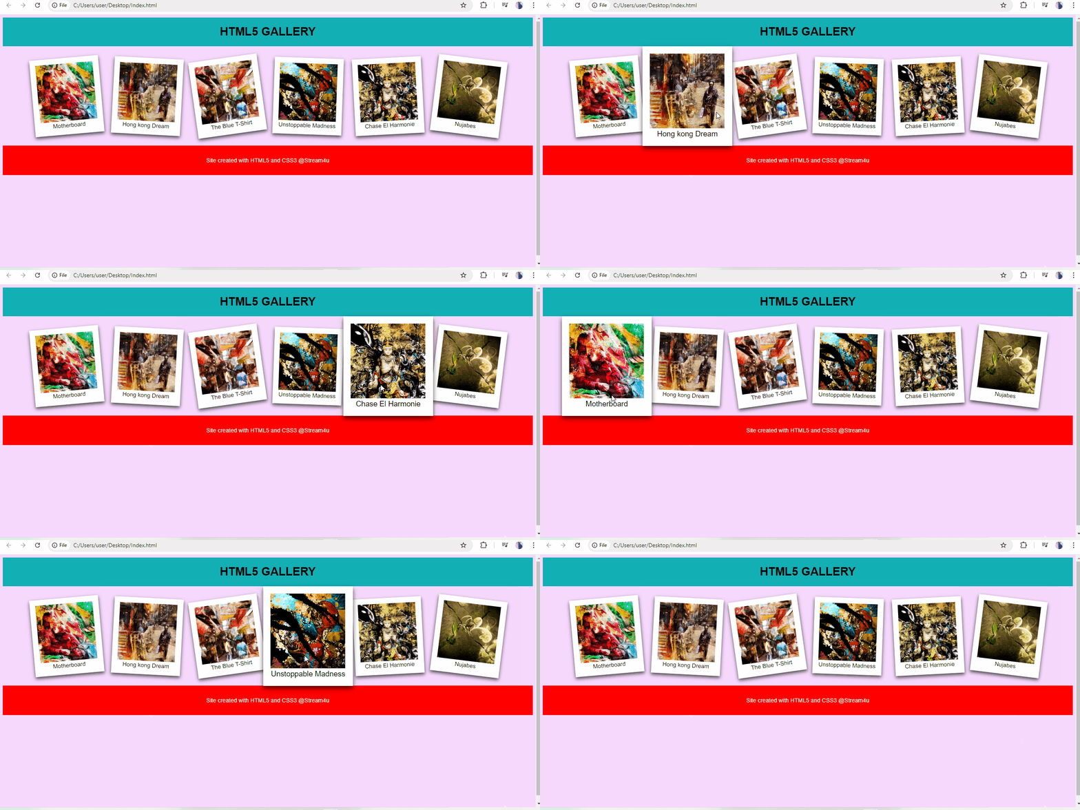
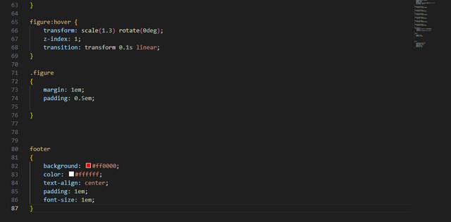
- Enlarge images when hovering. When hovering over the thumbnail, enlarge it with a ratio of 1.3. You will also make sure that the rotation is restored so that the thumbnail is straight.
In this section, we will make each image enlarge with straight position when mouse cursor on them, once mouse cursor moved from image, the image will back to its rotation place.
Code Input.
Output.
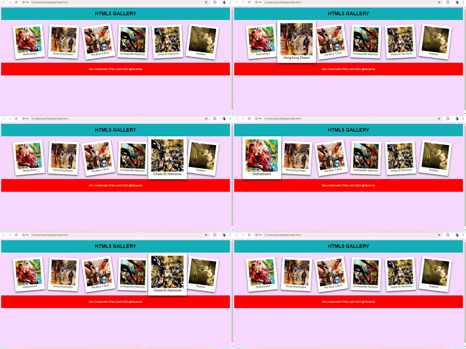
- Animation
Finally, to make the enlargement smoother, you will use your first CSS3 animation property: transform.
Place a 100 millisecond linear animation in the :hover pseudo-class of your thumbnail.
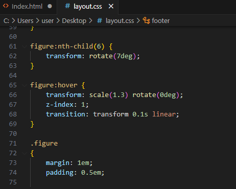
In this section, we will add 100 millisecond linear animation within :hover pseudo-class to make image enlargement smoother.
Code Input.
Output.
- Screen capture of completed pages in the browser.
- Screen capture of the HTML and CSS source code.
HTML source code.
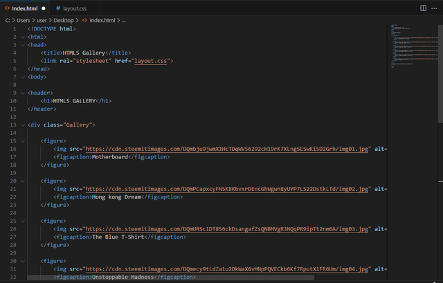
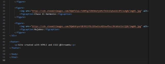
CSS source code.
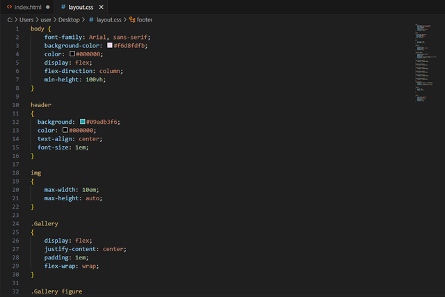
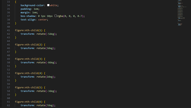
Images used in this blog are taken from source.
Author,
@steam4u
If you like this blog, you can join me in the comment section of this blog.
Hola amigo hiciste un buen trabajo
Yo no he podido participar de este curso de diseño web por mi computadora, actualmente los steem que me estan llegando los estoy destinando para arreglarla, espero que en menos de 15 días tenerla lista y quizás, tener la oportunidad de participar!!
Saludos!! Gracias por la invitación
Thank you. I wish your computer get ready soon.
Greetings brother you done your task job perfectly. Each and every step explain very well. I appreciate your hard working. Keep growing up with steem. Image gallery looking Fabolous. I wish you more success.
Thank you for your kind word. My major time was spend in image gallery and really does not expect such great output.
On Twitter X - SEC S19W3 || Animation, Transition & Transform (HTML5+CSS3).
Hi @aneukpineung78, @dexsyluz, @hamzayousafzai
The contest is about to ending, still I would like to invite you to check this contest. The details about this contest, you can find here: https://steemit.com/dynamicdevs-s19w3/@kouba01/sec-s19w3-or-or-animation-transition-and-transform-html5-css3
it is interesting, i planned to join but i couldnt make time .... Thanks stream4u, maybe next time.
Upvoted. Thank You for sending some of your rewards to @null. It will make Steem stronger.