"SLC21/WK2: Introduction to Logo Design
Hello friends!
Welcome to my blog. Logo design is an important part of any organization given its first expressional influence on viewers. Simple and nonambiguous logos tend to drive memorability and recognition in consumers' senses.
Logo design is simply that first identity that represents us even without our presence where we have our brand or personality. It is a vital part of visual creativity and brand visibility. Some would say that it is the facial expression or impression received by their organizations while showcasing other eye-catching values.
In creating a logo design we have to bear some basic principles in mind as this may make or mare our full representation of our brands. Many companies have excelled and made impacts and market penetration through visual visibility from their logos. That is to say; our twin personalities have to be well-created to represent our originality.
In designing a logo that best fits us, we have to take note of the following principles;
Simplicity: Our logo designs should embrace simplicity of purpose as one of its core elements. The company's message should be transferred and represented without complicity or complexity. No wonder most high-valued brands today have the most simple logos across the globe. Just like the mentioned golden rule, "LESS IS MORE."
Memorability: A good logo should be able to leave imprints on viewers' senses even after leaving the space where these logos are found. A brand that is easily forgotten is not ideal for use.
Timelessness: A good logo can provide an eternity pattern. It should be able to stay across decades and still able to maintain value. Simple use of elements that are not trendy should be created to remove the possibility of being outdated. A good example is the Coca-Cola logo.
Versatility: A good logo should be able to have a taste of versatility. This is a pattern that allows it to be used in different forms and still maintain its value. It could be used on business cards, billboards, company ID cards, etc. And its value could be maintained when printed in color or not.
Appropriateness: A good logo should also have this ideology in it. Having to pass the rightful information as needed. The expression and elements to be used should be balanced and also fit into what they represent.
We have other principles like maintaining a decent color representation, good typography, cultural sensitivity, etc. The color ambiance should be well balanced, the text fonts well used, and it shouldn't unintentionally offend any section or religion.
Just as we've given an intro on the importance of a logo; it is an integral part of helping give our brand the required identity. To a large extent, how end users see our brand is largely dependent on the logo. Let's look at some of the roles and impacts the logo plays.
A good logo serves as brand identity. It plays a vital role in being the face of whichever brand it represents. It serves as that visual representation of our brand, with consistency that allows customers to easily recognize them at any time.
A good logo helps to foster easy recognition and recall. When consumers can easily remember our brand, it makes it an easy ride over the competition. They find themselves going for these products without guesses. This is the power of "Memorability and Recognition" that comes with a strong logo design.
A Logo serves and helps play a key role in differentiation in a competitive market. There are many good logos out there; however, getting a unique logo helps give the brand an edge over other brands. Therefore, a stronger brand logo puts the brand above competitive lines and also repositions it strategically for luxury and quality.
A good logo helps foster good brand storyline and loyalty. This is an emotional pattern that helps drive consumers into having empathy and repetitive purchases from the brand. Brand storytelling helps to disclose vision and mission, which in turn lures consumer purchases and patronage.
We cannot forget about marketing and advertising function of logos. They are the first selling piece of any given brand. The majority of the campaigns. And advertorials are made through it, and given its versatility, it can be used in any of the advertising platforms (offline and online/digital).
Do's of a Good Logo design
While designing a logo, we have to draw our do's from the importance or roles these logos play to our brands. Let's look at some of these do's
1.Apply Simplicity during Design
Let's remember the Gilden rule "Less is More". We have to keep it simple to allow for easy recognition and as well versatility.

2.Use of Choice Colours
Colors are the beauty of any human creativity. Choosing an ideal color that matches the company's or brand's imprints would be the best fit. We have to learn some colloquial interpretations of colors.
3.Use of Appropriate Text Fonts
The use of appropriate font size is key in beautifying our logo designs. In doing so we don't need to choke the entire text space.
 | Nice font size. Fit any use and is versatile |
|---|
4.Ensure Clarity and Readability
Another important part while making our logos. We have to be sure what we create is readable visually and as well clear to everyone.
 | Readable and clare fonts |
|---|
Don't's of a Good Logo design
1.Complex use of logos
The use of too many resources during logo creation brings about complex difficulties for consumers to memorize and as well reproduce in case other needs come up.
| The use of complex logo designs |  |
|---|
2.The use of Clip Art
The use of clip art only undermines our originality. Therefore these clip arts only make our logos look limited and unprofessionally created. We must maintain originality in creativity. Every man to yourself, be original and unique.
| Use of clip art |  |
|---|
3.The use of Trendy Logos
We all know that when a thing no longer trends out there, it becomes outdated. We have to use designs that are not trendy so as to maintain timelessness.
4.The use of overly detailed fonts
Most of these font styles are beautiful but at the same unreadable if not bold enough.
 | overly detailed fonts |
|---|
In carrying out this, I was able to take into consideration the following principles;
- Simplicity
- Color ambience
- Readability of fonts
- Versatility of logo
- Memorability
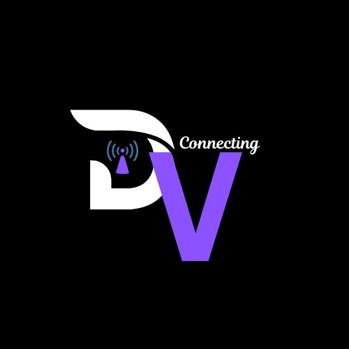
Davnox Ventures (DV) is a telecommunication partner that deals with the acquisition sales wing of the business. These include registration and activation of sim cards, activation of MIFIs and routers, distribution of physical recharge cards, etc. From the logo design, it is obvious the primary purpose of the logo and tagline expressly showed the important role of Davnox Ventures in the telecommunication sector.
Thank you, friends...
https://x.com/xkool24/status/1854529690708418651?t=V0JTWPBH4vsC0ZWQyhKF3A&s=19