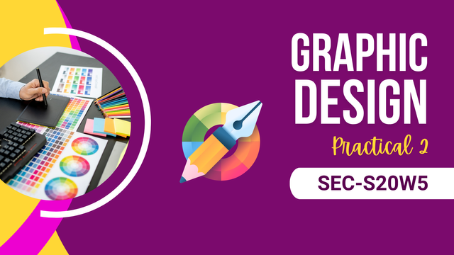
SEC-S20W5 Graphic Design Hands-on Practical 2
Greetings everyone! I hope you’re all doing well and learning from this graphic design series. So, here I am again, ready to take on this week’s challenge. It’s similar to the previous one, where we have to replicate a design provided by our instructor, @lhorgic, but with a slight twist. This time, we haven’t been given exact steps on how to do it. So, here’s a step-by-step breakdown of how I managed to achieve the final result.
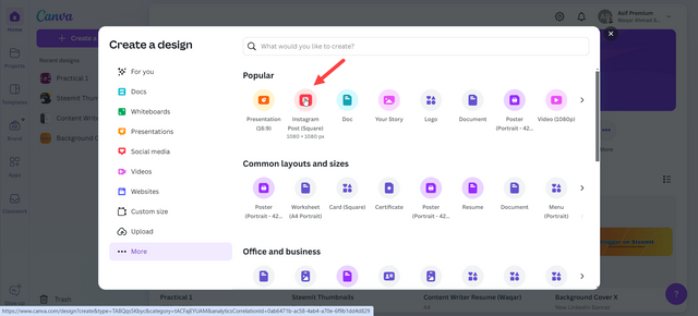
- Step 1: First off, I had to choose the dimensions of the design, which were 1080x1080. I had two options here: either select a custom size or just click on the Instagram post option (since it has the same dimensions). I went with the second option because it was quicker.
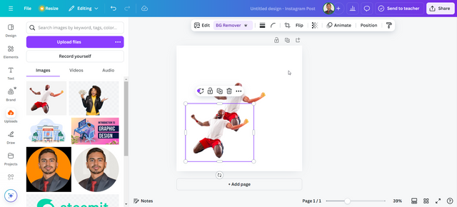
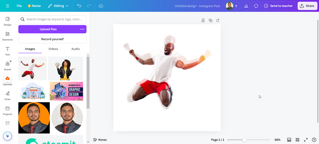
- Step 2: Next, I uploaded the free-to-use image provided by the instructor and then pressed Ctrl+D to create a duplicate.
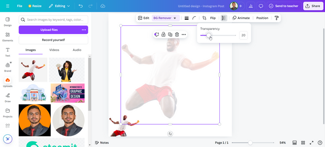
- Step 3: Then, I enlarged one of the images and reduced its transparency to 20.
- Step 4: After that, I adjusted both images on top of each other according to the required design. This step took me about 15 minutes to get it right.
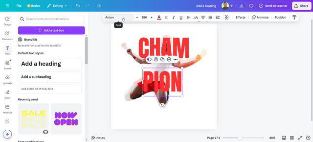
- Step 5: For the text, I chose the Anton font in red and added the words CHAM and PION in two separate text boxes.
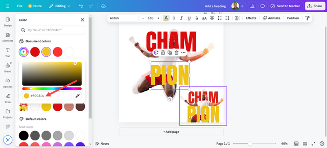
- Step 6: To get the correct colours, I uploaded the original design by the instructor and used Canva’s colour picker tool to extract the hex codes for the text. CHAM had the code
#da271d, and PION had#f0c31a.
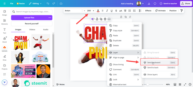
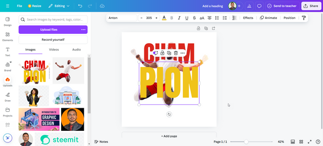
- Step 7: I set the font size of CHAM to 200 so it would match the design, and then I sent the layer backward.
- Step 8: Next, I set the font size of PION to 305 and adjusted it to fit the design perfectly.
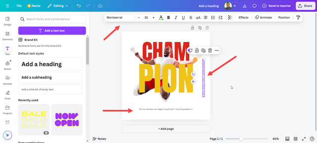
- Step 9: Then, I added my champion quote and the watermark using the Montserrat font.
- Step 10: Finally, I downloaded my design, and you can see the final result below.
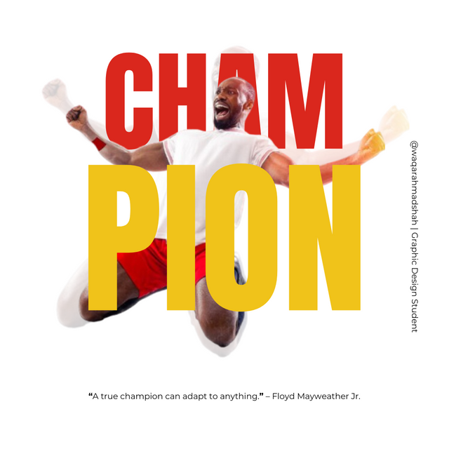
Now, let me quickly explain the design principles I kept in mind while creating this. I avoided edge-to-edge text and image placement to make sure the design didn’t look cluttered. I also followed the principle of colour harmony by using red and yellow for a strong contrast, giving the design a vibrant, energetic feel. I paid attention to alignment and line spacing to avoid too much empty space in the design. For hierarchy, I used different font sizes for CHAM and PION and emphasized them with different colours. Lastly, I didn’t bold the quote because it was drawing too much attention, so I kept it in plain text and smaller font size to avoid distraction.
Note:
All screenshots featured in this post are my own and have been captured directly by me.

Great work. The way you balance imagery and typography shows your creativity and attention to detail. The quote you added really ties everything together and gives the design more depth.
0.00 SBD,
0.09 STEEM,
0.09 SP
Upvoted. Thank You for sending some of your rewards to @null. It will make Steem stronger.