"SEC20/WK3: Typography and Practical Application."
Typography is basically a sort of art and technique in which you can choose different arrangements of typing letters or characters for the purpose of communicating any sort of information and for expressing your different thoughts by visual composition of different designs.
Most important things in typography are to choose font and design of font that you are using.After that it is really important to check size of your text and what about line spacing (All these things are important to note).You should not forget about alignment of text and color or contrast in color if it is.Then at last your focus should be at text style and emphasis and for this you may select bold or italics.
Through typography you can improve readability so in this way this thing could be helpful in conveying a clear text communication.Typography can add in beauty of your ideas as well as you can't only express your thoughts and emotions but you can also express your tone by this.Typography gives a particular identity and recognition to your work.
Typography types
Below I am explaining major types of typography so hopefully it would be understandable for you in my words;
Display Typography
• This is basically a large and attention seeking font type.Usually it seems very decorative, unique and bold in size.If you use it for headings then it looks very suitable.
• You can use it at posters or for advertisement purpose.In their examples there are Impact,Museo etc.
Monospaced Typography
• This is again a typography type in which you can see visual beauty of fixed wide shape font with equal gap or spacing.If these are in use for coding like functions then it would look good.
• This type is excellent to use at terminal interface or for editing code.Courier or Monaco can be under this type.
Handwritten Typography
• It seems that this is a type of art which actually really copies natural writing.This can be suitable to use when you are writing very informal or personal.This is good to use in those projects that seems to be creative.
• These can be useful for social media graphics or in handmade designs.Alex brush and dancing script can be under this category.
 |  |
|---|
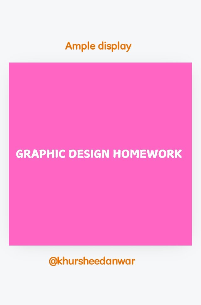
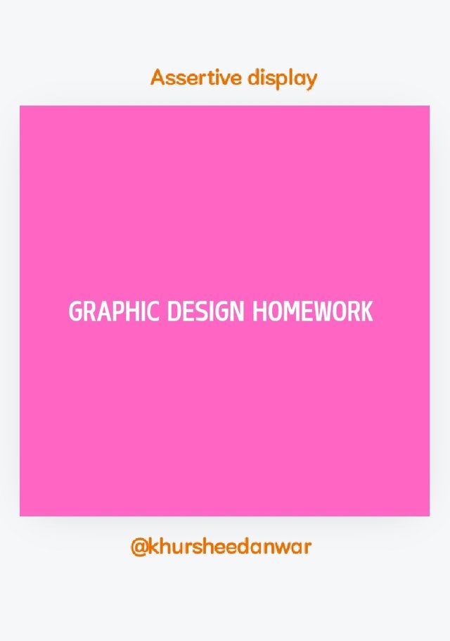
Above in screenshots you can see how Ample and Assertive display looks like.
 |  |
|---|
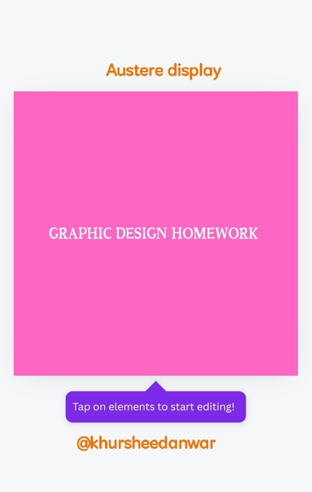
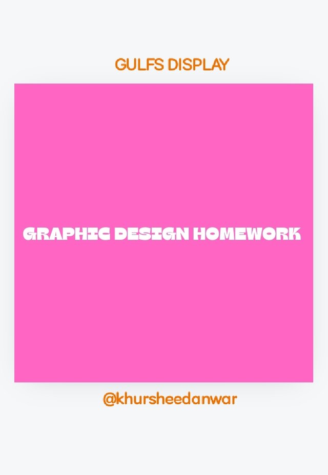
Above in screenshots you can see how Austere and Gulfs display looks like.
• I have shared screenshots of;
- Ample display.
- Assertive display.
- Austere display.
- GULFS DISPLAY.
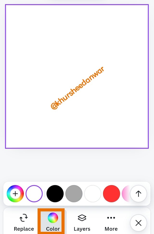 | 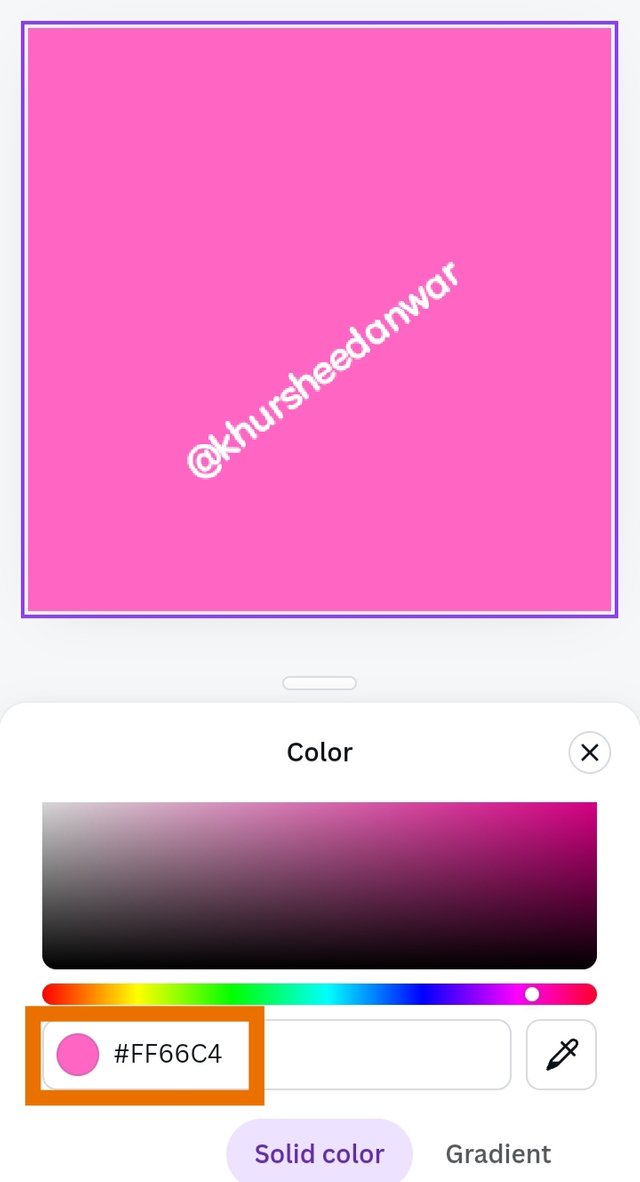 | 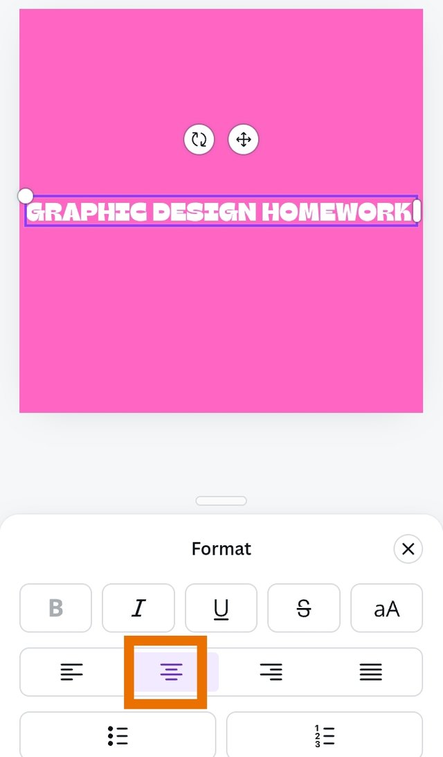 |
|---|
| SN | Items | Answer |
|---|---|---|
| 1. | Typeface/font used | Display/Regular |
| 2. | Colour Hex used | Pink /#FF66C4 |
| 3. | Alignment used | Centered |
@kouba01
@ngoenyi
@goodybest
@radjasalman
¡Saludos amigo!🤗
La tipografía Display se hizo muy popular cuando comenzaron a surgir los gammer ya que, en los diseños que ellos realizan para anunciar sus batallas, es una de las que más utilizan y en lo personal, me gusta mucho porque, también tiene unas letras muy bien definidas además de elegantes.
Te deseo mucho éxito en la dinámica... Un fuerte abrazo💚
Upvoted. Thank You for sending some of your rewards to @null. It will make Steem stronger.
💯⚜2️⃣0️⃣2️⃣4️⃣ This is a manual curation from the @tipu Curation Project
@tipu curate
Upvoted 👌 (Mana: 7/8) Get profit votes with @tipU :)
TEAM 5
Hi @khursheedanwar your post to the great job detailing typography the explaining to about different types and how they can be used are the really helpfull. Its nice to learn how fonts and design can creating to the text more powerfully. best wishes.....
Your explanation of typography beautifully captures its essence as both an art and a technique! 🎨✨ I appreciate how you've broken down the importance of font selection, size, spacing, alignment, and color. These elements truly make a difference in conveying information effectively.
The screenshots showcasing various displays like Ample and Assertive give a great visual representation of your points! Keep up the fantastic work in exploring and applying typography! 👏😊