SEC20/WK1: Introduction to Graphic Design and Principles.
Assalam O Alaikum |
|---|
Hello dear friends! Welcome to my post. How are you all? I hope you will be doing well by the grace of Almighty Allah. I'm also fine and enjoying my day. Today I'm here to participate in this Steemit engagement challenge season 20 week 1 organized by @lhorgic. I'm going to publish it in Steem4bloggers community and the topic of this challenge is about "Introduction to Graphic Design and Principles". So let's start without any more delay of time.
What is Graphic Design? Briefly Share with me your understanding about graphic design |
|---|
Friends, the graphic design is a branch of fine arts and design through which we deliver our ideas and content to others in the visual form. In that current era, the graphic design is a need of every field of our lives including the industries, educational sectors and in businesses. The person who has a degree in graphics design is known as graphics designer. In graphics designing, various things are included like images, colors and typography etc.
All these things are combined, make an elegant and eye catching design or layouts. Now a days, the graphic designing is the need of every industry whether it is clothes industry where the designs of clothes are made through the graphics designing first and then printed. To produce such visual designs, we use different graphics tools, websites and applications and make the design more unique.
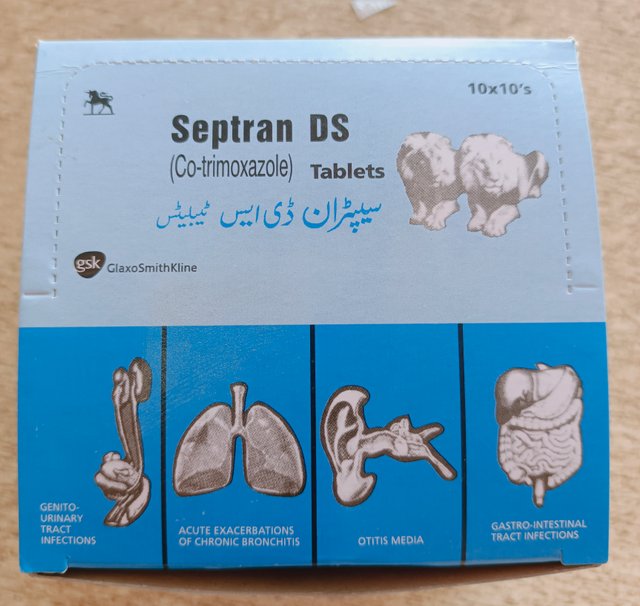
For example:
Above picture is the example of graphic design, which is actually a packing of capsules name Septran DS, used for infections. That whole packing is created through the graphics designing and you see how beautifully that work has been done. Actually it the charm of graphics design as everything on it is arranged through different graphics tools.
At the left side, you can see a horse which is basically the logo of that drug producing company. Besides it, the other visual elements including name of that drug, colors, diagrams of ear, stomach, lungs and urinary system are present there. Also the two Lions are present on it to make that design more unique and beautiful. In results, through the graphics designing, that type of designs can be created.
Pick any three of the principles of Graphic design and talk about them based on your level of understanding. |
|---|
The principles of graphic design are very crucial as they help the people to understand the things more briefly as with the help of them and by understanding them, the designer can make a design more unique and beautiful. So I have picked the following principles of graphic design which are very important to understand:
1. Balance;
Balance, is one of the key principle of graphic design and it is very important same like the balance is important in other fields of our lives. But in graphics, the balance refers to the placement of visual elements at their proper positions which make sure that the elements aren't overwhelming each others.
Types;
The balance can be found in two types i.e symmetrical balance and asymmetrical balance which are quite similar to each other. But the symmetrical balance, the elements are present at the both sides at their proper positions. But in asymmetrical balance, the elements are placed or distributed on the basis of color, scale and contrast.
2. Contrast:
Contrast, a another important principle of graphic design which helps to emphasize the difference between the elements present on the design to make it more visual. Contrast is basically the difference between the color, size and shape of the elements. In regard, we can say that the effective contrast is very important to make the design more engaging and attractive.
The contrast is not only based colors as different things are included in it to give the design a proper shape. In this way, the contrast of texts, shape, size and texture is also very important to take into count. So by combining all these contrasts, we can make a design more appealing, attractive and beautiful.
3. Alignment:
Alignment means that, setting the elements in such a way that the design look more organized as the alignments ensures that the each and every elements are present for a unique purpose which make the design more cohesive. The alignments include the Left, right and center alignments.
Practically show us how to make the graphical image below. |
|---|
1. Step 1;
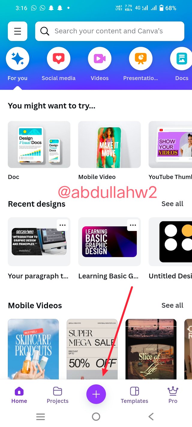
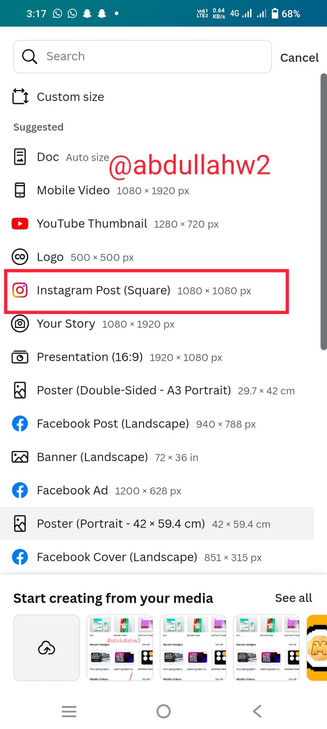
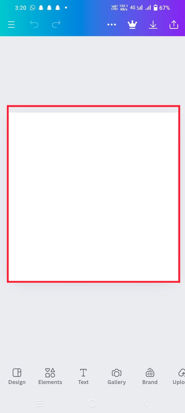
- In the First step, I have opened the Canva app from my mobile phone which was already installed in it. After that, I have clicked on the + button which opened a new window for me to select the size of design and I have selected Instagram post design 1080×1080 px.
 |  |  |
|---|
Step 2;
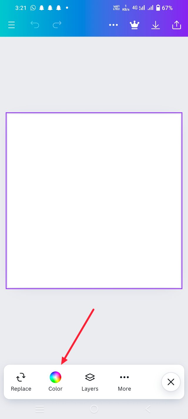
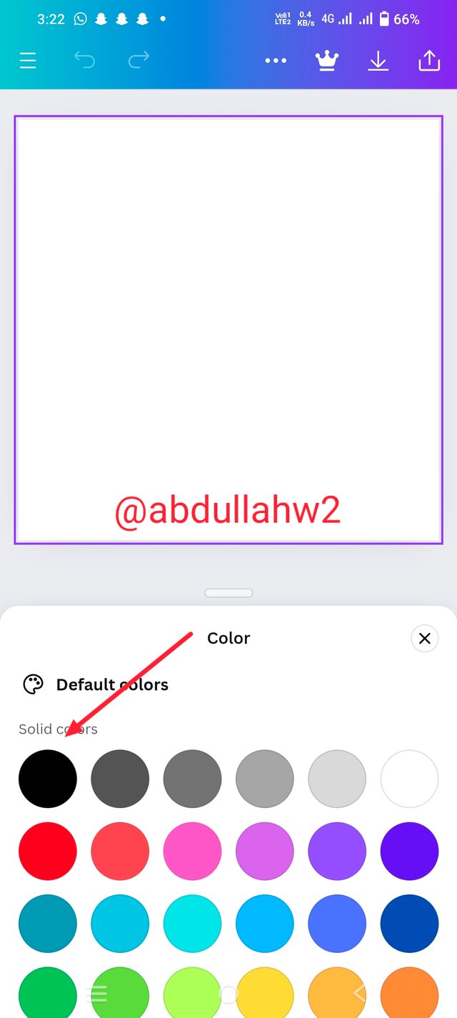
- In the second step, I have to change the color of that field so I have clicked on the color option from the bottom you can see. And in the next step, different types of colors appear on the screen and among them, I have selected the black color and the page turned black.
 |  |  |
|---|
Step 3;
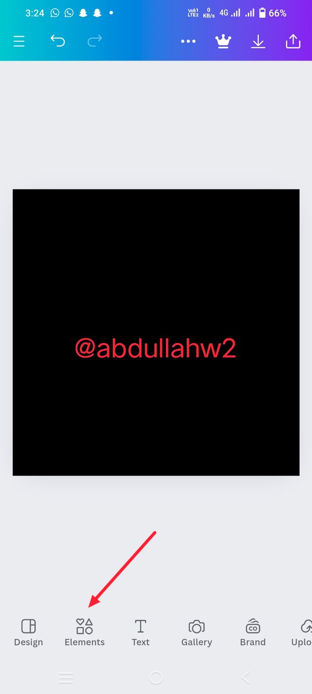
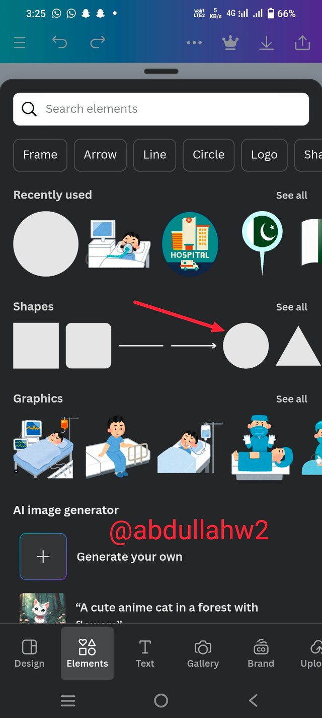
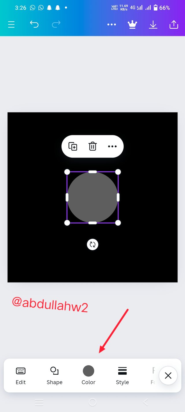
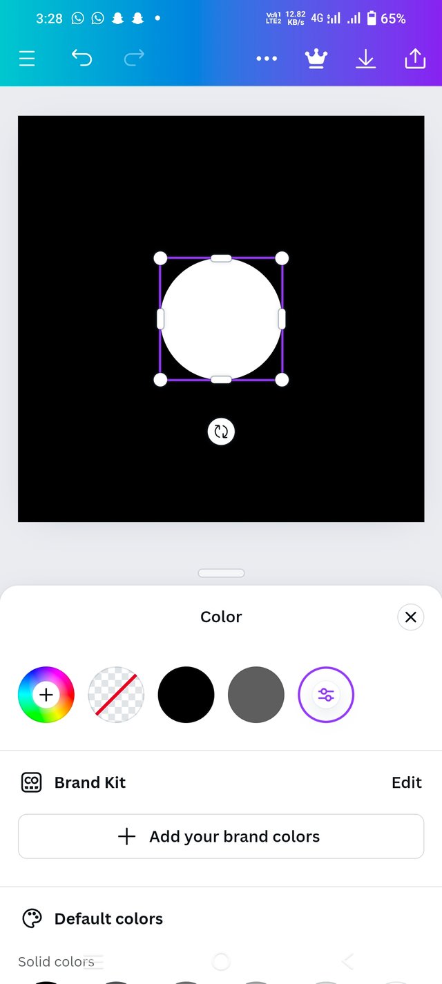
- After clicking on the elements option, I have moved to the new window from where we have to chose the elements based on our choice. So, after choosing the circle, I have changed its color from black to white which you can see in the below picture.
 |  |  |
|---|
Step 4;
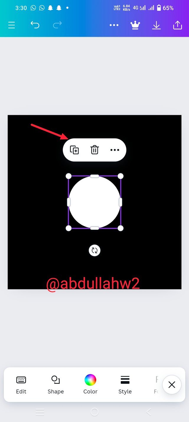
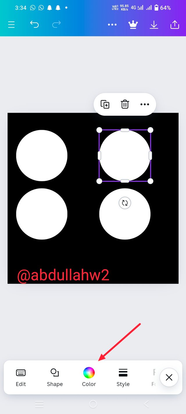
- After changing the color, I moved into the next step and clicked on the + option as mentioned in the below picture to increase the length of circle from one to 4. Then I have clicked on the color option again to change the color of circle.
 |  |
|---|
Step 5;
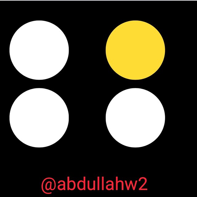
- In the last and final step, you can see, the color of our desired object has been changed successfully which means that we have learned this week's lesson briefly.

So friends, that was my entry about that challenge and I hope you will enjoy reading it. Now it is a time to say goodbye to everyone and I want to invite my friends @josepha, @suboohi and @jyoti-thelight to take a part in this amazing challenge

Thank you, friend!


I'm @steem.history, who is steem witness.
Thank you for witnessvoting for me.
please click it!
(Go to https://steemit.com/~witnesses and type fbslo at the bottom of the page)
The weight is reduced because of the lack of Voting Power. If you vote for me as a witness, you can get my little vote.
Upvoted. Thank You for sending some of your rewards to @null. It will make Steem stronger.
Hi @abdullahw2, I absolutely agree that understanding these fundamentals is essential for creating unique and beautiful designs. Your breakdown of balance, contrast, and alignment is spot on!
Thank you for the invitation, I shortly participate in this interesting contest
Thanks a lot dear Mam for a wonderful comment ☺️ it is highly appreciated and I'm waiting for your entry 🤗
@tipu curate
;) Holisss...
--
This is a manual curation from the @tipU Curation Project.
Upvoted 👌 (Mana: 1/7) Get profit votes with @tipU :)