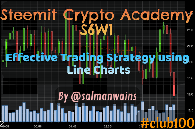
[Effective Trading Strategy using Line Charts] || Crypto Academy / S6W1 || Homework Post for @dilchamo|| By @salmanwains
This is Season 6 Week 1 of Steemit Crypto Academy and I'm writing homework task about "Effective Trading Strategy using Line Charts" assigned by Professor @dilchamo

Question# 1
Define Line charts in your own words and Identify the uses of Line charts ?
Line charts are one of the simplest forms of charts that show the price changes in terms of an oscillating line. The line is in fact constructed by joining various historical closing prices of an asset and continues to move by joining the closing prices of the assets.
Today we have various types of charts available but traders still prefer simpler charts because they help them to get an insight into the market moves quickly without having to delve into the details.
As already explained line charts are formed when closing prices of an asset respective of the selected time period are joined by simply a line these do not involve high, low or opening prices.
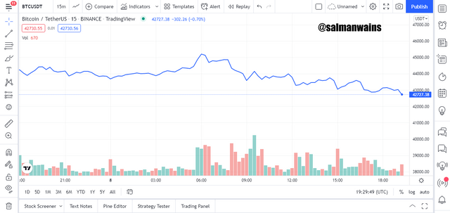
Below you see a simple line chart applied to a Bitcoin price chart.
Uses of Line Charts
- The most important uses of the line charts are that it provides the simplest way for the traders to see the price fluctuations of an asset.
- It aids in easy technical analysis of the historical prices
- They can also be used to identify the areas of support and resistance and hence areas of demand and supply
- They also aid in identifying the overall trend over the market and provide the opportunity to compare this data with various other indicators.

Question# 2
How to Identify Support and Resistance levels using Line Charts (Demonstrate with screenshots)?
Support and resistance levels re very crucial for trading the right trends. These areas represent the high selling and buying pressures points of the asset. Traders try to make use of these areas to predict price reversals and price continuations.
You can easily identify resistance and support levels with line charts since they only denote the closing prices. The support level is marked by the area where the price after dipping tries to rise. These areas represent the zones in which asset’s demand is high.
A strong support is formed when the line charts continue respecting this zone and bounces back above it every time it touches it. These are crucial buying points as shown in the screenshot below. In a strong bearish trend however, the price can break the support and continue moving down.
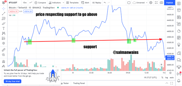
We have connected the previous swing lows to indicate a support line using a line chart and this can be extended to predict entry and exits in future.
The resistance level is marked by the area where the price after rising tries to go down. These areas represent the zones in which asset’s supply is high. A strong resistance zone is formed when the line chart continue respects this zone and bounces back below it every time it touches it or comes closer to it. These are crucial selling points as shown in the screenshot below. In a strong bullish trend however, the price can break the resistance and continue moving up.
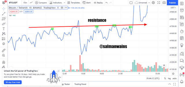
We have connected the previous swing highs to indicate a resistance line using a line chart and this can be extended to predict entry and exits in future.
Question# 3
Differentiate between line charts and Candlestick charts.( Demonstrate with screenshots)?
Following are the major difference between the line chart and the candlestick charts:
| Line chart | Candlestick chart |
|---|---|
| Line charts are very simple and are visually represented by a single line of same color. | Candlestick charts are bit more complex and are visually represented by candles of green for bullish and red for bearish trend. |
| No visual representation of the trend. | Candles are green in bullish trend and red in bearish trend. |
| They are formed by connecting only the closing prices. | Candles are constructed based on closing and opening prices and higher and low points. |
| Yields less information. | Gives more detailed information about the price changes of an asset. |
| Relatively a less accurate technical analysis tool. | Relatively detailed and more accurate technical analysis tool. |
| Cannot show the interaction between the buyers and sellers. | The formation of alternative bullish and bearish candles shows the tussle between buyers and sellers. |
| Ideal for long term traders who are not concerned by the price volatility and dynamics. | Ideal for moderate to short term traders that want to keep every move the asset under eye. |
| Emphasize more on the direction of the price. | Emphasize both on the direction and buying and selling pressures. |
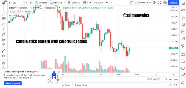
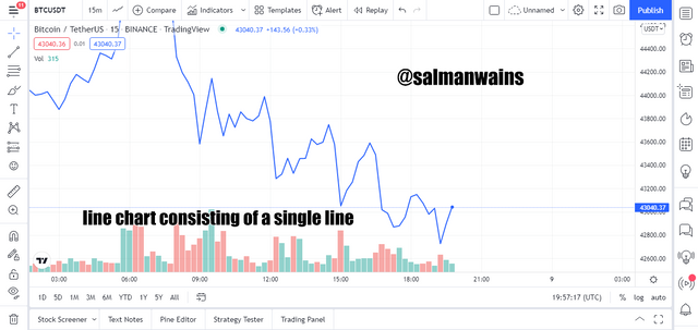
Below is the visual comparison between a candlestick and line chart.
Line chart consisting of a single line and showing only the direction of the market.
Question# 4
Explain the other Suitable indicators that can be used with Line charts.(Demonstrate with screenshots)?
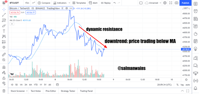
A good indicator to go along with line chart is the moving averages. This provides a setup to confirm your trading decisions. The moving averages can also be seen as dynamic support and resistance. They are important trend indicators.
Bullish and bearish trends with moving averages and line chart
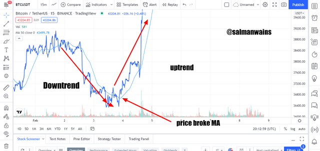
as the moving averages serve as a dynamic support and resistance levels, they also help in identifying the bearish and bullish trend. When the price is trading above the MA it means it is a bullish trend. When the price is trading below the moving average it means it is a bearish trend. In addition to that the farther the price is trading from the MA the stringer the trend and the closer it moves along the MA the weaker the trend.
Trend reversals
The MAs can also be used to predict reversals eventually when the price breaks these areas of support and resistance. when the price breaks the resistance to go below it, it is an early selling point and when the price breaks the support to go above it is an early buying entry point.
Question# 5
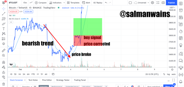
Prove your Understanding of Bullish and Bearish Trading opportunities using Line charts. (Demonstrate with screenshots)?
In this part I will combine the MA and line chart to demonstrate how this setup can earn us the best bearish and bullish opportunity.
Bullish Opportunity
For finding the bullish opportunity the price first must be trading below the MA indicating that the trend is bearish. It then should cross the MA which is acting as a support and moves above it. Wait until the price corrects and place the bullish signal with accurate stop loss and take profit. The right bullish signal with the SL and TP 1:3 can be seen in the BTC/USDT chart below.
Bearish opportunity
For finding the bearish opportunity the price first must be trading above the MA indicating that the trend is bullish. It then should cross the MA which is acting as a resistance and moves below it. Wait until the price corrects and place the bearish signal with accurate stop loss and take profit.
Question# 6
Investigate the Advantages and Disadvantages of Line charts according to your Knowledge?
Following are the pros and cons of the line chart
Pros
- It is very simple to understand and visualize.
- It is ideal for long term traders who only want to see the direction of the price.
- It is constructed using only the closing prices.
- Ideal for the beginners who are unable to understand complex patterns.
- Helps in identifying trend direction, support and resistance levels, bearish and bullish entry points.
Cons
- It is too simple and does not give much information about the price of an asset.
- It is not ideal for in-day traders who want to see every type of fluctuation.
- It is insufficient to deduce an accurate technical analysis.
- You need to combine it with various other indicators.
Conclusion:
Line charts are drawn by joining the closing prices of an asset in the given time frame. Though they provide less information than the candle stick charts they are relatively easy and comprehensive. For new traders complex chart patterns are often intimidating but line charts will clear a lot of things for them.
Note :
All the Screenshots have been taken from the tradingview.com platform.
CC:
@dilchamo
Club100 Eligible
Nice post keep it up.
if you haven't receive 100 STEEM than vote Lyon89 for witness
He is my friend so i am vouching for him
Vote Here for Lyon89 and get 100 STEEM
Hi, @salmanwains,
Thank you for your contribution to the Steem ecosystem.
Please consider voting for our witness, setting us as a proxy,
or delegate to @ecosynthesizer to earn 100% of the curation rewards!
3000SP | 4000SP | 5000SP | 10000SP | 100000SP