SEC S18-W1 || Mastering the Markets with technical analysis
 |
|---|
Greetings friends and welcome to my participation for the weeks engagement challenge from this amiable community where we to learn about mastering the market using technical knowledge. Hope you get to learn something new today as I attend to the hints as provided.
What is the importance of technical knowledge in trading? Describe the key components and information you can gather from a technical chart. |
|---|
To start with, why don't we get to know what technical knowledge in trading is all about before going into its importance? Therefore what is technical knowledge in trading?
Technical knowledge in trading is all about using charts, patterns, and indicators to analyze the past behaviour of a stock, currency, or any other financial asset to help traders predict future price movements of these assets and make informed decisions.
An everyday example would be driving a car because when you are on the road, you pay attention to road signs, traffic lights, and the behaviour of other drivers. Similarly, in trading, technical knowledge allows us to "read" the market by looking at charts, patterns, and indicators to help us identify trends, support and resistance levels, and potential entry or exit points for our trades.
Just like being aware of our surroundings on the road helps us drive safely, having technical knowledge in trading serves as our guide on making smart investment choices, as it is like having a roadmap to help us navigate the ups and downs of the financial markets.
For this reason, I can say that technical knowledge in trading is important for the following reasons:
Identifying Trends:
Technical analysis helps traders identify trends in the market because by analyzing price charts and indicators, traders can spot patterns that indicate whether the price of an asset is likely to go up or down, helping them make better decisions about when to buy or sell.
Timing Entry and Exit Points:
Technical knowledge helps traders in determining the best time to enter or exit a trade and this can be done by studying the various support and resistance levels, chart patterns, and indicators, to identify optimal entry and exit points to help maximize potential profits and minimize potential losses.
Risk Management:
Technical analysis allows traders to assess and manage risks by setting stop-loss orders and take-profit targets based on technical indicators. This way, traders get to protect their investments and minimize losses if the market moves against them.
Confirmation of Fundamental Analysis:
Technical analysis also complements fundamental analysis, which focuses on the financial health and prospects of the asset. Therefore, traders can use technical indicators to confirm the fundamental analysis of assets to gain more confidence in their investment decisions.
Knowing what Technical knowledge is all about and its importance, what then are the key components and information can we gather from a technical chart? When we look at a technical chart, the key components and information we can gather include;
Price:
The price is the main component of any technical chart as it represents the value of the financial asset (e.g., stock or currency) at different points in time. Therefore, by looking at the price movement history, we can see if the price is going up, down, or is relatively stable.
Time:
Usually represented on the horizontal axis of the chart shows the different periods, such as minutes, hours, days, or months, depending on the timeframe we are looking at, and it helps us to understand how the price of an asset has changed over time.
Chart Patterns:
Chart patterns can be said to be shapes, patterns or formations that appear on the chart, and they serve as indicators of potential trends or trend reversals in the price movement. Some very common examples of chart patterns are triangles, head and shoulders, and double tops or bottoms, and these chart patterns can give us clues about what is to happen next.
Support and Resistance Levels:
Support and resistance levels are known to be specific price levels that the price of an asset tends to bounce off of. Where support is like a floor that prevents the price from falling further (below), while resistance is like a ceiling that prevents the price from rising higher (above). These levels are important as they help us identify potential entry or exit points for our trades.
Indicators:
Indicators are said to be mathematical calculations applied to the price data on a chart to help traders analyze and interpret market conditions. Some commonly used indicators include moving averages (MA), relative strength index (RSI), and MACD (Moving Average Convergence Divergence). These indicators provide useful insights into the strength or weakness of a trend, overbought or oversold conditions, and potential reversals.
Therefore, by looking at these components and information on a technical chart, traders gain a better understanding of the price movements, potential trends, support and resistance levels, and other factors that can guide their trading decisions.
Explain how to read candlestick charts and the significance of different time frames in trading. |
|---|
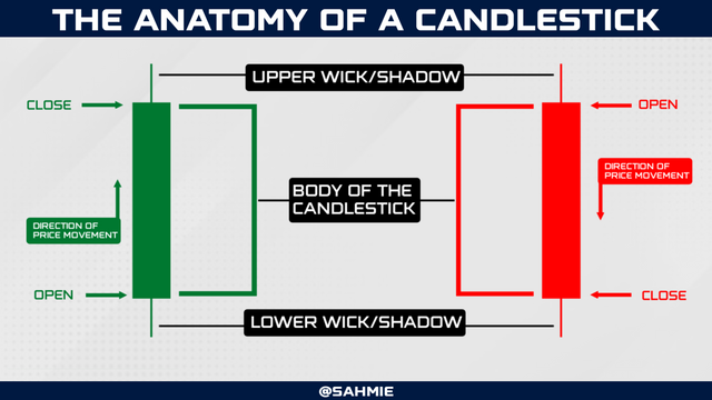
You might be wondering what is a candlestick chart. Is this referring to the common candle we see and use? Well, it does collect the name from common candles we use but then there are differences.
In trading, a candlestick is a way of representing the price movement of an asset such as stock, currency, or cryptocurrency over a specific period. However, it is called a candlestick because it looks like a little candle with a body and sometimes a wick on top and bottom.
 |
|---|
Let's say we have a candle lighting up a room where as time passes, the candle burns down, and the wax melts. In trading, we can say the height of the candle represents the price range (from open, to close), and the melted wax represents the price movement.
In trading, each candlestick on a chart represents a specific period, like a day, an hour or minutes. The body of the candlestick shows the opening and closing prices, while the wicks show the highest and lowest prices reached during that time. Hence, by looking at these candlesticks, traders can get a visual representation of how the price moved and whether buyers or sellers were in control.
Therefore, candlesticks are like little visual stories that tell traders about the price movement to help them make decisions based on patterns and trends they see, in a way to understand the market more visually and intuitively. So then, how do you get to read these little stories and understand what it is all about?
As stated earlier, each candlestick on the chart represents a specific period, like a day, an hour or minutes. And also that, the body of the candlestick shows the opening and closing prices, while the lines above and below the body, called wicks or shadows, show the highest and lowest prices reached during that time. Therefore, here is how a trader can read and understand the stories in a candlestick chart;
Looking at the body:
The body of the candlestick represents the price range between the opening and closing prices. However, the body is usually filled with two colours, Green and Red. If the body is filled with the Red colour, it means the closing price was lower than the opening price, which is considered a price decrease, and if the body is filled with the Green colour, it means the closing price was higher than the opening price and it's considered to be increasing in price.
Observing the wicks:
The wicks, or lines above and below the body, show the highest and lowest prices reached during that period, where the upper wick represents the highest price, while the lower wick represents the lowest price no matter the colour on the body of the candle.
Paying attention to the length:
The length of the body and wicks also provides additional information on the price movement of an asset, with a long body indicating a significant price movement, while a short body indicates a smaller price range. Whereas, long wicks suggest that the price reached extreme levels before reversing.
Looking for patterns:
Looking for patterns means analyzing multiple candlesticks together, therefore by so, we can identify certain patterns and trends. For example, a series of candlesticks with increasing bodies may indicate an upward trend, while decreasing bodies may suggest a downward trend.
However, since looking for patterns requires us to analyze multiple candlesticks together, it brings us to how many candle sticks we want to look at and the desired time interval (time frame) between the candlesticks. This brings us to the significance of different time frames in trading.
Generally, there are 3 common types of time frames, which are Long-Term Time Frames, Medium-Term Time Frames and Short-Term Time Frames, and they all play a significant role in analyzing the market and making trading decisions as follows;
Long-Term Time Frames:
Long-term time frames, such as weekly or monthly charts, provide a broader perspective on the market as they help traders identify long-term trends and major support and resistance levels.
Medium-Term Time Frames:
Medium-term time frames, like daily or 4 - 12 hours charts, offer a more detailed view of the market, helping traders to identify intermediate trends and potential trading opportunities. This time frame is mainly used by traders who prefer swing trading or position trading to identify medium-term price movements.
Short-Term Time Frames:
Short-term time frames, such as 1-hour or 30, 15, 2 or 1-minute charts, provide a close-up view of price action and are commonly used by day traders who aim to profit from intraday price fluctuations as these time frames help they spot short-term trends, support and resistance levels, and entry and exit points for quick trades.
However, the significance of different time frames lies in their ability to reveal different aspects of the market where the longer time frames help identify the overall market direction and major trends, and the shorter time frames provide more precise entry and exit points for trades.
Define chart patterns and differentiate between continuation patterns and reversal patterns. How can chart patterns be utilized to set effective stop-loss orders? |
|---|
In the previous section, we talked about analyzing candlestick charts to look for patterns, so then what are these chart patterns we are looking for?
Chart patterns are clues that appear on an asset price chart, giving traders hints about where the price might go next and these patterns are formed by the ups and downs of price movements over time, to help traders predict future price movements and make better trading decisions.
Think of chart patterns like shapes or formations that you can see on a graph. There are numerous types of chart patterns carrying different means such as Head and Shoulders, Double Top/Double Bottom, Cup and Handle, Ascending Triangle, Descending Triangle, Symmetrical Triangle, Bullish/Bearish Flag, Pennant, Wedge, Rectangle etc, and time will fail us to talk about all of these so let us talk about the two most common ones, which are;
- Uptrend Pattern
- Downtrend Pattern
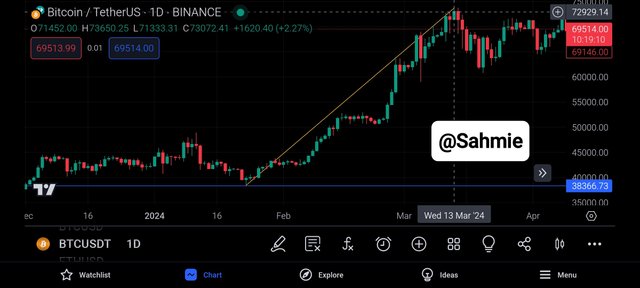
The "Uptrend" Pattern:
This pattern is like climbing up stairs, as it is made of a series of higher highs and higher lows on the chart, which continually takes the price upwards as the next candlestick is higher than the previous one, showing that the price is generally going up over time.
 |
|---|
The significance of this pattern is that traders see this pattern as a sign to buy because they expect the price to continue rising over time.
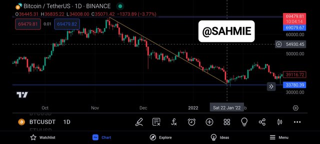
The "Downtrend" Pattern:
This pattern is simply the opposite of the uptrend, hence is like moving down a stair as it is made of a series of lower highs and lower lows (i.e., each peak and valley is lower than the previous one) on the chart.
 |
|---|
This therefore shows that the price is generally going down over time and traders see this pattern as a sign to sell or short-sell because they expect the price to continue falling.
However, these patterns can also be of specific shapes, such as triangles, rectangles, or head and shoulders which can give traders even more information about potential price movements.
Now, knowing what chart patterns are, what are continuation patterns and reversal patterns, and what differentiates them?
Continuation patterns, as the name suggests, indicate that the current trend in price is likely to continue. However, there may be a breather for the price before it continues its journey in the same direction. These patterns show that the market is taking a pause, gathering strength, and getting ready for the next move in the ongoing trend.
One example of a continuation pattern is the "flag" pattern, which looks like a small rectangle or a parallelogram on the chart. Therefore, when a flag pattern appears during an uptrend, it suggests that the price might take a short break before continuing its upward movement. Similarly, during a downtrend, a flag pattern indicates a temporary pause before the price continues its downward trend.
On the other hand, reversal patterns which are the opposite of continuation patterns signal the potential change in the current trend of a market as they indicate that the price might reverse its direction and start a new trend. Therefore, these patterns when appear serve as a warning sign that the current trend might be coming to an end.
An example of a reversal pattern is the "head and shoulders" pattern, where it looks like three peaks or valleys on the chart, with the middle peak or valley being the highest (the head) and the other two peaks (the shoulders) being slightly lower.
When this pattern is formed during an uptrend, it suggests that the price might reverse and start a downtrend once the neckline (the base of the head) is broken, and when it is formed during a downtrend, it indicates a potential reversal to an uptrend, also when the neckline is broken.
So then, how can we use all the lessons we learn from chart patterns to set effective stop-loss orders on our trades?
We have so far learnt how various chart patterns can provide valuable information to traders on when a market is expected to continue or reverse, so then how can it be used on setting stop-loss orders? But then, why is it a stop-loss order?
A stop-loss order is a predetermined price by the trader at which the trader has decided to exit a trade to limit potential losses. This is to say that, it is a price mark or point a trader has picked to exit a trade to minimise losses.
But then, we have come to learn in the earlier section that when analyzing chart patterns, there are certain levels or points that act as support or resistance, where a support level is like the floor of a house serving as a price level where the buying pressure is strong enough to prevent the price from falling further, while resistance which was likened to be the ceiling is a price level where selling pressure is strong enough to prevent the price from rising further.
Therefore, by identifying these support and resistance levels within chart patterns, traders can determine where to place their stop-loss orders. Hence if a trader is going long (buying), he might want to set his stop-loss order just below the support (floor) level, remember this, never above the support level as there may be a false break. By setting his Stop-loss a few pips below the support, if the price breaks below the support level, it could be just a false break, but once it's beyond that, then it could be an indication that the pattern has failed and the trader can exit the trade to minimise losses.
On the other hand, if the trader is going short (selling), he should set his stop-loss order just a few pips above the resistance (ceiling) level. Therefore if the price breaks above the resistance level, it could false break and if not it then suggests that the pattern has failed, and the trader can exit the trade to minimize your losses.
For me, to be on the safer side, I use the 21-day Average True Range (ATR) value to calculate the extra pips I need, by adding it to the resistance or support level prices.
What is Trading View and how can it be used to apply technical indicators in real-time trading? Describe the relationship between support and resistance levels and how technical indicators can aid in understanding these concepts. |
|---|
On the screenshots I provided above, you can see it is written from Tradeview, therefore it's nice you asked what is Tradeview.
Tradeview is a popular online platform that helps traders analyze financial markets such as stocks, currencies or cryptocurrencies and make trading decisions as it provides real-time charts and tools to apply technical indicators to trading strategies.
Hence, Tradingview is a tool that helps traders see what's happening in the market, offering a wide range of charts that show the price movements of different financial assets like stocks, currencies, and cryptocurrencies. Since Tradeview, allows traders to use technical indicators, what are these technical indicators then?
Technical indicators are like special goggles that help traders spot patterns and trends in the market as they use mathematical calculations based on historical price data to give insights into potential future price movements. Some common technical indicators include moving averages, MACD, RSI, and Bollinger Bands.
Therefore, on Tradeview a trader can choose from a wide variety of technical indicators and apply them to charts to help them identify things like trend direction, momentum, overbought or oversold conditions, etc. helping traders make more informed trading decisions.
Tradeview also allows traders to set up alerts to notify them when certain conditions are met. For example, if the price of a stock reaches a specific level or if an indicator gives a signal, you can receive an alert on your phone or computer.
Therefore to apply an indicator on a price chart using Tradeview, follow the steps below.
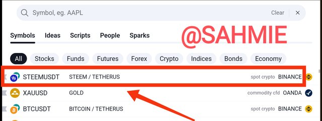
Step 1: Open the Tradingview platform on your preferred device and open a trading pair by searching for the trading pair of choice, I will be using the STEEM/USDT trading pair.
 |
|---|
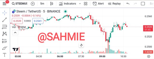
Step 2: Once you have the chart displayed, locate the "Indicators" button located at the top of the chart.
 |
|---|
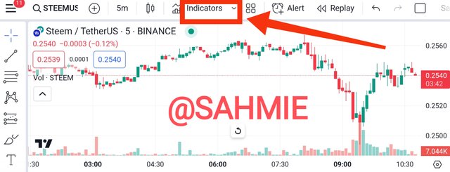
Step 3: Click on the "Indicators" button to open the indicator menu.
 |
|---|
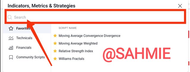
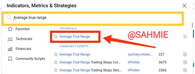
Step 4: In the search bar within the indicator menu, type the name of the indicator you want to add, e.g "Average True Range."
 |
|---|
Step 5: Select the desired indicator from the search results, click the "Apply" or "OK" button to apply them to the chart.
 |
|---|
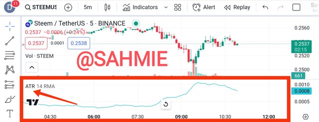
Step 6: The indicators should now be displayed on the STEEM/USDT chart, providing you with insights into market volatility.
 |
|---|
Describe the relationship between support and resistance levels and how technical indicators can aid in understanding these concepts. |
|---|
The support level of trade is like a trampoline where the price of financial assets tends to bounce back up, i.e., the price stops falling and starts going back up. Like the previous example of a floor that prevents the price from dropping further. Therefore, traders often see support levels as good buying opportunities because they expect the price to bounce back up from there.
On the other hand, the Resistance level is like a ceiling where the price of an asset tends to stop rising and start going down again, hence acting as a barrier that prevents the price from going higher and traders see resistance levels as good selling opportunities because they expect the price to drop back after hitting that level.
Therefore both support and resistance levels are important because they can help traders make better decisions, where support level serves as an opportunity to buy, but if the price breaks through a support level, it could mean that the trend is changing, and the price might continue to fall. Similarly, a resistance level serves as an opportunity to sell, but if the price breaks through a resistance level, it could indicate a potential upward trend.
Therefore, think of support and resistance levels as barriers that affect the movement of prices, helping traders determine when to buy or sell an asset based on how the price reacts to these levels.
However, to identify these levels, a trader looks at technical indicators such as Moving Averages (MA), Relative Strength Index (RSI), Bollinger Bands etc as these indicators are built with mathematical formulas that analyze past market data.
Provide an overview of pivot points and discuss their calculation and significance in trading. Explain how to configure and trade with pivot points, including strategies for pivot point reverse trading. |
|---|
For the lovers of basketball like me, there is a pivot point and it refers to the foot that a player must keep planted on the floor while holding the ball, i.e., when a player wants to change their position without travelling, they use a pivot point to rotate or move one foot while keeping the other foot planted, allowing the player to maintain his position.
Just like in basketball, trading also involves the concept of a pivot point, but in a different context because in trading, a pivot point refers to a specific price level that is used as a reference for potential changes in market direction just like a basketballer changing his direction. Therefore, traders analyze pivot points to determine levels of support and resistance.
Just as a basketball player uses a pivot point to maintain control and make strategic moves on the court, traders use pivot points to make decisions on when to enter or exit trades, with these pivot points acting as potential areas of price reversal or continuation, similar to how a basketball player uses a pivot point to change direction or make passes.
Therefore, pivot points are tools used in trading to help identify potential support and resistance levels as they act as reference points to determine possible price movements in the market.
Pivot points however are calculated using a formula that takes into account the high, low, and closing prices of the previous trading session (certain time frame, it could be a day, week, month, year, etc.).
However, the most common method is the Standard Pivot Points formula, which involves adding the high, low, and closing prices together and dividing the sum by three to get the pivot point. I.e.,
Pivot Point = (Previous High + Previous Low + Previous Close) / 3
From this, we calculate the additional levels of support and resistance using the formula;
Support 1 (S1) = (2 * Pivot Point) - Previous High
Resistance 1 (S2) = (2 * Pivot Point) - Previous Low
Then, to calculate Support 2 (S2) and Resistance 2 (R2) using the Pivot Point, we can use the formulas;
S2 = Pivot Point - (High - Low)
R2 = Pivot Point + (High - Low)
However, certain trading applications such as Tradeview provide us with an indicator we can use to cut out the whole stress of calculating it ourselves and over a range of different time frames. To apply this indicator to our chart, one has to follow the steps below;
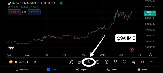
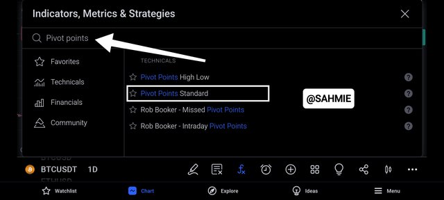
Step 1: On the you desired trading pair chart, click on the "Indicator" or "FX" button.
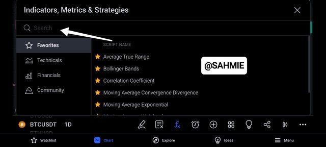
Step 2: On the search box, type pivot points, to search for the "Pivot Point indicator"
Step 3: From the search results click on "Pivot Point standard" as shown below.
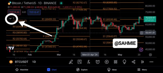
Step 4: The "Pivot Points" would be drawn and calculated on the chart showing the R1, R2, S1 and S2 points under an automated timeframe which is usually a month interval as shown below.

Now, as the screenshot shown above, shows the pivot points are calculated over a 1-month interval, hence to change this interval to your desired time frame, you need to follow the steps below.
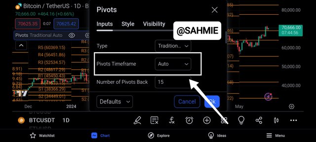
Step 1: with the Pivot Points on the chart, click on the "drop down menu" of the pivot points indicator as shown below.
Step 2: On the drop down menu, click on the "pivot points" as shown below to show the settings button.
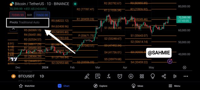
Step 3: On the drop pivot points menu, click on the "settings icon" as shown below.
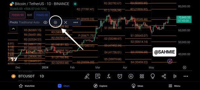
Step 4: Under settings, click on the "Timeframe", to show the different time frames as shown below.
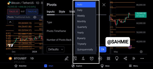
Step 5: Under the different timeframes on display, selected you desired timeframe to apply the pivot points as shown below, where I have picked weekly.
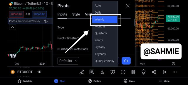
Below shows how the weekly pivot points looks like on the chart.
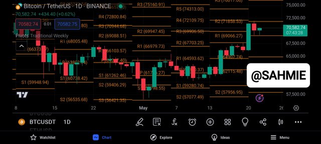
Overall, the significance of these pivot points lies in their ability to provide traders with potential price levels where the market may reverse or continue its current trend. Therefore, traders use these pivot points to make informed decisions on when to enter or exit trades, set stop-loss orders, or take profit targets.
CONCLUSION |
In conclusion, mastering the market with technical analysis is all about traders looking at past price charts with the help of various technical indicators to guess where prices might go next. Therefore, it is like using history to predict the future in trading, and how traders use this method to make smart decisions on buying and selling assets.
I wish to invite @starrchris, @ngoenyi, and @ruthjoe.
Thank You for your Time
NOTE: Always have a smile on your face, as you are never fully dressed without one.

Took me quite some time to go through your post. Such a thorough explanation of the topic. I specifically loved your basketball analogy for the explanation of Pivot points.
Good luck to you mate
I appreciate your effort in going through the post because I know it's quite long but I tried to explain everything simply. As a lover of basketball, the analogy for Pivot points was indeed a standout even for me. It's great when complex topics can be explained in relatable ways.
I really like your work and explaining the graphic details that are perfect for understanding It's really amazing that you share such valuable applications for others. understand it
Thanks a lot. I appreciate your kind words. I'm glad you find the explanations helpful and easy to understand.
@sahmie You have explained the key components of technical charts and how they help identify trends set entry and exit points and manage risk. The section on reading candlestick charts and understanding different time frames is very helpful especially for beginners. The explanation of chart patterns and pivot points is also clear and concise. Good luck with the contest
Greetings pal,
Thanks a bunch. I'm happy you found the info on charts and trends useful. Understanding candlestick charts and time frames can be a game-changer, especially for newbies. The part on chart patterns and pivot points being clear and to the point is great to hear. I appreciate your time and support.
Upvoted! Thank you for supporting witness @jswit.
Greetings my friend @sahmie! Your explanation of candlestick charts is superb! It's like decoding market secrets with a candle's flicker. All the best in the contest, success for you! 👍
Thank you for your time and this supportive feedback, I really appreciate your efforts and good luck to you too. Have a nice day.
You have effectively captured the essence of technical analysis, emphasizing its reliance on historical data to forecast future price trends, which is crucial for making informed trading decisions.
This is a clear and concise explanation of what a candlestick is in trading, highlighting its role in visually representing price movements over time, which is fundamental for traders to understand market dynamics.
Wow! You have correctly described the calculation of pivot points, stressing their reliance on previous session data, which helps traders identify potential support and resistance levels crucial for trading strategies.
All the best
Thank you for taking the time to share your thoughts and encouragement. I truly value all the effort, support, and kind wishes you've given. It means a lot to me.
Upvoted. Thank You for sending some of your rewards to @null. It will make Steem stronger.
You have presented the facts in this regard and have done it in a very clear manner and I offer you my heartiest congratulations on this.
I'm glad you noticed the clear presentation of facts. Your congratulations mean a lot to me. Thank you for appreciating my efforts, your support is truly valued.
Mostly welcome
Congratulations! This post has been upvoted through steemcurator04. We support quality posts, good comments anywhere, and any tags.