Effective Trading Strategy using Line Charts ]-Steemit Crypto Academy | S6W1 | Homework Post for @dilchamo
Hello Steemians, it is really exciting to be posting here again in the Steemit Crypto Academy community. I'm happy to be participating in the Season 6 Week 1 of the Steemit Crypto Academy.
This is my homework post of @dilchamo on “Effective Trading Strategy using line charts”.

1. Define Line charts in your own words and Identify the uses of Line charts.
LINE CHART
A line chart is a type of chart in the finance market that is used just like every other chart to track the price history and movement of an asset/security.
The line chart is a graphical display of informations of an asset price trend in the market. The informations of an asset price movement is represented on line chart with a continuous line which connect the information from point to point chronologically. Line chart is the most simplest and easiest chart that can be used by traders during technical analysis, and line chart only renders the closing price of a security.
One uniqueness of the line chart is that it simply connect the closing prices of a security with a straight line and it diminish the noise in the market during trading such as the high, low and open prices of assets. And this help traders visualize and identify price history as well as support and resistance levels inorder to make a good trading decision.
Uses of Line chart
- Line chart is used to make visible the price movement of assets in the market chronologically over a period of time.
- Line chart is used by traders to identify support and resistance levels thereby helping traders to make good trading decisions.
- Line chart is also used to track the lightest price change of assets in the market.
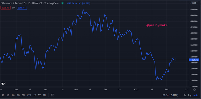
An example of a line chart
2. How to Identify Support and Resistance levels using Line Charts (Demonstrate with screenshots)
In the concept of technical analysis, support and resistance are the foundation and the most highly discussed. They are used by traders to identify levels on a chart which acts as a reversal or a pause in the price movement of an asset, tending to change or stop the direction of the price trend.
An identified support or resistance level can represent a potential exit or entry point, reason being that once the price of an asset reaches a support or resistance point; is either the price trend will pause and experience a reversal trend or it will brake the support or resistance level and continue in it's trend (bearish or bullish) until it meets the next point of support or resistance level.
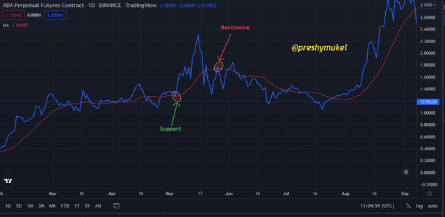
Support level on a chart
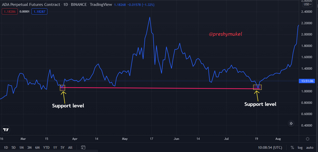
Support occurs when there is a high demand of an asset. It is a level where there's strong buying pressure thereby leading to a pause and at this level the downtrend breaks and an uptrend reversal occurs. The support level breaks to form a resistance level.
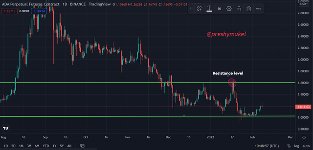
Resistance level in a chart
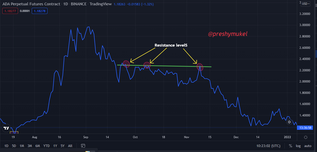
Resistance occurs on a chart when the supply of an asset is high. The resistance level is a point where the selling power becomes very strong thereby leading to a pause and then a break of the price uptrend which is afterwards followed by a downtrend reversal due to excessive selling of the asset. The resistance level breaks to form a support level.
3. Differentiate between line charts and Candlestick charts.( Demonstrate with screenshots)
| Line charts | Candlestick charts |
|---|---|
| 1. Line charts are represented by a continuous line segments. | 1. Candlestick charts are represented by candlesticks and these candlesticks are displayed in red and green colours for bearish and bullish candle respectively. |
| 2. In line chart a single data point is given which is the closing price of an asset. | 2. Candlestick charts provides four data points, the high, low, open and close. |
| 3. Line charts gives less data about a price trend by simply connecting closing prices of a given period of time thereby filtering out noise in the market and it is preferably used for a longer time frame. | 3. Candlestick charts gives more data than any other chart which most times can be confusing and hard to interpret. |
| 4. Line charts are the basic type of charts used for technical analysis because they are simple and easy to interpret. They can be easily interpreted by beginners. | 4. Candlestick charts are complex charts and hard to interpret especially for beginners. They are used by professionals. |
| 5. The overall price trend in a line chart cannot be spot at a glance like that of the candlestick charts. | 5. The candlestick charts overall price trend is easy to spot at a glance. |
An example of a candlestick chart
4. Explain the other Suitable indicators that can be used with Line charts.(Demonstrate with screenshots)
The saying that goes “No man is an island” applis in the finance world during technical analysis. Different indicators and tools are conbined to get a more reliable buy or sell signal, but in combining of tools and indicators one must be sure if such indicators or tools are suitable because it is only when they're suitable they can yield a good result.
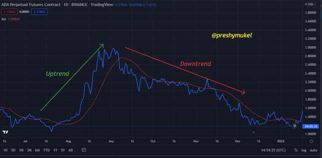
In this post I'll be combining the line chart with the moving average (MA). The moving average indicator is also represented with a continuous line which is used to identify price movement and it also serve as a powerful support and resistance on a chart during technical analysis.
Using a moving average indicator, the price trend can be identify as uptrend if the MA line is moving upward and as downtrend if the MA line is moving downward.
The use of Moving average on Line chart to identify trends and reversals
The moving average guideline is that, if the price of an asset is higher than the MA line then the price trend is upward. If the price of the asset is lower than the MA line then the price trend is downward. MA consist of different lengths which are 50, 100, 200 days.
Identification of trends and reversal using MA on a line chart
From the chart above it can be seen that the moving average line is below the price trend thereby representing an uptrend in the price movement of ADA. After a while there was a break and reversal trend thereby triggering the moving average line to move above the price trend, and at this point ADA started experiencing a bearish trend.
How to identify Support and Resistance levels Using Moving average on Line Chart
In an upward trend the lengths that serve as support levels are 50days, 100days, and 200 days MA, the price goes down a bit to find a support level and once it hits the support level the price continues to go up.
In a downtrend the MA will act as a resistance level, the price goes up a bit a to find resistance level, once the price hits the resistance level a reversal take place and the price start to drop again.
Using a moving average indicator to dentify support and resistance level on a chart
5. Prove your Understanding of Bullish and Bearish Trading opportunities using Line charts. (Demonstrate with screenshots)
It is of high necessity to identify the price movement (bullish and bearish movement) of assets before entering any trade because it is the only means through which a trader can make a good trading decision of an entry or exit points inorder to make profit and avoid losses.
Using a line chart a bullish and a bearish trend trends are represented by an ascending and a descending triangles as explained by @dilchamo in the lecture.
Bullish Trend
A bullish trend is represented by an ascending triangle. And from the chart below I was able to demonstrate my knowledge of the ascending triangle. Looking at the line chart we can see some low and high point highlighted from which we can understand how to draw the ascending triangle which provides our bullish trend signal.
From the chart it can also be observed that after the ascending triangle a bullish trend followed up.
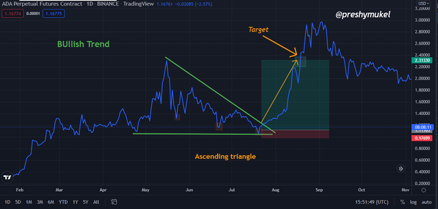
Bullish trend trading opportunity
Bearish Trend
A bearish trend on a line chart is represented by a descending triangle. I was able to identify my bearish trend from the line chart by highlighting some low high points on the chart from which I was able to draw my descending triangle. From the line chart it can be observed also that the bearish trend followed after the descending triangle.
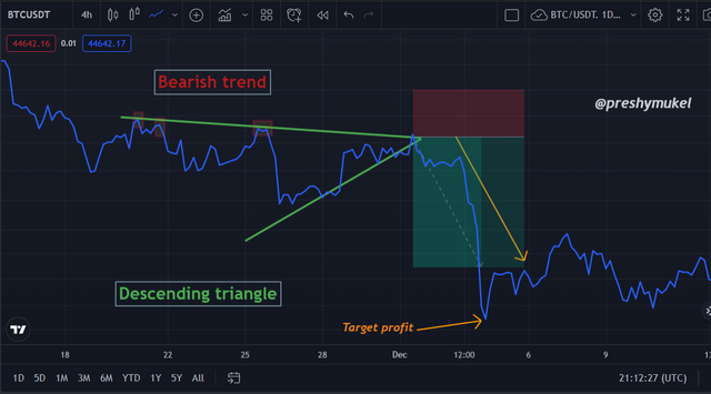
Bearish trend trading opportunity
6. Investigate the Advantages and Disadvantages of Line charts according to your Knowledge.
Advantages of Line Chart
Line chart is the basic type of chart used by traders for technical analysis because they are simple and easy to interpret. They can be easily interpreted by beginners.
Line chart connects the closing prices of an asset at a given period of time thereby filtering out noise in the market and it is preferably used for a longer time frame inorder to get a good result.
Line chart help traders visualize and identify price history and it as well serve as support and resistance levels.
Line chart is also beneficial because it shows even the tiniest changes that cannot actually be measured in other charts.
Disadvantages of Line Chart
Line chart is suitably used for a longer time frame as a short time frame will produce a false result thereby leading to losses. The line chart therefore can not be used by short term traders.
Line charts do not provide the complete data for price movement such as the open, low and high which also serves as a support when tracking the price movement of an asset.
Line chart requires previous data points such as closing points to be able to display the market movement.
Conclusion
The line charts are the simplest, easiest and fundamental type of chart among all the charts used for technical analysis in the finance market. The line chart makes it easy and possible for beginners to perform technical analysis.
Line charts provide a single data point (the closing price) thereby eliminating the noise in the market.
Line chart is suitably used by long term traders because since it provides a single data point, it requires a wide range of previous data to be able to reveal the market trend and therefore if it is used for a short term it might give a false signal.
For strong and accurate signals it is advisable for traders to combine the line chart with other suitable technical indicators or tools.
Thank you professor @dilchamo for such a wonderful lecture, it was indeed impactful.
N/B: All the images I used in the cause of writing this post are all my personal charts gotten from my
TradingView account