[ Effective Trading Strategy using Line Charts ]-Steemit Crypto Academy | S6W1 | Homework Post for @dilchamo
Hey guys,
Welcome to the first week of the season 6 SteemitCryptoAcademy lecture by Professor @dilchamo
Without wasting much of our time, let me quickly proceed with the given tasks.

QUESTION 1
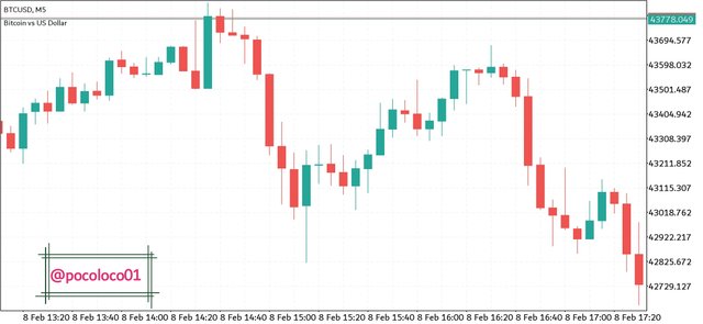
The Line charts which is as old as technical analysis it's self was discovered by Charles dow in the late 1800s.
This pattern of trading chart concentrates only on the closing of the asset price and has nothing to do with other parts such as its high, low, and opening like what we see on the candlestick chart pattern.
These highs, lows, and opening of an asset price are merely regarded as noise and therefore have not much use in identifying the actual movement of an asset. Therefore, nullifying these noises gives traders a more clear vision of where the asset price has moved over time.
Line Charts makes understanding market trends, support, and resistance levels easy to spot especially by newbies who find the interpretation of another form of trading charts such as candlestick chart complex due to its numerous components such as high, low, and opening.
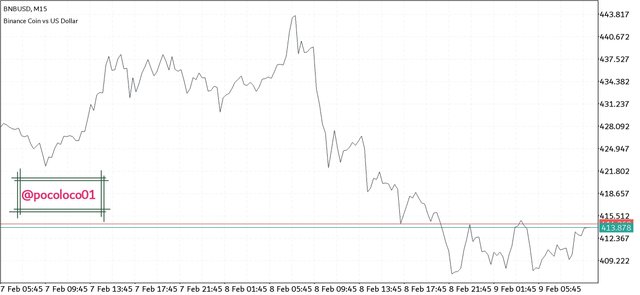
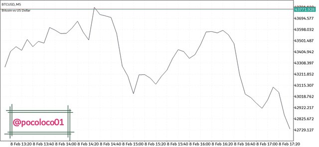
Line chart operates only by connecting the closing price of an asset together. This simple formation makes it easy for traders and analysts to utilize the more visible price history in analyzing the market.
- Screenshot
Just as every other chart has its uses, the line chart is no exception.
CLEARITY
The line chart gives traders a clearer vision of where the asset price has traveled to over time. It does this by concentrating only on the closing price of an asset.
SIMPLICITY
The line chart is quite simple to interpret especially for newbies because it removes other complications such as high, low, and opening of an asset price which are regarded as noises usually caused by volatility.
IDENTIFICATION OF SUPPORT AND RESISTANCE
Line charts make the identification of support and resistance levels easy to spot due to their simplicity. This in turn aids traders to easily make trading decisions as regards those areas.
RECOLLECTION OF DATA
Line charts make data interpretation and recollection easy for traders due to their clarity that allowing traders to easily track changes over a different period.
TREND VISIBILITY
Line charts also make price trend more clear and easier to identify even without the use of trend-based indicators because it doesn't include price shadows which tends to reduce the visibility of price trends.
QUESTION 2
The support and resistance levels are very important levels when it comes to trading. These levels serve as the basis for all technical analysis because it is used to identify the areas where the buying or selling pressure is great to reverse a current market trend.
The line chart easily identifies this area because it concentrates only on the closing price thereby making more visible the actual position and movement of the price, unlike the candlestick chart that contains the price shadows as well as the opening thereby reducing the visibility of these core areas of support and resistance.
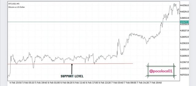
- THE SUPPORT LEVEL
The support level is the zone where the buying pressure is great enough to reverse the decreasing price of an asset.
In some cases, the price of an asset tends to break the support level if the selling pressure is greater than the buying pressure at that particular point. When this happens, the just broken support level turns out to be a resistance level for the bearish price.
- Screenshot
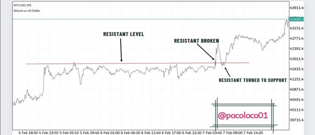
- RESISTANCE LEVEL
The RESISTANCE level is the zone at which the selling pressure is great enough to stop the up-trending price from moving further.
The line chart makes the zone quite visible though sometimes, the price moves above the recognized resistance zone and when that happens, the just broken resistance zone turns out to serve as a support for the new price.
- Screenshot
QUESTION 3
Line Charts and Candlestick Charts are both charts that represents asset price movements on the market.
There are a few similarities between the two charts and one of them is the fact that they both show the closing points of prices at different times.
Having few similarities, there are also some differences between them and they are as follows;
⏹️Line Charts connect only the close of the asset price while Candlestick Charts show a lot of price information which includes; the close, the open, and as well as the lowest and the maximum points attained by the price which is known as the shadows.
⏹️Line Charts is very simple to interpret as it contains not much details of the price action but only a line connection of the close while the Candlestick Charts is more complex especially to newbies because it gives more details to the price such as its opening point, closing point, and shadows.
⏹️The Candlestick Charts gives more information on the activities of the buyers at different times. This information is represented using different colors of candles with the bearish candle indicating that sellers are in control while the bullish candle indicates that buyers are in control at a given point in time. On the other hand, the Line Charts show no such information as it has nothing to differentiate between buyers and sellers at any given point.
QUESTION 4
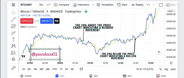
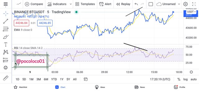
Now we will be looking at the application of indicators suitable for the line charts and one of the indicators I will be talking about here is the EMA.
The EMA is a trend-based indicator that is used to properly identify the direction of the overall price trend. It does this by filtering out minor fluctuations thereby making visible the actual price direction of an asset.
The above explanation of the EMA makes it suitable to be used on a Line chart in other to identify the price trend.
When the EMA, trends below the Line Charts it indicates a bullish movement and when it trends above the chart, it indicates a bearish movement.
- Screenshot.
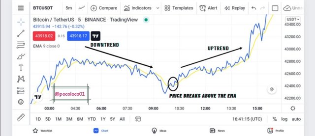
Also, the EMA is used in identifying price reversal on the MARKET. When a bearish price breaks above the EMA, it signals a possible bearish-to-bullish trend reversal. Similarly, when the bullish price breaks below the EMA, it indicates a bullish-to-bearish price reversal.
These price reversal signals that are usually provided by the EMA, normally serve as entry or exit points for traders though it is best confirmed by applying other indicators such as RSI for confluence sake.
- Screenshot
Another indicator that is suitable for the line chart is the RELATIVE STRENGTH INDEX.
The RSI indicator is a volatility-based indicator that works by identifying when an asset is either overbought or oversold which in turn signals a trader to either enter or exit the market.
The RSI indicator has three important regions which are the upper region. middle point and the lower region. With the upper region ranging from 70-100, the lower region ranging from 30-0 while the midpoint stays at the 50 mark.
When the RSI moves above the 70 mark, it indicates that the asset has been overbought therefore a trader should expect a possible pullback of the asset price.
Also, when the RSI moves below the 30 mark, it indicates that the asset has me oversold and a possible bearish-to-bullish trend reversal is expected.
Adding the RSI indicator on the Line Chart aids a trader in identifying the above-mentioned regions thereby signaling him or her on what to do.
- Screenshot
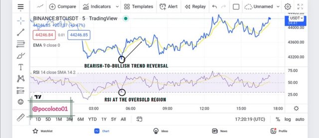
In addition, the RSI indicator also serves to spot out divergence on the line chart.
Divergence is identified when price action is signaling what is contrary to the indicator. Let's say the price trend is indicating a continuous bullish movement by the formation of higher highs and at the same time the indicator is signaling a trend reversal.
When the above happens, it indicates that the current trend is weak and is prone to a possible reversal therefore a trader is required to either enter or exit the market.
- Screenshot
The above screenshot shows the formation of higher high by the Line Charts which indicates a continuous uptrend movement. At the same time, the RSI indicator is already at the overbought region and with a higher low formation which indicates a bearish movement.
The above indicates that the current bullish trend of the price chart is weak and prone to a possible reversal just as seen above.
QUESTION 5
We have already discussed some uses of Line charts especially the fact it makes trend identification easier when compared to the candlestick chart.
In this section, we will be identifying bullish and Bearish trend opportunities using Line charts.
In other to achieve that, I will start by applying the moving average indicator which will serve to provide an entry for a bullish and Bearish trading opportunity.
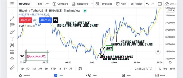
- BULLISH ENTRY
In other to identify a bullish entry using the moving average indicator on a line chart, I will, first of all, identify the direction of the trend using the same moving average indicator.
To identify the trend direction, I will start by considering the position of the moving average indicator and if it is trending above the price chart, which indicates that the trend is a bearish one.
After identifying a bearish trend, I will wait for the line chart to break above the moving average which indicates a possible bearish-to-bullish trend reversal. Once that happens, I will wait for the price to retest the newly formed support on the moving average indicator before making an entry.
- Screenshot
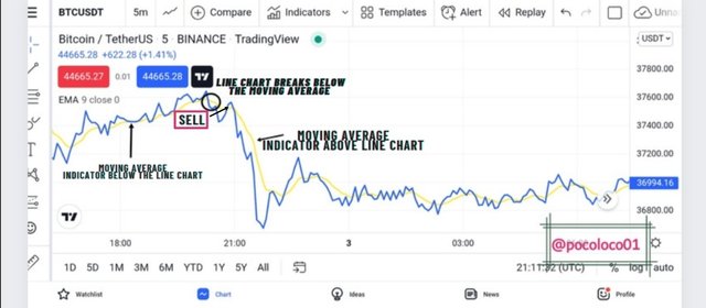
- BEARISH ENTRY
In other to identify a bearish trading opportunity using the line chart, I will start by applying my moving average indicator just as did before.
This indicator will serve primarily in the identification of price trends. When the indicator is below the price chart, it indicates a bullish movement.
After a proper identification of pride direction using the moving average indicator, I will move to spot a breakout below the moving average which will serve as an entry signal for a possible bullish-to-bearish trend reversal. When the breakout happens, I will patiently wait for the price to retest the newly formed resistance and pull back before making an entry. This is to avoid false signals and fake-outs.
- Screenshot
It is always important to first identify the trend direction before making an entry in other to avoid trading against the trend which normally leads to an accumulation of losses.
QUESTION 6
We have initially talked about the few uses of Line charts but here we will be outlining the various advantages and disadvantages of Line charts.
The line charts is very simple and easy to understand especially for newbies in crypto trading because they do not contain complex details of the price action such as the high, low, the open. But only a line connection of the close.
The Line Charts makes trend identification easy because it focuses only on the close of the price thereby making the direction very much visible.
The Line Charts also allow easy identification and measurement of small price changes which are difficult to identify on other chart patterns such as the candlestick chart due to the formation of price shadows.
The Line Charts also make identification of major support and resistance zone easy due to its simplicity and filtering of noise which are the things that make the identification of these areas much more difficult on candlestick charts.
The Line Charts only provide information on the closing price of an asset and that is not enough for a trader to properly make a good trading decision. Details like high, lows, and the open are also important.
The Line Charts do not take note of price volatility because it doesn't show the highs and lows of prices.
Using Line Charts on a lower timeframe tends to generate multiple signals thereby creating a hard trading decision for traders.
Some important price information such as the maximum and minimum points a price attained before getting to close at a certain point are ignored on price chart. This information is essential as it helps traders to identify the buying and selling pressure on the current market.
The Line Charts also do not give traders enough information based on the activities of buyers and sellers in the market. It does not allow traders to know if buyers or sellers are in control at a given point in time.
CONCLUSION
The Line Charts is one of the numerous market charts that is used in the interpretation of price behavior, movement, and direction.
The Line charts is a very simple and easy to interpret chart for newbies who find other chart patterns complicated. The Line Charts makes the identification of support and resistance level easy because it excludes all market noise.
Nevertheless, the Line Charts is best used with technical indicators such as moving averages and RSI for a more accurate analysis which will aid to maximize trading profits and minimize loss.