| Part 2 - Crypto Academy / S6W3 - Homework post for nane15.
Unsplash
1:Explain your understanding of charts, candlesticks, and time frames. (Use your own words and put screenshots)
2:Explains how to identify support and resistance levels. (Give examples with at least 2 different graphs)
3:Identifies and flags Fibonacci retracements, round numbers, high volume, and accumulation and distribution zones. (Each one in a different graph.)
4:It explains how to correctly identify a bounce and a breakout. (Screenshots required.)
5:Explain that it is a false breakout. (Screenshots required.)
6:Explain your understanding of trend trading following the laws of supply and demand. It also explains how to place entry and exit orders following the laws of supply and demand. (Use at least one of the methods explained.)(Screenshots required.)
7:Open a live trade where you use at least one of the methods explained in the class. (Screenshots of the verified account are required.)
: Conclusion.

1:Explain your understanding of charts, candlesticks, and time frames. (Use your own words and put screenshots)
CHART
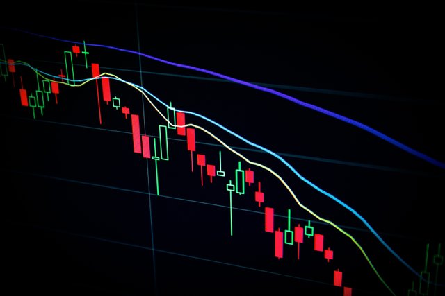
Charts are regarded as real-time visualization of an asset's price. The chart in cryptocurrencies can be said to be the basis of every technical analysis, as it's very impractical to analyze the movement of an asset or predict its future price without the help of the graphical representation of its price in real-time, some of the different types of charts include
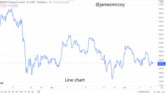
- Line chart
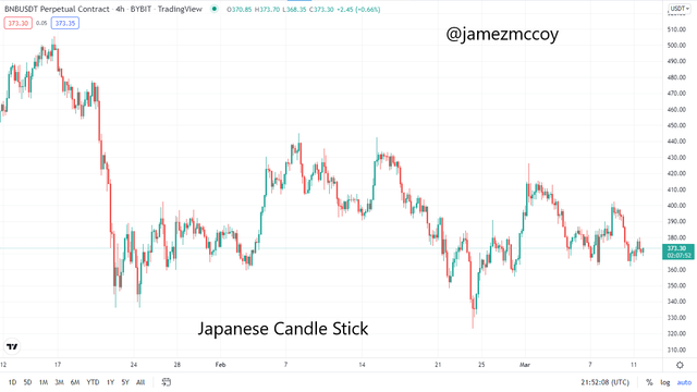
- Japaneese candlestick chart
- Heiken Ashi chart
- Bar chart e.t.c
Although all the different types of chart perform a similar function i.e graphically display the price of an asset alongside its fluctuations they do so with different types of calculations lets take the line chart, for instance, it is the most basic of all chart as it only calculates the price of an action based on previous closing prices hence it tends to have the least amount of noise while the Candlestick chart puts into consideration open, close, high and lows when calculating price action hence tends to create a lot of noise and distortions in the chart. Although they are different and have different calculations they all perform the basic function of displaying price action some with more information than others, below is an example of a chart
JAPANESE CANDLESTICK
The Japanese candlestick is a technical analysis tool used to indicate price movements by showing opening and closing and highs and lows in the market price for a specified period of time. It offers information like highest points, lowest points, opening prices and closing prices, markets direction, help analyze to predict if there is going to be a bullish trend or bearish and all this information can be absorbed by a Trader by just a glance at the chart
Japanese candlestick and even most technical indicators now usually green bar represents upward movement in the market and on top of the green indicates a close and the bottom of the green indicates an open while red indicates downward movement in the market and the bottom of the red bar indicates close while the top indicates the open. The wick often known as the shadow is seen on the top of the candlestick whether Red or Green it represents the highest point the market has reached within your specified period of time and if the wick on a candlestick is high it indicates high volatility in the market while if the wick is very low it indicates low volatility in the market
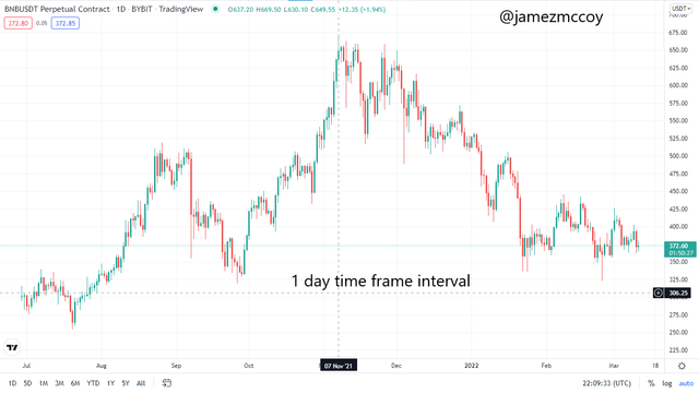
TIME-FRAMES
Time frames represent time intervals with which data is represented graphically in a real-time chart, time frame depending on our preferences can be used to see a particular data in different perspectives, for instance, a chart can be seen to be bullish in a 30 mins time frame but entirely bearish if looked at from a longer time frame like 1 day.
Time frame is an aspect of our chart which is also a fundamental tool that every trader needs to acclimatize himself with to be able to properly analyze the direction of a market, for instance using a strategy based on a longer time frame like a 1-day chart on a 5 mins time frame can prove to be futile and may lead to wrong entries. On a 1 hour chart time frame each candle represents an hour so does a daily time frame chart each candle will represent 1 day. A screenshot of a daily time frame chart is seen below
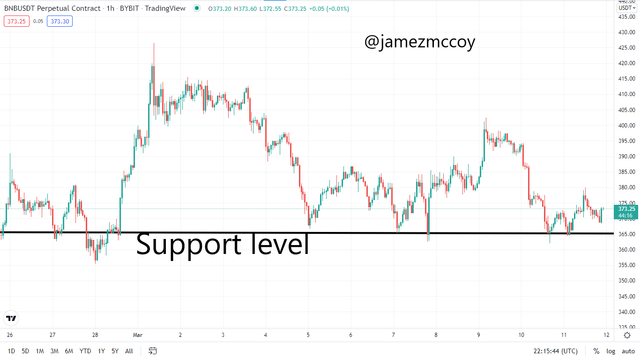
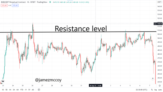
2: Explains how to identify support and resistance levels. (Give examples with at least 2 different graphs)
Support and resistance is a level created in a market often due to a certain level of balance between buyers and sellers in a market, support level is created by an imbalance between buyers and sellers in a market where the buyers don't allow the price of an asset to exceed a certain price level hence the asset price action experiences a certain type of multiple reactions with a certain price level forming a support level
While the resistance level is also created in the same fashion in this case, the sellers step up and overpower buyers when the price of an asset hits a certain level hence causing multiple reactions with a certain price level in the market. This repeated process is often the cause of the formation of support and resistance in a market, this is levels are often discontinued by a process called Breakout which is caused by either the buyers or sellers overpowering one another hence pushing the price of an asset to new higher highs and higher lows or new lower highs and lower lows depending on who is buying or selling the most
The identification of support and resistance level can be done very easily by merely observing the chart and looking for areas where there are multiple reactions between an assets multiple highs for resistance levels or multiple lows of an asset for support level and can be identified easily with the help of a trend line.
SUPPORT LEVEL
Tradingview
RESISTANCE LEVEL
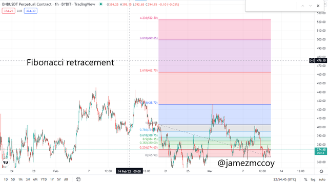
3: Identifies and flags Fibonacci retracements, round numbers, high volume, and accumulation and distribution zones. (Each one in a different graph.)
FIBONACCI RETRACEMENTS
Fibonacci retracement can be regarded as a technical analysis tool that can serve as a potential spotter for support and resistance levels of an asset's price action, when price moves in the opposite direction of a trend the price action is said to have retraced.
The Fibonacci is usually placed between relevant highs and lows in an asset price chart and important retracement levels are displayed where one can tell where an asset's price action is likely going to be retraced. For a downtrend the Fibonacci retracement is place at the previous higher high and connected with the new lowest low after which different levels and ratios will be displayed, each level represents a certain ratio and can prove to be crucial support or resistance level for our assets future movements, vice versa for an uptrend
ROUND NUMBERS
In some cases prices tend to create a strong resistance and support level around round numbers, lets take a look at the screen shot below
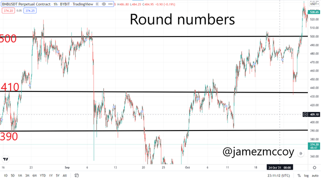
Our asset used the 500 as a resistance which it reacted with on multiple occasion while it used 390 as a basic support level, in between this support and resistance our asset is seen to have multiple reactions with 410 as both support and resistance level. As a crypto trader, some price levels are very important to take note of especially if one notices consistency in relations and pullback within a certain price level.
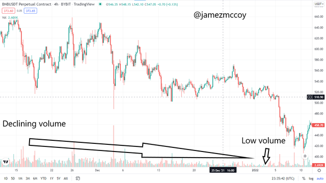
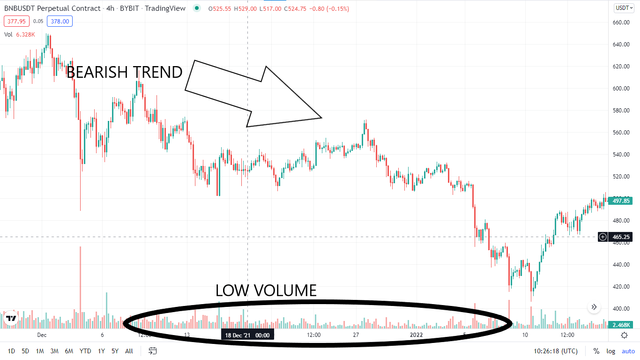
HIGH VOLUMES
As every crypto trader knows the higher the volume in an asset is the more likely there is to be a trend and an accumulation kind of volume often brings about a pump or rise in an asset's price hence profits are made in the asset. A volume indicator is an essential tool that basically has two components i.e red and green sticks, domination of green candles indicate the accumulation of asset hence growth while the dominance of red candles indicates high volume but in a sell manner hence a decline in an asset price is expected to follow. High volumes are most likely to cause strong trends and depending on whether the asset is being bought or sold will determine trends direction an example can be seen below
Tradingview
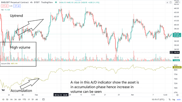
ACCUMULATION AND DISTRIBUTION ZONES
The Accumulation and distribution zones are simply margins created by buyers and sellers depending on what phase the market is, this zones can be closely related to the volume of an asset, when the market is in either phase it can be seen from the volume of the asset when the market is in an accumulation phase we can observe that the green candles will be dominant in the volume indicator and vice versa for distribution
The higher the rise in volume the higher the demand which in turn indicates an increased rate in trader's accumulation of an asset which will also lead to an increase in price rate and vice versa.
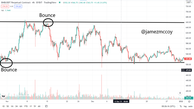
4:It explains how to correctly identify a bounce and a breakout. (Screenshots required.)
A bounce can be said to be crucial interaction that happen when price action is seen within the support and resistance levels when an asset reacts with a specific level within the zone and the price does not closes when retracing its step the asset is said to have experienced a bounce, a screenshot example of bounce can be seen below
Tradingview
A bounce can easily be identified in support and resistance zone with multiple reactions specifically one without an asset not breaking or closing while trying to react with the opposite important level while
A breakout can be seen to be an important market movement which usually is seen to occur in support and resistance levels, A breakout often occurs as a result of an imbalance between current buyers and sellers in a market. When buyers are more in the market and a breakout occurs it is mostly seen to occur toward the resistance side causing the asset to continue in an uptrend while a market with more sellers selling and a breakout occurs is most likely to happen in the support level hence the asset will be seen to be in a bearish trend. An example can be seen below
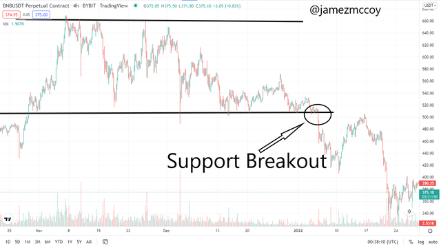
Determining Previous trend direction and direction the price action broke out of the Support and Resistance zone can be quite crucial to predicting the future trend of an asset for instance if an asset came from a bearish trend and made interaction with a certain price level creating support and resistance zone and broke out in the support side it is said to be a CONTINUATION breakout while if it breakouts the resistance side it is regarded to as a REVERSAL breakout and vice versa for the bullish trend
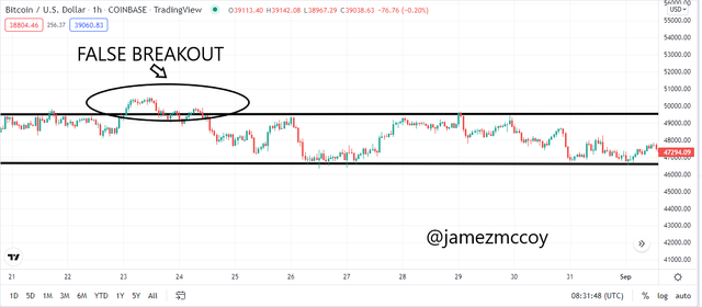
5:Explain that it is a false breakout. (Screenshots required.)
A false breakout can be said to be a failed attempt by the price action to break the support and resistance level,Basically, a False breakout in support and resistance level is in most cases caused by low or inadequate volatility in the asset's market, re-balance between buyers and sellers or Low interest between buyers/sellers
When a price action attempts to break a zone the asset is required to have a minimum amount of volatility before it can create new higher highs or lower lows, in most cases, a false breakout traps a lot if traders especially those trading based on emotions or on guts without proper technical analysis.
6:Explain your understanding of trend trading following the laws of supply and demand. It also explains how to place entry and exit orders following the laws of supply and demand. (Use at least one of the methods explained.)(Screenshots required.)
Trend trading in accordance with the law of supply and demand can be quite profitable if a trader understands the concept properly
"The law of demand and supply outlines the interaction between a buyer and a seller of a resource. The law of demand and supply says that sellers will supply less of a product or resource as price decreases, while buyers will buy more, and vice versa."source.
This principle simply dictates that when the supply of an asset is enormous and the demand is low the price of the asset will experience a decline hence a downtrend will be perceived in the asset's chart, while when the supply is low and the demand is high the asset's price will be increasing hence an uptrend will be seen in the chart of an asset, this principle can be used to strategically map out entry and exit in a real-time crypto market.
In an uptrend an asset will experience high demand and a low supply will be observed in the market this information can be used to place an entry in the market as when this is seen or perceived an uptrend is mostlikely to occur afterwards, the volume indicator and the Accumulation and Distribution indicators will be the sole signal tool in this case as when supply is low the little that is available is being transacted back and forth hence there is a significant increment in the asset's volume and vice versa for a downtrend, graphical representations below
DOWNTREND
Tradingview
UPTREND
Tradingview
HOW TO PLACE ENTRIES AND EXITS
FINAL RETRACEMENTS
The final retracement is seen at the end of the trend when other waves have been identified and confirmed , the final retracement is often seen to happen in three phases a,b and c each subsequent wave having a weaker or shorter momentum than its previous implying that wave a has the strongest momentum while c has the weakest and b in between indirectly telling the trader that the trend is weakening.
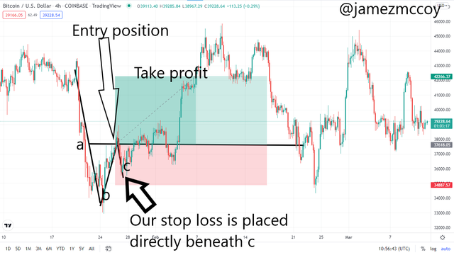
The stop loss is to be placed directly beneath c for safe trading and take profit to stop loss ratio can be adjusted to facilitate profit intake but personally i prefer the 2:1 take profit to stop loss ratio
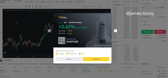
7:Open a live trade where you use at least one of the methods explained in the class. (Screenshots of the verified account are required.)
For my live trade made use of the elliot Final retracement to obtain my entry and exit spot. I marked my entry after drafting wave a b and c and put my stop loss beneath c since i was using a leverage of 20x i used a short time frame to mark my entry. I entered the trade at 17.669 and made my exit at 17.702 with a profit of 3.62% totalling 0.16USDT
CONCLUSION
A combination of different chart, multi time frame analysis and different indicator strategies like the final retracement and law of supply and demand can help lessen one's losses in the crypto world of one knows how to combine and properly apply this strategies. Thanks to professor @nana15 for this wonderful course
You've got a free upvote from witness fuli.
Peace & Love!