Japanese Candlestick Patterns -Steemit Crypto Academy Season -Homework Post for Task 10

(a) Explain the Japanese candlestick chart? (Original screenshot required).
(b) In your own words, explain why the Japanese Candlestick chart is the most used in the financial market.
(c) Describe a bullish and bearish candle. Also, explain its anatomy. (Original screenshot required).

Explain the Japanese candlestick chart?
The Japanese candlestick model, established by a rice merchant Homma Munehisa, is the most widely adopted and acknowledged by every trader in every country. We all know that no pattern, whether it's a candlestick, a bar chart, or a basic line chart, can anticipate market movement.
Homma Munehisa's main motivation for designing candlestick patterns was to better comprehend the sentiment of buyers and sellers at any given time. Believe me, you can't anticipate the market's future; otherwise, you'd be a millionaire by now and not be reading this dreck. The candlestick, bar, and line charts all have different ways of displaying market conditions, but the candlestick pattern is more instructive than the other two.
Candlestick Pattern
Line Pattern
Bar Pattern
A learned guy can anticipate (may be right or wrong) the sentiment of the market for the short term using the above line pattern, but a learned guy can predict (may be right or wrong) the sentiment of the market using the candlestick pattern. The Japanese candlestick pattern is the most extensively employed by cryptocurrency, commodities, and stock traders all over the world due to its ease of gauging market emotion.
The attitude of buyers and sellers can be discerned via Candlestick patterns. The Candlestick is made up of four sections that demonstrate how the asset price behaves. The four parts are as follows:
- OPEN
- CLOSE
- HIGH
- LOW
Candlestick patterns are displayed in two colours: green and red. The green candlestick denotes bullish moves, which occur when the market is dominated by buyers. The sellers are in control of the Red candlestick, often known as a bearish candlestick. The game of supply and demand is at the heart of it.
In other words, if there is a lot of supply of any asset, demand will be low, and the price will fall (bearish - Red candle), and if there is a lot of demand, the price will rise (bullish - Green candle) (Bullish - Green candle).
In your own words, explain why the Japanese Candlestick chart is the most used in the financial market?.
Candlestick patterns appear to be more convenient, accessible, and understood than the other two charts, bar charts and line charts. Candlestick patterns are extensively studied, and some of the recurrent patterns might assist any trader in predicting the market's likely next move. Traders continue to chart in order to extract any available clues from candlestick patterns in order to place massive bets. As a result, it is used by the majority of financial markets, including cryptocurrencies, stock markets, gold markets, and commodities markets. The candlestick pattern provides a precise picture of price fluctuation when used in technical analysis.
- You may readily identify market trends when you witness candlestick patterns for any asset. Candlestick colours are an important instrument for traders to use when determining market movement. The creation of various forms of well-known patterns such as Engulfing, Doji, Hammer, the morning and evening star, and the production of different types of well-known patterns may readily locate the bullish and bearish.
Assist in comprehending the emotions of both buyers and sellers. - There is a supply and demand game at work, a candlestick pattern has evolved. For any asset, the creation of a green candlestick indicates that buyers are more optimistic about the product than sellers. When the red candlestick appears, buyers are less optimistic about the asset, and sellers are selling their asset, resulting in bearish patterns.
- Both bar and line charts are more difficult to comprehend than candlestick patterns. Any rookie may learn several types of candlestick patterns by reading various blogs or just watching a good lesson, however studying bar and line charts is much more difficult.
- Candlesticks come in a variety of colours and shapes. The candlestick pattern's body size also gives an indication of the amount of specific assets. Traders can get an indication of how much people are buying and selling merely by looking at candlestick patterns. So, in summary, the Candlestick pattern delivers a wealth of information (bearish, bullish, market sentiment, and volume) simply by looking at it, however the bar and line chart cannot compare in terms of comprehending market movements.
Describe a bullish and bearish candle. Also, explain its anatomy. (Original screenshot required).
Bullish Candlestick
In question 1, there are primarily two sorts of candlestick patterns: bullish and bearish. Bullish candlesticks appear when there is low supply and high demand for any asset, as we all know (buyers are optimistic about the asset). Because of the little supply and high demand, the asset price soars, generating powerful bullish patterns.
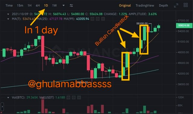
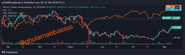
I've highlighted how the bullish candle appears in the diagram below. The chart below is a one-day chart, with each candle representing one day.
The hourly candlestick chart of bitcoin was very positive, with prices reaching 50k to 55k USDT. Bullish candlesticks indicate that purchasers are confident that BTC will achieve its all-time high.
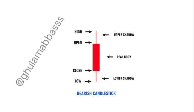
A Bullish Candlestick's Anatomy
As previously stated, each candle is made up of four components, each of which represents a particular price at any given time. There are two more parts. When it comes to candlestick patterns, the body and shadow are also quite essential.
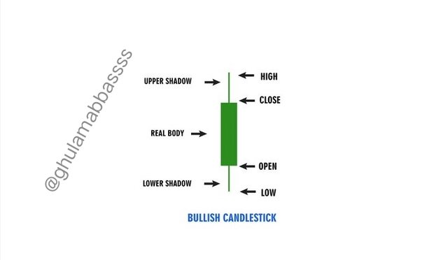
OPEN:
This is the price at which an asset's price movement begins. The candlestick's body will be formed by price movement. The opening of a bearish candlestick is always higher than that of a bullish candlestick. It is also known as the asset's initial price.
CLOSE:
This is the candle's final price, and it represents the end of the specific candlestick pattern. It's also known as a closing price.
HIGH:
Within a certain period, this is the highest point/price of any candle. If the high is above the close in a bullish candle, more individuals are buying the asset, indicating buying pressure that propels the market upwards.
LOW:
The lowest price point that a product hits throughout a given time period. If you see that the low is lower than the open price, it means that the price opened at a high level but fell due to selling pressure. Later, though, purchasing pressure pushed the market higher.
The body and shadow are the other two pieces that result from the interaction of these four points.
BODY:
In candlestick patterns, the area between the close and open price is referred to as the body. The larger the body, the higher the volume of certain items traded.
SHADOW:
It is the area of the candlestick between the low and high prices, or the high and opening prices. It's also known as the candle's wick at times. The larger the wick or shadow, the more uncertain the market's movement.
Bearish Candlestick
Already discussed in question 1, a Bearish candlestick appears when there is more supply than demand for a particular asset (buyers are not optimistic about the asset). Because of the huge supply and little demand, the market is under selling pressure, resulting in strong bearish candlestick patterns.
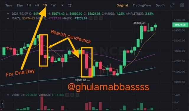
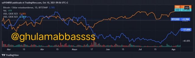
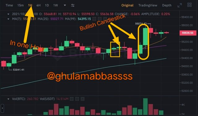
I've shown how the bearish candle works in the chart below. The chart below is a one-hour chart, with each candle representing one hour. The yellow boxes in the graphic below indicate that bitcoin was bearish at the time indicated.
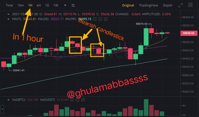
A Bearish Candlestick's Anatomy
As previously mentioned, each bearish candle contains four components, each of which indicates a particular price at a specific time.
OPEN:
This is the first or starting price of an asset, at which point the price volatility begins. The candlestick's body will be formed by price movement. A negative candlestick opens higher than a bullish candlestick in general. It is also known as the asset's initial price.
CLOSE:
It is the candle's final price, and it represents the end of the specific candlestick pattern. It's also known as the asset's closing price for a given period.
HIGH:
It is the highest point reached by any candle in a certain period of time. If the high is above the open in a bearish candlestick, people are buying the asset more, and then selling pressure is created, turning the entire candle bearish.
LOW:
It is the asset's lowest price during a given time period. If the low is lower than the closing price, it means the price opened at a high but later fell due to selling pressure.
Conclusion
Professor @reminiscence01 did an outstanding job in the last homework 10 by teaching several forms of candlestick pattern development in the market. I'd want to express my gratitude for his incredible work because I was getting bored trying to comprehend candlestick patterns from tutorials or blogs. After completing this homework 10, I found it to be quite simple. I'm pleased that I completed all ten homework assignments in less than a month and learned a lot in the process. Many thanks to all of the lecturers.

😍Thanks for your time😍
Mention
Prof . @dilchamo
You've got a free upvote from witness fuli.
Peace & Love!