Effective Trading Strategy using Line Charts -Steemit Crypto Academy | S6W1 | Homework Post for @dilchamo

Hello everyone,
Welcome back to our great academy. I thank God who kept us alive to see this new season. I give Him all the glory.
It is another wonderful privilege to take part in this knowledge impacting lecture presented by Prof. @dilchamo.
I learnt so much about effective trading strategy using Line Chart. I have also done necessary research needed for a good home work.
Here I present my home work for the week.

1. Explanation of Line chart

Line chart is a type of chart that uses a single and continuous graphic line to represent the history of cryptocurrency price action. It shows information of data points usually connected with a straight line.
Line chart visually represents crypto asset price history clearly and orderly in a line form. It is one of the easiest and less complex chart that everyone, both newbie and professional traders can understand and interpret.
Line chart also known as Line graph is in a very simple form. It depicts only changes in the closing price of a crypto asset over a period of time. A line chart reduces noise generated by Open, High and Low prices in the trading days.
Line chart makes price movement of an asset to appear clearly and very simple on a chart in such a way that traders can read and understand without stress.
Line chart is made up of a horizontal a-axis and vertical y-axis. The horizontal a-axis shows the time frame like, minutes, hours, days, months or years, while the vertical y-axis shows the price of an asset.
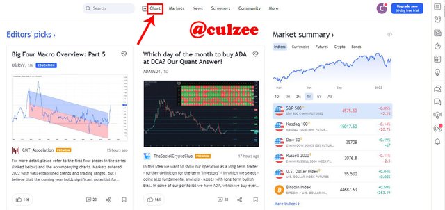
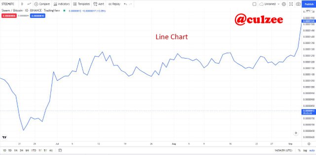
To apply line chart, simply go to any trading platform and click on chart icon and select Line chart. For example, let me apply line chart using Tradingview.com platform.
First of all, I go to www.tradingview.com. When the site opens, click on chart.
Screenshot from tradingview.com
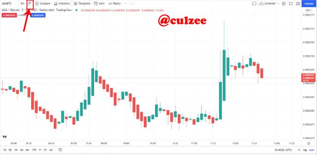
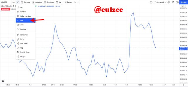
The default chart is candlestick. Then I clicked on the candle icon and a list of charts shows up, then I clicked on "Line"
Screenshot from tradingview.com
Screenshot from tradingview.com
and the line chart appears.
Now, you can see that the chart has changed from Candlestick to Line chart, which is showing a single graphical line representing crypto asset price action history.
Uses Of Line Charts
Line charts can be used for different purposes. Below are some of the things line charts can be used to achieve.
- Line charts are used to track changes in cryptocurrency market over a short and long periods of time.
- They can be used to show data variables and trends very clearly
- Line charts can be used with technical indicator to predict market trend
- They can be used to distinguish patterns either bullish or bearish
- Line charts can be used to follow crypto asset price movement over a short and long period of time
- They can be used by traders to identify support and resistance level in any trade
2. How to Identify Support and Resistance levels using Line Charts
The Support and resistance levels are very important as far as cryptocurrency trading is concern. They are the basis for technical analysis. Every trader is supposed to know how to identify them because understanding how it works enable him to have an idea of the possible direction of price action.
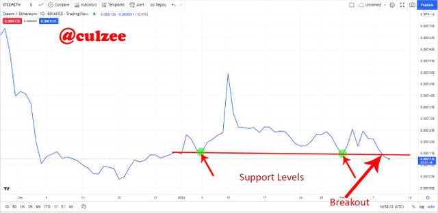
* Support level
This is an area in the chart where the market price of an asset had difficulties to break below. At the support level, the price tries to go down lower but was stopped by a strong buying power forcing the price to bounce off the support level.

Screenshot from tradingview.com
From the above screenshot, you can see how the price tries to break the support trendline at the point I marked with small green circle with red arrow pointing at it.
What happened is that the buyers have been dominating the market over a period of time and the sellers started waxing very strong trying to take over the market from the buyers.
So, they continued to press the price down to over-power the buyers but when they reached the support level the buyers used a stronger buying power to stop them from pressing the price down further and the price bounces back upward.
Identifying and drawing a Support line
Support levels can be identified simply by a horizontal line. The first thing you need to do is to identify a past price-level where the price tried to break below but could not succeed.
Identify the current Lower Lows and draw a straight line connecting the swings.
* Resistance level
This is an area in the chart where the market price of an asset had difficulties to break above. At the Resistance level, the price tries to move higher but was resisted or stopped by a strong selling power forcing the price to bounce off the Resistance level .
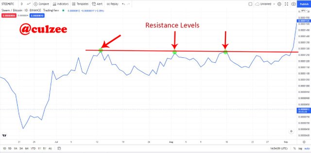
Screenshot from tradingview.com
From the above screenshot, you can see how the price tries to break the resistance trendline at the point I marked with small green circle with red arrow pointing at it.
What really happened is that the sellers have been dominating the market over a period of time and the buyers started waxing very strong trying to take over the market from the sellers.
So, they continued to press the price higher to over-power the sellers but when they reached the Resistance level the sellers used a stronger selling power to stop them from further pressing the price higher and the price bounces back downward.
Identifying and drawing a Resistance line
Resistance levels can be identified simply by a horizontal line. To identify the Resistance level, the first thing you need to do is to identify a past price-level where the price of an asset tried to break above but could not succeed.
Identify the current higher highs and draw a straight line connecting the swings.
NOTE
Any time the price breaks the support level and the price continues going downward, it means there is a trend break out. That is a very good signal to enter sell position. See screenshot example.
Screenshot from tradingview.com
From the above screenshot, You will notice the breakout point at the point I indicated with big red arrow.
Similarly, When the price breaks the Resistance level and the price continues trending up, it means there is a trend break out. That is a very good signal to enter buy position. See screenshot example below.
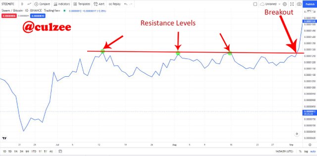
Screenshot from tradingview.com
From the above screenshot, You will notice the breakout point at the point I indicated with big red arrow.
3. Difference between line chart and Candlestick chart
Technical analysis is one of the most important aspect of cryptocurrency trading. But before doing any technical analysis using indicators, you would need to decide on which type of chart to use.
In this section, I will be looking at the difference between line chart and Candlestick chart which many traders use for their technical analysis. Knowing the difference can help you to choose which chart will help you to get the best market trend analysis.
Below are the major differences between line chart and Candlestick chart:
The first difference:
Line chart uses a single graphic line to represent cryptocurrency price action. This chart only makes use of closing prices of assets and filters out a lot noise which can be used sometime to read the market direction. For this reason line chart do not offer adequate information about price behaviour.
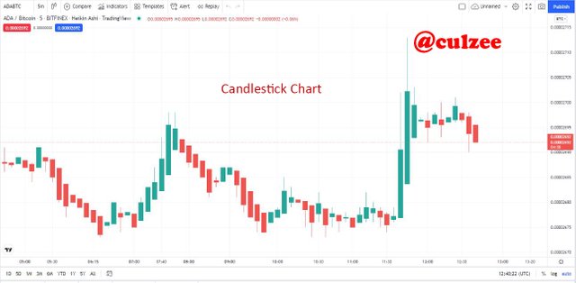
While the Candlestick chart is made up of Green and Red candles, where the green candle represents the buyers and the red candle represents the sellers. Candlestick chart uses open, high, and low prices which provides detail and adequate information about price action.
The second difference:
Line chart is a single and continuous graphic line that represents the history of asset price action. While candlestick chart is not a single line, it consists of series of green and red candles which usually forms highs and lows.
The third difference:
Line chart appears clearly and very simple that newbie traders can easily understand and use. While candlestick is not clear and simple in such a way that a newbie trader can easily understand. It is mostly used by professionals and expert traders.
The fourth difference:
Line chart is very good for a long time-frame trading analysis. This is because long time-frame trading does not require too much details. What is most important is the direction of price action. While the Japaneses candlestick counterpart which can also be used for long time-frame is much better used for short time-frame trading that needs all the details of the market trend.
Below are screenshot examples for a candlestick chart and a line chart.
Screenshot from tradingview.com
Screenshot from tradingview.com
4. Suitable indicators that can be used with Line charts
Below are some technical indicators which can work well with line charts.
Moving Average Indicator
One of the most suitable indicator that can be used with Line charts is Moving Average technical indicator. Moving Average is a trend following indicator used by traders to determine the direction of market.
MA indicator sums up the data points of a crypto asset over a specific period of time and divides it by the number of data points to arrive at an average.
The Moving Average indicator is a popular indicator among crypto investors and traders. It is a single line indicator that shows the average price movement of an assets over a particular time period.
Moving Averages is very good technical strategy that provides support during bullish trends and it offers a resistance during bearish trends.
Moving Averages is a nice tool to use in line graph when it comes to getting a clear market entry signal before making a trade decision.
Below is a screenshot example of Moving Averages indicator.
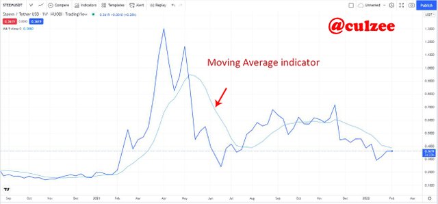
Screenshot from tradingview.com
From the above screenshot example, I have indicated the Moving Averages indicator with red arrow.
MACD Indicator:
Another indicator that can be used with Line charts is Moving Average Convergence and Divergence (MACD).
Moving Average Convergence/Divergence indicator is a momentum oscillator that is used by crypto traders to predict market trends. It is also a trend following indicator that seeks to identify changes in the price of an asset.
MACD is made up of the MACD line (which checks the distance between moving averages), the Signal line (which identifies changes in the price momentum) and the Histogram (which shows a graphic representation of the distance between the MACD line and the signal line).
The MACD Indicator gives a buy signal when the MACD line (the blue line) crosses the signal line (the yellow line) from below and a sell signal when the MACD line (the blue line)crosses the signal line (the yellow line) from above.
Below is a screenshot example of MACD Indicator. I will use corresponding screenshots in the next question.
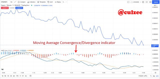
Screenshot from tradingview.com
From the above screenshot example, I have indicated the MACD Indicator
with red arrow.
5. How to find Bullish and Bearish Trading opportunities using Line charts
The ability of a trader to identify Bullish and Bearish Trading opportunities using Line charts is of great importance in cryptocurrency trading. If a trader can accurately identify Bullish and Bearish Trading opportunities in the crypto market his profit margin will be great. But if he can not accurately find Bullish and Bearish Trading opportunities, he is bound to always trade at a loss.
Therefore, finding Bullish and Bearish Trading opportunities using Line charts is of utmost importance and we must pay great attention to it.
To find Bullish and Bearish Trading opportunities using Line charts I will be using Moving Average Convergence/Divergence indicator. The reason I prefer to use this indicator is because it is a trend following indicator which identifies changes in the price of an asset, and it is very simple.
Identification of Bullish Trade Opportunity
To identify a bullish trade opportunity on a line chart using Moving Average Convergence/Divergence indicator, observe the indicator, when the blue line (MACD Line) crosses the yellow line ( Signal Line) from below and the blue line is above the yellow line, it signals a bullish trend. At this point a trader can enter a buy position. See below screenshot example.
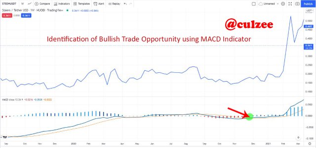
Screenshot from tradingview.com
From the screenshot above, observe the point I marked with small green circle with red arrow, you will notice that the blue line (MACD Line) crossed the yellow line ( Signal Line) from below and the blue line is above the yellow line, This is a signal of a bullish trend. At this point a trader can enter a buy position. this is because the price has started rising. So, If a trader buys the crypto asset now as the price continues to rise the trader makes more profit.
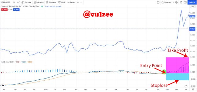
Screenshot from tradingview.com
With the signal I got from the above MACD indicator I setup my entry point, my stoploss and Take Profit for a buy position at the ratio of 2:1, as you can see on the above screenshot.
Identification of Bearish Trade Opportunity
To identify a bearish trade opportunity on a line chart using Moving Average Convergence/Divergence indicator, observe the indicator, when the blue line (MACD line) crosses the yellow line (Signal line) from above and the yellow line is above the blue line, it signals a bearish trend. At this point a trader can enter a sell position. Below is a screenshot example.
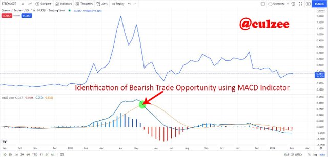
Screenshot from tradingview.com
From the screenshot above, observe the point where I marked with small green circle with red arrow, you will notice that the blue line (MACD line) crossed the yellow line (Signal line) from above and the yellow line is above the blue line, it signals a bearish trend. At this point a trader can enter a sell position. This is because the price has started falling. So, If a trader sells his or her crypto asset now as the price continues to fall the trader has opportunity to make more profit later.
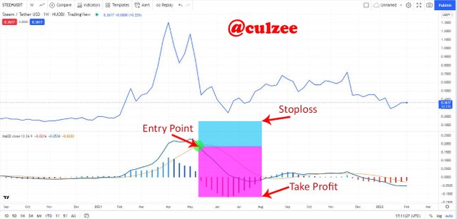
Screenshot from tradingview.com
With the signal I got from the above MACD indicator I setup my entry point, my stoploss and Take Profit for a sell position at the ratio of 2:1, as you can see on the above screenshot.
6. Advantages and Disadvantages of Line charts
There is nothing perfect in this world. Everything in this physical world in which we live has some areas of strength and some areas of weakness. Line chart is not exceptional. Below are some advantages and disadvantages of Line charts.
Advantages Of Line Chart
The following are the advantages of Line Chart:
Simple and Easy to Understand:- Line Chart is one of the charts in cryptocurrency trading that is very simple to read and easy to understand. It uses a single line to connect the closing price points. This makes it less complex chart that can easily be understood by the newbie traders and professional traders.
Filters Noise:- Another advantage of line chart is that it uses only asset closing price points which helps to filter out a lot of noise from chart. Unlike in the Japanese candlestick that uses open, close, high, and low of an asset which generates a lot of noise making a candlestick chart look complex.
Depicts Changes:- One other good advantage of Line chart is that It shows changes and market in the closing price of an asset over a period of time.
Identification of Market Trend:- Line chart can be used to easily identify support levels, resistance levels and even trendline breakouts.
Can be combined with Technical Indicators:- Another advantage of line chart is that it can be used with different technical indicators to determine and predict the next market direction just like the Japanese candlestick chart.
Disadvantages of Line Chart
Below are some of the major disadvantages of line chart.
Inadequate information for traders:- One of the major disadvantages of line chart is that it doesn't provide enough information for traders to carry out a deeper technical analysis that can lead to a very good trading decision. For this reason, traders who use line chart to carry out short time-frame analysis make shallow trading decision that can lead to losses.
Uses only closing price of an asset:- Another big disadvantage of Line chart is that it uses only the closing price of an asset. This will not provide adequate data that are required by traders or investors to determine and predicts better price action.
Not suitable for short time-frame:- This is another disadvantage of the line chart is that makes many traders to stop using the chart and go for candlestick chart. Line chart is more effective for longer time-frame traders and investors. It is not suitable for short time-frame traders. Using line chart in a short time-frame does not work well because of the absence of Open, High and Low as can be obtained in the candlestick.
Conclusion
Line chart is one of the easiest and less complex chart that everyone, both newbie and professional traders can understand and interpret. It visually represents crypto asset price history clearly and orderly in a line form.
In this home work, I have been able to explain line chart in details and highlights it's uses. I have also explained how to Identify Support and Resistance levels using Line Charts as well as the differences that exist between line charts and Candlestick charts.
However, I mentioned and explained some indicators that can be used with Line charts and how to find Bullish and Bearish Trading opportunities using Line charts
Finally, I highlighted and briefly explained some advantages and disadvantages of Line charts. To make my points clear and easy to comprehend I used numerous screenshot examples.
Thank you very much for reading my home work. I appreciate.
Before I sign out, I want to say a very big thank you to our amiable lecturer, prof. @dilchamo for the wonderful lecture. Thank you once again and remain blessed.