Basics to Trade Cryptocurrency II - Steemit Crypto Academy |S6W3| - Homework Post for Professor @nane15
Hello wonderful people, how are you today? I hope you're having a fantastic week. I'm ecstatic to be a part of this unforgettable lecture. In this article, I'll share my experience with Basics to Trade Cryptocurrency II.


Understanding Charts, Candlesticks and Timeframes
Traders can use a variety of tools to make trading decisions in the market. The basic analysis has limits since it does not show market demand and supply. Furthermore, previous prices cannot be used to forecast future prices. Technical analysis is without a doubt one of the most essential tools accessible to retail traders for forecasting future prices. Let's have a look at some of the technical analysis tools that are now accessible in the marketplace.
Line Charts.
The line chart is the most basic type of chart in the market. The line is used by the majority of traders because to its simplicity and efficiency of usage. A quick peek at the line chart might help traders identify price direction. The line chart is created by utilizing a dynamic to link the closing prices at different time intervals. A line chart example is presented below.
Japanese Candlestick Chart.
The candlestick chart is the most popular chart among traders in today's financial market. Although the line chart is simple, it does not display important pricing information such as the opening, closing, and high price. Furthermore, determining price movement that is generated by trader emotions and sentiments is challenging. A candlestick chart is an excellent tool for analyzing price fluctuations and market interactions between buyers and sellers. The candlestick chart is seen beneath.
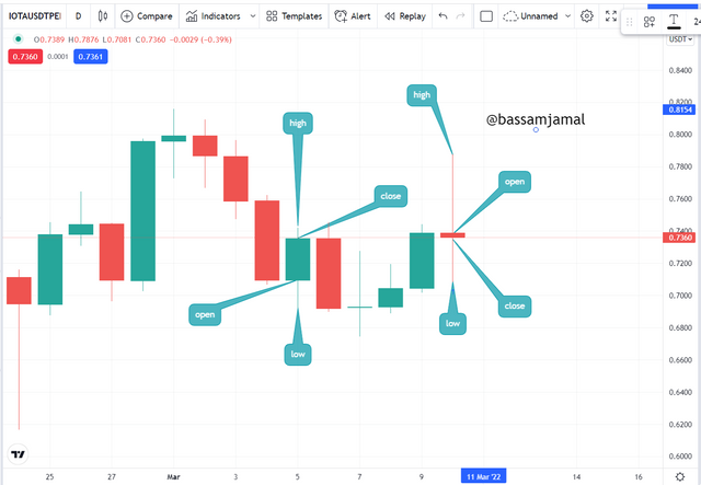
I determined the anatomy of the candlestick using the chart above. Looking at the chart, we can see a bearish candlestick (red), indicating that sellers controlled the market throughout that time period. In addition, the green candlestick (green) indicates that purchasers controlled the price throughout that time period.
The bullish candlestick indicates that the price closed above the opening price within a timeframe, indicating that buyers were interested in the asset. A bearish candle also indicates that the price closed below the opening price, indicating that sellers controlled the marketplace. The candlestick chart is without a question a highly essential technical analysis tool in today's environment.
Timeframes
The period reflects a certain point in time when the trading activity occurred in the market. This may be done on a monthly, weekly, daily, 1 hour, or 1-minute basis. Using the candlestick chart, for instance, the construction of a candlestick indicates the trading activity that occurred inside the timeframe. The daily period is depicted in the chart beneath.
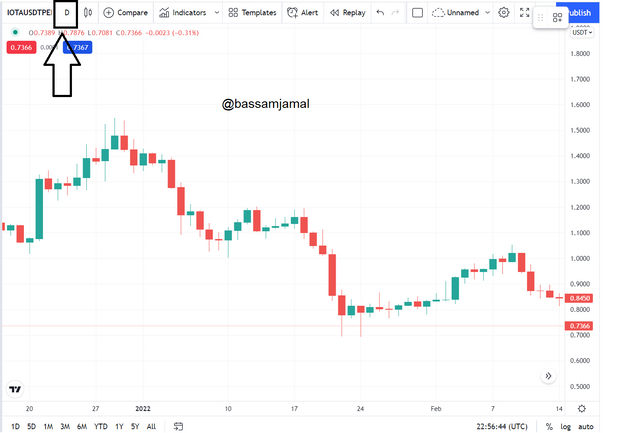
The Daily period is seen in the chart shown above. This implies that at the conclusion of each day, each candle on this chart symbolizes the trading activity and contacts of traders.
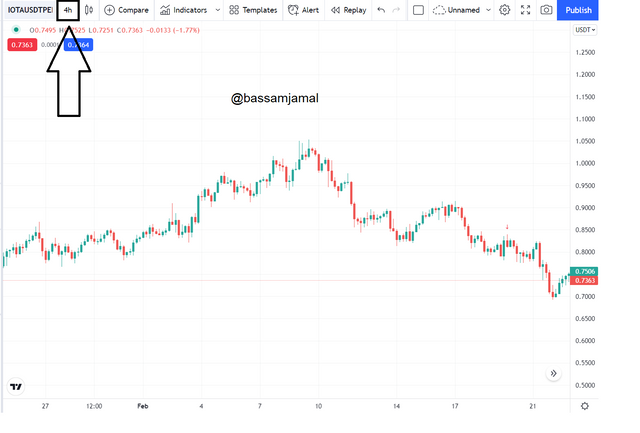
The 4-hour candlestick chart is seen here. On the 4-hour chart, we can detect some noise and erratic oscillations. On a daily basis, however, we have a clear, which helps us grasp price movements easier.
Identifying Support and Resistance on the Chart
Support and resistance areas are critical levels for investors to consider before making a trading decision. Support and resistance levels in the marketplace signify areas of considerable buying and selling demand. Market traders use support and resistance levels as entry/exit markers.
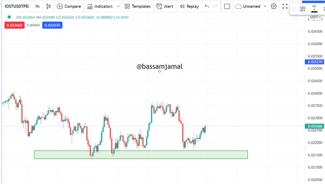
Support Levels.
The market's purchasing appetite is focused on the support level. After an extended negative trend, traders may be taking gains on their selling holdings. This slows down the price, causing the market to go into a purchasing frenzy. When the price reaches the support level, it is predicted to reverse. However, this is not always the case. The price might break through support throughout a strong negative trend, allowing the bearish trend to continue. A sample of the assistance is presented below.
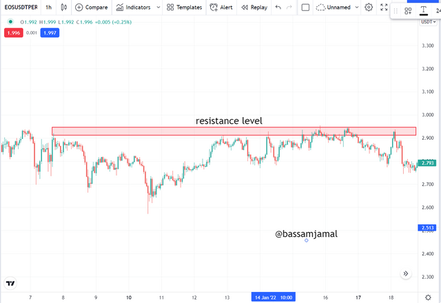
Resistance Level.
The resistance level serves as a point of sale in the market. This region is used by traders to take profits. After a protracted bullish run, price is predicted to be denied at the resistance. Occasionally, throughout a strong rally, we see price break through the resistance level, indicating that the positive trend will continue. Before making a trading choice, traders must constantly be on the lookout for reversal patterns. The graphic depicts an instance of a resistance level.
Fibonacci Retracements, Round numbers, High volumes, Accumulation, and Distribution zones.
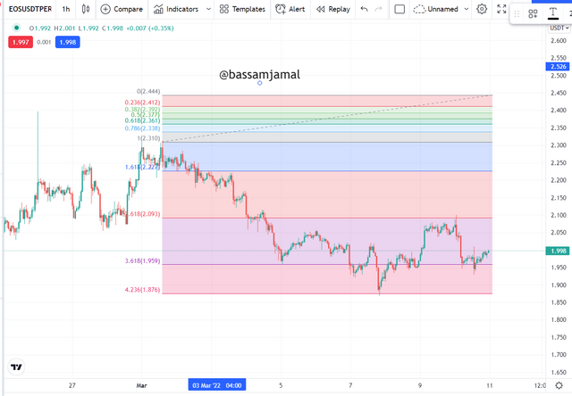
The price fluctuates in zigzag patterns in a moving market, generating highs and lows as it travels higher or downward. There are significant instinct and retracement swings in the opposite direction of the initial trend. The pullback is the outcome of traders taking profits and providing a chance to enter the market at a low price. The Fibonacci retracement tool is a technical analysis tool that may be used to determine market reversal points. The tool contains many levels at which price is expected to revert following a retracement. The Fibonacci technique is used to draw an uptrend from a previous low point to a recent high. The chart below provides an example.
Round Numbers
Most traders consider an easy approach to detect critical levels on the chart, particularly when executing stop-loss and take-profit orders. We understand that profit-taking and stop-loss strategies are marketplace entrances and exits that cause price reversals. Most traders would rather have a stop loss or take a profit level of 2 than 2.8.
Volume.
The volume indication is quite important in this industry. Price and volume have a direct link, as well as every trader must concentrate on the volume indicator to identify price fluctuations. Price ranges with reduced body candlesticks are common throughout the gathering and dispersion phase of the market. This is accompanied by low volumes, indicating a low level of volatility in the market.
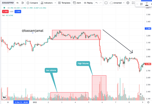
The chart above shows that during the market's dispersion phase, we see a price point with no orientation. This demonstrates minimal volatility, which is reflected in the volume indicator by modest volume bars. Following the distribution phase, price broke out of the range, indicating a downtrend.
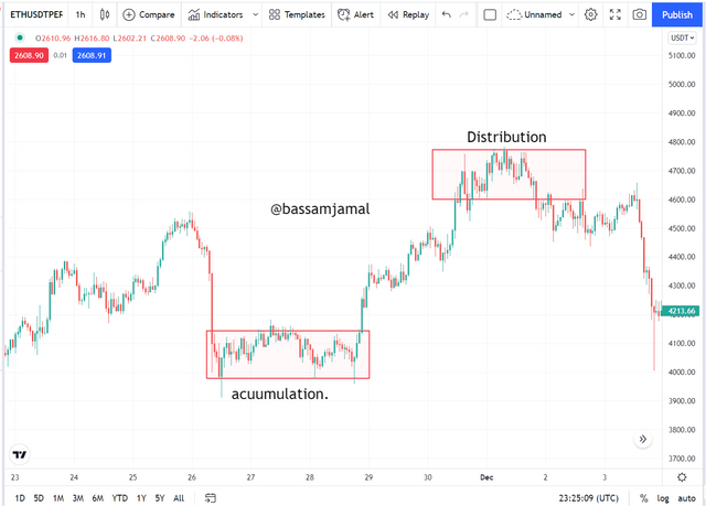
Accumulation and Distribution Zones.
The market might be in either an uptrend or a decline. These tendencies are the outcome of price accumulation and distribution. The market's consolidation phase is viewed as a profit-making opportunity for large investors on their sell position. At this time, the market is slowing down in order to gather liquidity and optimistic indications for a possible rise. After a negative run, significant players extract profits on their sell positions by completing their trading, which is what happened at the accumulation. Following that, they begin to open buy positions, which slows the market and creates a range as well as positive reversal indications. This bullish reversal signal piques the attention of buyers in the asset.
How to correctly identify a Rebound and a Breakout.
Trading support and resistance levels is a challenging task. As a result, these sites are frequently used as escape points. The rationale for this is that if the price reaches this level, it may either revert back down or break through to continue the original trend. Furthermore, if the price breaks through this level, a trader may be duped into a false breakout, which can result in losses. In this part, we'll look for a breakout and a comeback to confirm a breached level.
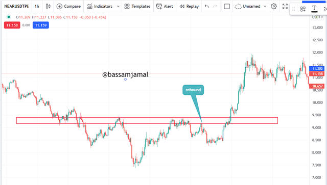
We can detect a breakdown of a support level in the chart above. Price retested this support level several times until further selling pressure came to market, causing the price to burst through the support level and keep falling.
False Breakout
Trading at support and resistance levels is tough and hazardous since the price is generally manipulated at these levels to produce liquidity by the large players. Normally, pricing is expected to revert at crucial levels. The vast majority of retail traders put sell orders at resistance levels and purchase orders at support levels. Stoploss thresholds are set above and below the levels for these orders. The price will then break out of a level to hit the stop loss levels established above and below these levels.
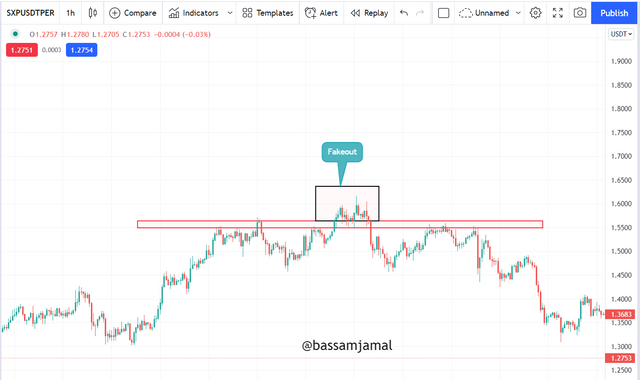
This breakthrough will drive amateur investors to exit their holdings and start a buy trade in the breakout trend. Following that, we observe prices revert back to the broken level, driving them out of the market once more.
Explain your understanding of trend trading following the laws of supply and demand. It also explains how to place entry and exit orders following the laws of supply and demand. (Use at least one of the methods explained.)(Screenshots required.)
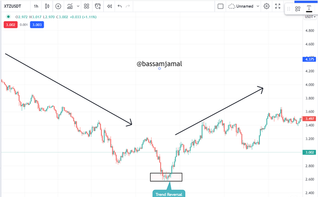
The cryptocurrency market is very volatile, with the price of a coin fluctuating on the exchange market. Because of changes in demand and supply, the currency moves up and down from time to time. When traders' attitudes regarding the market shift, the market trend shifts. When the market is in a slump, investors see it as a favourable time to purchase and come into the market by purchasing coins. The coin's demand rises as its supply falls. The coin's price begins to rise, and the coin begins to trend higher. The negative trend has ended, and the bullish trend has begun in the market.''
Likewise, whenever the market is on an upswing, the value of the currency is higher. Traders see it as a favorable exit point and begin selling coins to gain. When the panic selling in the marketplace exceeds the purchasing pressure, the demand falls and the supply rises, causing the price to rise. In the market, there are essentially two trends. Whenever the price of a coin rises, individuals take benefit of the pattern and sell their currency. Consumption is decreasing while supply is increasing. As a result, the price falls and a downtrend occurs. As a result, the trend shifts from bearish to bullish or from bullish to bearish.
How to place entries and exit orders following the laws of Supply and Demand
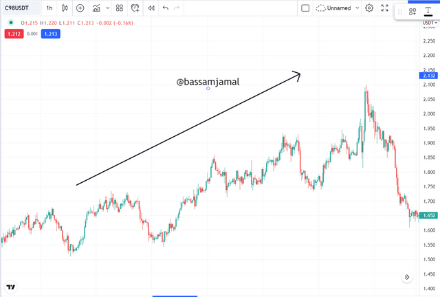
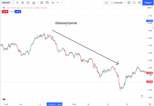
We should understand that the pricing rises or falls in response to supply and demand. An upswing market develops when the market surpasses available supply. This results in higher highs and lower lows on the chart. Similarly, when supply increases, the price falls, resulting in a downward market with lower highs and lower lows on the graph. Are below samples of an upswing marketplace and a declining market.
- This is a picture of an upswing marketplace taken from the TradingView platform, and we could see that the marketplace is heading higher by making higher highs and lower lows.
- This is a picture of the downward marketplace taken from the TradingView website, and we could see that the marketplace is heading lower by making lower highs and lower lows.
How to place entries and exit orders following the laws of Supply and Demand.
At this level, we will enter a trade, based on the law of supply and demand, and we will examine how to enter and leave here from.
Entry after Pullback
We've stated it before, and we know for a fact that marketplace values fluctuate based on supply and demand. We've previously examined how if the currency's supply is less than the desire, the prices increase. And if we can enter the marketplace using the rule of supply and demand, the market must be trending. In an upswing market, the market climbs higher by making higher highs and lower lows. We may enter by utilizing the supply and demand rule and the Pullback approach.
Using this supply and demand criterion, the entrance we make using a pullback technique in an uptrend marketplace must be viewed as a market turnaround after the pullback at the historic record break, and we may enter after achieving this level.
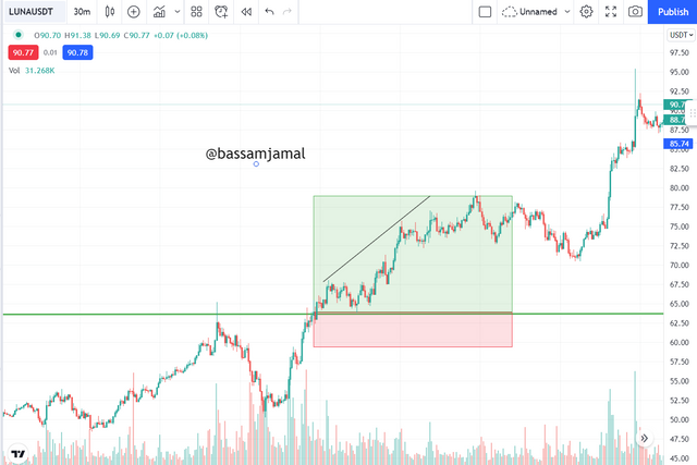
As I presented a snapshot taken from the TradingView platform on the LUNA / USDT pair, I utilized a 30-minute time frame here but as I mentioned above,
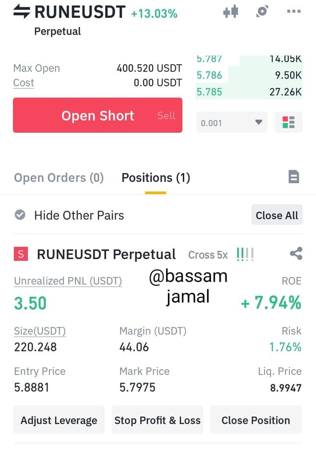
Demo Trades on a Crypto Asset pair
I've put a resistance line here, and the price has touched it a few instances, moving upwards by contacting. Price has re-entered resistance as it rises. And after I grabbed the image, I chose to enter just as the value was rising by approaching the resistance level.
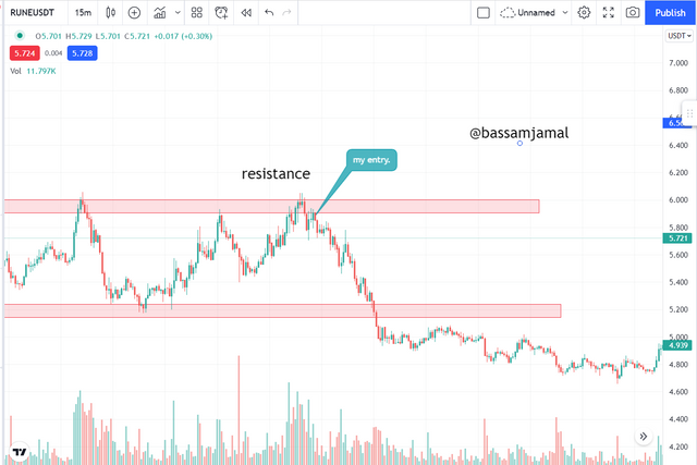
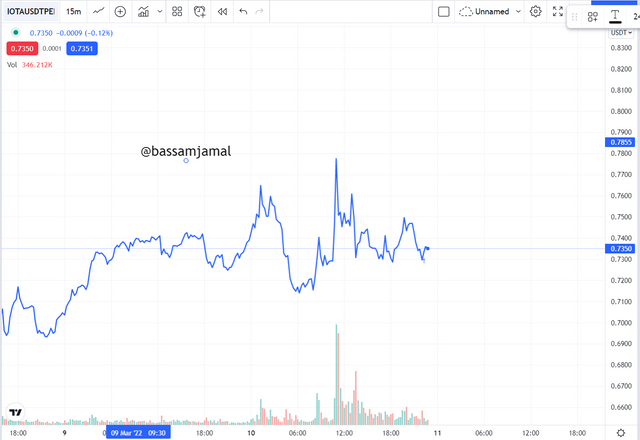
Above is a snapshot that I captured from the TradingView platform of the RUNEUSDT pair using a 15 minute time period.
Conclusion.
In this research, we covered various significant trading techniques, with an emphasis on market critical levels. Trading is straightforward if we have a fundamental understanding of trading and simple trading methods. Traders must concentrate on recognizing important levels and also how price reacts when it reaches certain levels. Stoploss orders should also be put at strategic points, as discussed in this course.