Effective Trading Strategy using Line Charts || Steemit Crypto Academy | S6W1 | Homework Post for @dilchamo
This is a very informative lecture about line charts. It is very helpful for those traders who are not much familiar with the technicalities of the candlestick charts. I have learned about line charts. Now, I am able to do trading with a line chart. I try to answer all the questions in my own words. I hope it will be very helpful.

Define Line charts in your own words and identify the uses of Line charts.
The line chart is another way of representing the asset price over a particular time. The line chart is quite different from the candlestick chart. The line chart is comprised of one line that represents the price movement of an asset over a particular asset. There is no information about the opening, high, and low. It only indicates the closing price or current price.
The line chart is representing the price movement smoothly. The factor of noise is negligible. It represents the movement of price straight away. The line chart gives us a general idea about the price movement. It indicates the price movement in a two-dimensional way.
Line chart comprised of two dimensions. One is horizontal and the second one is vertical dimensions. The horizontal dimension represents the timeframe that is set by the trader accordingly. The vertical dimension represents the movement of price over a certain time period.
In the above figure, you can see how the line chart looks line. It is comprised of a single line that is oscillating on the chart. When the line is moving upward direction then it indicates the uptrend or increase in price. When the line is moving downward direction then it indicates the downtrend or decrease in price.

How to apply a Line chart?
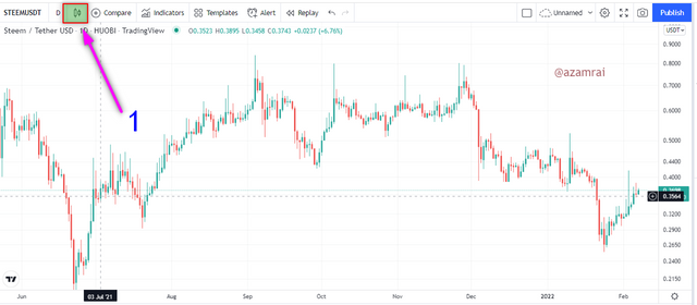
We can easily apply the line chart on any asset pair. When we open the chart on any trading platform, by default the candlestick chart is applied. We need to change the candlestick chat to a line chart. To apply the line chart, you to do the following steps.
- Go to the Tradingview.com platform and open the chart of any asset pair.
- Next, you need to click on the Candle button as you can see in the figure.
- Then you need to select the Line as mentioned in the figure.
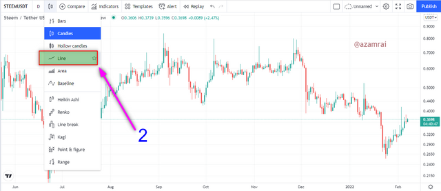
In this way, we can easily apply the line chart to any asset.
Uses of Line Chart
- As we know that the experienced trader recommends using the Japanese Candle Stick chart, but it is not suitable for those who are not so much familiar with the technicalities candlestick chart. So, a Line chart is a very good option for them to trade.
- Line chart is free from the noise of candles. It shows the result straight away.
- It is also suitable for long-term traders. Because long-term traders get a general idea about the price asset.
- Trader uses line chart to easily determine the support and resistance level by connecting high and lows of the line.
- Due to ease in determining the price movement, traders do better trade decisions. That is they make better trading decisions without using complex and technical candlestick charts.
Question no 2
How to Identify Support and Resistance levels using Line Charts (Demonstrate with screenshots)
When we are using the line candlestick chart, then determine the support and resistance level by connecting the highs and low of candles with the trendline. In the same way, we determine the support and resistance level by connecting the high and lows of a line chart.
Support Level
The price of the asset goes down and touches a particular point and pulls back. Again, price and asset go down and test the same point and gain pull back. When the price asset goes down and tests the particular point more than two times but does not cross the particular level and every time price pullback then we connect the test point with a trendline. It indicates the support level. It means that at this level, a huge amount of buy orders are placed.
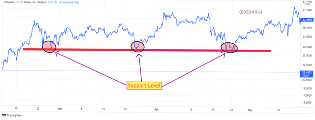
In the above figure, you can see that, support level. At the support level, the price asset tests the support level several times but does not cross the level. We can easily determine the support level with the line chart. Because it indicates the price movement straight away. We connect all the support levels with a single trendline. Then collectively it represents the support level.
Resistance Level
The price of the asset goes up and touches a particular point and pulls back. Again, price and asset go up and test the same point and gain pull back. When the price asset goes up and tests the particular point more than two times but does not cross the particular level and every time the price pullback then we connect the test point with a trendline. It indicates the resistance level. It means that at this level, a huge amount of sell orders are placed.
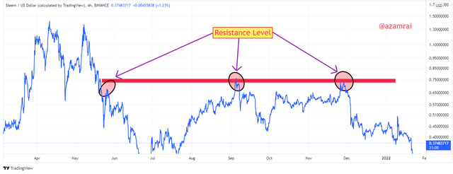
In the above figure, you can see that, resistance level. At the resistance level, the price asset tests the resistance level several times but does not cross the level. We can easily determine the resistance level with the line chart. Because it indicates the price movement straight away. We connect all the resistance levels with a single trendline. After connecting the resistance level with trendlines then we call it a resistance level.
Differentiate between line charts and Candlestick charts.
The Candlestick chart and line chart are quite different from each other. As we discussed in the above section that the candlestick chart is comprised of high lows and closing and opening prices of candles. On the other hand, the line chart is comprised of a simple line that is moving in a direction where the price wants to move. We will discuss both charts with graphics.
Candle Stick Chart
It is comprised of candle that contains information about closing, opening, high and low of an asset over a certain period of time. A little bit of technical knowledge is required to understand the candlestick chart. There are several indicators that are working on the creation of candles. For instance.
The Fractal Indicator is totally dependent on the creation of candles. Traders predict the next move of an asset using the formation and pattern of the candle. It contains the information of high price asset, low price of an asset, opening, and closing of asset price over a certain time period. It is suitable for short-term or swing traders.
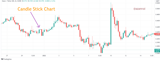
In the above figure, you can see the candlestick chart. In this chart, I use 4 hours chart. It means that every candle contains the price data over the 4 hours. It shows the price fluctuation over the 4 hours.
Traders use candlesticks chart to determine the support and resistance levels in order to take an entry and exit from the market. There is so much noise in candles. We cannot easily predict the next move by observing the candlestick data. It is quite difficult to predict the next move of the asset.
Line Chart
The line is chart is quite simple to chart as compared to the candlestick chart. It is comprised of one line that is moving in a direction where the price asset wants to move. It is a simple graphical representation of asset price movement by a single line. It contains only the closing data of assets.
Any technical knowledge is not required to understand the Line chart. It is suitable for long-term traders or for those traders who just want to get a general idea about the price movement. Traders use a line chart to get information about current trends easily.
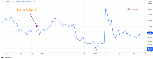
In the above figure, you can see the line chart. In this chart, you can see that only a single line is representing the price movement of assets. After merging all the data of candles, the line chart is made. When the price increases, it moves upward direction, and when the price decreases then it moves in a downward direction.
Traders also use a line chart to determine the support and resistance levels in order to take an entry and exit from the market. The line chart is free from noise. We easily understand the price movement on a line chart.
Explain the other Suitable indicators that can be used with Line charts. (Demonstrate with screenshots)
There are several indicators that are used in trading. But prefer the trend-based indicators. Because many time here that Trend is you Friend. So, want to trade using a line with a trend-based indicator. I use 21 days Moving Average indicator on a line chart. This indicator is very good for determining the buy and sell signals.
Buy Signal
When the indicator line crosses the chart line from up to bottom and is placed below the chart line, then it indicates the buy signal. It is an indication of an uptrend market. After making the cross the price is moving upward direction till the indicator remains below the price chart line.
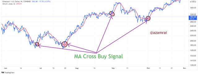
In the above figure, you can see that there are several buy signals are mentioned. You can see that when the price crosses the chart line from up to bottom the price increases. In this way, the Moving Average is the best indicator used with a line chart. Because it is easy to determine the buy signal with the Moving Average indicator.
Sell Signal
When the indicator line crosses the chart line from bottom to upward and is placed above the chart line, then it indicates the sell signal. It is an indication of a downtrend market. After making the cross the price is moving downward direction till the indicator remains above the price chart line.
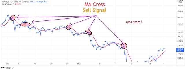
In the above figure, you can see that there are several sell signals are mentioned. You can see that when the price crosses the chart line from bottom to upward direction then the price increases. In this way, the Moving Average is the best indicator used with a line chart. Because it is easy to determine the sell signal with the Moving Average indicator.
Prove your Understanding of Bullish and Bearish Trading opportunities using Line charts. (Demonstrate with screenshots)
There are many patterns made by the price of assets. These patterns indicate the coming bearish and bullish trend. Triangle, rectangle, rising wedge, falling wedge, Double bottom, head and shoulder, and breaking the structure are the patterns that indicate the price movement in a particular direction based on the nature of each pattern.
If the pattern is made at the peak price of an asset, then it indicates a downtrend. And when the particular pattern is made after a downtrend then it gives a signal of the uptrend. After the formation of the pattern, the price asset is moving both upward and downward direction.
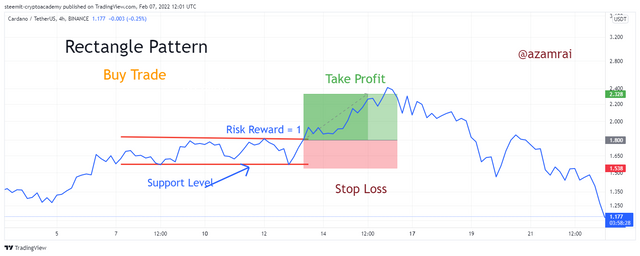
We will discuss the rectangle pattern here. In this pattern, the price of assets makes highs and lows at the same levels. When we connect all the highs with trendline all the lows with trendline then we will see the rectangle pattern is formed. When price breaks the rectangle pattern with breakout then the price asset is moving in an upward and downward direction based on the nature of the pattern.
Bullish Trading Opportunity
It is used to take an entry into the market. A bullish rectangle pattern is made after the downtrend of the market. After a downtrend, the price of assets makes highs and lows at the same level. After that we can all the highs and lows with a line then we have a bullish rectangle pattern. When price break this rectangle pattern upward direction then it is a bullish trading opportunity or buying opportunity.
v
In the above figure, you can see that the bullish rectangle pattern is made. When the price breaks the rectangle pattern upward direction, then the price of an asset is moving upward direction as you can see in the figure. We should not avoid risk management in trading.
So, we should set stop loss after determining the support level and set take profit level after determining the resistance level. In the figure, I set stop loss and take profit level.
Bearish Trading Opportunity
Bearish rectangle patter is made after the uptrend of the market. It is formed at any place but most of the time is formed after an uptrend. After an uptrend, the price of assets makes highs and lows at the same level. After that we can all the highs and lows with a line then we have a bearish rectangle pattern. When price break this rectangle pattern downward direction then it is a bearish trading opportunity or selling opportunity.
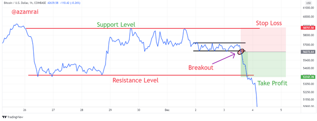
In the above figure, you can see that the bullish rectangle pattern is made. When the price breaks the rectangle pattern downward direction, the price of an asset is moving down as you can see in the figure. Risk management is compulsory in bearish trend opportunities.
So, we should set stop loss after determining the support level and set take profit level after determining the resistance level. In the figure, I set stop loss and take profit level.
Investigate the Advantages and Disadvantages of Line charts according to your knowledge.
There are many types of traders available in the market. A Candlestick chart is difficult to understand but a line chart is easy to understand for those traders who do not have enough technical knowledge. It is quite a simple chart that helps to determine the current market trend using the simple line.
It is comprised of a single line that represents the price of the asset. It is not showing the detail of highs, lows, and openings. It is only showing the closing price. It is suitable for long-term traders. It is easy to read the line chart.
It is not suitable for short-term or swing trading. Because short-term trading is done on the basis of candles. Now we will discuss a few advantages and disadvantages shortly.
| Advantages | Disadvantages |
|---|---|
| It is easy to read the chart | It is not suitable for short term trading |
| It is suitable for long term trading | Line chart not filter the small trading signals|
| Noise in Line chart negligible | It provides not enough details about price action |
| No technical knowledge required to read the chart | It is not more than a line |
The line chart is good for those traders who just to get a general idea about the price movement. It consists of a single line that represents the price action. We can easily determine the support and resistance by using the line chart as compared to the candlestick chart.
We can easily perform trading using a line chart with the indicator. Indicators tell us about the buying and selling opportunities. According to my perception, the Moving average is the best indicator that we should use with a line chart. We can also determine different types of chart patterns using the line chart.