Assignment Crypto Academy Season 04 - Week 01 | Advanced Course -Onchain Metrics[@sapwood]
This is my submission for the Assignment provided by Professor @sapwood. The session was on OnChain matrics data that helps Investors or Traders to understand the overall sentiment or Cycle of the market. I am really excited to learn so many new concepts about Blockchain technology this Season.
(1) What is a HODL wave, how do you calculate the age of a coin(BTC, LTC) in a UTXO accounting structure? How do you interpret a HODL wave in Bull cycles?
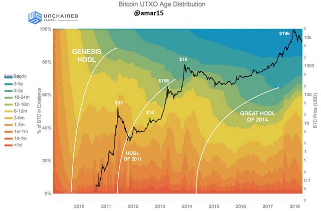
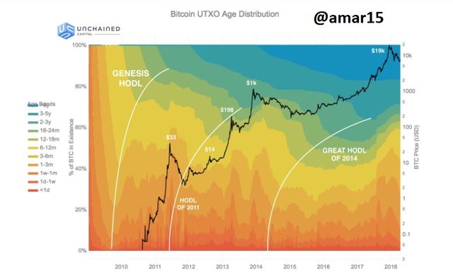
This is another indicator that tells the people are buying and holding Bitcoin and the accumulation has been done over the period of time before any Bull Cycle begins. The more accumulations lead to bigger and massive Bull Run as you can see in the picture that in the year 2018 the accumulation was the top. After this huge consolidation, the price of BTC increased from 3200 USDT bottom to 63k USDTwhich is an ATH for now.

The HODL wave takes a look at the unspent transaction outputs of bitcoin that means when the transaction was last spent for any Asset and gives us a visual representation. This HODL wave can be calculated for any given period of time ranging from 1 hr, 1 day, week, 1 month-3 month, 1 year - 10 years, etc.
How do you calculate the age of a coin(BTC, LTC) in a UTXO accounting structure?
BTC uses UTXO (Unspent Transaction Output) method for the accounting and each UTXO is the chain of transactions of bitcoin from the beginning (the time it was mined) to a particular address. So whenever any transaction is made on the network from one wallet to another wallet in any timeframe within an hour, day, week, month etc a new UTXO is created on the network. For example, yesterday if you have transferred 1 bitcoin to your friend then it would appear in the band or timeframe of a 1-day HODL wave and if you have bought some bitcoin years ago and stored it in your cold wallet for a long time then it would appear in the Year HODL wave chart.
You can see the HODL wave of the percentage of Bitcoin transactions made in the last 24 hours and this is how we can check for months, weeks,s and years using the Time Band.
.png)
How do you interpret a HODL wave in Bull cycles
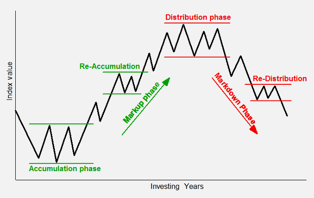
As we know before the beginning of any Bull Cycle there is a long period of accumulation been done by the big players and once they filled their bag the bottom is created. You can see the Phases of the Bull cycle in the picture.

So the HODL wave helps us to understand when was the last peak accumulation has been done and after that, the bull cycle may start. As you can see in the Graph there is three HODL wave-
1. Genesis HODL
2. The HODl of 2011
3. Great HODL of 2011
These HODL waves show when the maximum number of bitcoins has not been spent or transferred anywhere except sitting idle in the Hardware, Cold wallet, Ledger. Increasing the graph upside means the accumulation or dip buying is going on.
I will be explaining the Bull Cycle of December 2018 to April 2021. As you can see on the above chart the HODl is at the peak of $19k and this is the time period when the BTC created its bottom around 3200 USDT. After this huge accumulation, the bull cycle started and the price of bitcoin made high of 64k USDT in the month of April.
.png)

(2) Consider the on-chain metrics-- Daily Active Addresses, Transaction Volume, NVT, Exchange Flow Balance & Supply on Exchanges as a percentage of Total Supply, etc, from any reliable source(Santiment, Coinmetrics, etc), and create a fundamental analysis model for any crypto[create a model for both short-term(up to 3 months) & long-term(more than a year) & compare] and determine the price trend (or correlate the data with the price trend)w.r.t. the on-chain metrics? Examples/Analysis/Screenshot?
Step-1: Visit https://app.santiment.net/
Step-2: In the search Box type Crypto Asset eg- BTC, ETH, LTC, XRP
.png)
Step-3: Type the details you need for the Asset in the Search box
.png)
Daily Active Addresses:
Daily Active Adress means the address which is participating in any kind of Transaction over the Network. I am going to analyze the Data LiteCoin. I will be explaining in short term and long term. YOu can select the duration using the Date Box.
.png)
1. Short Term:
I am going to use the last 3 months' data to analyze the number of active users on the network. Here the Green Line denotes the price of LiteCoin and the Yellow Bar denotes the number of active users everyday..png)
As you can see in the picture in the last 3 months the number of active users was minimum on 30th July only 185.67K active addresses and the price of LTC was 136 USDT. After that, the activity started increasing and reached 469.4K on 25th Aug and the price also increased to 176 USDT.
2. Long Term:
I am going to use the last 3 year of data to analyze the number of active users on the network..png)
As you can see in this picture the number of Minimum active addresses was 41358 only when the price of LTC was 41 USDT then after that the number of active addresses start increasing along with the price and made high of 469.4K on 28th Aug when the price was 174 USDT. This is not necessary that if the price is increasing then the number of active addresses increasing because the price of the asset depends upon various factor like Market sentiments, teamwork engagement etc.
.png)
Transaction Volume
The transaction volume represents the number of assets that have been exchanged on the Network. For example if A person is sending 200 LTC to person B and then person B sending 50 LTC to Person A in return then the total volume would be 250 LTC.1. Short Term:
In the short term I will be using 3 months of Data. In the chart, the green line represents the price of the LTC, and gravy shadows represent Volume.You can see the Transaction vol was the lowest 25th July only 1.08 B and the price of LTC was 125.44 USDT. After creating low it started increasing and made high of 5.7B and the price of LTC was 179.28 USD.
.png)
2. Long Term:
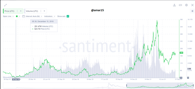
For the long-term analysis I will be using 2 years of data. In the chart, you can see the lowest volume was 291.4M and at that time the price of LTC was 23.78 USDT. After this period it started increasing and made a high of 12.77B and the price of LTC was 171.1 USDT..png)
.png)
Network Value to Transaction Ratio (NVT)
NVT can be calculated by dividing Daily Market Cap of Asset by Daily Transaction value. It helps us to understand the real value of the asset as it tells us whether the users are using the Network or not. if the value of NVT is high that means the number of transactions is less so it can be considered as an oversold asset same vice versa but as the professor explained this alone is not enough however we can use it for confirmation purposes along with other technical analysis tools.1. Short Term:
In the short term I will be using 3 months of Data. In the chart the Red line is NVT ration and the green line denotes the price of LTC..png)
The minimum NVT Ration was on 3.02 on 1st August when the price of LTC was 145.28 and you can observe after this the came to a bit more down the started increasing. The maximum value of NVT was 25.78 on 9th August when the price of LTC 149 USDT.
2. Long Term:
For the long-term analysis I will be using 2 years of data. As you can see in the chart the minimum value of NVT was 0.811 on 14th May when the price of LTC was near an all-time high. The maximum value of NVT was 126.74 on 14th October when the price of LTC was 57.02 USDT..png)
.png)
Exchange Flow Balance
Exchange Flow is an aggregator that can help us to get alert some such activities performed on the exchange. Exchange Inflow is considered as **Bearish Sign** because the asset is been deposited to the exchange wallet and it may be for selling where Exchange Outflow is considered as **Bullish Sign** because someone is buying and transferring it in the cold wallet to store for a long term or you can so say dip-buying.1. Short Term:
In the short term I will be using 3 months of Data.As you can see in the picture when the Exchange flow was -30160 and the price of btc 40k it came a bit down then started going up. Where the Exchange flow of on the peak of 13820 and the price of btc was 31.3k then it started going even more down.
.png)
.png)
2. Long Term:
For the long-term analysis I will be using 2 years of data. as you can see in the picture the Exchange flow was -5071 when the price of btc was 13.1k and this is the time when BTC was moving towards the previous ATH a made high of 64K..png)
Here the Exchange flow was 111.4k when the price of BTC was 8200 USDT and it started d. umping around 1k then again started moving up so as the professor explained in the session that this is not 100% sure if the Flow is positive then it is going to dump hard it may be but not necessary.
.png)
Supply on Exchanges as a percentage of Total Supply
On the on-chain metrics it shows what percentage of total Supply of btc is being traded on the Exchange. I will be analyzing the short-term and long-term data.2. Long Term:
For the long-term analysis I will be using 2 years of data. As you can see in the picture the minimum supply on exchange was 13.16% on 5th Aug 2021 and that the price of btc was 38k..png)
When the Total Supply on the exchange was 15% on 14th March 2020 then the price of BTC was 5200.
.png)

3. Are the on-chain metrics that you have chosen helpful for short-term or medium-term or long-term (or all)? Are they explicit w.r.t price action? What are its limitations? Examples/Screenshot?
On-Chain metrics data are helpful very helpful especially in Medium and long-term investment and this is would be a deadly combination if we mix it with the Technical Analysis. With the help of On-chain metrics, data can be helpful to know the strength of the particular asset as we all the overall sentiments of the market. For example,
a) if the HODL wave is increasing which shows the accumulation is going on and that means the accumulation is going on and this the time to accumulate good assets which have very good fundamentals.
is the time he
b)We can check the daily transaction on the network that helps us to the userbase of the Asset and if any network has good fundamental and userbase then it will definitely gonna give you a good return in long run.
You can see in this picture when the Outflow owas on the Peak when the max bitcoins are being transferred to the Cold wallet from eh exchanges and this was the last dip-buying. After this huge outflow, the price of BTC started pumping.
.png)
The on-chain metrics can be helpful in the short term as well for example if we will figure out that the Inflowonthe exchanges are increasing then we can be alert with our open positions and hold with stop-loss as it may lead to the dump.
As you can see in the picture on 19th May the Inflowwas 341.72K which is the higher inflow in the last couple of months. This is the tie when BTC dumped really hard and even I lost huge. I really wish I know the importance of Onchain metrics before.
.png)
Are they explicit w.r.t price action?
The on-chain metrics data and Price as fine correlations. The price actions are being formed from the Past and current price moments of the asset where on-chain metric data help us to get the insightht of any network. In the above picture when the huge Outflow in the month of March and was the time when the Mx dip-buying been done by the Institutional in big players. And after this long accumulation finally, BTC gave a breakout and made a new ATH.
.png)
What are its limitations?
a)Signal Limitations On-chain metrics generate false signals too in this picture you can see the Outflow & the Inflow is almost and in this situation is pretty difficult to predict what is going to be the next.
.png)
Here is another example when the Outflow is huge still the price of BTC is declining which is a false signal. As per the data when the Outflow is huge it means the Asset is being transferred to the Cold wallet for storage and the supply is decreasing on the exchanges which should lead to increasing in price.
.png)
b)Limited Asset On the on-chain metrics we can easily find the data for BTC because this is the mother cryptocurrency that spends a decade however there are other cryptos like XRP, ETH, Cardano, link, etc as well. In the current Cyrpot market there is more than 8000 Cryptocurrency and it is not possible to get the data for even the top 100 currencies.

Conclusion
On-chain metrics is really an amazing tool that will help us to know the insight of the asset and what's going on in the market and sentiments. Alone on-chain metrics are not enough however if we combine with Technical Analysis then this is going to be very powerful and help us to predict the future price accurately. The session conducted by the professor was really awesome and I enjoyed doing this assignment.
