Effective Trading Strategy using Line Charts -Steemit Crypto Academy | S6W1 | Homework Post for @dilchamo

A line chart is a very simple type of chart that displays information as a series of points connected by straight line segments. This type of chart is most often used to visualize trends on fairly long time frames.
The strength of line charts lies in their simplicity: they make it easy to see the closing price for a currency pair at any given time. This is the easiest chart to understand, with a line chart showing price on the side and date below.
However, the line chart will not tell you about the increase or decrease in prices and open market prices. Featuring less detail than Japanese candlesticks, line charts are used very little by traders today. It basically provides information about market trends.
This line graph is a display of price changes in the form of a line. It should be noted that for each timeframe (a chart period, for example, five minutes), four price values are distinguished.
The first is the price at which the timeframe is opened. The second is the maximum value of the price for the period, the third is the minimum. And finally, the closing price of the period is taken into account.
The peculiarity of the line chart is that it is formed by the closing price, as it is considered the most important for the period. From here, we see a smoother overall price picture.
Identify the uses of Line charts
A line chart is a very simple type of chart that displays information as a series of points connected by straight line segments. This type of chart is most often used to visualize trends on fairly long time frames.
Using a line graph, it is easier to track the time change of any of the parameters. There are four parameters in our table - of course, you can display them all in one graph with different color curves, but visibility will be affected by it. It's easier when the graph shows a change in one or two parameters.
In determining the levels of support and resistance is important when trading any asset. The main difficulty is the ability to determine the level and correctly place the lines. This is a practical skill, as there is no one-size-fits-all definition of how to define support and resistance lines. The task of finding levels is somewhat facilitated by the fact that there are many indicators by definition on the trading platform. At the same time, many trading strategies are built on support and resistance lines, the effectiveness of which also depends on the practical skills of the trader.
- support line
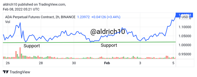
- resistance line
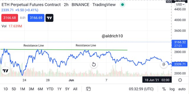
It is believed that in an uptrend, resistance levels form at the peaks of the impulse movement, and support levels form at the lows of the corrective movement. The next low coincides with the next high and, accordingly, turns a resistance level into a support level. On descending levels, the high coincides with the previous low, and the support level turns into a resistance level.
In this case, the transaction is concluded when the price approaches the upper border of the channel, relying on the cross of the resistance line or a rebound and a decline in the price. To a greater extent, it is not specific points that count, but support and resistance price zones. Which trend will win should be determined by the additional features on the chart of lines, bars, candlesticks and so on.
A line chart is a very simple type of chart that displays information as a series of points connected by straight line segments. It is constructed by points - each point indicates a price level at which the price stopped at the last second of the current time period (Time Frame).
For example, if the current TimeFrame is M1 (1 minute), then the end point will appear on the chart at the last second of each minute (at the 59th second). The graph itself carries a minimum of information - it shows only the most important information, without paying attention to the necessary details.
On such a chart, we see only the final data - the price value at which the price was at the last second of the current time period. But there is absolutely no information about what volatility is, how high the price rose or how low it fell during this time. This is a big minus for technical analysis. But this graph is not useless. For example, it relates very well to the Price Action pattern.
Another advantage of this graph is the filtering of false information. Let's say you need to open a deal for 30-60 minutes, and by opening a line chart with the M1 Timeframe, you can easily determine the current price trend and draw the right conclusions. All this is available for the same reason - the line chart completely hides all unnecessary information about the price movement and shows only its direction.
Japanese candlesticks are much easier and faster to convey to traders all the necessary information, unlike other types of charts.
The body of the Japanese candle perfectly shows where the opening price level is, and where the closing price level is, and less significant information (high and low prices) is "depicted" in the form of "tails" (shadows) at the top and bottom of the candle body.
We can say that the Japanese candlestick set is ideal - the most important information is highlighted in bold, but there is a place for less important, but still necessary information about price movements within a certain price range.
Like bars, Japanese candlesticks contain all of the same time intervals as the current Timeframe. For example, if the current Time Frame is H1 (1 hour), then each candle will store information about price movements for one hour. Candlestick charts, like bars, allow traders to use candlestick patterns and patterns formed on price charts.
Also, unlike line charts, candlestick charts allow you to most accurately determine entry points. A chart consisting of bars can boast of the same.
The RSI is a popular indicator among short-term traders and solid investors looking for long-term trends. Bottom line This indicator for professionals is very sensitive to the time parameters set by the user. In this case, the oscillator does not give false positives, but remains sensitive enough to make a profit. Although this oscillator is quite reliable when used on minute charts.
As already mentioned, the RSI indicator is an indicator of changes in the speed of the price, with the dominant weight of closing quotes being only the asset under study. That is why the author considers it possible to use the relative strength index when merging with charts of trading assets, as well as when diverging - divergences. The RSI indicator also cannot provide 💯% efficiency, so I suggest using several indicators at once to be more effective and using the RSI Indicator on a line chart will provide information on market conditions whether the market is in overbought or oversold conditions.
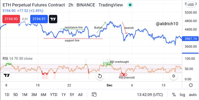
We can see in the chart above that I use the RSI indicator on the line chart where the RSI indicator provides information about the market being overbought and oversold as you can see in the picture above. Using this indicator will provide more information about market conditions.
We need to know that determining the direction of the market is very important in identifying trading opportunities in the market although this all depends on the ability or experience of the trader in determining trends in the market. Trading without knowing the condition of the market direction is very risky and can cause losses for that traders need to first analyze the market trend before entering into a trade.
Using line charts makes it easier for traders to determine the trend in the market and here I add the MA indicator to identify the market more accurately in determining market trends and provide traders with opportunities to use bullish and bearish trends on line charts.
- Bullish Trading
When the price in an uptrending market breaks through the resistance line it signals a reversal in the market from a bearish trend to a bullish one. Adding this MA indicator creates greater opportunities for traders to trade in the Bullish trend.
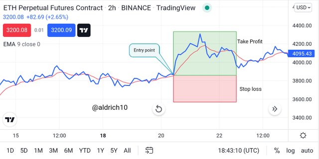
In the picture above I use the Eth chart where I have determined the opportunity to trade using the Bullish trend on the line chart. I noticed in the market where the price showed a movement from a bearish trend to a bullish one, here I determined the entry point in the trade and after that set a stop loss position placed below the previous low and for take profit we placed it at the previous high price. Where the risk in profiting from trading is a 1:3 ratio.
- Bearish Trading
When the price in a downtrending market breaks through the support line it signals a reversal in the market from a Bullish to a Bearish trend. Adding this MA indicator creates greater opportunities for traders to trade the Bearish trend.
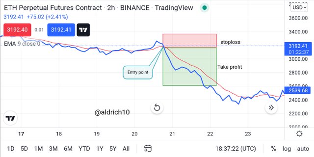
In the picture above I use the Eth chart where I have determined the opportunity to trade using the Bearish trend on the line chart. I noticed in the market where the price showed a movement from the Bullish to the Bearish trend, here I determine the entry point in the trade and after that I set the Take Profit position to be placed below the previous lowest price and for Stop loss we place it at the previous high price. Where the risk in getting a profit from trading is a ratio of 1:2.5
Benefits of line charts:
• ability to reflect data over long periods of time, visual simplicity and intuition of data even for very long periods of time, ability to clearly see various patterns of graphical analysis, without which it is impossible to imagine technical analysis.
• The strength of line charts lies in their simplicity: line charts make it easy to see the closing price for a currency pair at any given time. This is the easiest chart to understand, with a line chart showing the price on the side and the date below it.
• The filtering of false information. Let's say you need to open a deal for 30-60 minutes, and by opening a line chart with the M1 Timeframe, you can easily determine the current price trend and draw the right conclusions. All this is available for the same reason - the line chart completely hides all unnecessary information about the price movement and shows only its direction.
Drawbacks of line charts:
• does not provide information about trading strength throughout the day, or whether gaps occur from one period to the next.
• lack of reflection of the level of opening / closing of the selected time interval, the value of the maximum / minimum price reached in the period is recorded. Most often, line charts in technical analysis are used to identify the general trend - as a rule, on the daily timeframe. It is also important that the line chart does not show price gaps, which significantly complicates a detailed analysis of the price chart on the foreign exchange market.
• Line charts will not tell you about price increases or decreases and open market prices. Featuring less detail than Japanese candlesticks, line charts are used very little by traders today. It basically provides information about market trends.
A line chart is a very simple type of chart that displays information as a series of points connected by straight line segments. This type of chart is most often used to visualize trends on fairly long time frames.
The strength of line charts lies in their simplicity: they make it easy to see the closing price for a currency pair at any given time. This is the easiest chart to understand, with a line chart showing price on the side and date below.
The peculiarity of the line chart is that it is formed by the closing price, as it is considered the most important for the period. From here, we see a smoother overall price picture.
You do not qualify for #club75 so do not use that tag.
@steemcurator02 when I checked 2 days ago the account was still power up 75% that's why I used the tag #club75
The whole point of the #club's is that you stay in them and grow.
You are late to vote, you should take the post's publishing date instead of today.
Just my opinion.