Steemit Crypto Academy Season 4 Beginner's Course - Task 10 : Candlestick Patterns by @reminiscence01
This is @aizazghumman; here I am going to share my homework post on the topic "Candlestick Patterns" given by respected professor @reminiscence01
.png)

a) Explain the Japanese candlestick chart? (Original screenshot required).
b) In your own words, explain why the Japanese Candlestick chart is the most used in the financial market.
c) Describe a bullish and a bearish candle. Also, explain its anatomy. (Original screenshot required)
Explain the Japanese candlestick chart? (Original screenshot required)
So far we have studied the two types of analysis involved in crypto markets one of which is fundamental analysis and the second is technical analysis. This is where candlestick charts come as they are the technical analysis tools used in different formats of trading. The chart was developed to analyze the price direction of an asset. They are comparatively considered more authentic than bar charts.
Below is the screenshot of candles stick chart of BTCUSD trading pair:
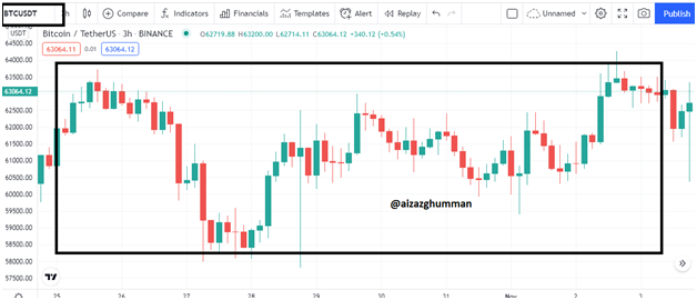
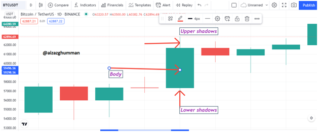
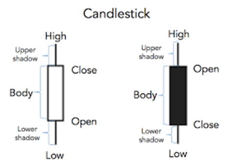
As you can see the candles have been divided into three parts the real body which is the central position and the upper and lower shadows or simply called wicks. These three parts are further divided into 5 parts which are open, close, high, low, and the real body remains the same. The open value is the opening price of an asset the closing value is the closing price of an asset the high and low value shows how high or low the price went. Before explaining these highs and lows further I’d like to explain the two types of candles we come across. As you can see in the picture there are candles of two colors red and green the green candle represents positive or bullish movement i.e. the price is moving from lower to high and the red candle represents bearish movement i.e. the price is moving from higher to low showing the negative movement of price.
Now let’s understand the opening and closing prices. Let’s suppose you open a chart of 4h. now the candle starts forming from the bottom i.e. the opening price of an asset the low price tells you how low the price went whereas and the closing price tells you the closing price of the asset in 4h period while the high price tells you how higher the price went but brought back by sellers at closing value.
WHY CANDLESTICK CHARTS ARE USED MOST
There is number of reasons why this chart is widely used however I’ll be discussing a few of them
The candlestick charts are pretty much self-explanatory, unlike other hard-to-crack charts. Whereas with Japanese candlestick charts the traders can detect price movements or market trends immediately and can behave accordingly.
With the help of these charts users can figure the support and resistance level of the price of an asset i.e. where the price can meet rejection or where it has the potential to raise more.
Not only current market condition the Japanese candlestick also lets traders predict the future price movement i.e. where the price can change its direction in simple terms it aware traders or investors of market reversal too.
The chart being colorful helps traders easily read bearish and bullish candles which will be discussed in detail in the last part of this assignment.
Describe a bullish and a bearish candle. Also, explain its anatomy. (Original screenshot required)
Although we have it covered in the first part however I’ll be discussing the bearish and bullish candle in detail here.
Bearish Candle
The bearish candle or in easy words the red candle forms when the movement of the price of an asset is negative i.e. price falls from higher to lower. This shows that people who have been holding their assets are now distributing them resulting in the worth or price of that asset going in a downtrend.
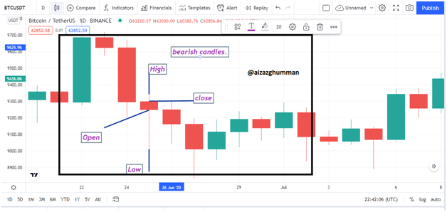
Anatomy
As discussed earlier the candles have 5 parts as follows
- Open
- High
- Body
- Close
- Low
Open
It is the opening price of the downtrend of asset price i.e. the starting price where asset price started to move in a bearish direction.
High
The high price defines or tells the highest price value at the time of opening of the market of that asset of chosen time frame.
Body
It tells the range of price between higher to lower price value.
Close
The closing price tells the closing price or worth of asset in a downtrend of selected time frame.
Low
The low price tells how lower the price went at the time of closing of an asset at that particular chosen time frame.
Bullish Candle
The bullish candle forms when there’s a positive movement of the price of an asset. The positive movement means the price of an asset moves higher from lower value increasing the worth of an asset. This means the traders are accumulating that asset at that asset hence making it expensive. The candle is of green color by default though the color can be changed.
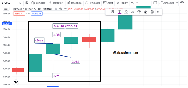
Anatomy
Like a bearish candle, the bullish candle consists of similar five parts.
- Open
- High
- Body
- Close
- Low
Open
This tells the opening price at which the traders start accumulating assets. It is the starting price at which the uptrend of an asset price began.
High
This tells the highest price at which the asset was being purchased in an uptrend of price direction at the chosen time frame.
Body
This again tells the ranging price value between higher and lower points
Close
The closing price tells the price at which the last price of the chosen time frame of the chart at which the asset was purchased.
Low
The lowest price value tells how low the price or value of asset moved at the time of traders accumulating assets in the chosen time frame.
Conclusion
The Japanese candlestick pattern chart is one the most widely used trading chart in technical analysis of different trading formats whether it’s the stock market or Forex or Crypto markets. They help traders to read the price movement of an asset giving them major support and resistance points helping traders to behave the best according to the market situation.
Lastly thanks to the professor for this amazing topic it was fun to study this topic, hopefully, I have met the requirements of the task.
@dilchamo i did not recieved vote yet
Do not use the #club5050 tag unless you have made power-ups in the last month that are equal or greater than any amount you have cashed out.