Repost Verifed but not upvoted Crypto Academy / Season 3 / Week 2 - Homework Post for @reminiscence01
Japanese candlestick
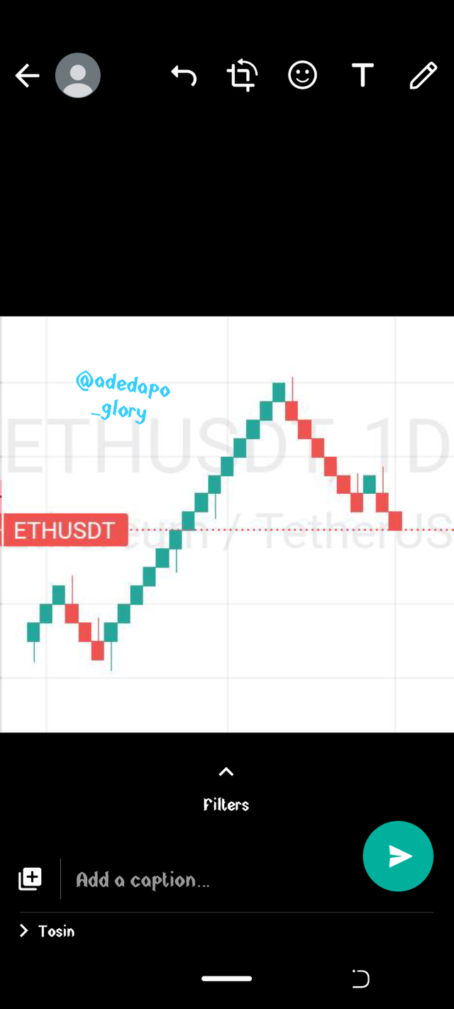
Japanese candlestick chart is a kind of tool in the financial chart used to show the price movements of stocks, currencies, crypto and so on. It is more like a bar chart but slightly different in that a candlestick shows important informations. It shows trading patterns over short periods of time.
The candlestick charts shows meaning to the traders showing current and last prices and giving a signal to future movement of the asset price. Candlestick chart also helps a trader to know which is dominant maybe the buyers or the sellers. The use of candlestick charts is also regarded to as technical analysis.
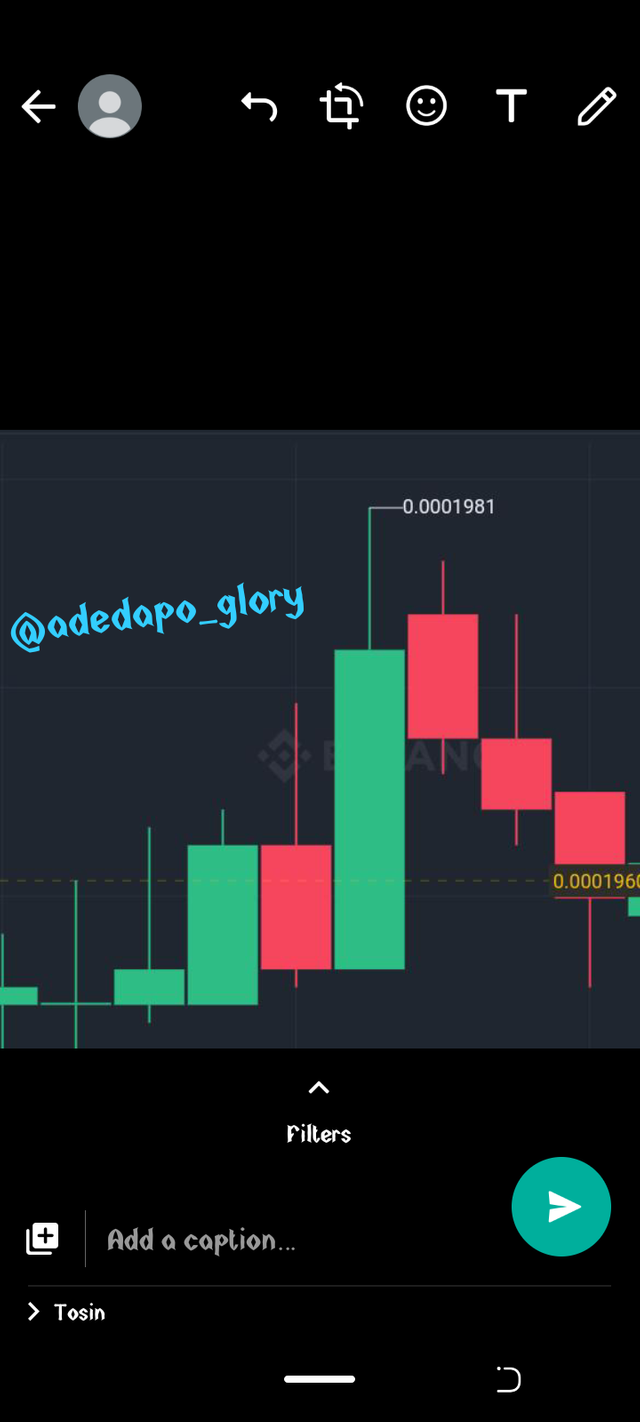
A screenshot of a candlestick is shown below.
You might be wondering what brought about the existence of a candlestick or why is it called the Japanese candlestick chart, well we will go back to the 17th century when Japanese trades rice. Candlestick was Introduced by a legendary rice trader named Homma who hails from Japan.
He brought the idea of a candlestick which has then be modified. He was good with demand and supply which made him determine to research more on the rotation of price and how markets responds.
This innovation has been very useful from time past due to how essential it seems, a candlestick shows 4 important parts which are the representation of the price movement like the high, open, cloe and low.
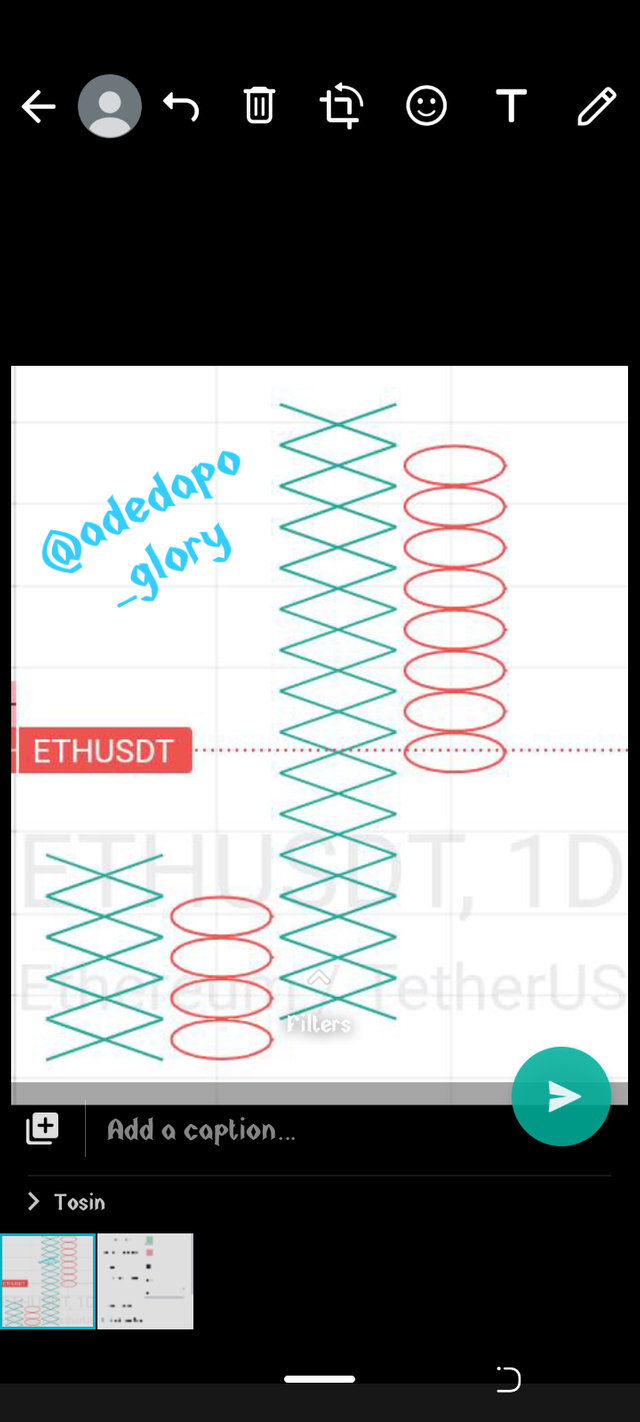
A POINT AND FIGURE CHART
A point and figure chart is a chart in the trading view that plots the movement of price of assets without the consideration of time.
Point and figure chart consists of staked X's or 0's each representing a set amount of price movement.
The X means the price is rising while O represents a falling price. The box size is determined based on the trader preference and the asset's price, during price reversal on this type of chart for a new column to form like from X to O or from O to X the price must reverse by the reversal amount set.
This chart helps technical analyst to be able to draw a well defined support and resistance as it also filters noise and allows for a more defined price movement.
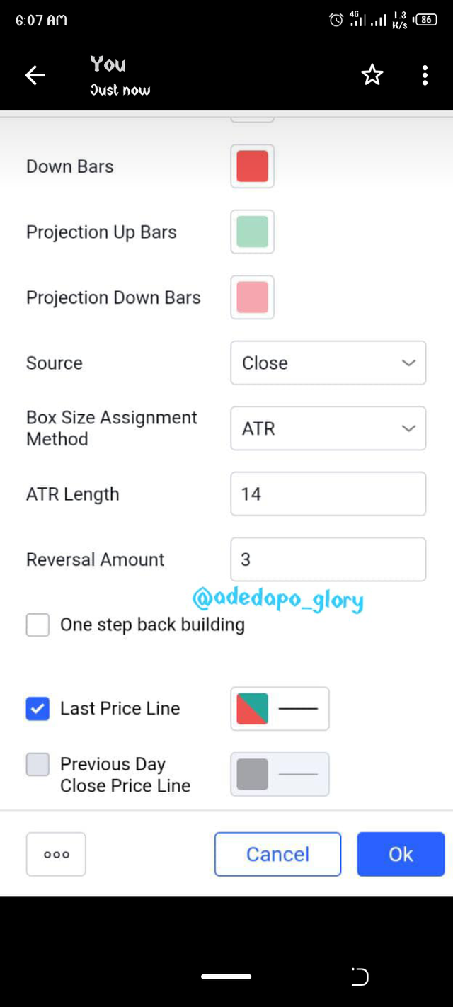
Point and figure doesn't exactly have a calculation with which it works, it just requires the setting of at least 2 values. One is the size of the columns, this can be set to maybe $0.5 or $1 depending on the trader or using of percentage of the current price.
Average true range cab also be used in setting the size, this means it is based on the volatility of the price.
The reversal amount also needs to be set as well, in a standard way the reversal amount is always three times the size of the box for example if the box size is set as $2 then the reversal amount will be $6, this can also be modified by the trader go anything he wishes.
There is also an option to set whether to use the high and low of the asset price or the closing price. If the use of high and lows is employed it tends to produce more columns unlike when the closing price is just considered. .
P&F charts can be slow to react to price changes. A breakout, for example, must move the box amount in order to signal a breakout occurred. This may benefit some traders as it may reduce false breakout signals, but the price has already moved the box amount (or more) beyond the breakout point. For some traders, getting the signal after the price has already moved that much may not be effective.
There are certain limitations to the point and figure chart, as much as it helps to reduce false breakouts, there are false breakouts that tends to be like a trend reversal which might be missed out. Also of a trader depends solely on point and figure it might lead to a big loss because the trend reversal is always large since the reversal amount has to be ×3 of the size and the reversal might not show on the chart until the price move to the set amount of trend reversal.
RENKO CHART
Renko chart is another tool developed by the Japanese used in monitoring price movement of an asset. It only works with the price movement and not price movement in relation to time. It is named after a Japanese word renha known as bricks since the chart looks like series of bricks.
The blocks are positioned 45 degree angle up or down on the previous brick which means the bricks don't form beside each other and a brick is created when a specific price change occurs such as $0.1, $0.5, $1 and so on. Renko doesn't have a time scale because some brick might take longer to form than some others due to the fact that it doesn't work with time but with price.
The chart also helps in filtering noise from the market and help traders to clearly see trend because little movements aren't recorded.
In as much as renko makes it easier to spot trends it also hinders us from seeing some price information that could be useful to a trader.
Why is Japanese candlestick widely used?
You might be wondering why the Japanese candlestick is used widely and one of the major used tool.
Japanese candlestick chart is designed in such a way that it shows the relationship between the market price, demand and supply of an asset.
The chart helps to determine the groups dominating the market at a particular time either the buyers or the sellers which is always denoted in the candlestick by the color it carries. It help us know the trend of the market as well if it is bullish or bearish.
Japanese candlestick helps in seeing if there will be a reversal in the current trend or not.
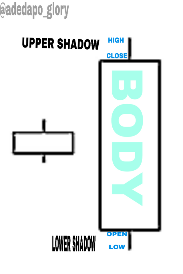
ANATOMY OF THE CANDLESTICK
A candlestick is made up of two things called the body and the shadows, it has four different features which are the opening price, closing price, the high and low of an asset at that particular time.
The shadow is a wick on the body of the bar which shows the high and low of the price at that time while the bar shows the opening and closing of the price. The bar and the wicks are what makes up a candlestick.
The color of the bar called the body is what determines if there is a buy/bullish or a sell/ bearish price movement. The body of the candlestick can be white, blue, green or red depending on the platform but the white and green is mostly for the bullish while the red and black is for the bearish.
So when there is a white body we know it is a bullish movement, the longer the white body the more bullish it is. When the white candlestick goes very long then it means there is an aggressive buying in that period and the bullish movement wins.
Opening price indicates when the price movement starts, this place is marked and the price movement is built on it.
Closing price is the last mark of the price before the formation of a new candlestick.
Lowest price is the part of the candlestick that shows the lowest price of the asset at a time while the highest price is the part that shows the highest price of the asset at a time. The body indicates how long the buy or sell covered at a particular time it is always between the high and low price.
BULLISH CANDLE
This candlestick is the one which represents the increase in price of an asset. It starts from the bottom to the top. This means that it starts from the open part labelled below and closes at the close part labelled above.
BEARISH CANDLE
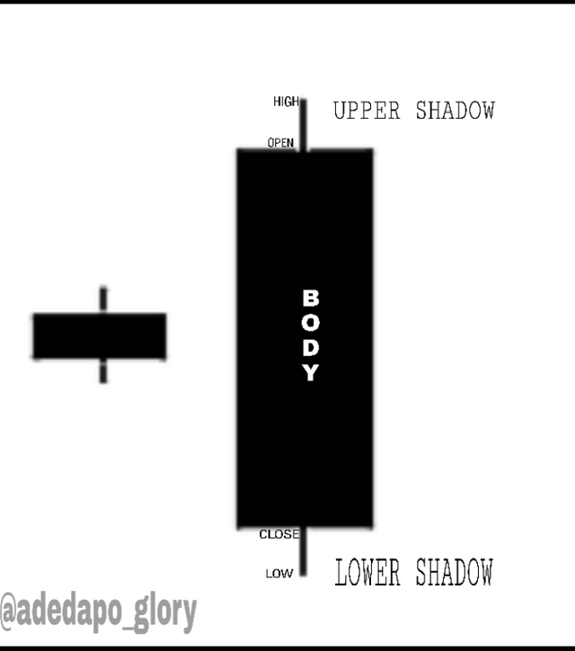
This is the opposite of the bullish candle this candle represents the falling or selling of the asset or commodity and the price start from the top to the bottom which is why open is labelled up and close is labelled down. The high and low prices has been explained above.