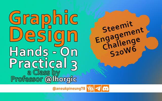
SEC20/WK6: Graphic Design Hands - On practical 3
This is my homework post for Steemit Engagement Challenge Season 20 Week 6 assignment of Professor @lhorgic’s class, SEC20/WK6: Graphic Design Hands - On practical 3.
1. Task
• Create a beautiful design to celebrate your successful completion of your 6 weeks course on Graphic Design. Be as detailed as possible by showing every step from start to finish. Discuss about every principle you engaged in making the design. Avoid copying other people's ideas, be creative. In addition, label your screenshot with your username.
2. Answer
When I read the assignment to create a design to celebrate the successful completion of the Graphic Design class, I thought of a design that shows the process of creating a design and the results, therefore the design will have elements such as gadgets, and a bunch of designs that have been made. And of course there would be a few lines of text to further implant the message into the viewer's mind.
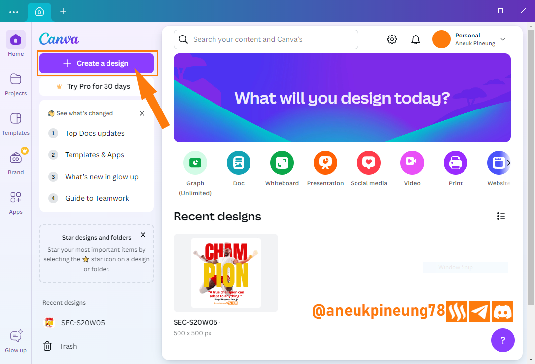
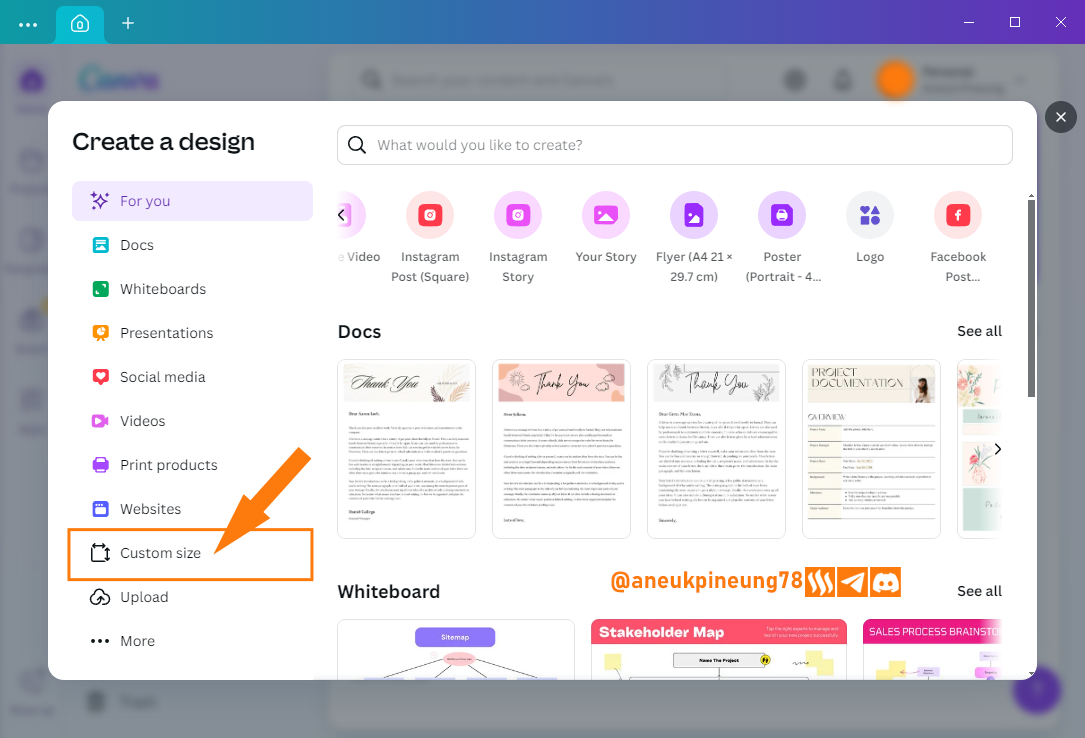
- I opened Canva and pressed the [Create a new design] button.

Image is clickable and might show larger resolution. - To set the size, I selected [Custom size] from the pop-up window that followed. I decided to make the design at a size of 1000 x 1000 px.
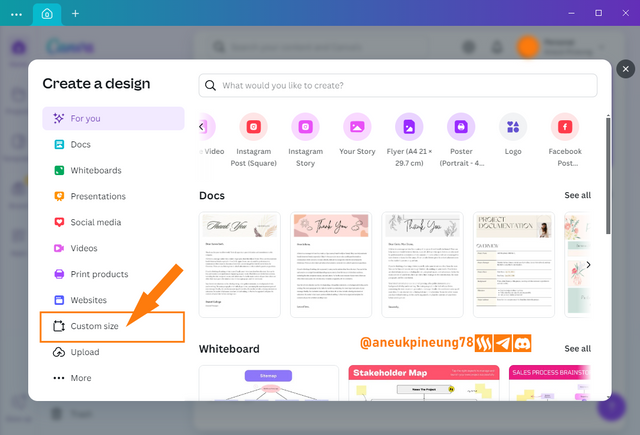
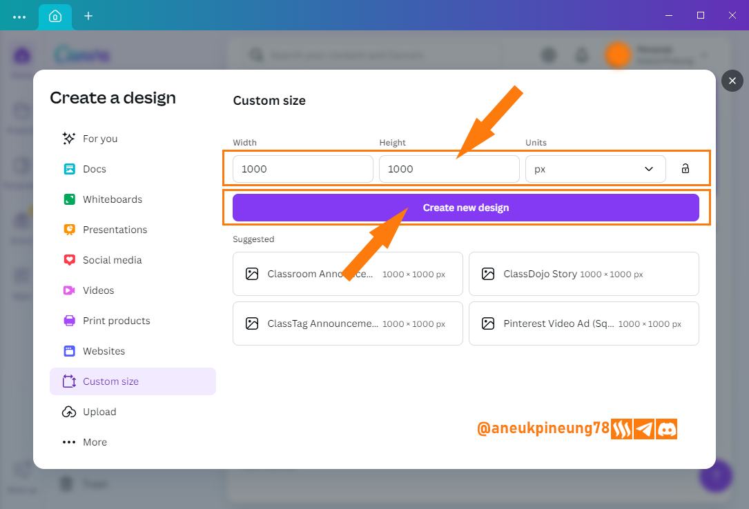
Image is clickable and might show larger resolution. - I filled in the size of the design I wanted to create and pressed the [Create new design] button.
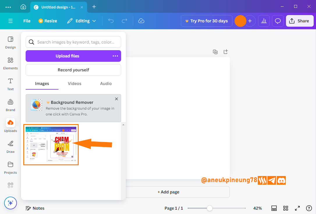
- I have a screenshot image of the Canva interface, I upload it to Canva, first I press the [Uploads] button (1) and then press the [Upload fiiles] button (2).
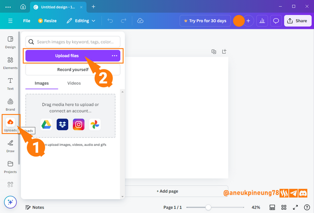
Image is clickable and might show larger resolution. - I search for the file in the storage on my device and press the [Open] button to put it into Canva's storage space.
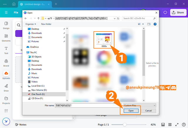
Image is clickable and might show larger resolution. - The image has been imported into Canva. I pressed on the image to insert it into the canvas.

Image is clickable and might show larger resolution. - The image has been inserted into the canvas.
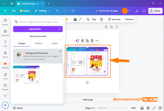
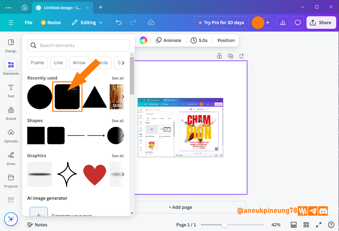
Image is clickable and might show larger resolution. - Next I wanted to make an illustration of a gadget. I pressed the [Elements] button and selected rounded rectangle.
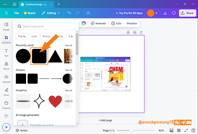
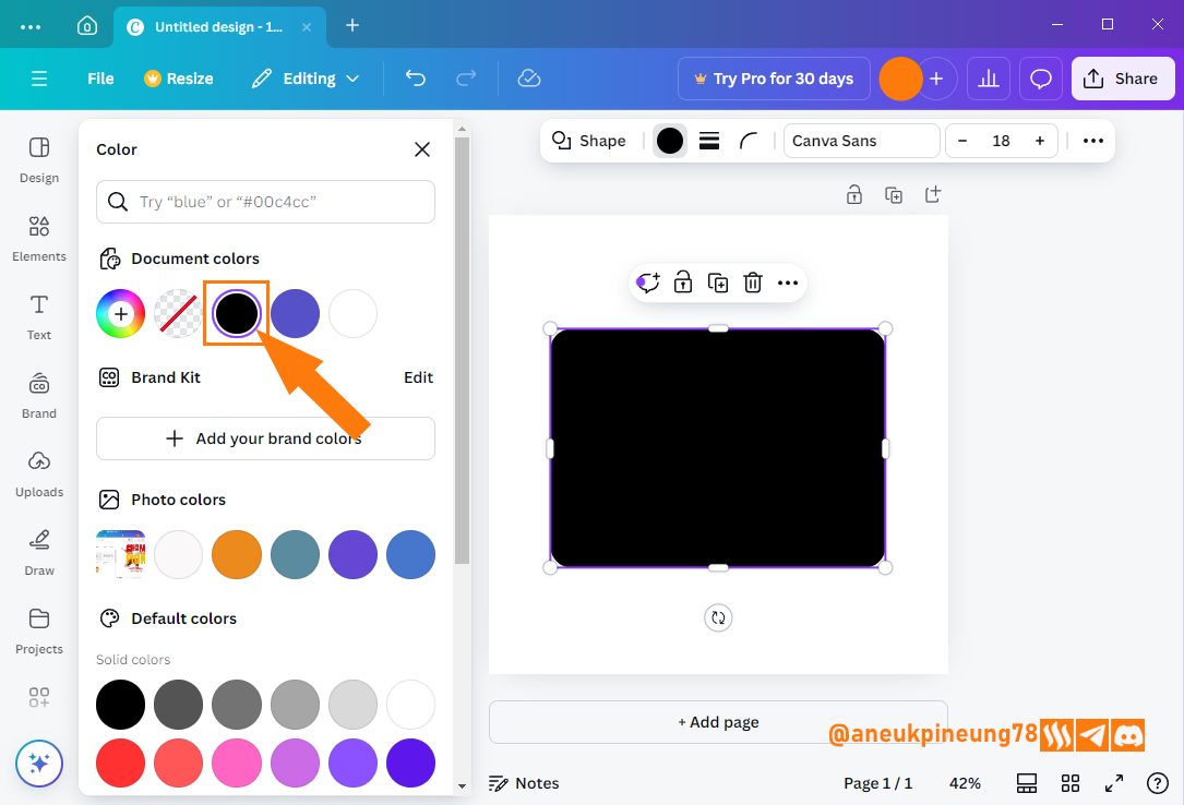
Image is clickable and might show larger resolution. - I changed the color of the rounded rectangle because I thought that black would represent gadgets better than bluish.
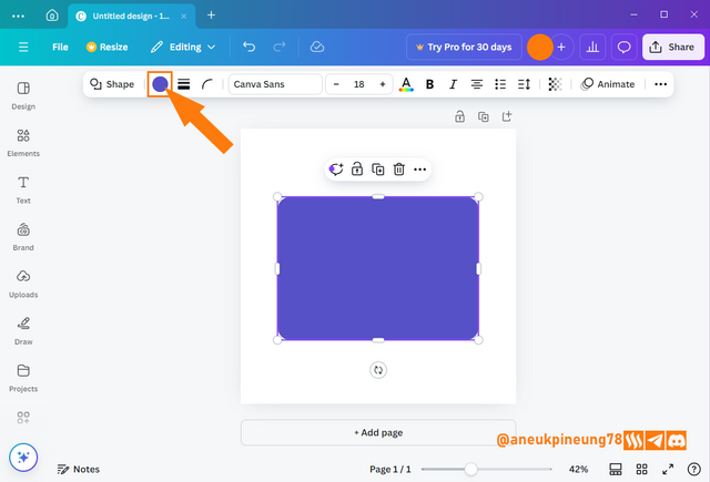
Image is clickable and might show larger resolution. - That's it, the rounded rectangle had turned black.
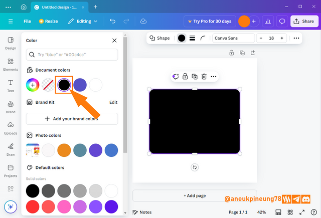
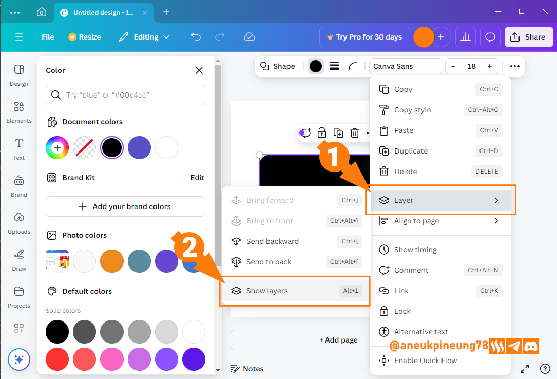
Image is clickable and might show larger resolution. - I needed to send this gadget illustration under the Canva's interface screenshot. So I right-clicked on one of the elements in the canvas (in this case was the rounded rectangle), then I selected [Layer], and [Show layers].

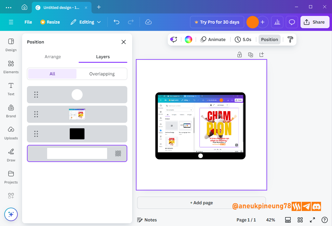
Image is clickable and might show larger resolution. - The layers window appeared on the left of the screen, I dragged and dropped the layers to arrange their position, and I also added a white circle to the gadget illustration to illustrate the on/off button.

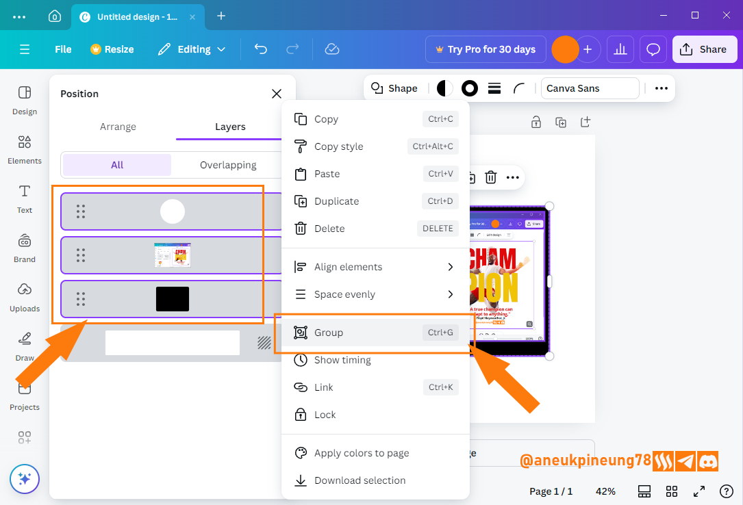
Image is clickable and might show larger resolution. - My work with the gadget illustration Has done for now, and I will make all the layers that make up this illustration a group. I selected all the layers that make up the gadget illustration, right-clicked on one of the layers, and selected [Group] on the pop-up menu that appeared.
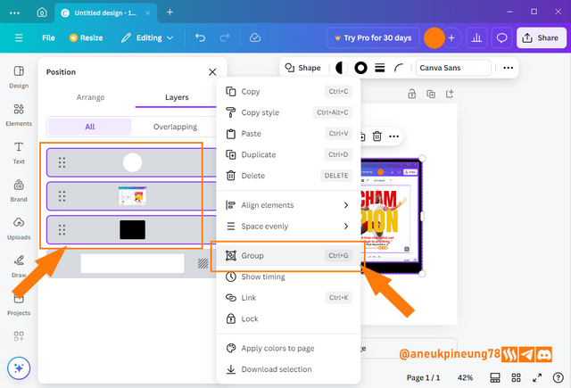
Image is clickable and might show larger resolution. - The layers window showed that all the layers had become a group.
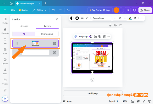
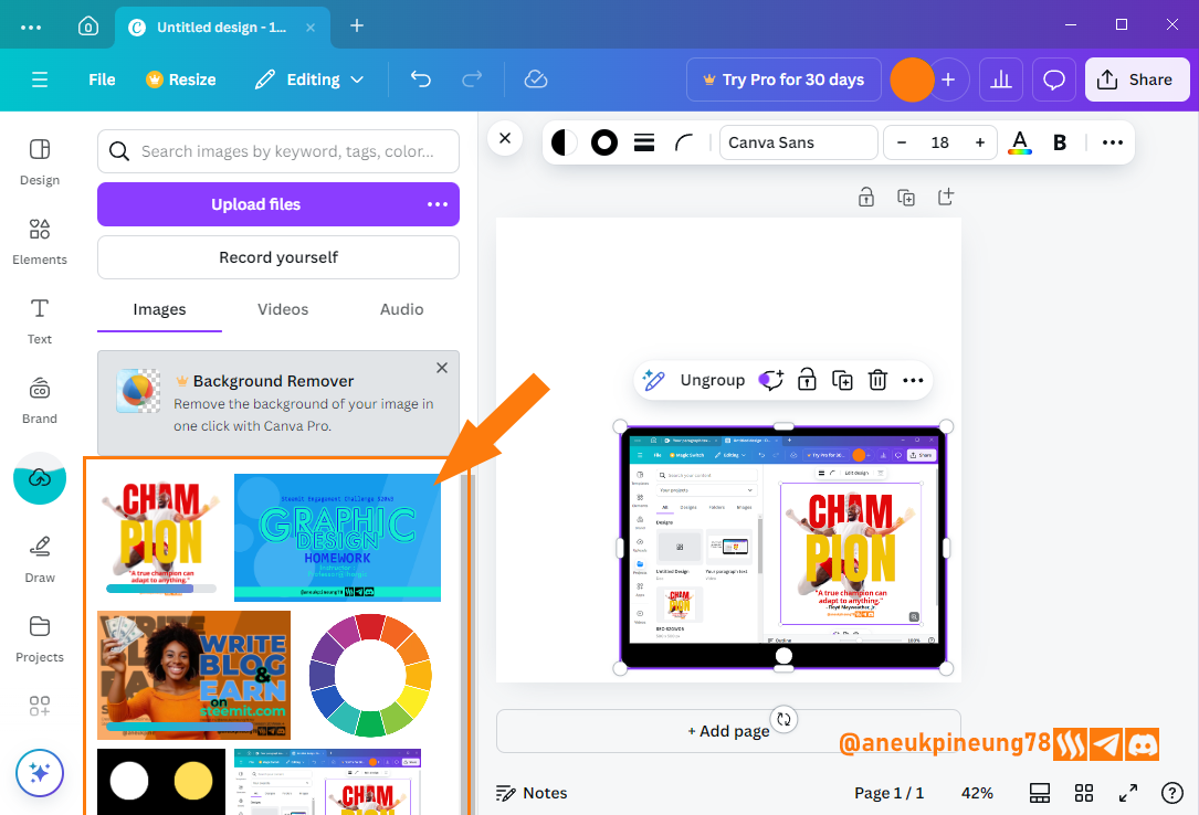
Image is clickable and might show larger resolution. - I imported some more images to Canva storage, the images from previous classes of Graphic Design.
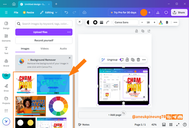
Image is clickable and might show larger resolution. - I arranged the images so that they overlap, no detail is needed from each image individually, but that together they convey a message: unity. I also rotated the gadget illustrations slightly so that they appear more dynamic.
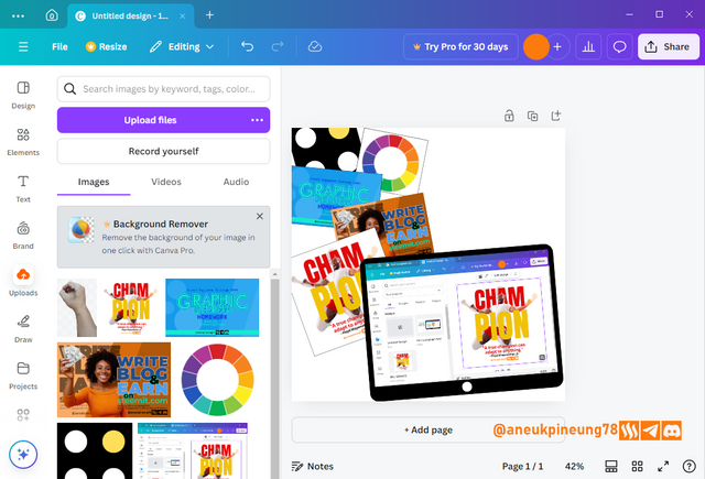
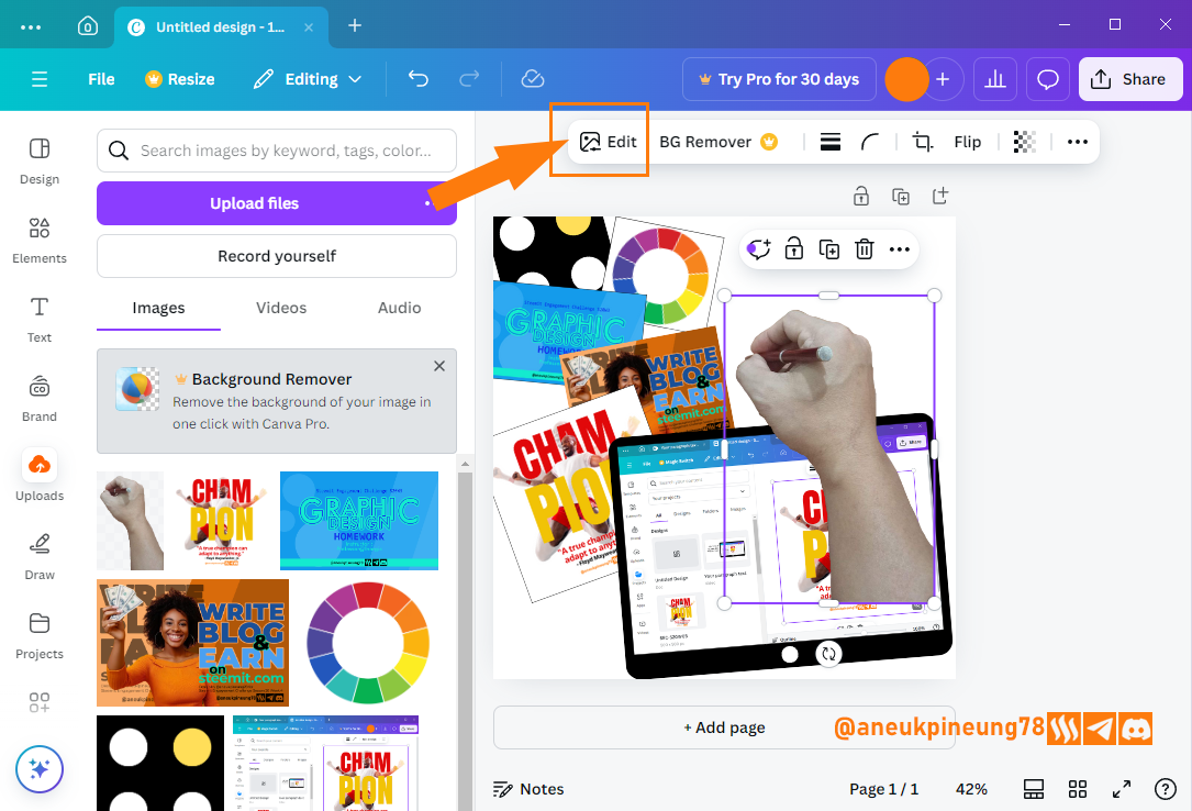
Image is clickable and might show larger resolution. - To make this look more realistic, I needed an illustration of someone operating Canva, so I needed a hand holding a stylus there in the design. I took a photo of my hand holding the stylus, saved it as a transparent PNG and imported it into Canva. I thought the hand image looked a bit pale, I felt a little editing would make it better. I clicked the [Edit] button on the menu on top of the screen.
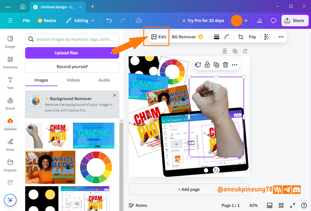
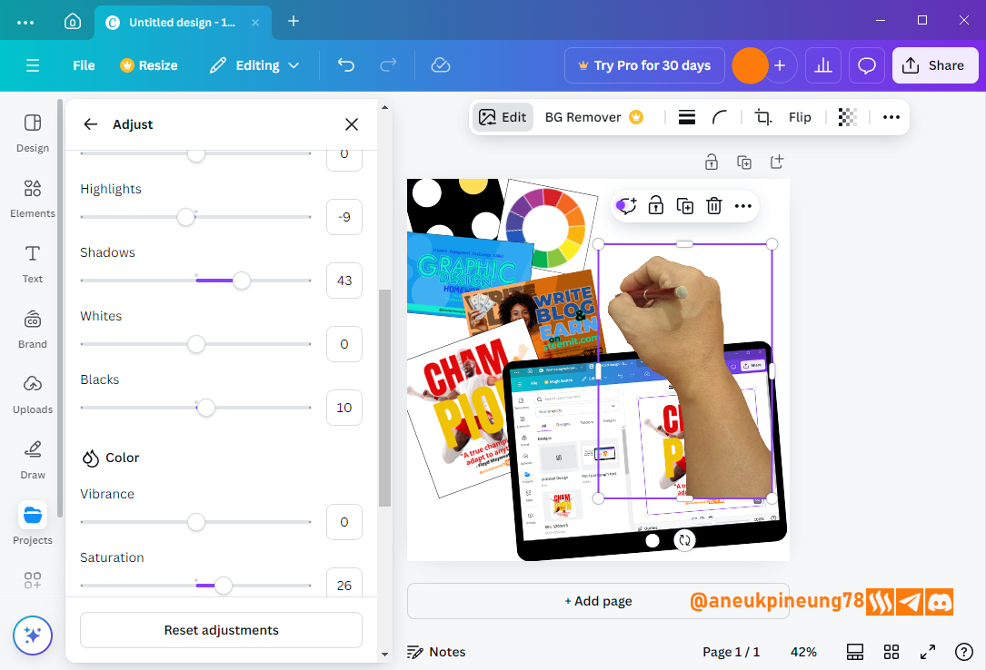
Image is clickable and might show larger resolution. - On the side bar, I chose [Adjust].
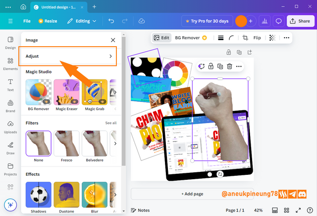
Image is clickable and might show larger resolution. - I did the adjusment on some variables: contrast, brightness, highlights, shadows, and so on, until I met the satisfactory result.
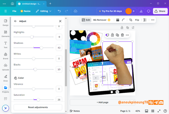
Image is clickable and might show larger resolution. - I adjusted the position and size, resulting in this provisional result.
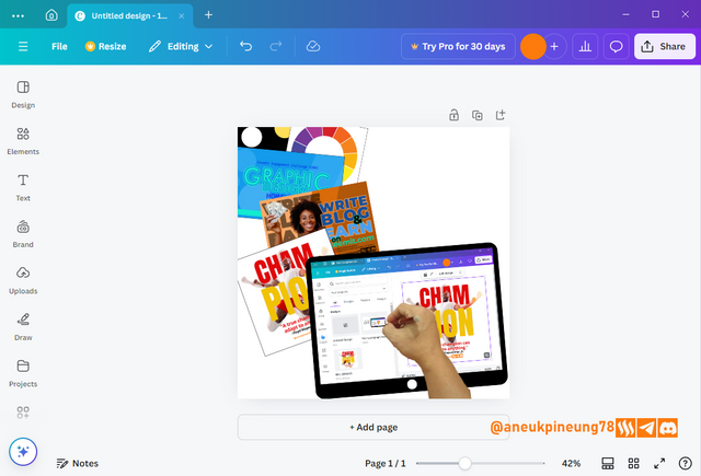
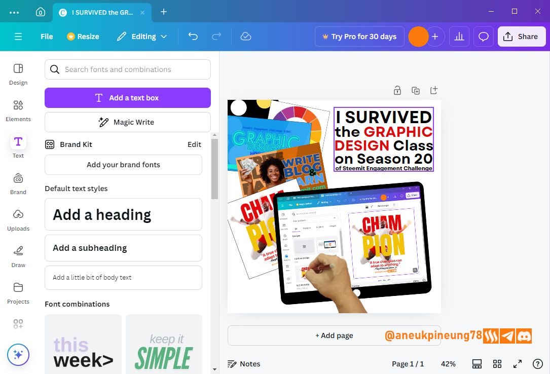
Image is clickable and might show larger resolution. - Time to add some text. I hit the [Text] button (1), ad chose [Add a text box] (2).
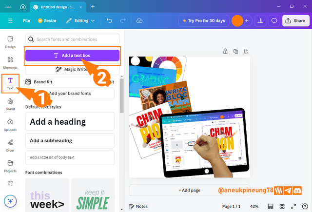
Image is clickable and might show larger resolution. - I added the text in a center-aligned position, then set the size so that each line fills just enough so that overall it look like left-right alignment (justify). I used this font named Garet, a dynamic yet modern and clean looking font.

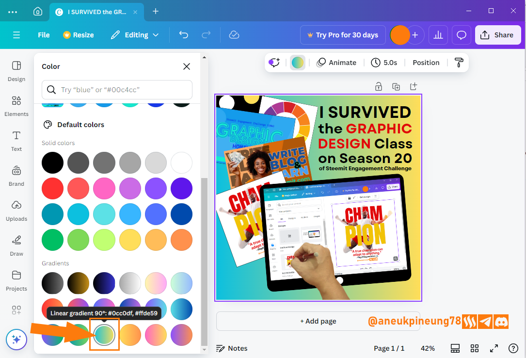
Image is clickable and might show larger resolution. - I decided to change the background color of the design, and I found the following gradient color that gives off a cheerful and dynamic vibe.

Image is clickable and might show larger resolution. - I repositioned the elements to make room for the design's proprietary watermark. I uploaded an orange watermark, and when I inserted it into the design I thought the color didn't match, so I edited in the same way that I edited the hand drawing, until I got a slightly darker color that could sit nicely on the design.
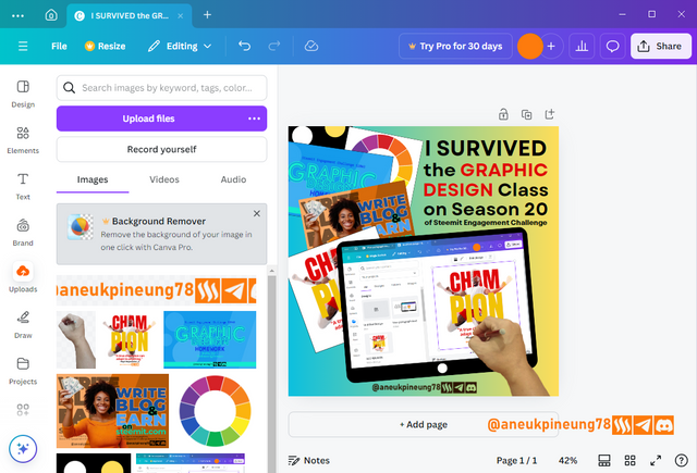
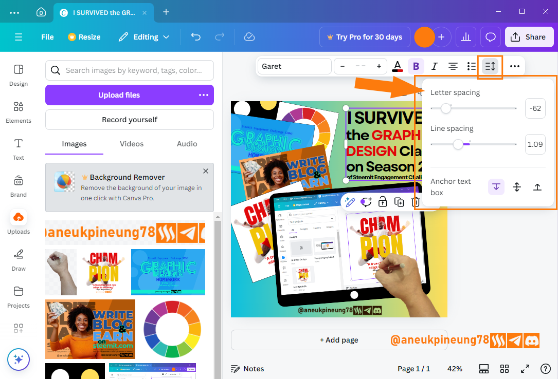
Image is clickable and might show larger resolution. - At that time, I saw that the text had spaces between letters that tended to be a bit far apart and could be narrowed down. I selected the text box and pressed the [Spacing] button, then set the letter spacing and line spacing so that I got a design that I was satisfied with.

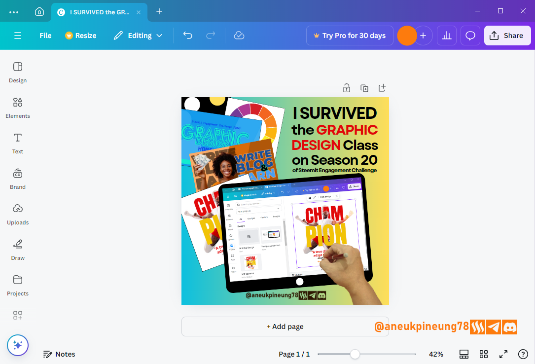
Image is clickable and might show larger resolution. - This is the final result on Canva.
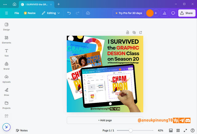
Image is clickable and might show larger resolution. - And this is the downloaded result.
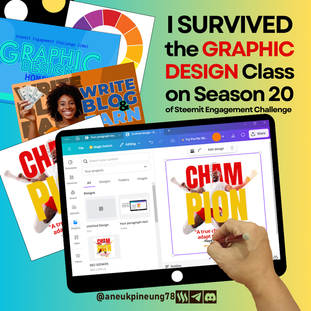
Image is clickable and might show larger resolution.


3. Principles
- Color Theory.
This is a colorful design, involving quite a lot of color, especially coming from the background which is a gradient, and the image elements inserted into it. Overall, the colors in the design do not drown each other out. Among the colors in the design and their psychological properties:#fbdd5b, this is a bright variant of yellow, which is one of the variants of the color gradation in the background. Psychologically, among the positive meanings that accompany the color yellow are: optimism, creativity, energy, and attention;#80CE9F, is a light green color with shades of blue, is a soft color and brings a feeling of calmness, the positive values attached to this color are: balance, growth, openness;#0ec0dd, which is a bright cyan blue color, this type of color is often referred to as aqua. This color that lies between blue and green brings a fresh and modern feel. In color psychology, the positive values that accompany this color are: coolness, calmness, modernity, communicativeness, and dynamism;#e00709, which is a strong red, is often associated with the values of spirit and passion and strength. from a psychological point of view, this color is accompanied by positive meanings among others: energy, excitement, passion, courage, strength;#000000or black, is a stern color, the positive values that accompany it in color psychology, including: authority, strength, formality, elegance.
- Typography
- Fonts used and their typefaces
In this design, only one font type is used, Garet, which falls into the geometric sans-serif typeface category. Among the main characteristics of this typeface that Garet also has are: clean, modern, neat, dynamic. - Hierarchy and Contrast
Hierarchy and contrast are achieved with the play of size and color. - Leading
Each line has sufficient spacing so that readability is maintained. - Tracking
Each font has sufficient spacing so that readability is maintained. - White Space
Sufficient spacing. - Alignment
Left-Right alignment (justify).
- Fonts used and their typefaces
- Emphasis
The emphasis on the main element of the gadget illustration shows the creative process in the Graphic Design class, and the other elements show the achievement (result) of the class. The text plays its own role to embed the message further into the viewer's consciousness. - Contrast
Overall, the design gains enough contrast so that each element is able to play its function and is not drowned out by or drowning out the other elements.
Thanks
Thanks Professor @lhorgic for the lesson. Inviting @rayfa, @watii, and @sumarni123.


https://x.com/aneukpineung78/status/1847085723918520398
Thanks, highly appreciated.
Terimakasih pak sudah mengundang saya di postingan yang luar biasa ini
Congratulations, your post has been upvoted by @scilwa, which is a curating account for @R2cornell's Discord Community. We can also be found on our hive community & peakd as well as on my Discord Server
Felicitaciones, su publication ha sido votado por @scilwa. También puedo ser encontrado en nuestra comunidad de colmena y Peakd así como en mi servidor de discordia
Thanks, really appreciate it.
Hello @aneukpineung78 thank you for participating in this week's lesson. We have assessed your entry and we present the result of our assessment below.
Feedback:
Let me start by appreciate you for coming this far with me on this six weeks course and also commending you for the effort put into this practical, I love the outcome of your step, your design looks cool.
You design tells a beautiful story of your participation, this is what every graphic design should do, passing a clear message with visual. You highlighted some of your previous assignments showing your participation in the previous class
In all, you did beautifully well and I must commend you for a job weldone. Thanks for staying through the whole process.
Regards
@lhorgic❤️
Thanks, Professor.
Wow...undangan yang luar biasa untuk saya. Terimakasih ya Pak @aneukpineung atas undangannya. Ingin rasanya ikutan hal yang semacam ini. Tapi ilmunya belum ada sedikitpun untuk desain grafis. Ini mah cakep pakek banget.