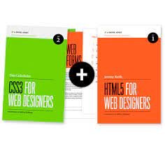
CSS3 for Web Designers

Designing and coding your hundredth unordered list navigation has the potential to become pretty tedious. Every now and then, a web designer needs a little something to shake things up. HTML5 and CSS3 have been providing that inspiration lately, and A Book Apart has delivered each in convenient book form.
Looking good, again
This book, like its predecessor, is a lovely physical specimen. The dominant color is a spring green, appropriate for its rejuvenating content, and the layout is again simple but appealing. When so much consideration has been put into a design, it invites close scrutiny and nitpickiness, so here goes: delineating paragraphs with vertical space rather than an indent seems appropriate for the web, not for print. A minor complaint, which I had with the last volume as well.
Clear and concise
The author gives clear explanations and working examples of CSS3 features, such as text-shadow, box-shadow, and new selectors. CSS Transitions get a lot of attention, as a simple and lightweight alternative to javascript for small enhancements. Rather than including JQuery and the colors plugin, for example, to create a smooth color animation of a logo or button, a transition (with appropriate browser prefixes) can be applied:
button{
background-color: rgb(50,0,0);
-webkit-transition:background-color .3s ease;
-moz-transition:background-color .3s ease;
-o-transition:background-color .3s ease;
transition:background-color .3s ease;
}
.button:hover { background-color: rgb(255,0,0); }
Not comprehensive
This is purposefully a “brief book” that cannot cover everything in CSS3, and the author rightly focuses on features that can be implemented appropriately today. However, while the author or editors may have valid reasons for omitting them, HSLa and border-image seem to have as much support as RGBa or multiple backgrounds, and open up a range of creative possibilities. Also, while the :last-child selector is introduced (p. 96), and good references are provided for other CSS3 selectors, the more general :nth-child and the sibling combinator (~) seem worthy of mention.
The thrill is back
I am old enough for Mr. Cederholm’s story about coding Javascript rollovers, which introduces Chapter 2, to bring back a lot of memories. Actually making the page respond to the user was a real thrill, as primitive (or you might even say embarrassing) as it seems now.
Perhaps more important than the actual details of the CSS3 techniques provided in this book is its overall approach. Of course, “progressive enhancement” and its flipside “graceful degradation” have long been preached by leading web practitioners. But here Mr. Cederholm is also encouraging designers to let web design be thrilling again; make the extra effort to add creative details that may “surprise and delight” the growing number of users that will see them.
Conclusion
Mr. Cederholm often uses the phrase “fold in” to describe incorporating new CSS3 rules:
Now we’ll add a unique :hover treatment to each item, knowing that the catch-all transition will smooth out and animate whatever we fold in.
This brought to mind the process of baking a cake, where ingredients are carefully “folded in” to the batter. Whether intentional or not, it is an apt allusion, as CSS3 can for now (until the spec is closer to being finalized, and browser support is more robust) be thought of as the icing on the cake. A cake without icing, after all, is still a cake and a perfectly serviceable dessert, just not one quite as beautiful or delicious.
Thank you
I was interested in this book and agree with the author's ideas on web design. What customers and visitors see when they come to your website determines how they see your business. So it's important to check what's being displayed on your website as soon as possible.
The CSS3 specification is the undisputed future of web page decoration, and its development is far from over. Most modules are still being improved and modified, and no browser supports all of them.
Absolutely, animations can significantly enhance user experience when used thoughtfully. The key is to use them sparingly and purposefully. Start with simple animations like fade-ins and slide-ins to draw attention to important elements without overwhelming the user. It's crucial to keep performance in mind, so limit the number of animated elements on a page and use hardware-accelerated CSS properties like transform and opacity for smoother performance. Additionally, always test your animations on different devices and browsers to ensure consistency. For further details on how to effectively implement animations and other CSS3 features, you might find this useful resource helpful https://claspo.io/templates/use-case/request-call-back/ It provides practical examples and insights on enhancing user interactions while maintaining performance and usability. This approach will ensure your CSS3 animations are both engaging and efficient, adding value to the overall web design.