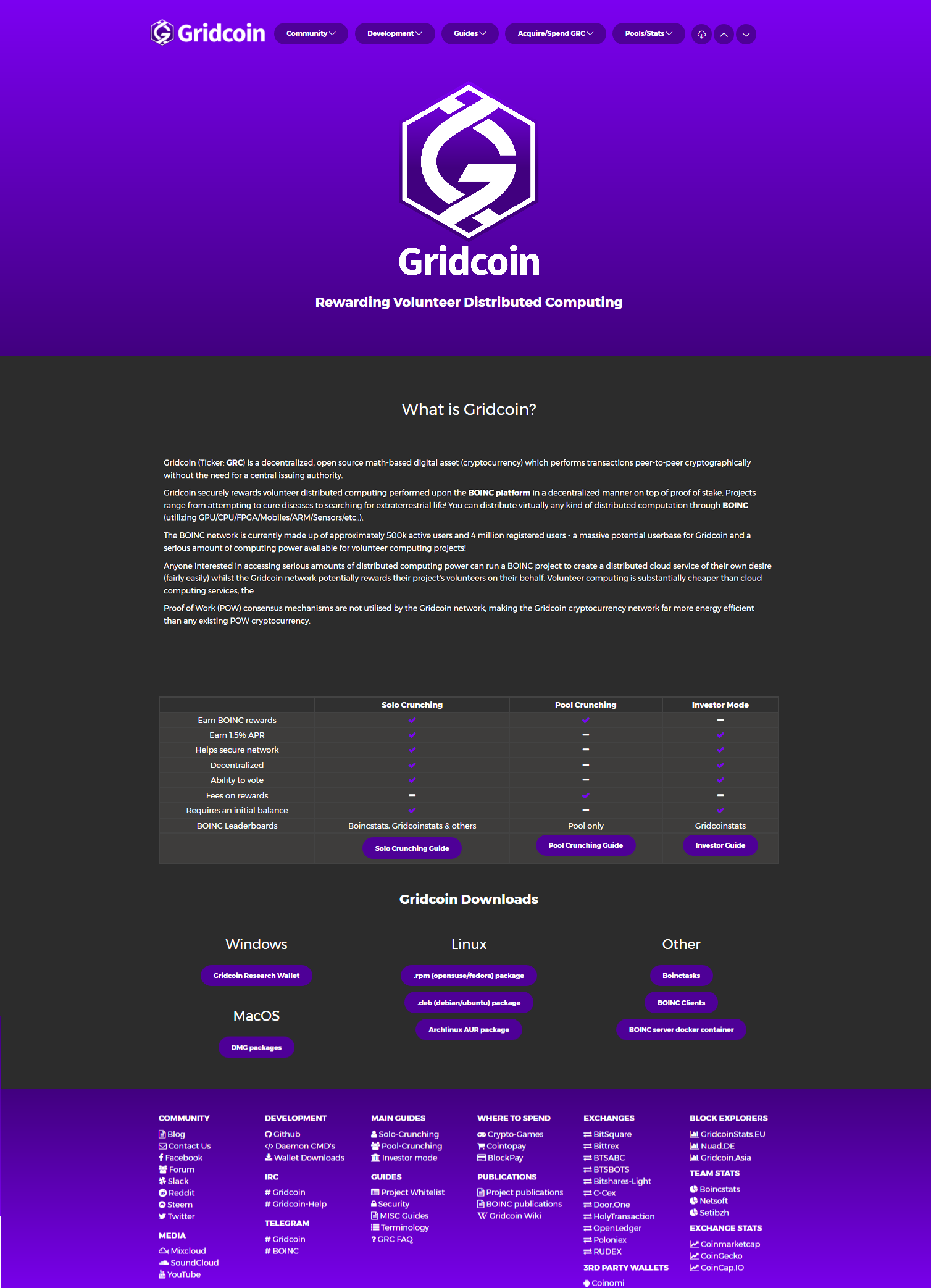
Gridcoin.US Website overhauled!

Thanks to barton26, peppernrino & everyone in the slack web-dev channel for helping create the latest version of the gridcoin website.
Do note that the above image was spliced together through multiple screenshots, it's best viewed directly.
Change log:
- Migrated from grctest repo to gridcoin-community repo (better organization & less centralization).
- New logo & colour scheme used throughout the website.
- Solo/Pool/Investor mode advantage/disadvantage section summarized in table format. This is far simpler and less wall-of-text-y.
- New download links for Mac OS (Thanks acey!)
- Boinc server docker repo added under 'other' downloads.
- Header and footer contents updated.
- Blog added.
- Contact us page added.
- Door.One added to exchanges header/footer (we'll have compatibility through open.grc).
Have any further suggestions or want to help development?
Please head on over to the gridcoin-site community repo on github & get submitting issues and or pull requests!
Best regards,
@cm-steem
Nice job @CM-steem and thank you for your help also.
Great job! I'm also in favor of slight adjustments to make the color scheme a bit less aggressive. But overall: super neat!
While I do like the explanation text under "What is Gridcoin?" ... may I suggest to insert a "easy-as-one-two-three" kind of summary before that?
Something along the lines of:
Let's earn money for supporting science.
This way we could have a really simple summary before visitors get confronted with the slightly technical "What is Gridcoin" text body as it is now.
Since this is more helpful and I have to live up to my user name here: I created a pull-request.
This is a great update for Grid Coin. I've been listening to you, cm-steem, on the Hangouts for weeks and wanted to find a resource to learn more about it. The few clicks I just did on the site shows the info is organized really well with concise language.
Having done info architecture in a past life I know how challenging it can be to pull it all together.
Congrats to you, barton26, peppernrino, and everyone else who worked on it.
Upvoted & Resteemed.
A little bit too much of the same colour in my opinion, bites a little bit in my eyes. :)
We'll dial into the correct balance of purple, don't worry ;D
The purple kinda bites in my eyes as well. The green of before was quite nice (and natural) and I guess it wouldn't be too bad in combination with the purple logo (which would additionally highlight the logo).
The site looks great! However the purple and grey clash quite a lot. I realise the purple was community voted so we cannot really change that, so maybe a different shade of grey may be better? The tick marks on the table half way down are also difficult to read.
Yes ... a little bit lighter grey would be good (and give a nice kinda spacey look).
This is top-notch shit! To the fucking moon and beyond
That's the spirit! :)
I've fallen in love all over again. Ty @cm-steem!
very useful information @cm-steem, these are nice improvements, the website is looking very attractive and beautiful than before, thanks for sharing
Nice!, simplified, the advantage / disadvantage helps new people decide what they would like to do, and Purple Power!! And i got a friend with a mac who would love the link to th osx wallet,
Very good indeed @cm-steem, I really am in love with the new design. Thanks alot for pushing gridcoin forward ! If we keep this effort up gridcoin will live long and prosper ! Thanks guys