SLC21/WK5: Hands-On Practical
Hello Friends,
I am Muhammad Ahmad from Pakistan and today I will participate in the Engagmen Challenge Contest organised by Dear @lhorgic. I am feeling perfect and lucky because in this Lecture I will learn many things like how I can design the best flyer design and then add some mockups etc and much more. So without wasting any time let's get into it.
Designing a Logo for my Brand |
|---|
Step: 1 Designing A Logo
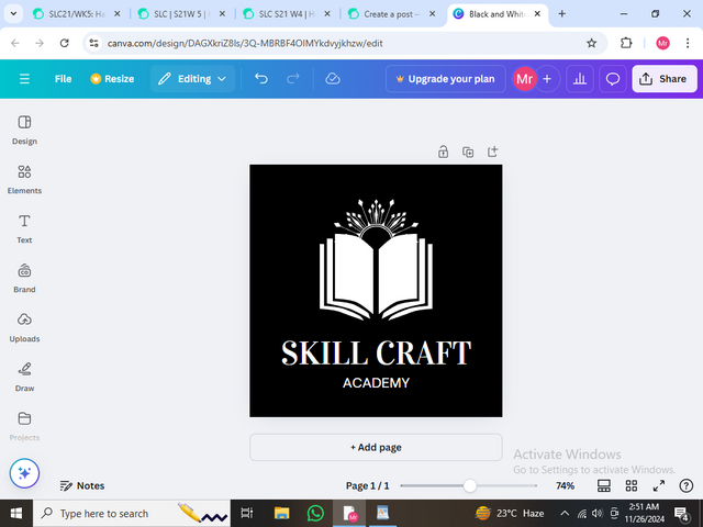
I opened my Canva on my Browser (Google) and then first of all I made a Logo because I missed the previous session of this lecture, so that's why I have to make a Logo first of all.
I have made an Educational Logo for my brand and I will use that logo in my onward design. My brand is about an academy in which I will provide some educational courses, so for that, I have made an Education logo which you can also check. So let's begin.
Designing a Poster for my Brand |
|---|
Step: 2 Making A Poster
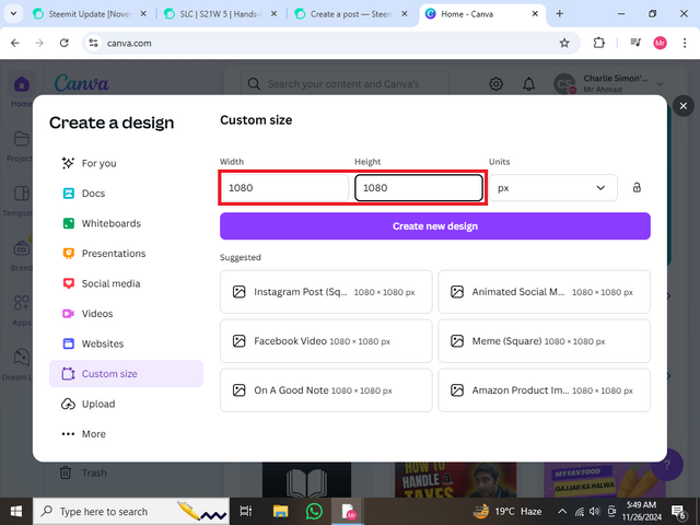
In this step, I have to design an attractive poster for my brand. So for this, I have to go to Canva again and then you have to select a Custom Size for making a poster I have selected the size (Height 1080 and Width 1080) and then click on Create New Design.
.png)
Step: 3 Changing Colour
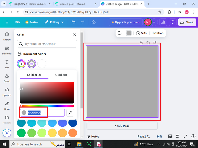
Now you have to change the colour as I have selected the Greyish colour with the code (#AAAAAA).
.png)
Step: 4 Adding Circles
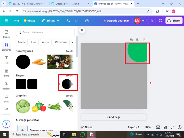
You have to add a circle and give it a green colour then I have arranged it according to my alignment. Like I have arranged it in the corner.
.png)
Step: 5 Adding Frames
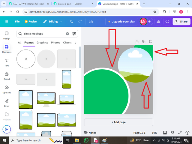
Here you have to add a circle mockup and adjust as I did and then you should copy the first circle and enlarge it after that copy it again small its size a little bit and colour the first circle with white and green with other circles. Now it will give a very cool effect.
.png)
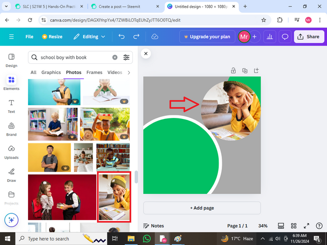
Step: 6 Adding Boy Image
In this step, I searched for a boy studying, after searching I saw a picture which I liked on the Free version of Canva and then added it to my mock-up picture which you can see.
.png)
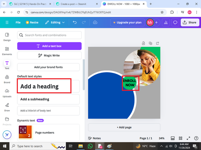
Step: 7 Alligning My Poster
Here I have changed the colour to purple and also I have copied the green circle at the corner aligned it to the centre and then typed the text Enroll Now
.png)
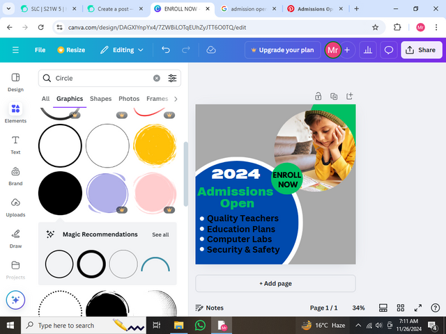
Step: 8 Adding Titles
Now I have added some more titles as you can see like 2024 and the Admission Open title also with some more unique features of the school. I have also added the bullets which have a good effect on my poster.
.png)
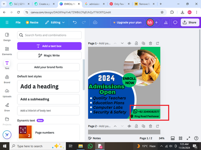
Step: 9 Adding Contact Details
Now I have added my contact information by first making a square and then filling it with a green colour. Then I arranged it at the end of my design and I also added the icon of WhatsApp and Address by simply searching for the icon png and then removing its background and then adding it to Canva to use it.
.png)
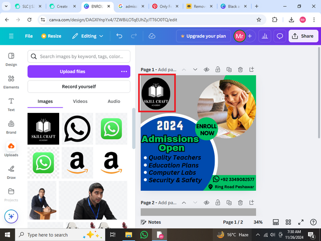
Step: 10 Adding Logo
Now its time to add the logo which I have designed so for that I have added the Circle Frame and then inserted my logo in it.Also, one thing I have to tell you Dear Instructor that in my post I have used the word Mockup for frame mistakenly. So Kindly ignore it.
.png)
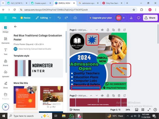
Step: 11 Adding some elements
In this last step, I have done some finishing steps like adding some elements and the dot dot design at the end which you can see as I highlighted it. Also, I have added pencils which give a great look.
.png)
Final Result Of My Poster |
|---|
Principles That I have been Engaged in making this Desig |
|---|
◉ There are alot of principles which I have been engaged with but I am going to discuss some. So let's begin so the first and most important is Alignment. I have to focus on it a lot as you can check my poster too. I have also kept balance and Typography. This is also one of the most essential steps as we have taken a lot of lectures on it in the previous month. However, I have been engaged with this principle by bolding the text and much more. Hierarchy is also the principle in which I have been engaged. Also, I have been engaged with Colour combinations and much more. I will discuss it very shortly because all of these principles are told by me in previous lectures, if you want to ee then you can.
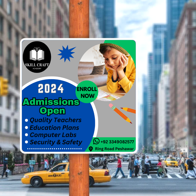
Promoting My Design Through Mockup |
|---|
➤ Now it's time to promote my Design through mock-up. I was on the free version of Canva so I couldn't get any great design for my mock-up but after a lot of research, I got this one. I hope that you will like this. Then I added a mockup on this which you can see.
✦ I am going to invite dear @kouba01 @heriadi and @irawandedy to participate in this amazing Challenge. I hope that you all will participate in it.
.png)
.png)

Congratulations, your post has been upvoted by @scilwa, which is a curating account for @R2cornell's Discord Community. We can also be found on our hive community & peakd as well as on my Discord Server
Felicitaciones, su publication ha sido votado por @scilwa. También puedo ser encontrado en nuestra comunidad de colmena y Peakd así como en mi servidor de discordia