With my best wishes and heartfelt love, I would like to begin my post. Today I’m here to be a participant in the challenge "SLC21/WK3: Logo Design - Part 2" organized by honorable Sir @lhorgic. Due to some of my medical crisis, I wasn’t able to participate earlier but today I’m delighted to be a part of this lesson.
Designed By Canva Pro
So without any further delay I’m going to start my today’s lesson.

• Discuss about each of the logo types we have and then talk about conditions when such logo should be used and when not to be used for a brand. You can do a little research to aid you.
WORDMARK LOGO
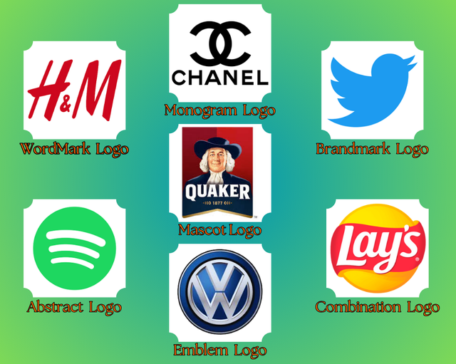
By the word Wordmark logo, I understand that types of logos which center around the brand’s name and the core visual element used as typography. It’s not only relying on icons, symbols and all other additional graphics rather it’s mainly focused on of representing the brand name along with a memorable and appealing way to the viewers. By Wordmark logo aim is to have a brand name people can remember with ease. I can mention some brand names such as - H&M, Tiffany & Co., Sony, Panasonic, Samsung, Volvo, Canon and so on. These brand names are built on iconic identity by using their wordmark logo. The Wordmark logo feature not only creates awareness among customers but also makes the name easy to remember among customers. Having a simple, memorable name through typography can carry any brand’s value, personality, and more especially the quality of it. Nowadays in our crowded marketplace place, it’s very predominant to choose the right font and name for a brand. The reason is it will stand out among all and make a lasting impression between the reader or viewers.
MONOGRAM LOGO
A monogram logo is often called as lettermark logo. It is a creative way of representing a brand through their initials. A monogram logo's simplicity is the main charm of it. It appears a sleek and modern impression toward the readers instead of displaying the entire brand name. It beautifully turns the letters into a symbol which conveys both the brand’s personality and of its purpose as well. The adaptability makes the monogram logo a special place among the all. On a business card, social media, packaging, or even in large-scale signage it maintains a clean and comfortable appearance across the whole platform.
BRAND MARK LOGO
Through the class, I understood brandmark logo means that kind of logo which is visually representing of a brand through a single image or any icon. By giving any kind of lengthy explanation or writing the full name, this logo shows the brand identity clearly. The beauty of a brandmark logo lies in its simplicity as well as its elegance. This logo works perfectly for any established company the reason is their values and name are already widely famous by all the people. Anywhere watching this logo, people can identify the renowned company and have trust on it. According to me, the brandmark logo is not a good idea for the startup. Because I felt people couldn’t relate about the new company, their offer, and not even the service they could provide better. A well-intellectual designed brandmark logo easily captures the attention of a viewer and also leaves a lasting impression into their mind and heart.
Designed By Canva Pro
ABSTRACT LOGO
An abstract mark logo is a unique type of logo which uses shapes, patterns, or creative elements by symbolizing a brand. These logos creating a powerful impression in the views without being any too much literal. This logo provides emotions, ideas, and values which align with the brand’s identity. This logo is beautifully fitted in the sector of technology, design, and fashion. It relates a connection with the audience in a unique and also in imaginative way. The special quality of this logo is that they’re not properly clear which a pictorial logo which might have. The customer might not instantly understand the meaning of the logo but this could make it harder to remember and deep think about the logo. Every abstract mark logo is not only a logo that make but it has a tale behind it.
MASCOT LOGO
A mascot logo is that kind of logo which made in a creative way that brings a new life to a brand. This logo brings an illustrated artistic design which becomes the friendly face of the brand and also affects the personality and warmth. This logo always tries to connect with their audience attaching with emotions. This logo tells us a story or tale, changes our mood, and sparks our emotions. For the children's products, entertainment, and food companies, this is the perfect choice of logo for their branding. This logo is able to create a humor and friendly image though it is not suited for any serious professional sectors. The logo is represented in a cartoon format where the audience can relate in a friendly way and bring some unforgettable part of their identity.
EMBLEM LOGO
An emblem logo is one that combines both with text and imagery. This logo’s specialty is its ability to communicate with the audience with a great sense of prestige, trust, and longevity. This logo gives a positive vibe which makes the brand more reliable and brings a sense of heritage. Though creating this logo is much challenging but it brings a strong view to the audience. From my point of view, there can be an error made in this logo when the brand has more wording or smaller wording that it can’t be fit in a small space even though it sometimes it is difficult to read.
COMBINATION LOGO
Combination logo refers to the kind of logo which is a fusion of both text and image. It represents the icon and also the image. This makes a clear sense to the audience about the brand which it stands for. It helps the brand growth and at the same time creates a strong long-lasting visual identity for the audience.

• Pick any two (2) of the Logo types discussed and then practically demonstrate how to make them, showing your detailed process.
Step- 1
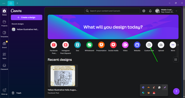
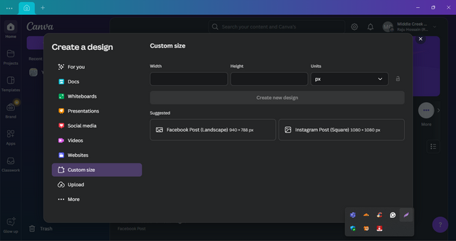
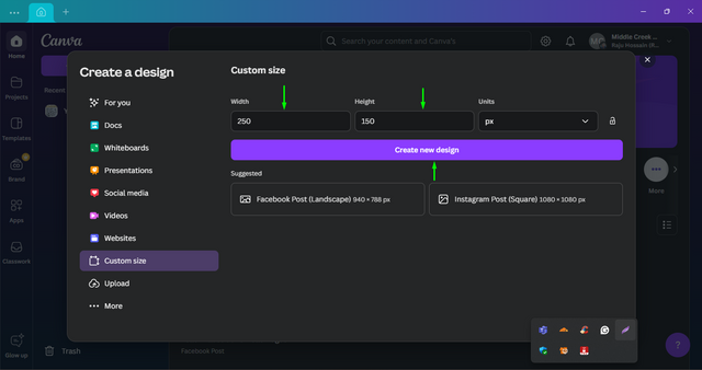
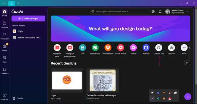
First I open the Canva app. Then I clicked the option of "Custom size". After that, I got a new interface where I had to input the required size.
Step- 2
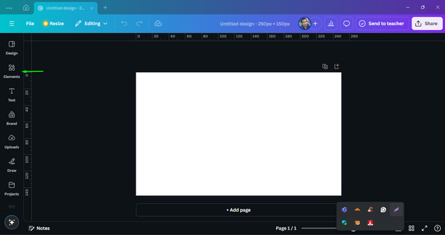
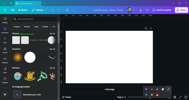
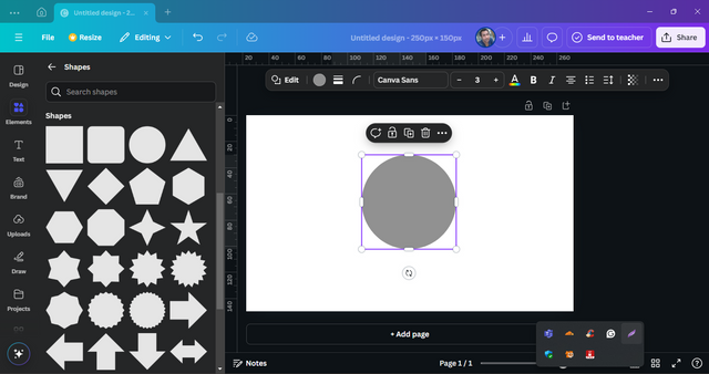
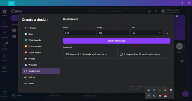
In the width, I put 250 and in the height put 150 px. After putting this measurement I clicked on the button of "Create New Design" option. A new blank page opens up on my screen. From the left side, I select the "Elements" options. Among the elements option, I select the "Shapes" option.
Step- 3
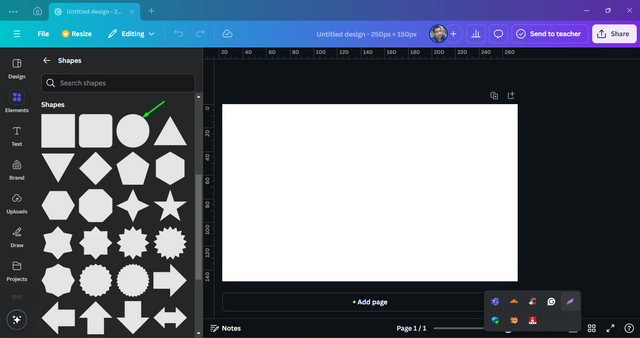
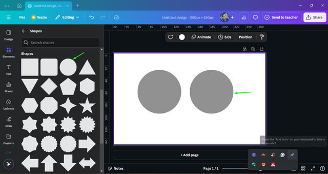
From various shape options, I select a circle. Hereafter I circle appeared on my page. In this same way, I made another circle beside the previous one.
Step- 4
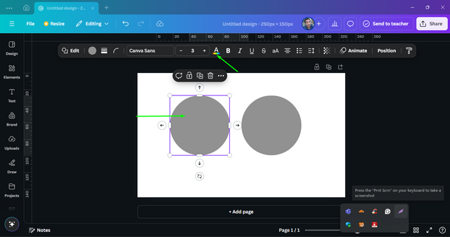
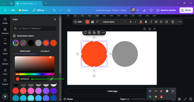
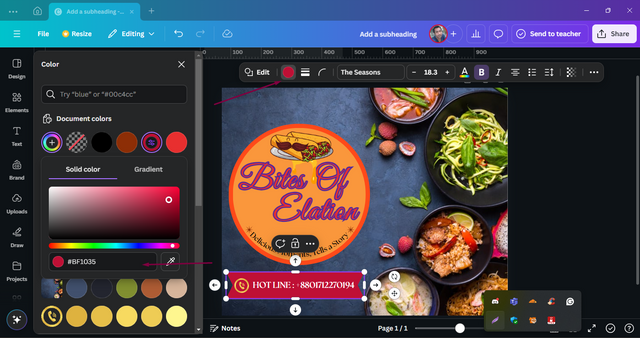
I like to change the circle's inner color that’s why I clicked on the "A" option.
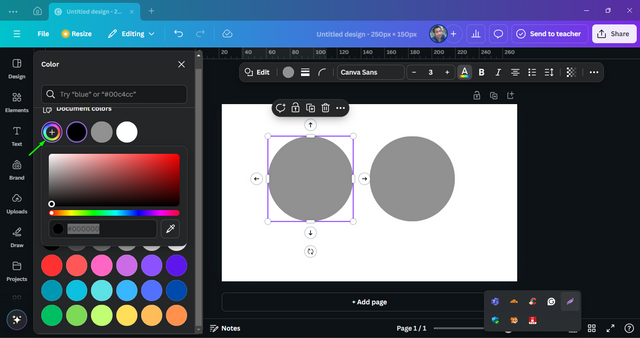
After that, an interface appeared colour from there I chose a dark color.
The circle background hex color code is "FF4A1A".
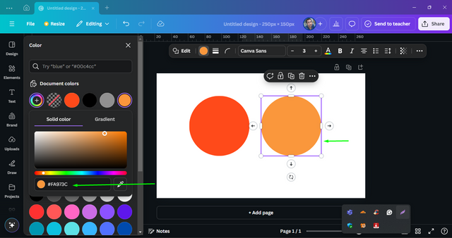
Then I changed to another circle and made the hex color code as"FA973C". These contrast color combinations I had learned from Sir's previous classes.
Step- 5
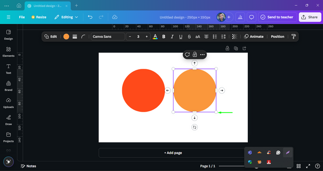
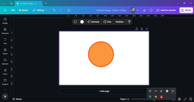
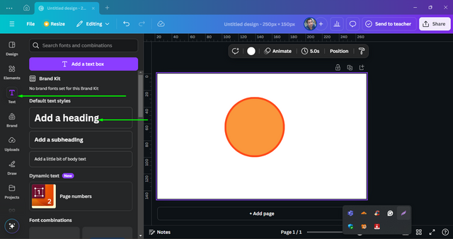
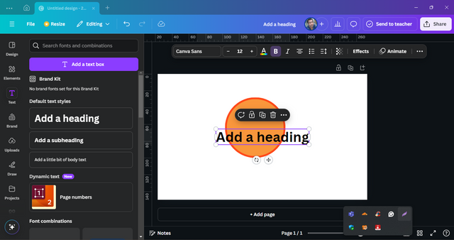
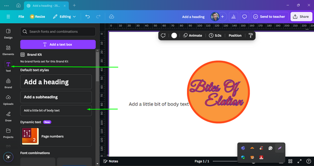
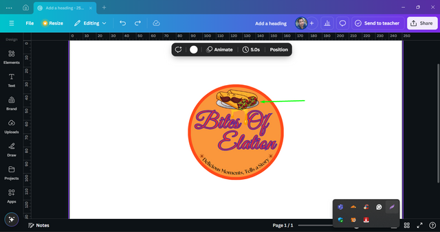
I clicked on the right side of one circle and by clicking the corner of it made it a little smaller. Then I put it in the left side circle. From the left side, I select "Text". On that interface, I select the "Add a heading".
Step- 6
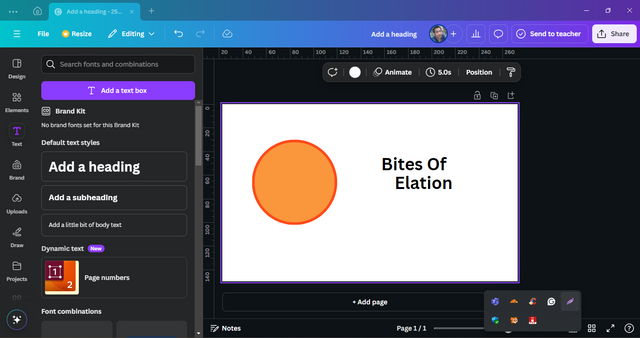
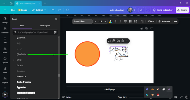
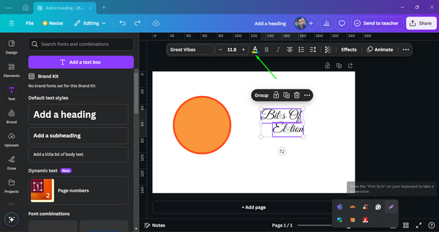
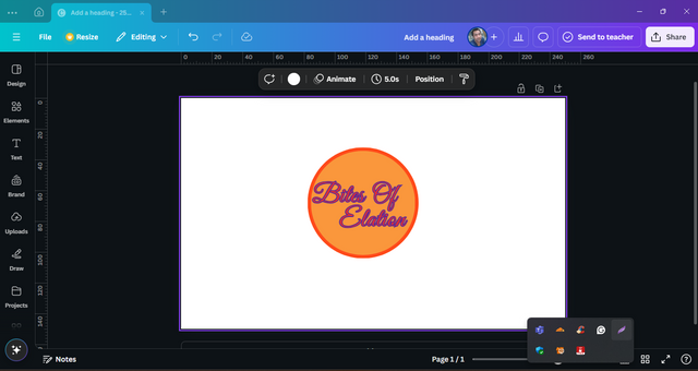
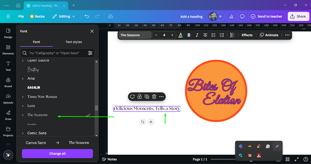
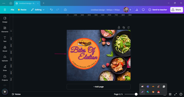
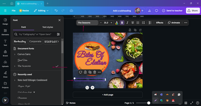
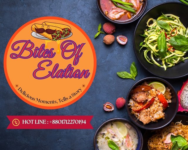
I got a text box. I wrote my dream food shop named "Bites Of Elation". Then I change the font style by clicking on the top font style and selecting the style "Great Vibes".
Step- 7
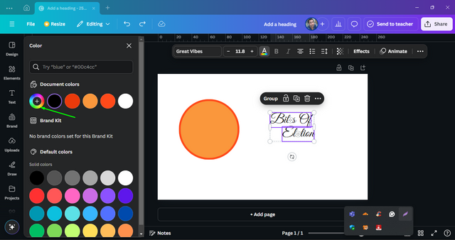
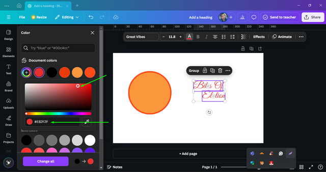
I change the color of fonts by clicking upon on "A". Clicking on the colors and selecting the color code as the hex color code as "E82F2F".
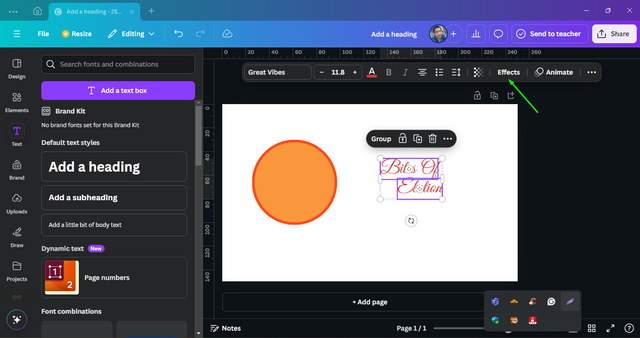
Step- 8
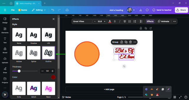
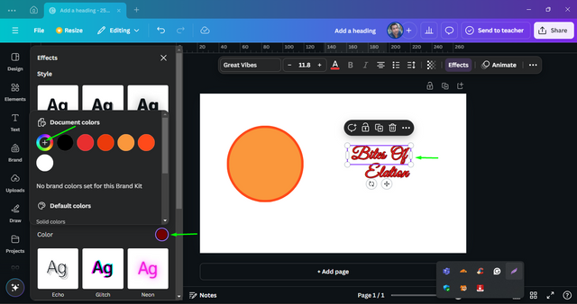
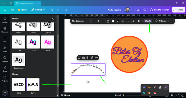
On the top options I select the "Effects". Among all the effects options I chose the "Outline" option. Then I clicked the color option.
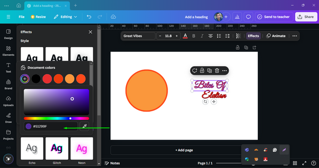
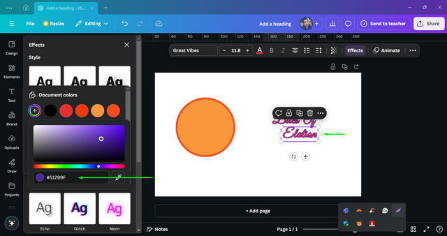
I chose the hex color code of "51299F". I made this change for all the fonts. I put all these fonts into the middle of the circle.
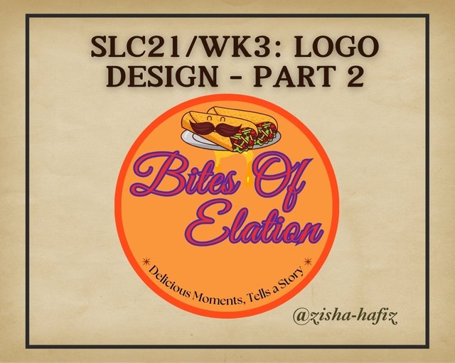
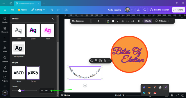
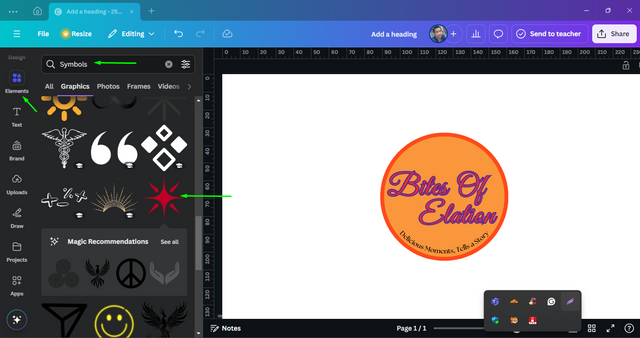
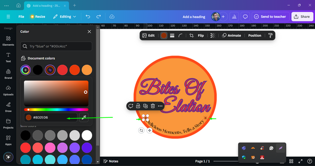
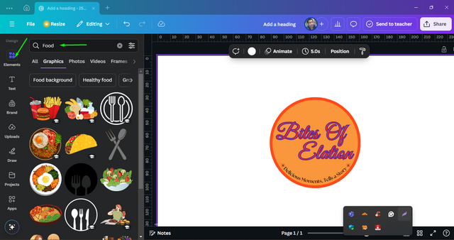
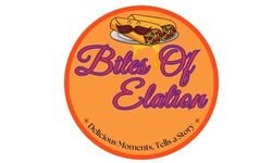
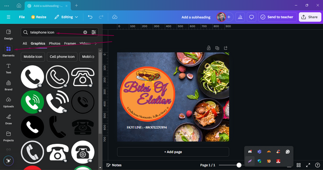
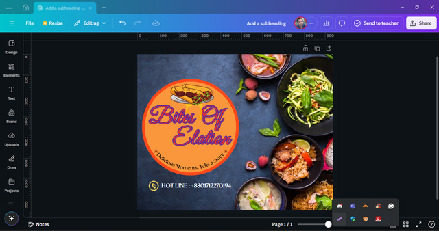
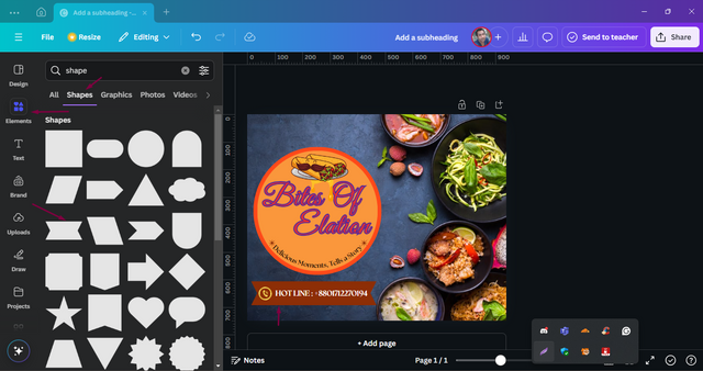
As a new startup I would like to reduce my costs that’s why I prefer to have the flier in combined with a "Word Mark Logo" and "Combination Logo". I think this will suit with my inner imagination of my branding and also wishes that you’ll also love my presentation.





X Promotion :- SLC21/WK3: Logo Design - Part 2
Congratulations, your post has been upvoted by @scilwa, which is a curating account for @R2cornell's Discord Community. We can also be found on our hive community & peakd as well as on my Discord Server
Felicitaciones, su publication ha sido votado por @scilwa. También puedo ser encontrado en nuestra comunidad de colmena y Peakd así como en mi servidor de discordia
Very well written post. I have no knowledge about how to design these logos. But you are much talented in this work. This post shows your hard work. Your hard work is truly inspiring and appreciative. Keep it up dear. Success in the contest.
Your prayers and inspiration mean a lot to me, sis. I'm not an expert on this but I try my best to perform as I learned from the classes. This class really gives me a vast knowledge of graphic design.
keep it up dear. You will achieve your goal.