SLC21/WK2: Introduction to Logo Design.
Hello Everyone. I am @shiftitamanna
From #Bangladesh
Assalamu Alaikum everyone. Today I have studied the syllabus of SLC, S21W2 Introduction to Logo Design educational program organized by @lhorgic and discussed below the logo design tasks. So let's get started.
%20(22).png)
Image created by Canva.

What I mean by logo in simple language is an image consisting of signs, symbols, letters or words that convey the brand identity and work style of an individual or organization. Basically what kind of work the brand does or for whom it works can be understood only by looking at that logo. And by this logo a viewer will get a strong impression about the person or organization. This requires an attractive logo design.
From my point of view, if you draw any symbol as you want, it will not be applicable as a logo. Meaning All the elements that will be included in the logo design should make sense.
This means that the logo design must contain the brand name, icon and slogan. So I believe that a well designed logo tends to increase both the sales and reputation of a business or organization. Because every organization or brand depends on their logo. Which will help to gain recognition all over the world.

The role of logo in gaining brand awareness is undeniable. Because the success of any organization or brand depends to a large extent on an attractive logo. It also has a positive effect on the high profitability of the organization. For example, if I am interested in purchasing a product, the first thing that draws my attention is the brand's logo, which creates a strong impression in my mind. Then I would be inclined to purchase the product. And the logo will be memorable for re-purchasing the product later on.
Here are some important points that a logo plays for a brand:
Can quickly grab the attention of visitors which makes customers think that their products are worth purchasing. Also, logos play an important role in promoting the product.
Logo is a mainstay of product or brand identity of an individual or organization. In simple terms, the brand acts as the foundation of all its descriptions.
A logo plays a lot of role in creating a strong impression about a brand. Because only a good logo to present to the first known customers of a company creates interest among customers.
A logo plays a role in fostering loyalty to an organization or brand. An attractive logo will make your brand more trustworthy and accessible to consumers once it is widely known.
%20(23).png)
Image created by Canva.
A logo is not only a symbol but also represents a brand I think. It is through this logo that the reflection of the brand's thinking and consciousness spreads worldwide. Because as I mentioned before, the perception of a brand comes mainly through the logo. So the following principles should be kept in mind while creating a logo.
Distinctive and Memorable : One of the most important features of a logo is that the logo should be distinctive and easy to remember after seeing it. So while creating a logo design the elements should be such that it is easy for the customers to remember it.
Simplicity : Emphasis should be placed on the logo style always being understandable to the general public. Of course, by simplicity I mean that the logo design should use attractive colors with clear lettering and an impactful slogan. As soon as you see it, the simplicity of the logo emerges and catches everyone's attention.
Originality : The originality of a logo's design has a lot of impact. Because according to certain principles logos should not be similar to what a brand has previously used such as icons or symbols. So at this time I think it is necessary to have a touch of own brand.
Appropriateness : The logo design should never be one that doesn't fit with the organization or brand. For this, the appropriateness of the logo has a great influence on the brand or organization. Because brand and logo are an integral part which helps in gaining global recognition.

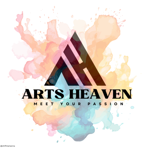
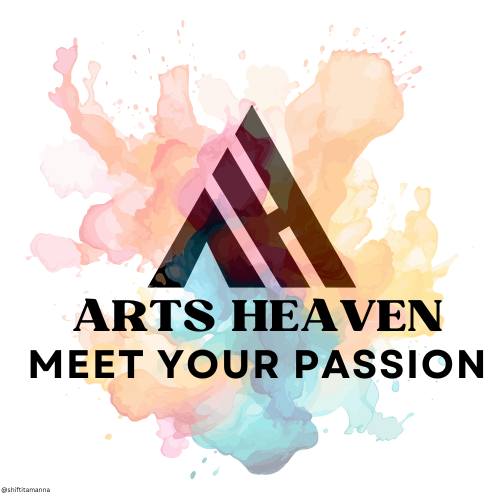
- Balance your Tagline : A logo design must have a balance between the brand name and tagline. The brand name should be in good position and the tagline should be in a thin font that stands out in an attractive way. And customers are able to understand it at first glance.
 |  |
|---|
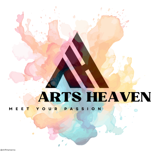
- Allignment : Alignment of words is a very useful element in logo design. Because if the text in my logo is not in alignment it looks bad and is not visible to the audience. Which I have presented clearly in the following example.
 |  |
|---|
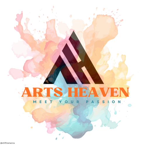
- Colour combination : Color combination is a very important factor in logo design. I believe that the color of an object draws people's attention. In addition, color works to maintain the tranquility of the human eye. So the color of the design has to be selected so that it doesn't look boring to the eyes of the audience. So selecting the appropriate color is a useful element for logo design.
 |  |
|---|
- Typography : Typography is a very important aspect of logo design. The brand name is the main attraction in typography. And if the customer can't read the brand name then that logo will not give good results for the business. So it is better to use fonts in the logo which are clear and elegant.
 |  |
|---|
I got a very good idea of logo design from the text by which I have the ability to design a logo. Also I have prior experience in design work and have done with various foreign clients to promote their business or blog.
Anyway, today I will show you how to create a logo for a business. Business establishments are intended to sell paintings or art materials. So I am going to design a logo for an art supply store. So let's get started.
Before creating the logo design I would like to give a brief idea about this. As it is thought that this art store is called Arts Heaven. And as its slogan I have decided Meet Your Passion. The reason behind this slogan is that for many artists, painting acts as a passion. And customers can collect all the materials to present their passion on canvas from this Arts Heaven.
Then we will proceed to the main design.
Step : 01
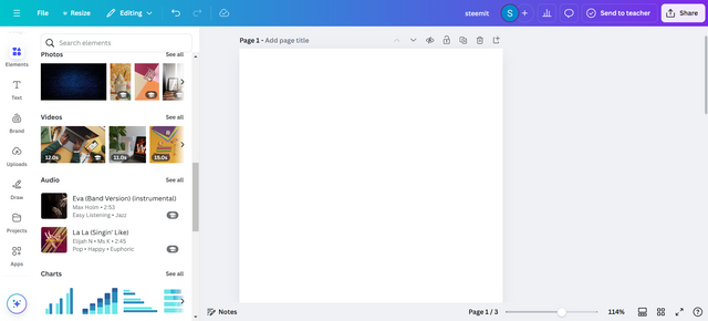
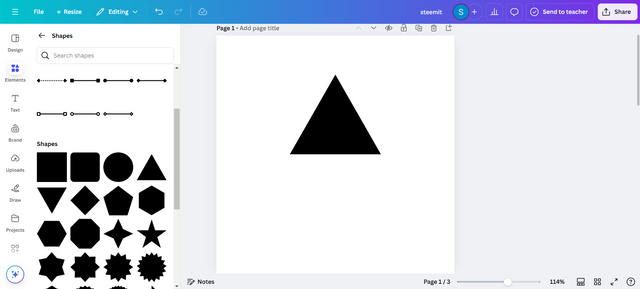
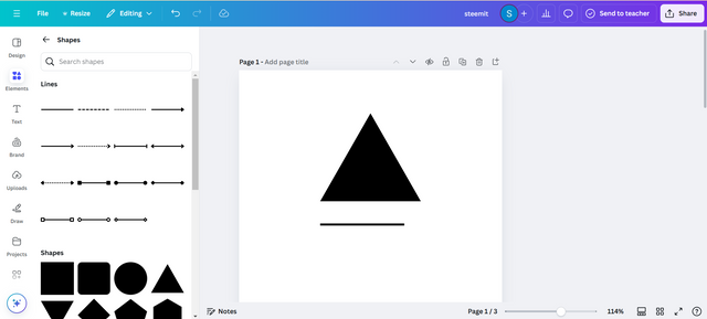
- First I'll open up my Canva Pro. Then I will take a blank template. I will create a logo for the organization first. Since my organization name is Arts Heaven, I will work with the first two letter font of the brand name in my logo. That is, I will design the logo with "A" and "H". So I will take a triangle shaped element in the empty template.
 |  |
|---|
Step : 02
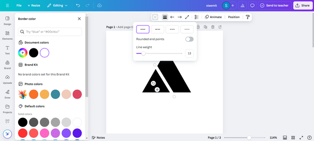
- Then I take a line from the elements. I will increase the line weight by clicking on the line style above the line. I took 13 points on the line weight. Then I will place the line curved to the left side of the triangle as you can see in the image below.
 |  |
|---|
Step : 03
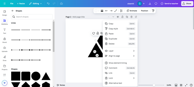
- Then I duplicate the same line as mine. And the way to get the duplicate is after clicking the right button of the mouse.
Step : 04
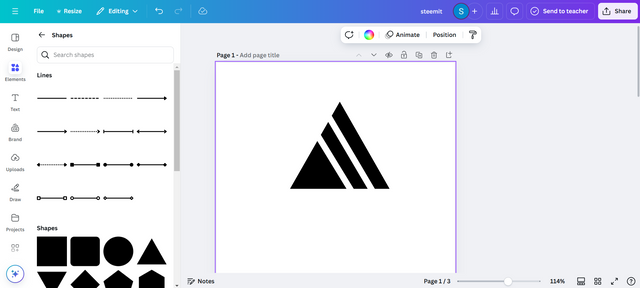
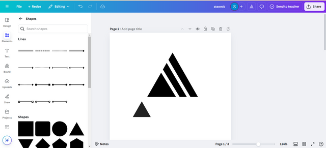
- I will place the second line above the first line in the same way. It should be remembered that the weight of the two lines should be 13 points. Then I take another triangle through the element.
 |  |
|---|
Step : 05
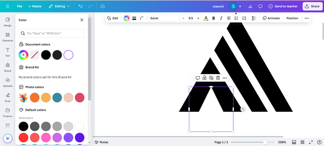
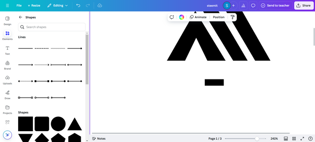
- I will make the triangle smaller and fit it in the lower part. As you can see my screenshots. With this I created the font "A" by Arts. In the screenshot next to it I will take another line from the element. I will shorten it. And the line weight I will keep at 13 points as before.
 |  |
|---|
Step : 06
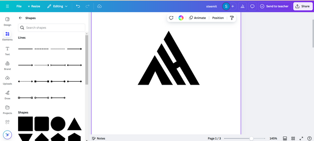
- Then I will curve that smaller line along the middle of the two larger vertical vertical lines above. Now you look exactly like "A" and "H".
Then I will write the name and slogan of the brand.
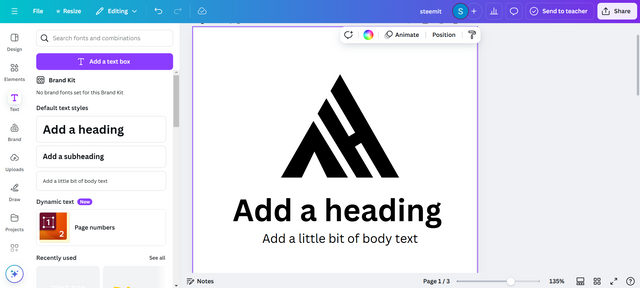
Step : 07
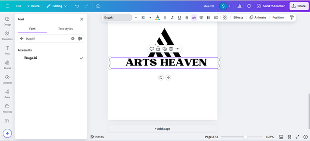
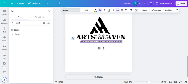
- First I will write Arts Heaven. Here I have taken "Bugaki" font as the font. And the font seems to me to be very suitable. I have given its font size as 32. At least I have balanced the brand name with my logo. Then I wrote the tagline Meet Your Passion. I made the slogan text smaller and thinner than the brand name to create balance between them.
 |  |
|---|
Step : 08
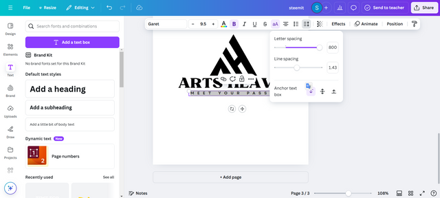
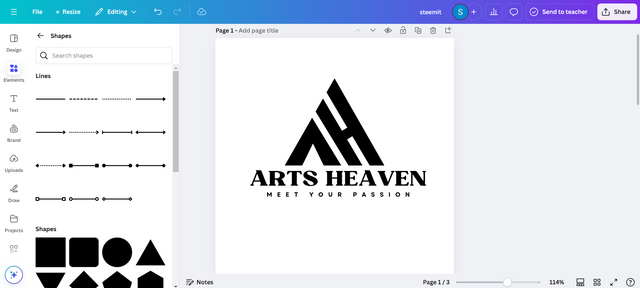
- Then I selected the text of the slogan and clicked on the spacing above. There is a letter spacing option by which I increased the spacing of the tagline a lot. I think it will make my logo more attractive.
 |  |
|---|
Step : 09
- The alignment and balance of my brand name and slogan along with the logo of the company seems perfect to me. And about 90% of my logo design is done.
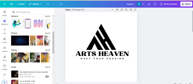
Step : 10
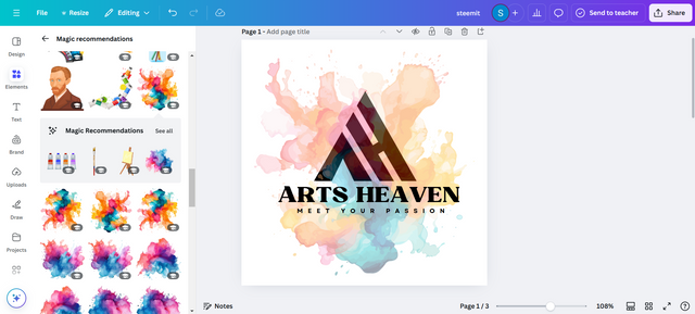
- Now I'm going to click on the element again to add a different feature to my logo. There I will select a watercolor element that you can see in my attached image.
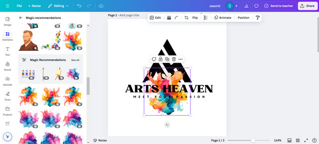
Step : 11
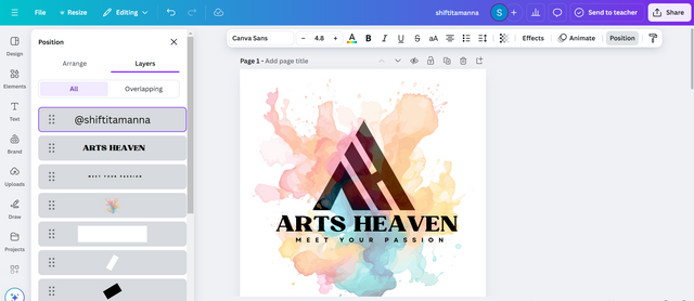
- I will increase the size of the color component and set its transparency to 39. Then it will be very interesting to watch. Here the layers of the components have to be placed properly.
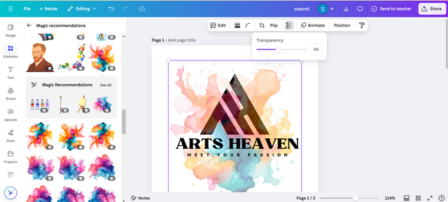 |  |
|---|
Step : 12
- The reason for adding the element of color is that we have read in the text that logos can create a strong impression of the brand through text, symbols and elements. So since I am in the client's business selling art products, this element of color will make the buyers attention towards a brand.
Outcome of My Design :
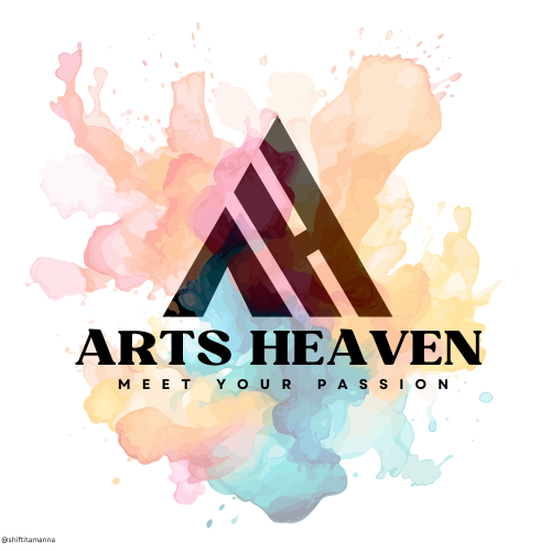
The brand name of the logo, slogan and the entire design are entirely my ideas. I hope you will like it.

All images in my article are my own.
%20(500%20x%2050%20px)%20(1).gif)
I would like to invite my friends @mdkamran99, @hotspotitaly, @irawandedy and @o1eh to participate in this contest.

I invite you to support @pennsif and @pennsif.witness to grow across the whole platform through robust communication at all levels and targeted high-yield developments with the resources available.

Click Here
%20(2).gif)
Your thinking and presentation on logo design is really appreciated! You have beautifully highlighted how important a logo is to a brand. Good luck for the contest.