SLC21/WK1: Introduction to Gradients and Application

Design
Hello everyone, welcome to this week's engagement learning challenge. It's been an amazing week in the past as we have been able to learn the various basics in Graphics design. Continuing this season with the same energy, I am ready to put in more effort and come out with magical results as time passes by. Thank you to our trainer and instructor @lhorgic For coming out Victorious this season so that we can continue learning Graphics design hands on.
Discuss about Gradients the way you understand it. Also mention other types of gradients not captured in this lesson.
In graphic design, a gradient involves the application and use of a smooth transition between two or more colors. It's a technique used to add depth, dimension, and visual interest to designs. By blending colors seamlessly, gradients can create a sense of movement, energy, and atmosphere.
Types of Gradients
Linear Gradient:
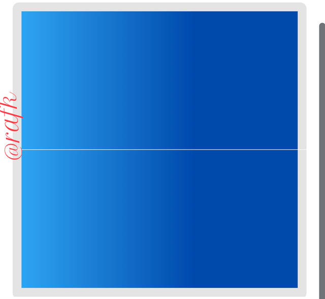
- A linear gradient transitions between two or more colors along a straight line.
- It's commonly used for backgrounds, text effects, and simple shapes.
Radial Gradient:
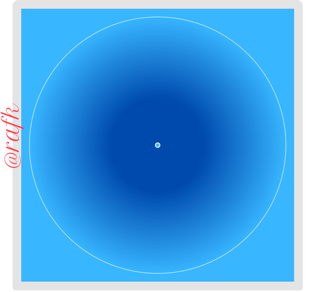
A radial gradient transitions between colors from a central point outward in a circular pattern.
It's often used to create a spotlight effect or a 3D illusion.
Angular Gradient:
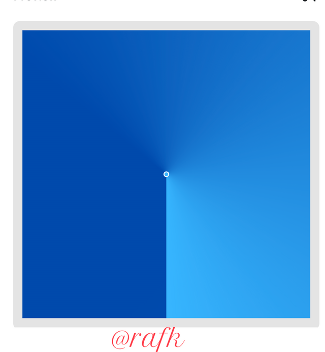
- An angular gradient transitions between colors along a specific angle.
- It's a versatile type that can be used to create unique and dynamic effects.
Diamond Gradient:
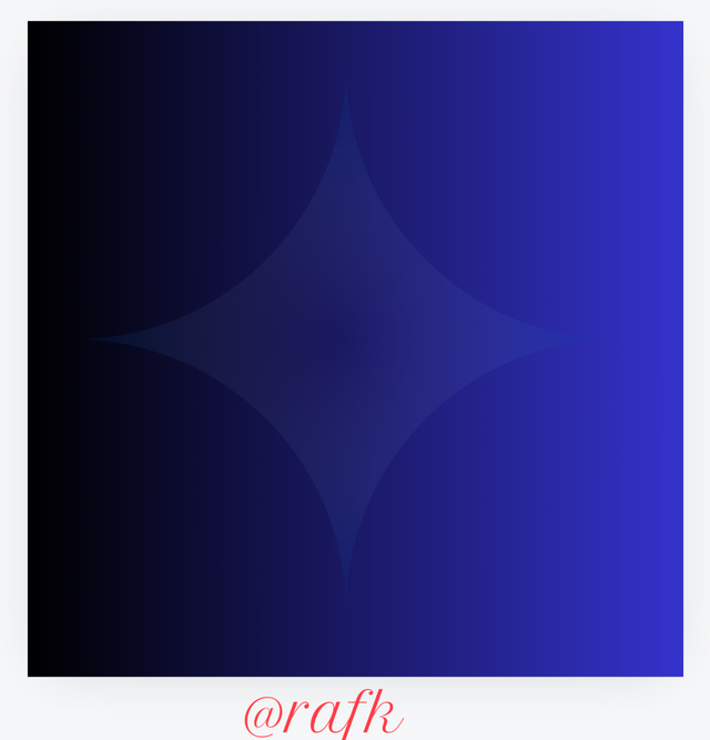
- A diamond gradient is a gradient that protrude in a diamond shape with sharp edges.
Noise Gradient:
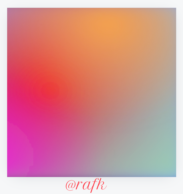
- This type of gradient includes random noise or textures to create a more organic, natural look.
Spherical Gradient:
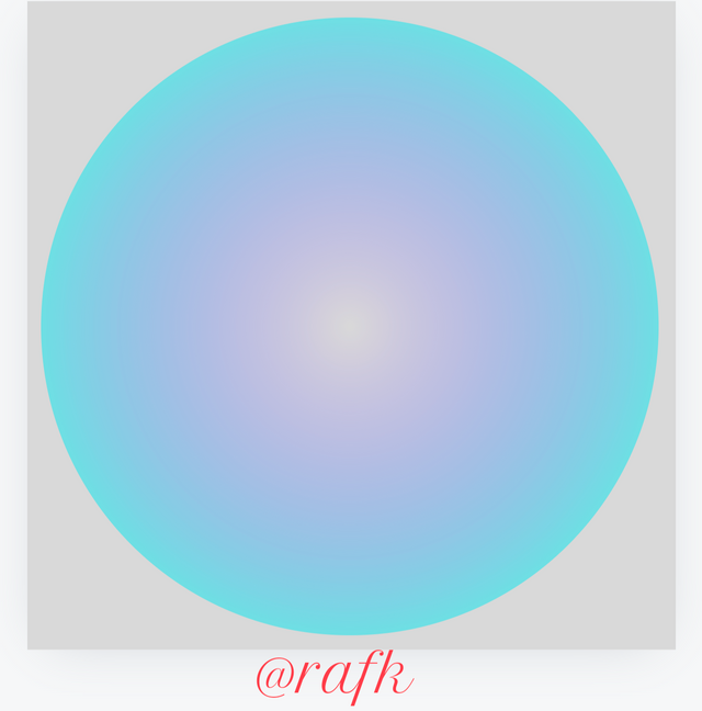
- with spherical gradient, it follows the contours of a sphere or other curved surface in a design background.
Common Uses of Gradients in Graphic Design:
Backgrounds: Gradients can create stunning and eye-catching backgrounds for websites, presentations, and print materials.
Text Effects: Adding a gradient to text can enhance its visual appeal and readability.
Logos and Branding: Gradients can be used to create unique and memorable logos and branding elements.
Illustrations and Infographics: Gradients can add depth and realism to illustrations and infographics.
User Interface Design: Gradients can be used to create visually appealing and intuitive user interfaces.
Tips for Using Gradients Effectively:
Choose the Right Colors: The colors you choose for your gradient should complement each other and the overall design aesthetic.
Consider the Direction: The direction of the gradient can significantly impact the visual effect.
Experiment with Opacity: Adjusting the opacity of the gradient can create subtle or dramatic effects.
Balance with Other Elements: Gradients should be used in moderation and balanced with other design elements.
Create 3 gradients using the following guidelines.
a. The first gradient should be made with just one colour having different complementary shades. Ensure you reveal their hex codes.
To begin with, I head to my canva app and open my workspace. I'm going to be using the Instagram template Dimensions For this exercise. While my workspace is fully loaded, I moved to the section which shows apps, click on it and then proceed by typing in the search bar gradients.
Afterwards, I proceed by selecting the type of grading I want to work with. In this lesson. I will be demonstrating until gradient as previously mentioned above among the six which are: linear, radial and angular gradients.
In this first task I choose to use the linear grading for more visual application. Let's have a look of how this works.
Procedure.
Open canva app. Select the Instagram templates
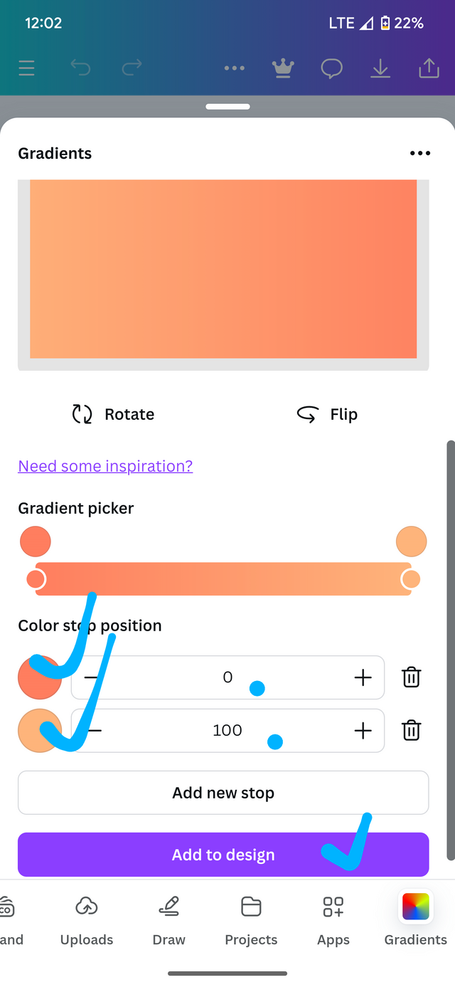
Scroll to the right and tap on Gradients if available, if not, tap on apps. I'm typing the search bar. Gradient. This option is for those who are playing gradient for the first time. Once applied it will automatically appear at the bottom left like in the screenshot below.
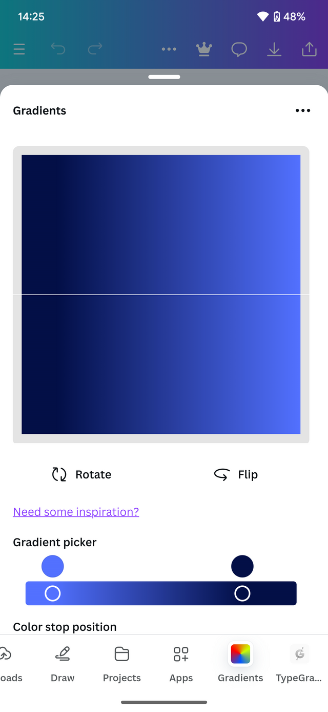
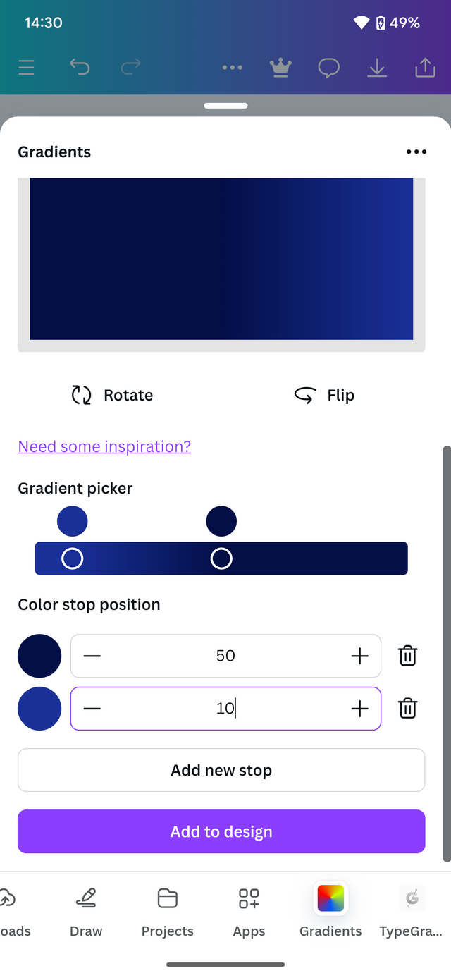
I choose the type of gradient, like I said we are working with linear gradient. Choose your colors and adjust The gradient, selecting the values which fits the gradient well.
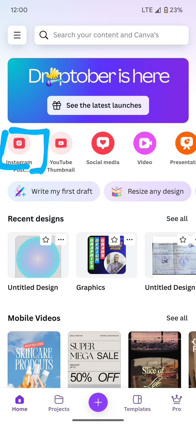 | 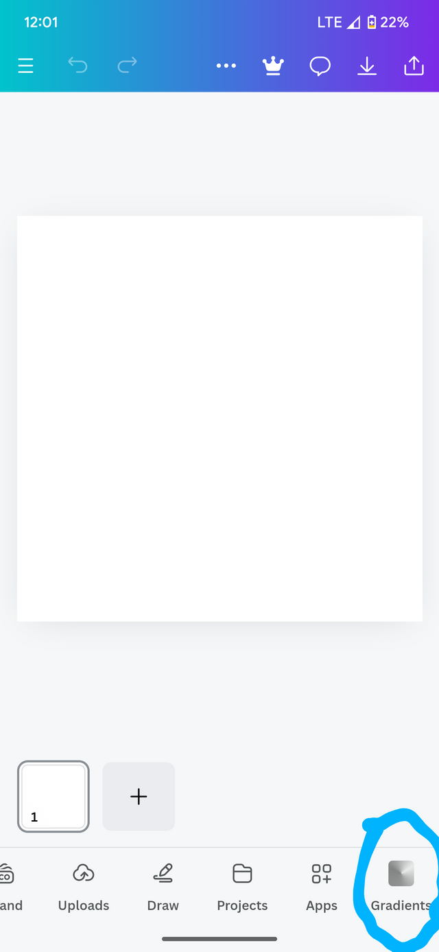 |  |
|---|
After carefully adjusting our colors to blend well, we can select Add to design. This will produce our gradient as desired.
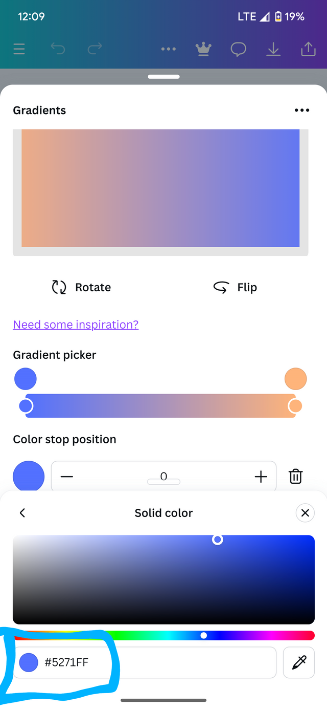 | 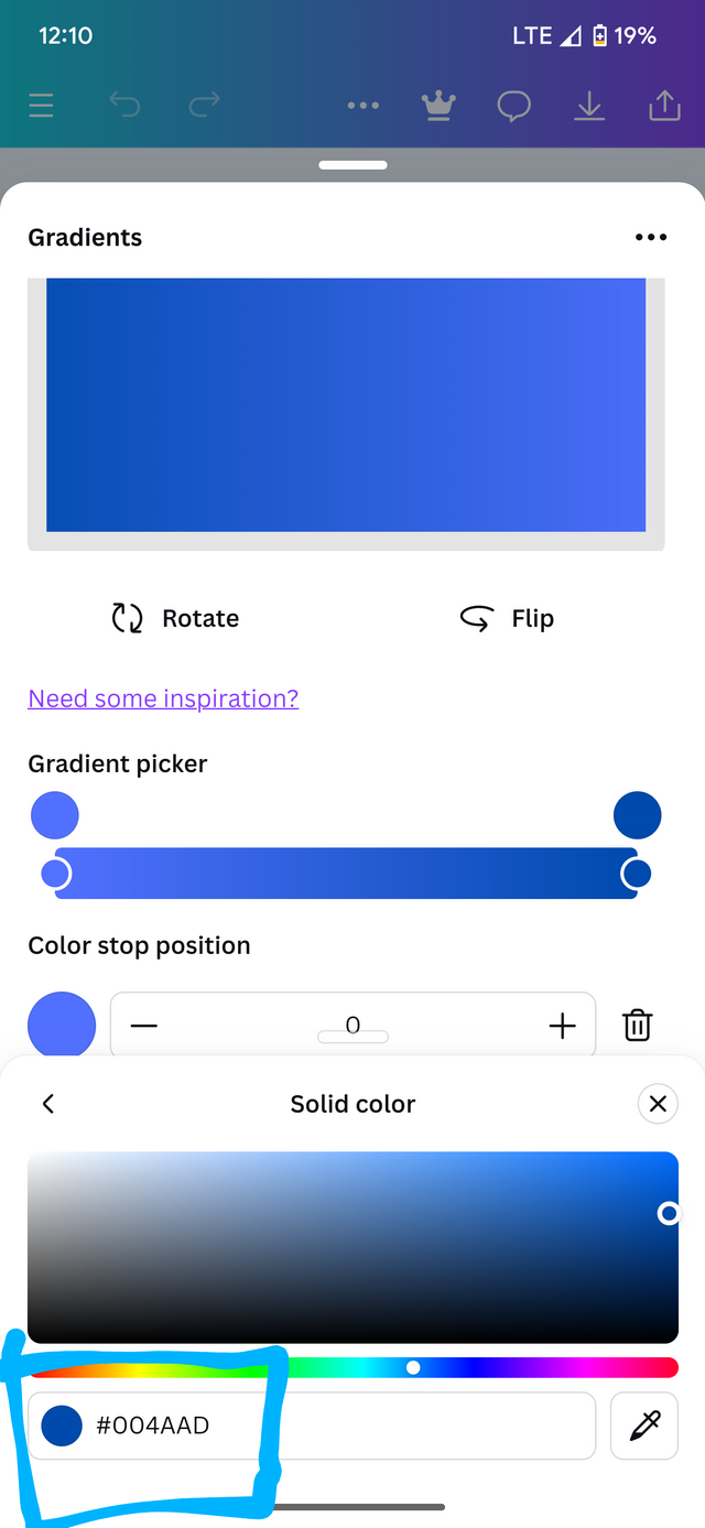 | 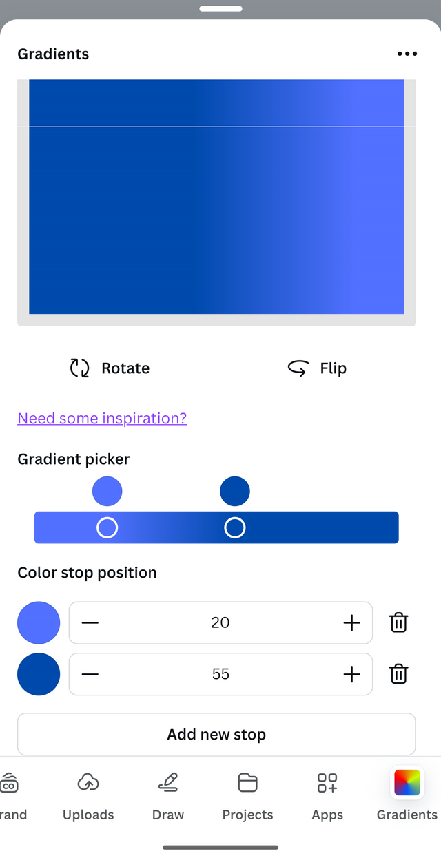 |
|---|
Colors and hex codes.
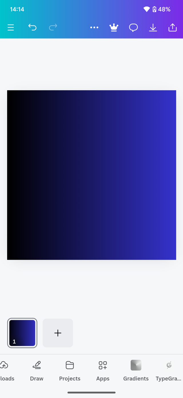
After adjusting, I forward to the Add to design section and this is the result.

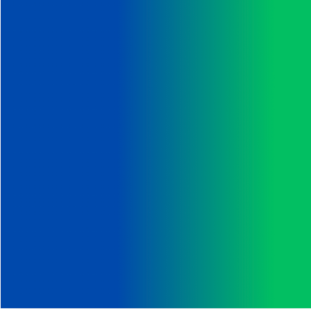
b. The second gradient should be made with two different colours (hex codes) that blends so well. See your colour theory lesson on how to combine colours.
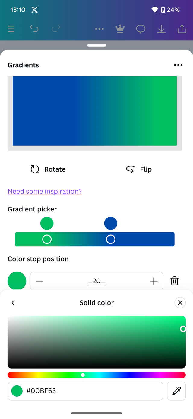
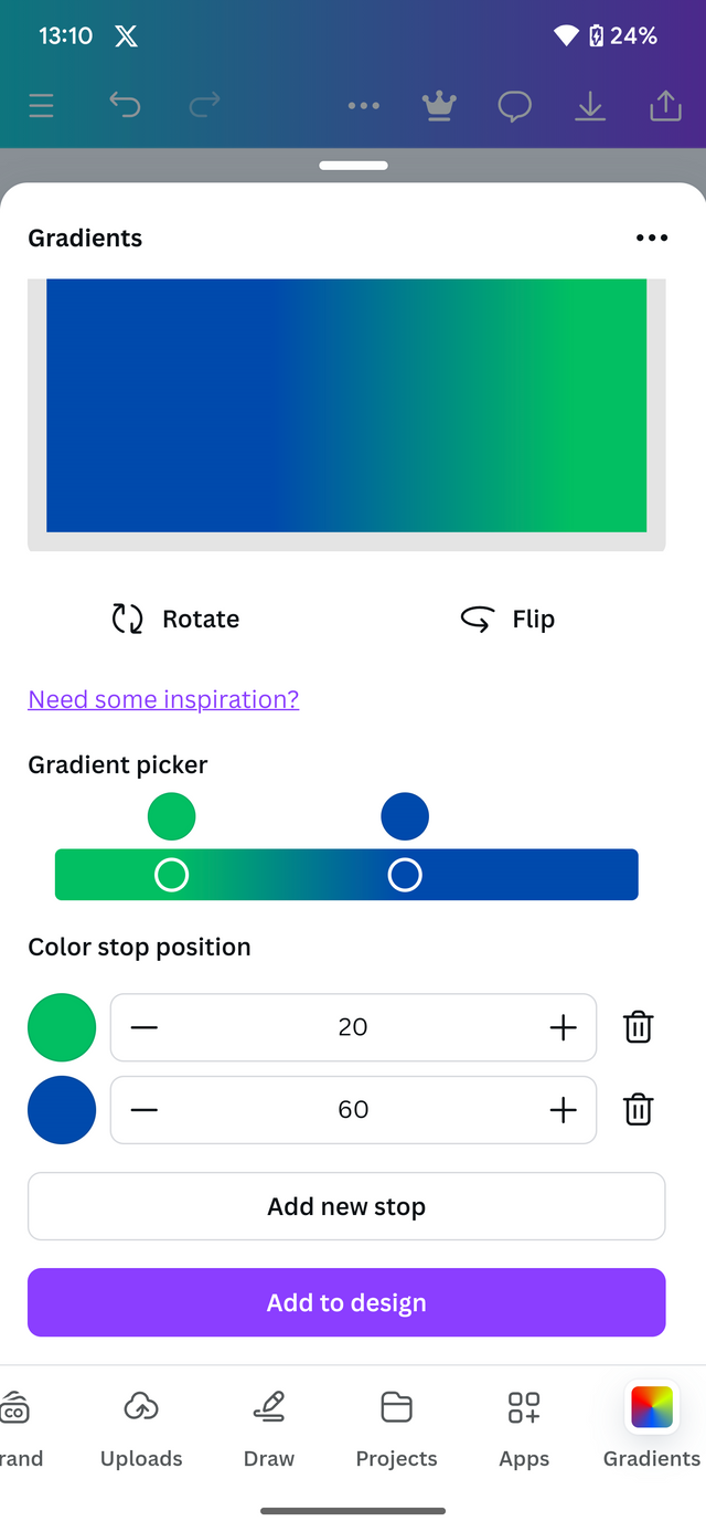
Still the same procedure as we did in the first one. But then this time around we are going to choose two different colors and then adjust them to match.
Procedure.
Pick the first color,
Pick a second color,
Adjust until a perfect gradient is formed.
Tap add to design. And set it as background
 |  |  |
|---|
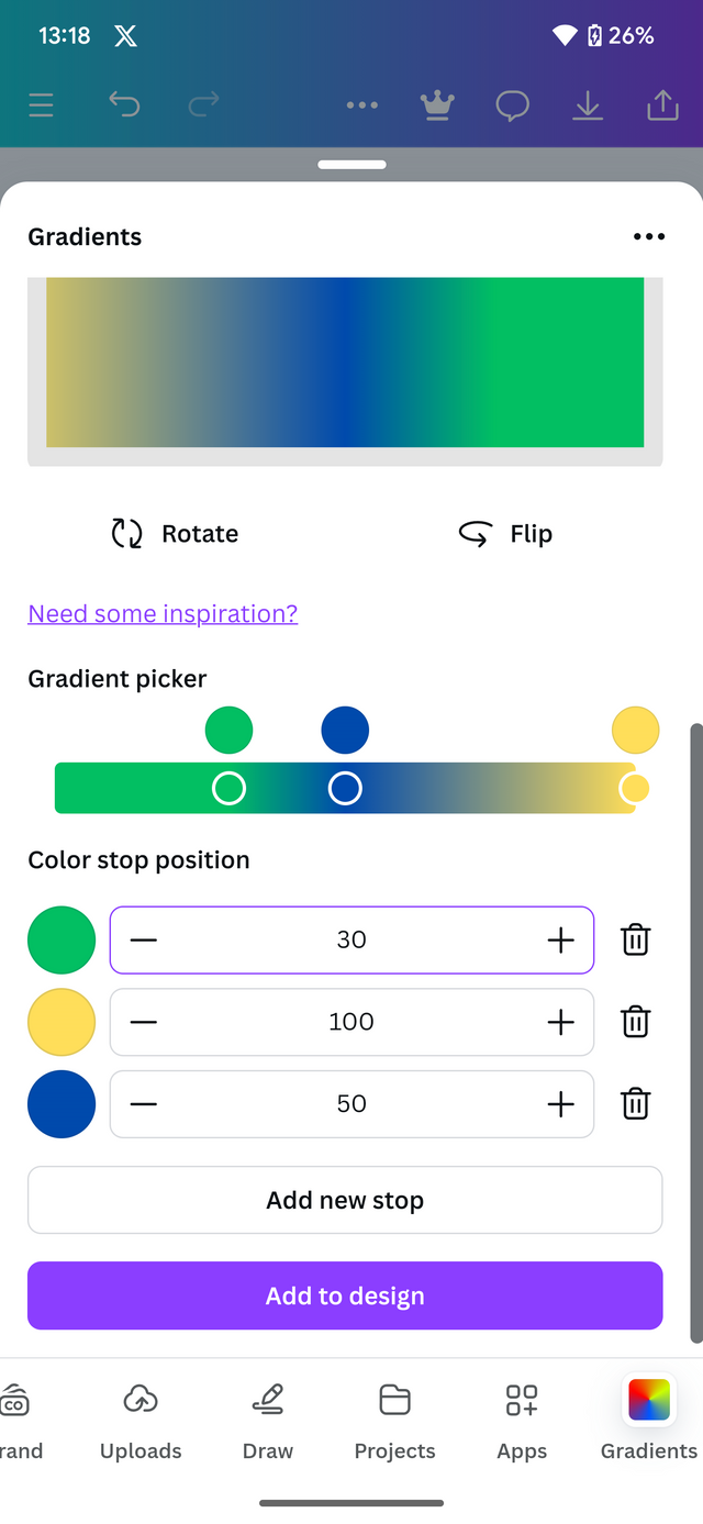
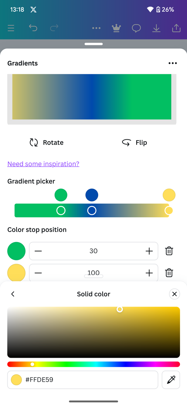
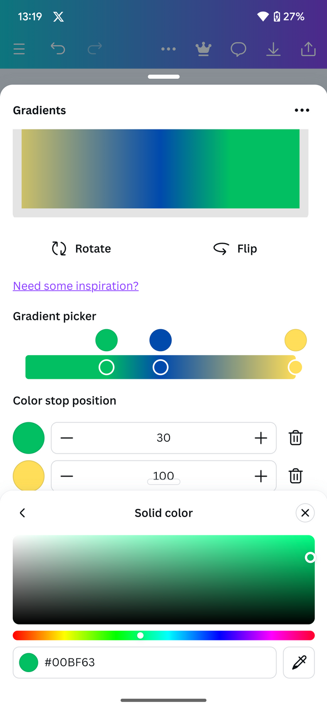
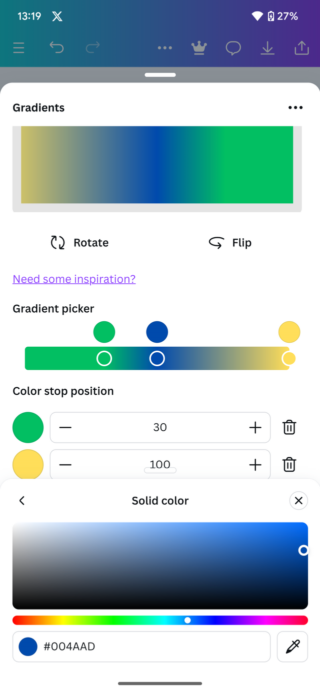
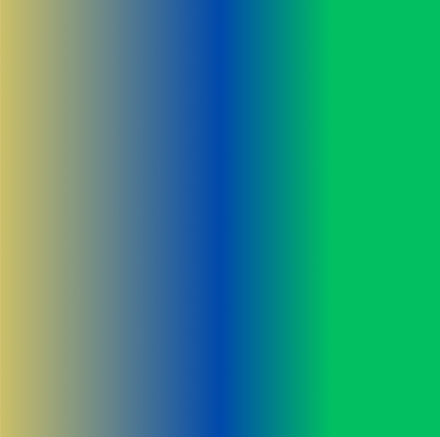
C. The third gradient should be made using three colours (hex codes) that blends perfectly.
Procedure
Add a third color using the Add button directly below the second color.
Adjust the three colors to form a perfect blend. Gradient.
Click Add to the page.
 |  |
|---|---|
 |  |
| - | - |
Linear
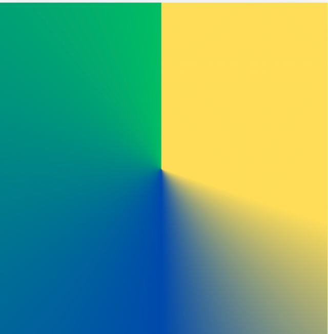
Angular
Create a Text gradient using the tool shown you in this post. Ensure not to use the default colour on the app, rather use your own combinable colours.
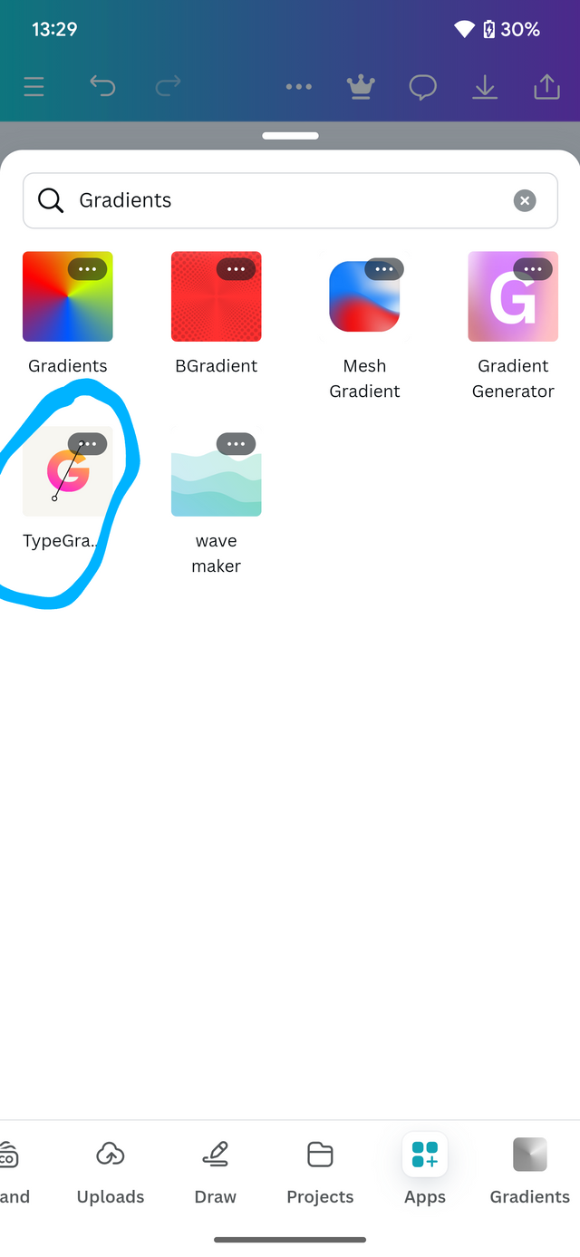
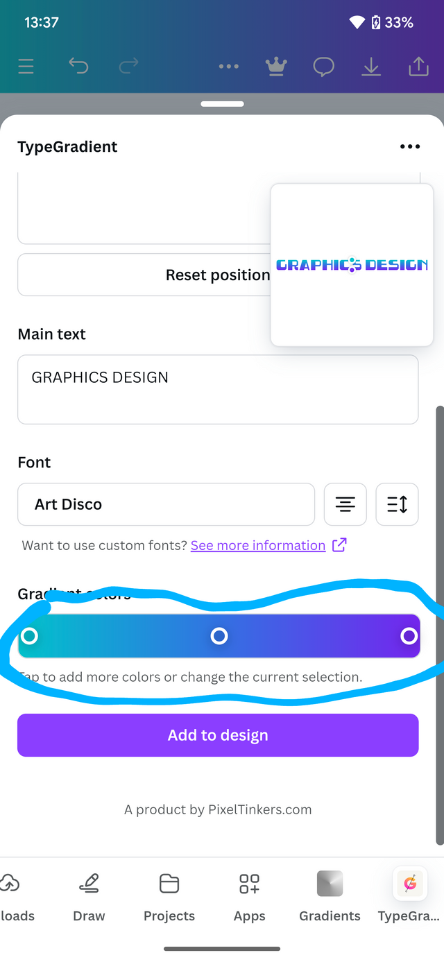
In order to create a text using the present tool, we are going to head to canva and still under the gradient section. We are going to tap typegradient.
This will provide us with a template which we can then edit and add the colors to our desire. Here's an illustration of how to carry on.
- Tap on apps and then tap on type Gradients
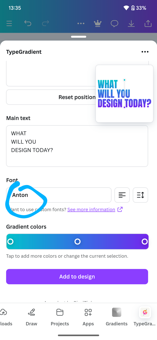
- Input the text you want to display
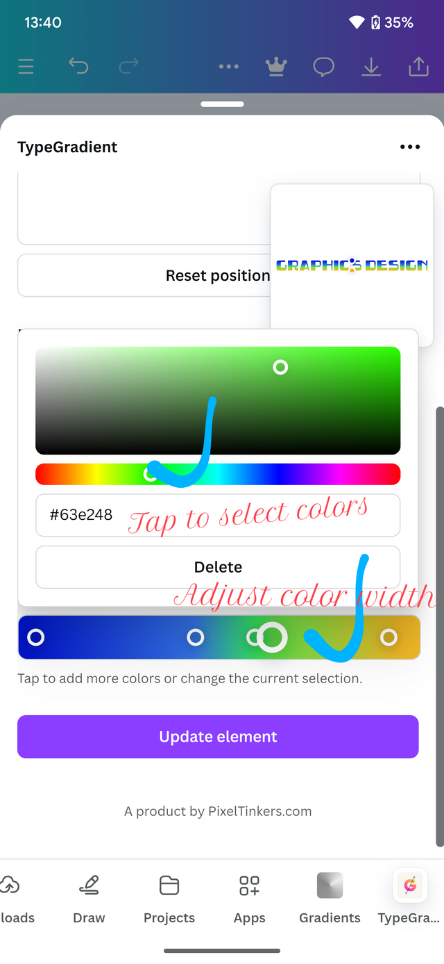
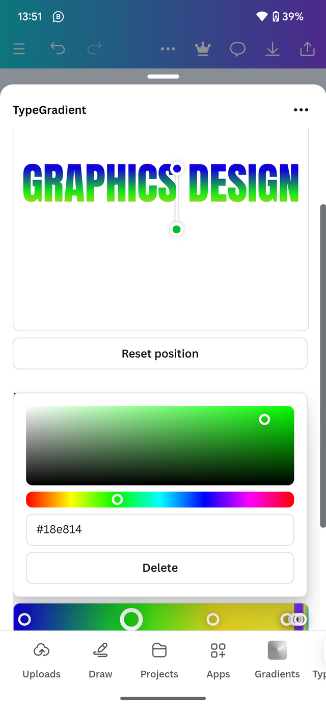
- Adjust the colors has illustrated below
- Click add to Design.
 |  |  |
|---|
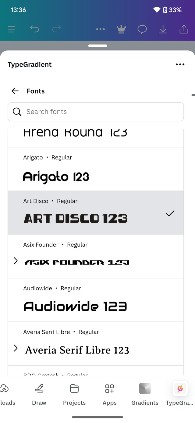
Proceed to input your text and then adjust the colors to match your design. You could use the arrow too. I just the color width.
 |  |  |
|---|
After carrying The above instructions, this is how your output will look like depending on the color selected.

2 colors
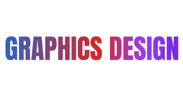 multiple colors
Pick one of the background gradient you made and create a beautiful flyer design with it. Ensure you do not reproduce my design, rather do something entirely different from mine.
In this section I decided to pick the color which I believe can. Best portray the desire of my audience, with that aspect I will be picking blue and sky blue.
I begin by applying the background. After which I proceed by adding some elements including text elements to make my design look cool.
 |  |  |
|---|
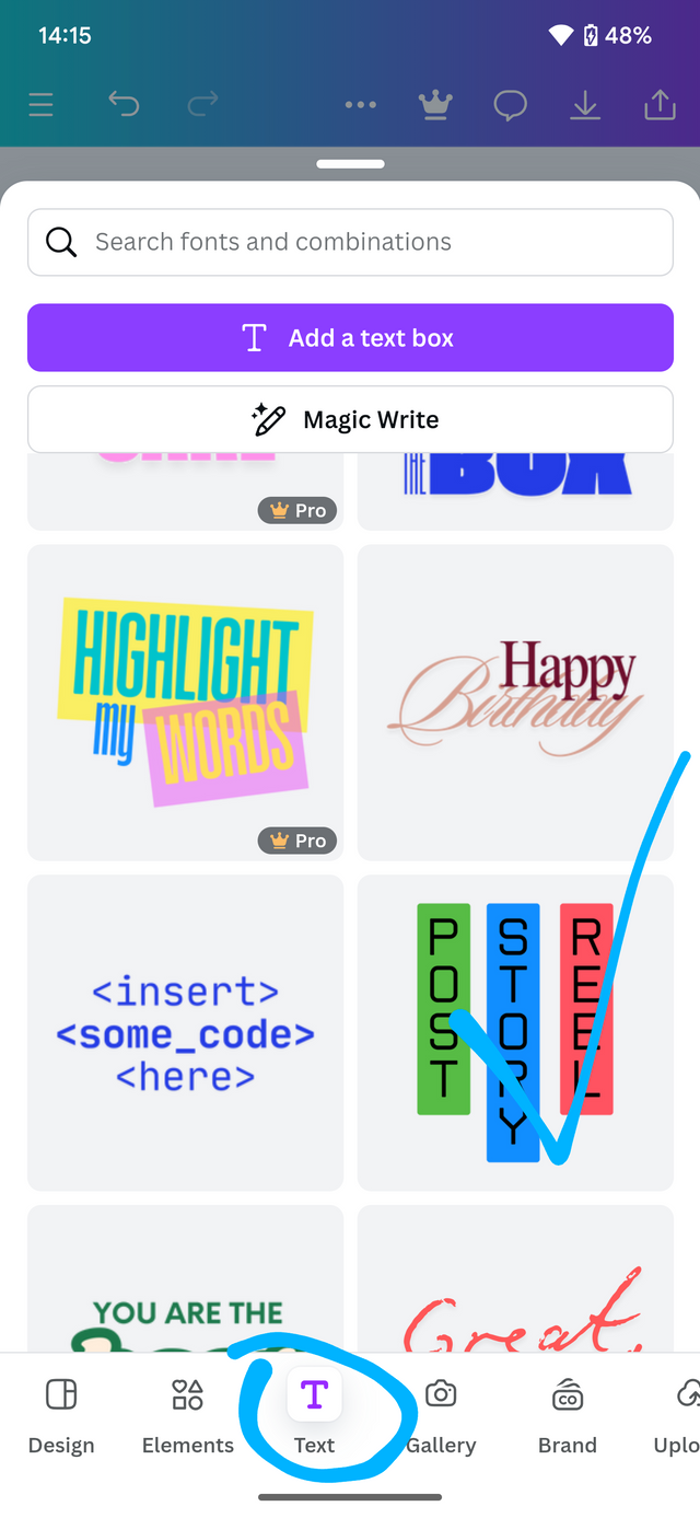
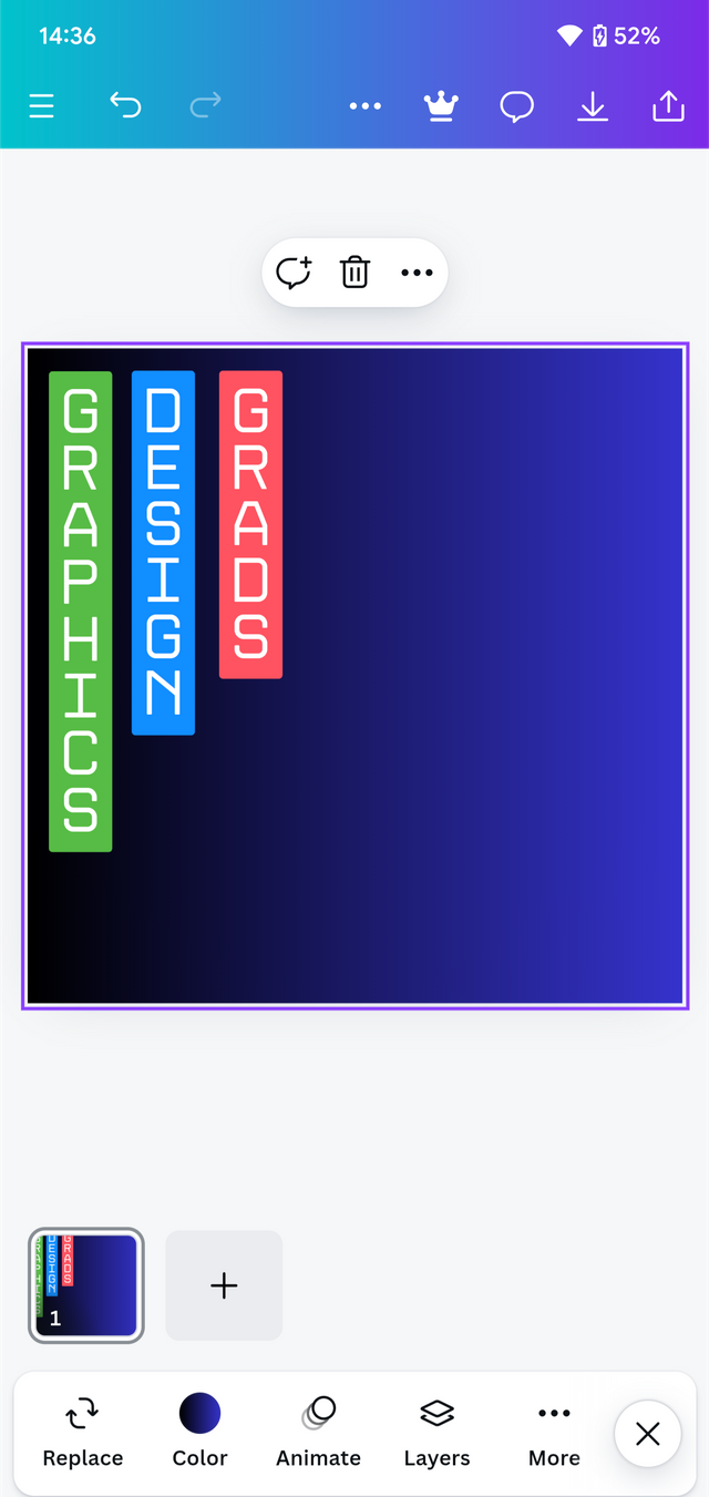
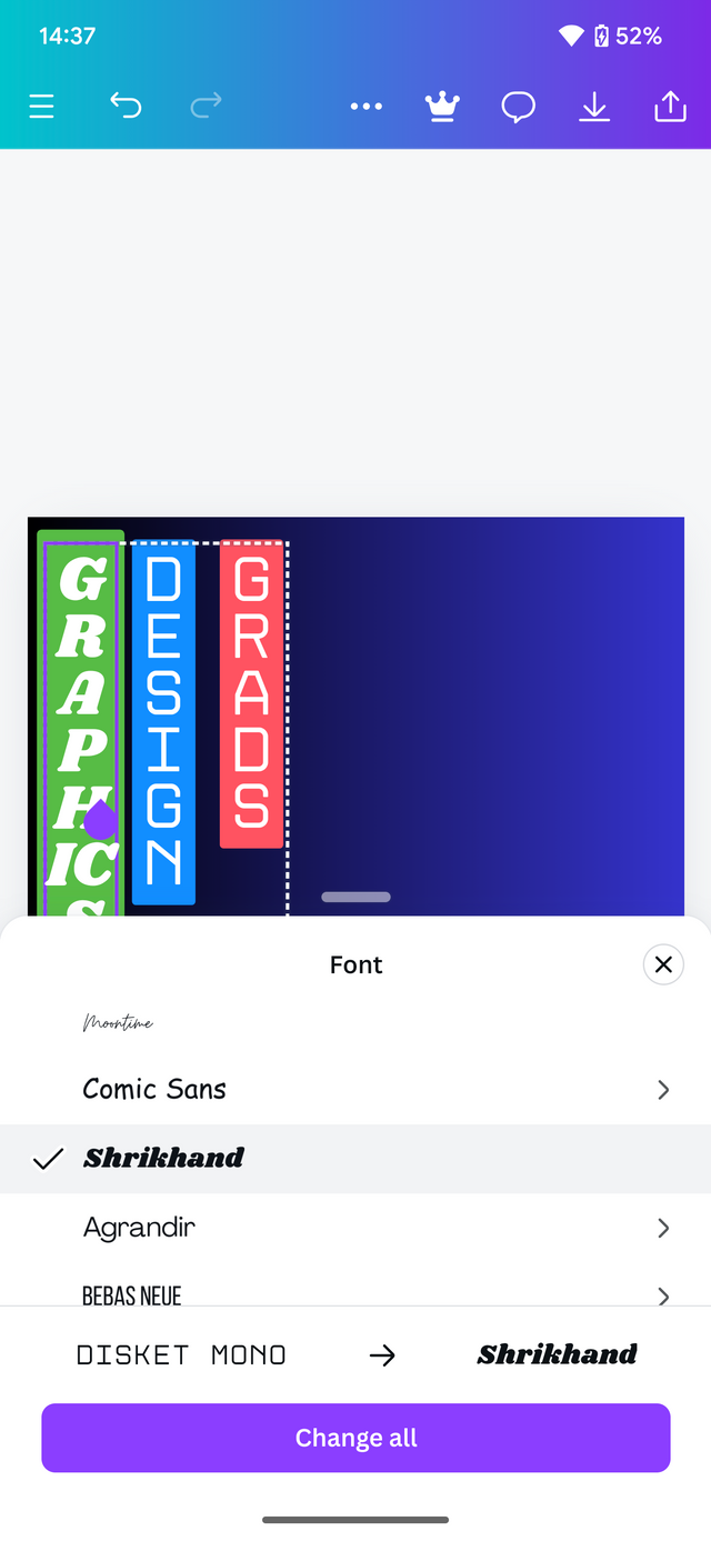
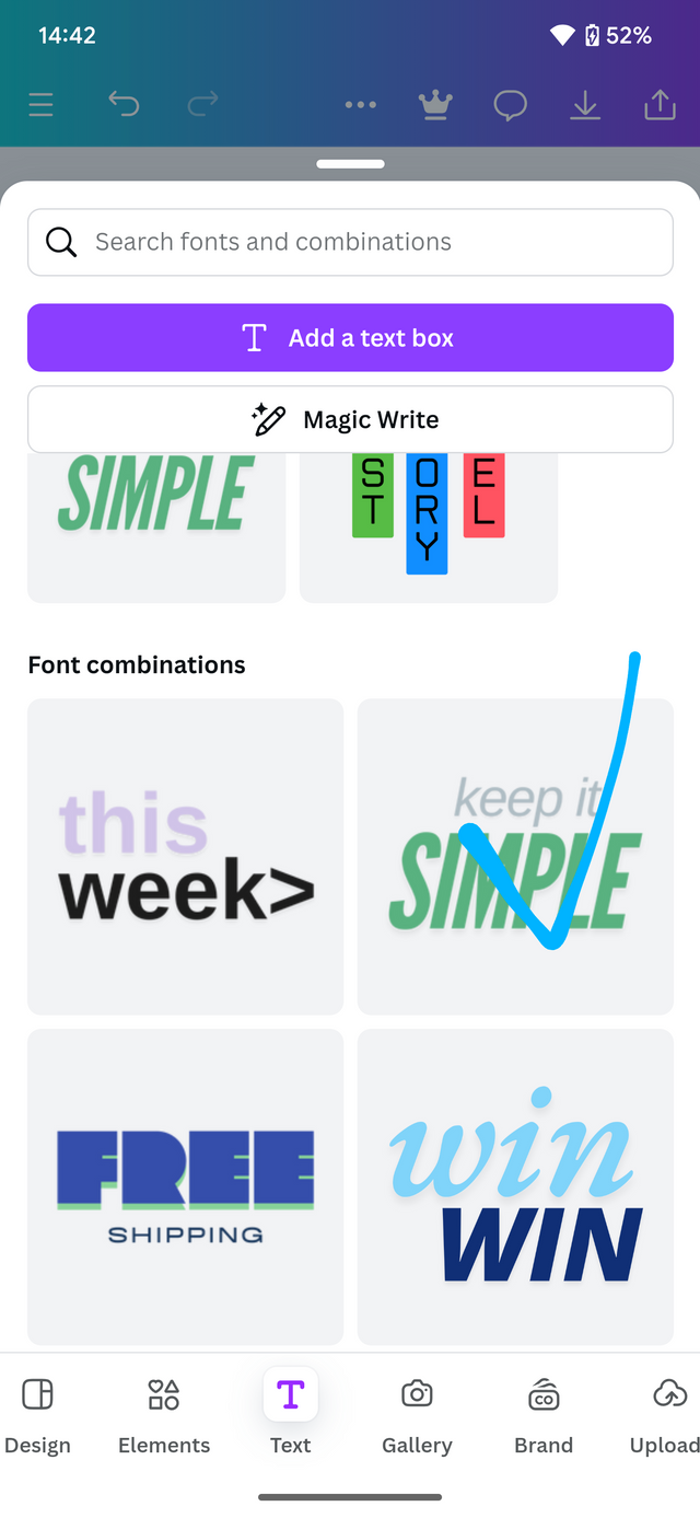
With my background set , I proceed To add in the text elements An other relevant text needed. First I tap on text and then select the required text.
 |  |  |
|---|
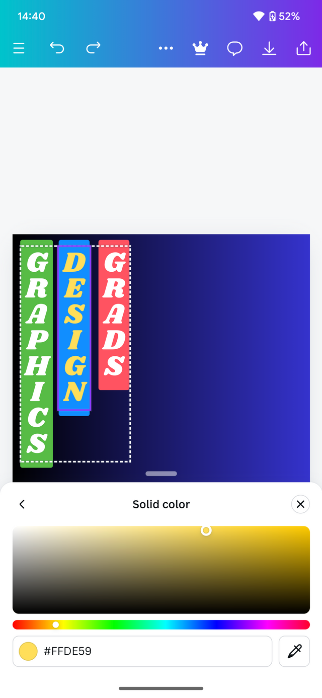
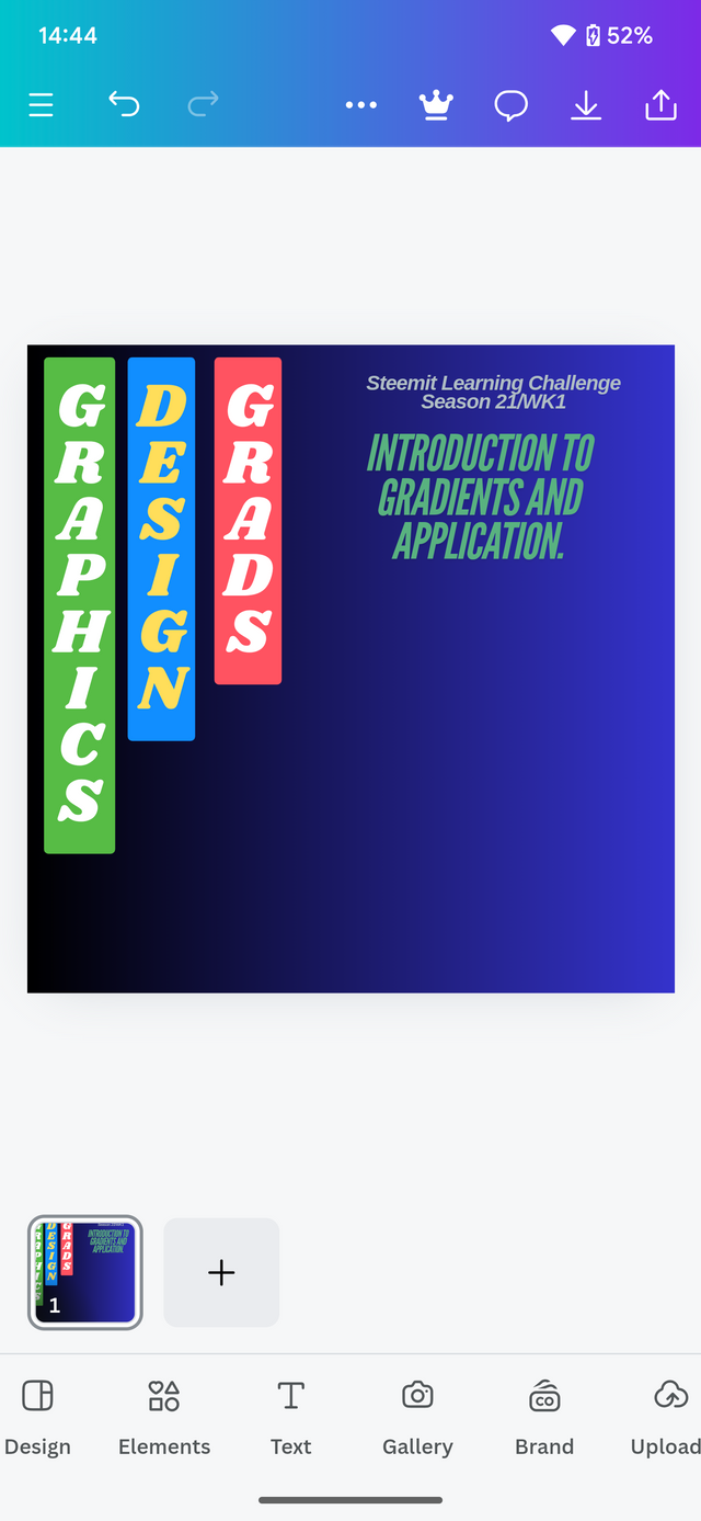
I then added desired text To make my design cooler . After what I add other elements to complete the design.
 |  |
|---|---|
 |  |
| - | - |
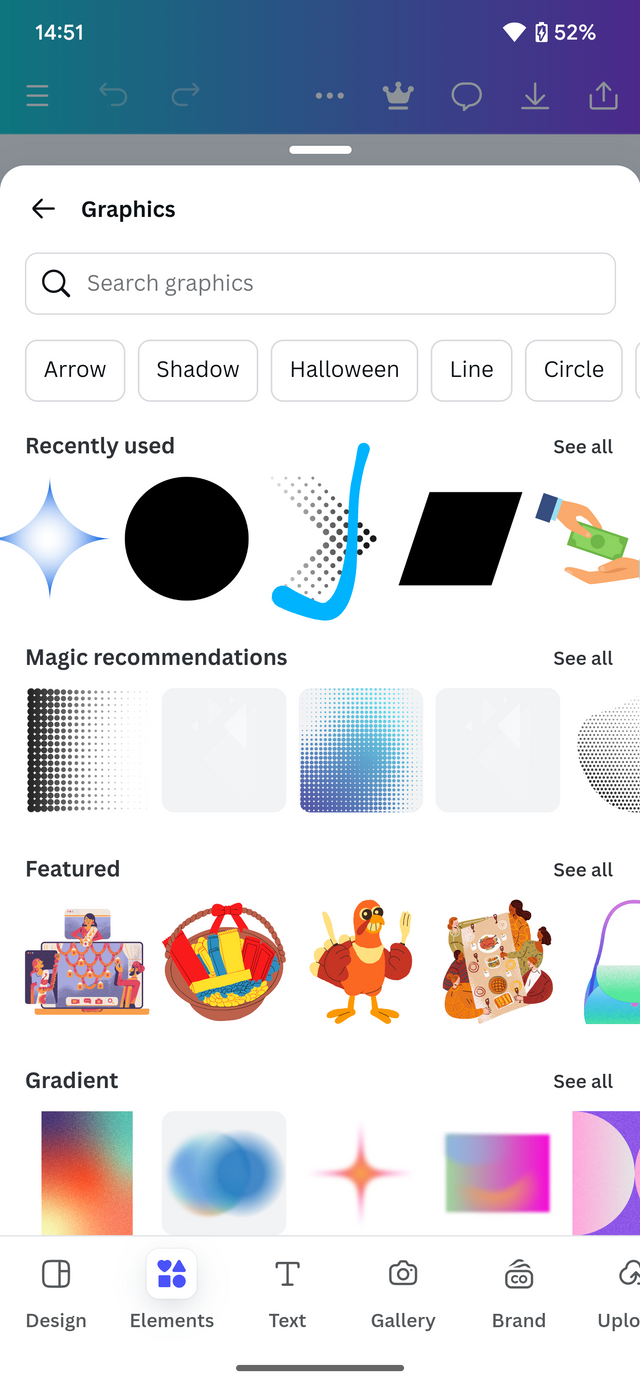
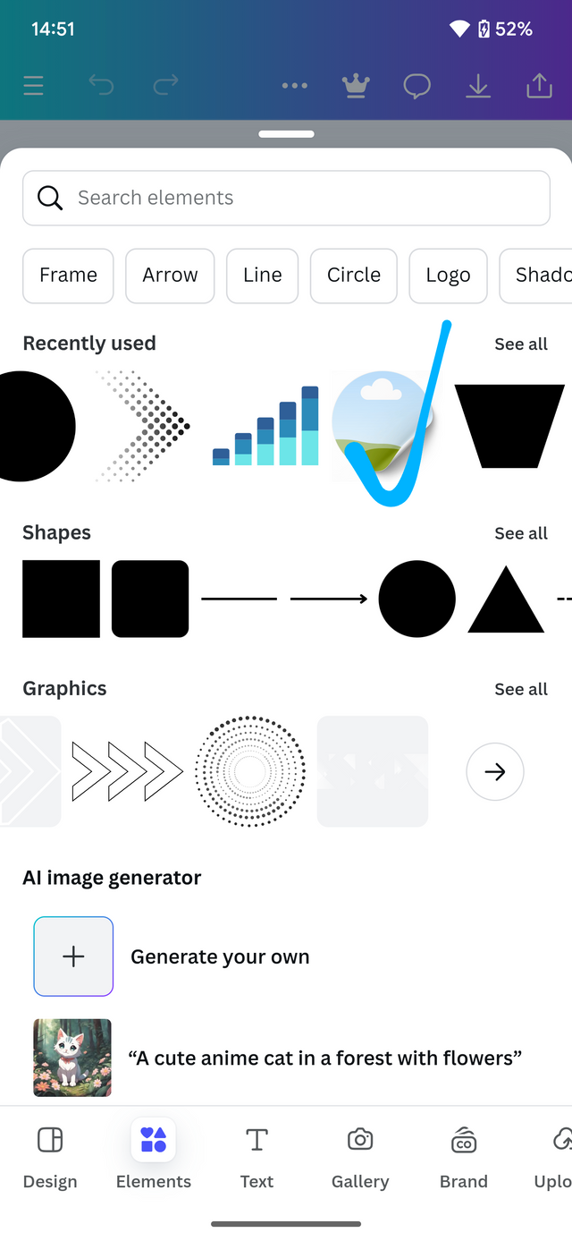
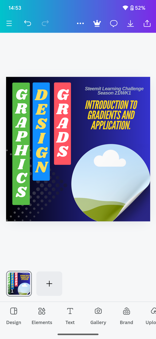
I add a few more elements to complete my design.
 |  |  |
|---|
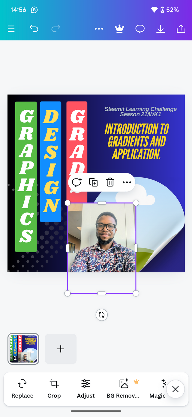
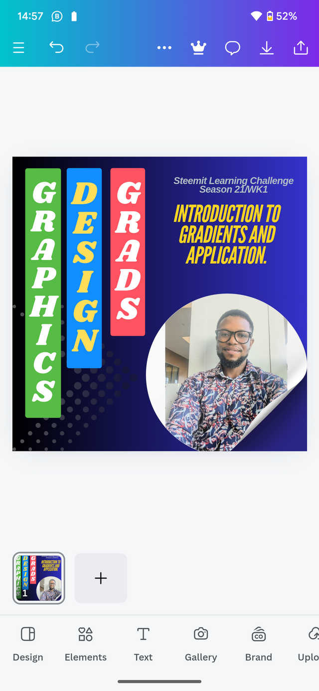
On the last step, I will drop and drop my photo. This will give out the final results.
 |  |
|---|
Final results

In conclusion, I will say it was an amazing task learning something new about gradients. I have been applying it in my designs but not consideration The various principles required. Owing to the fact that I have been using template gradient from the canva app but today I have learned to create a gradient and use it myself. Thanks to this lesson.
In that aspect, I would like to invite the following persons. Join me participate in this contest. @simonnwigwe, @chant, @kouba01 .
Cc: @lhorgic
Credit to: @rafk
¡Holaaa amigo!🤗
Me encantó ver que entre los elementos que utilizaste, hay uno que tiene el tipo de gradiente Rombo... No sé si lo hiciste consciente o inconscientemente pero, el punto de esto es que eso le aporta el doble de impacto visual a tu diseño así que te felicito por ello.
Te deseo mucho éxito en la dinámica... Un fuerte abrazo💚