"SEC20/WK6: Graphic Design Hands - On practical 3"
OMG! I can't believe I made it to the finals, this is a miracle because not all that started with us ended with us. A lot of people gave up after week one, others after week three but I'm standing tall here today celebrating my success.
Graphic design isn't a hard work, it only requires your ability, strength, and passion to pull through. Thanks to my instructor @lhorgic who tirelessly devoted his time to make this class a success. I wish we'd continue this class next season. I am inviting @ruthjoe @pandora2010 @patjewell to join this class.
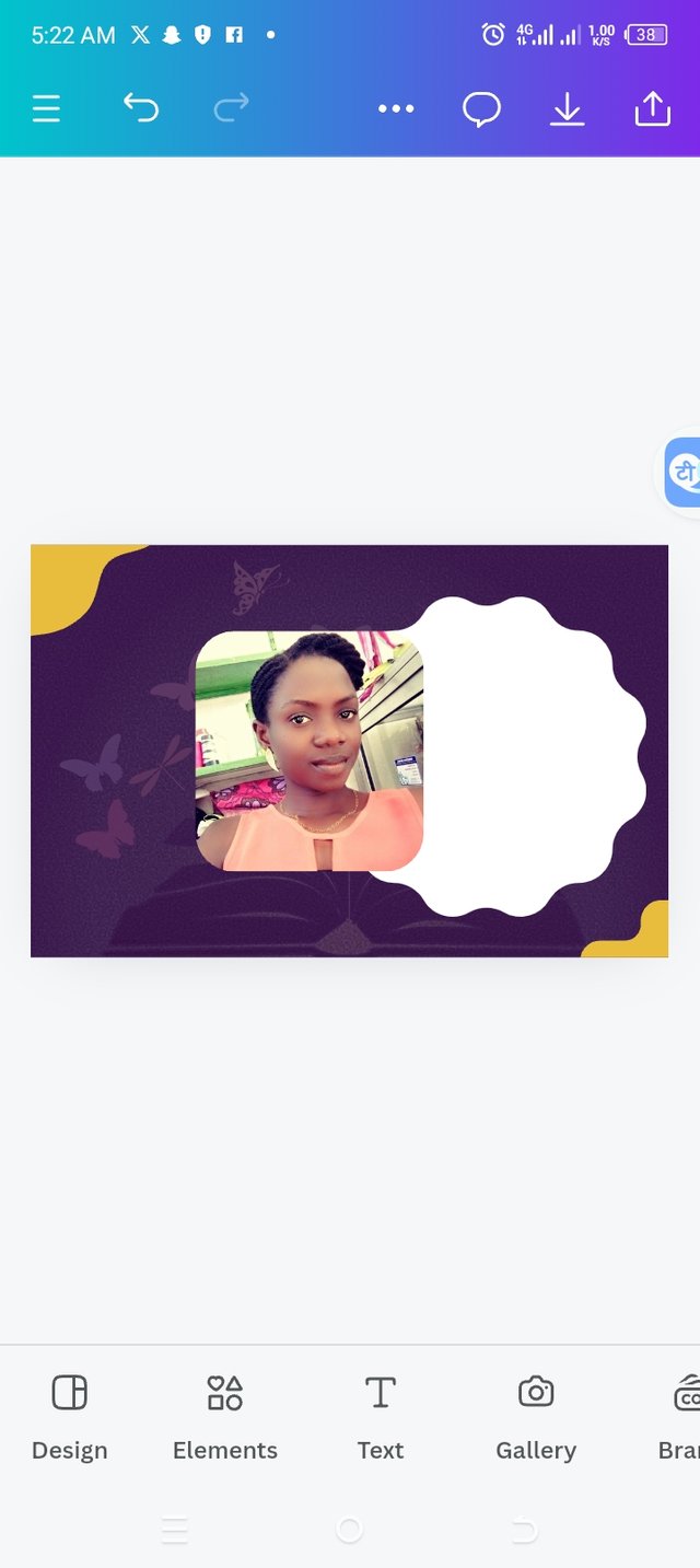
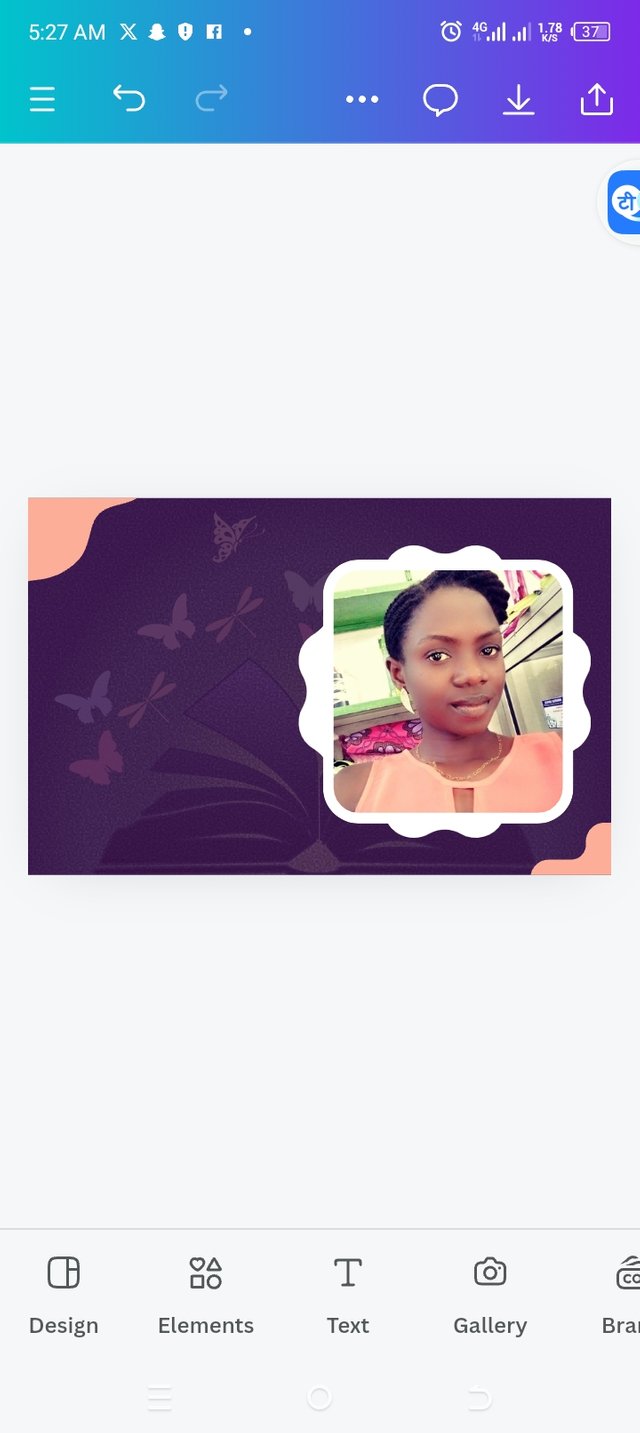
For the assignment this week, I have designed something good to celebrate my success and below, you will find my processes...
Step 1
Creating a workspace through my app.
 |  |  |
|---|
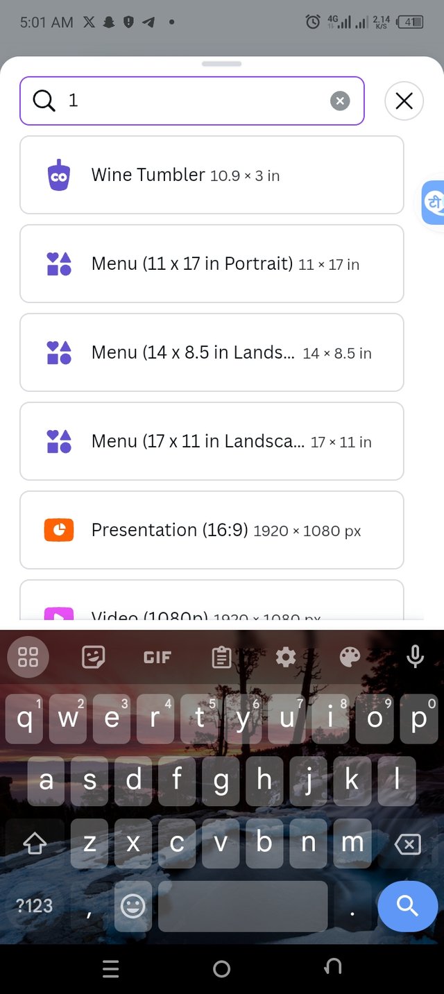
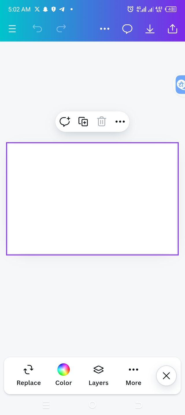
• The first step was to open to canva app, identifying the + icon, I clicked on it to create an appropriate workspace for my design.
• I added a dimension of 17×11 in landscape as seen in the image above.
• Now, I have my workspace ready for use.
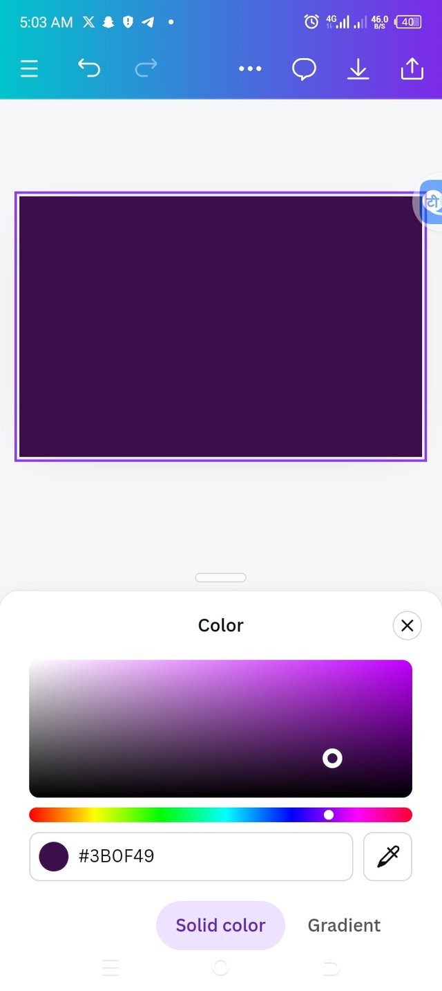
Step 2
Choosing a background color for my workspace
 |  |
|---|
• Since my workspace was ready, I chose a good color that would complement the pieces I'm working with. The hex code #3B0F49
• You can see from the above image, that my color is properly set.
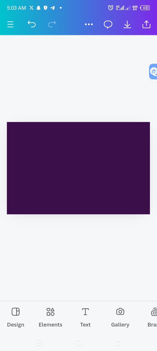
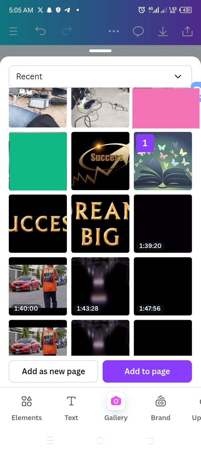
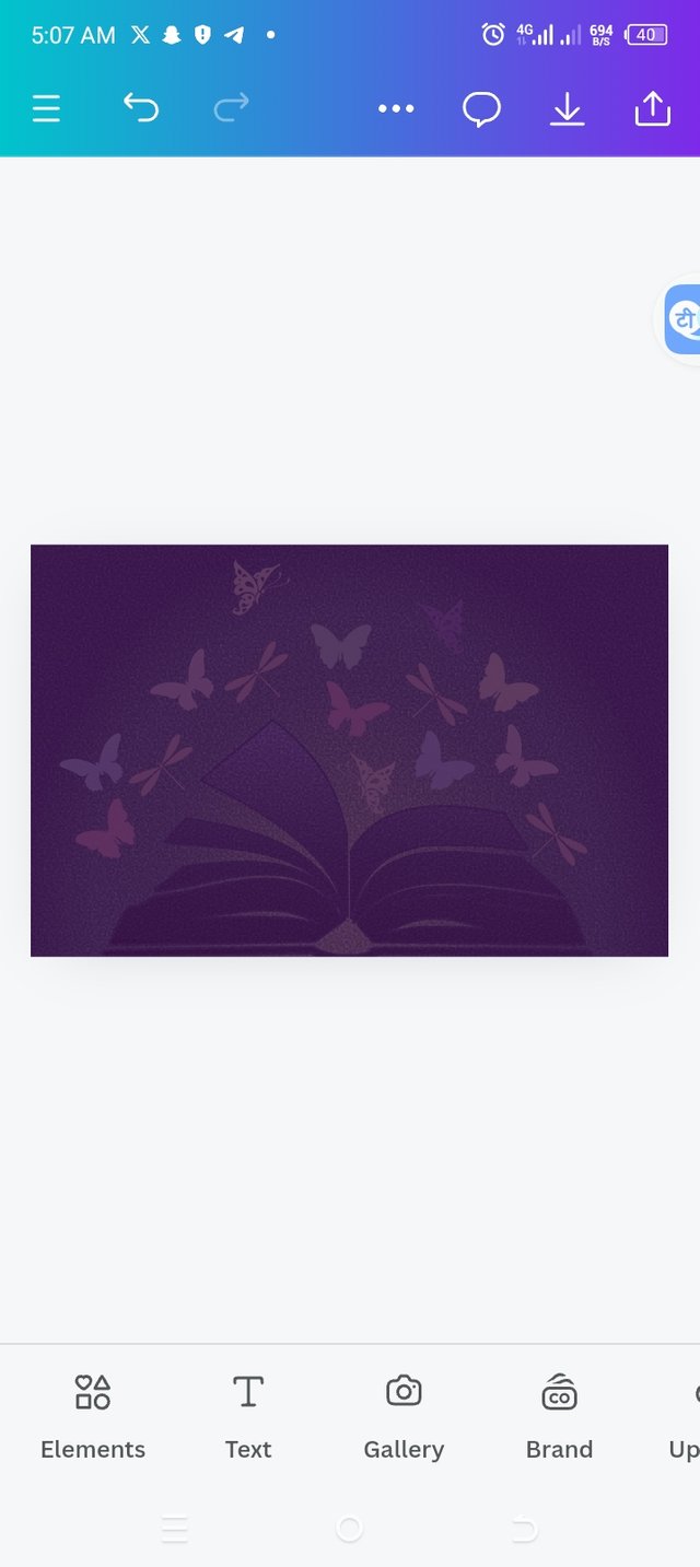
Step 3
Adding background image
|  |  |  |
|---|
• I went ahead to add background by clicking on the gallery icon below to launch me into my photo gallery.
• I selected the right image that I need for this design by clicking on the image and then add to page.
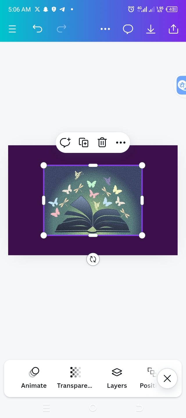
• The image is launched into my workspace.
• I went further to expand the image to fit into my workspace then I clicked on transparency to 20 to get the image lighter for background use.
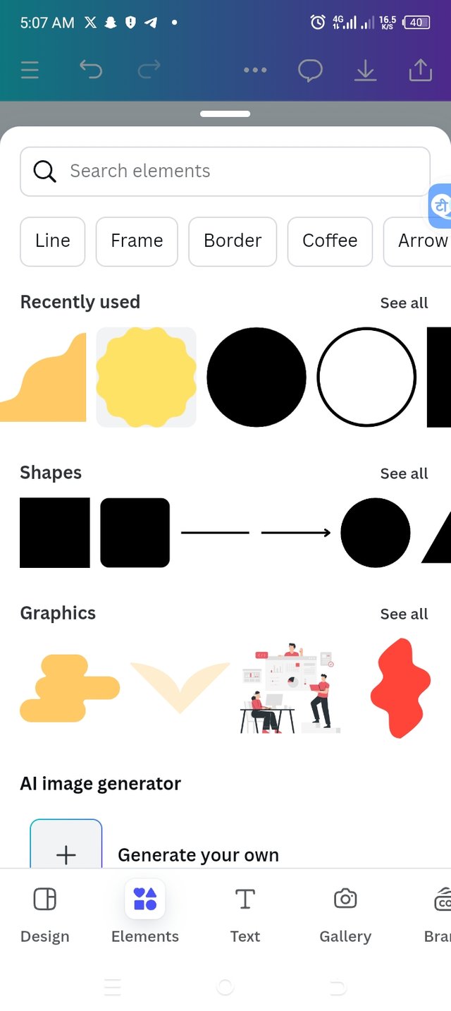
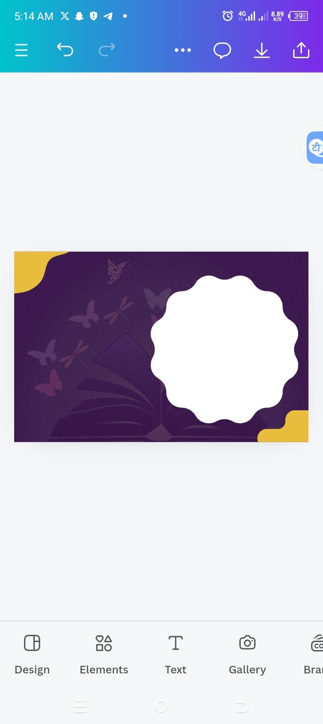
Step 4
Adding elements to my workspace
|  |  |
|---|
• I clicked on elements icon below to make my choices of elements that I need for my work.
• I selected the right elements and it appeared ring in my workspace.
• I set them to their positions as you can see from image above.
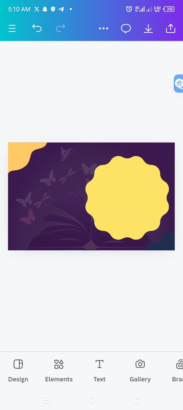
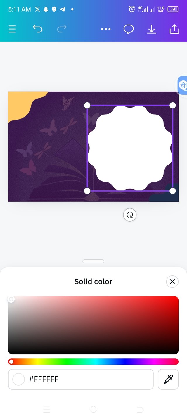
Step 5
Adding color to elements
 | 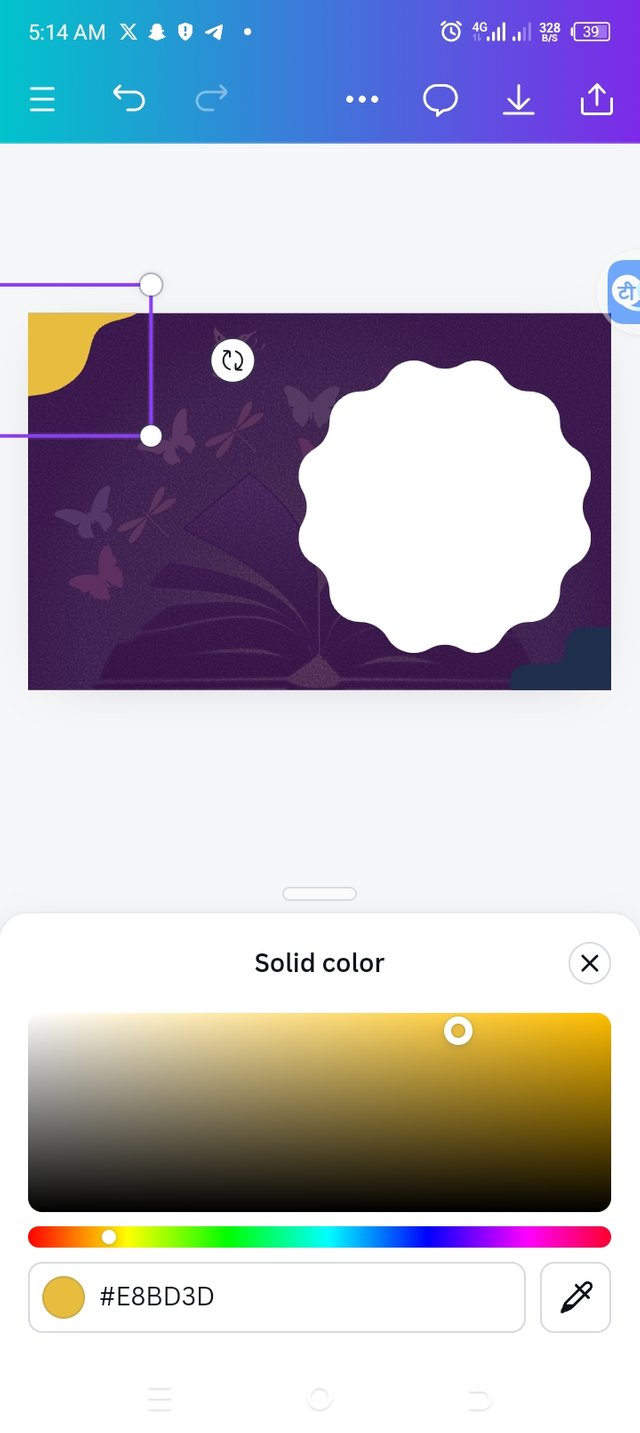 |  |
|---|
• I clicked on color icon to add the color that complements my workspace color.
• I chose color for the first element, hex code #FFFFFF, then the second third elements were the same with hex code #E8BD3D. You can tell from the images above that these colors complement my background color.
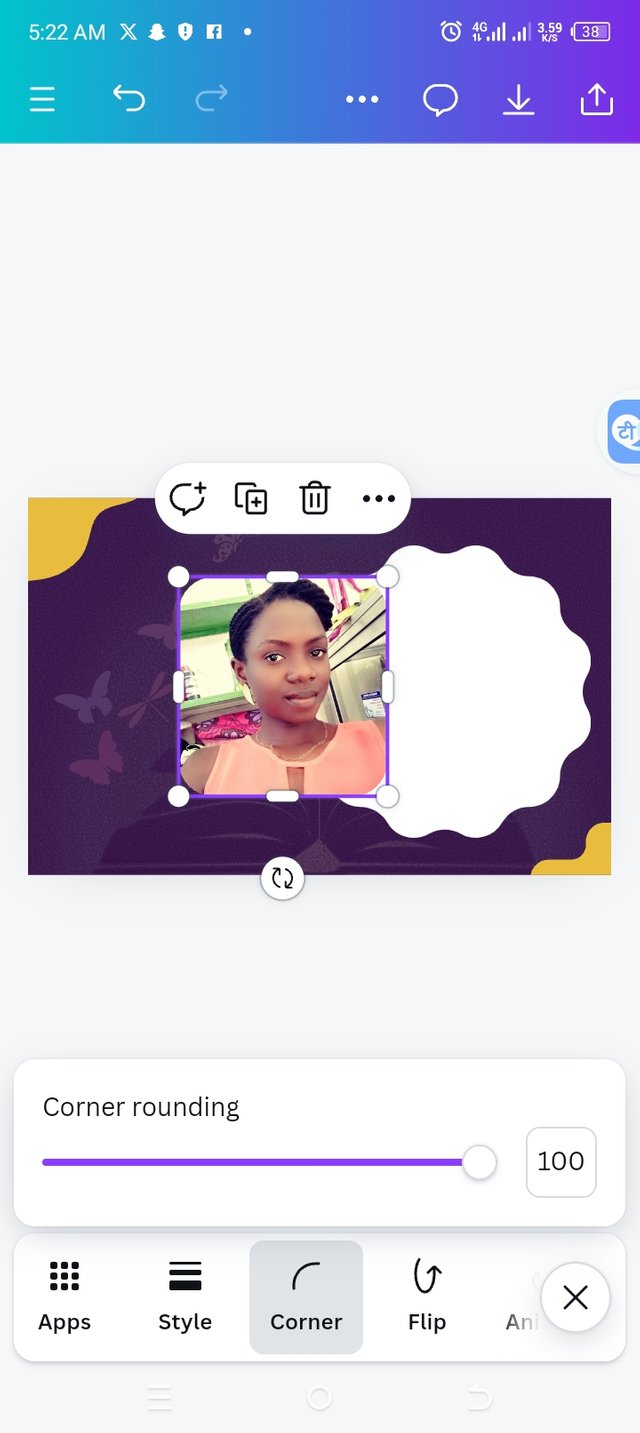
Step 6
Adding an image and adjusting it
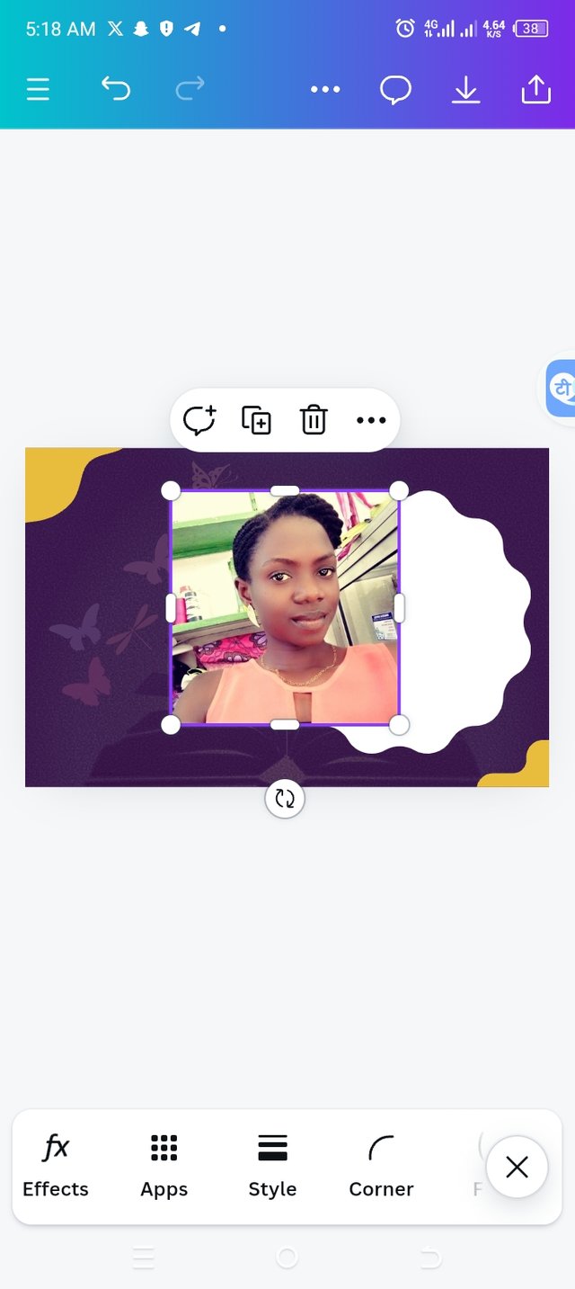 |  |  |  |
|---|
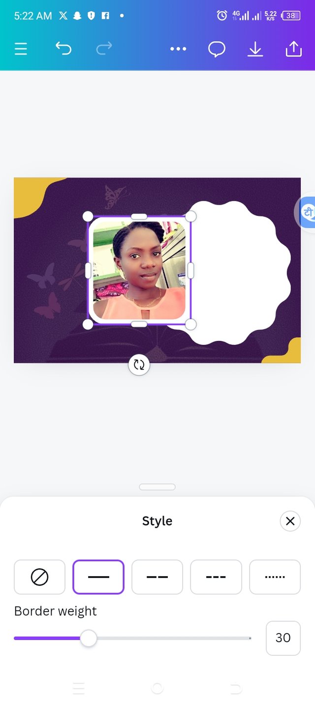
• I added an image by repeating the same process I did earlier. Click on image and choose the right image.
• I wish to round the edges of my image, so I clicked on corner icon and increased it to 100 so that my image edges would have a nice shape. You can view from the image above.
• I went ahead to click on style and then clicked on broader weight to be reduced to 30.
Step 7
Changing my elements color
 |  |  |
|---|
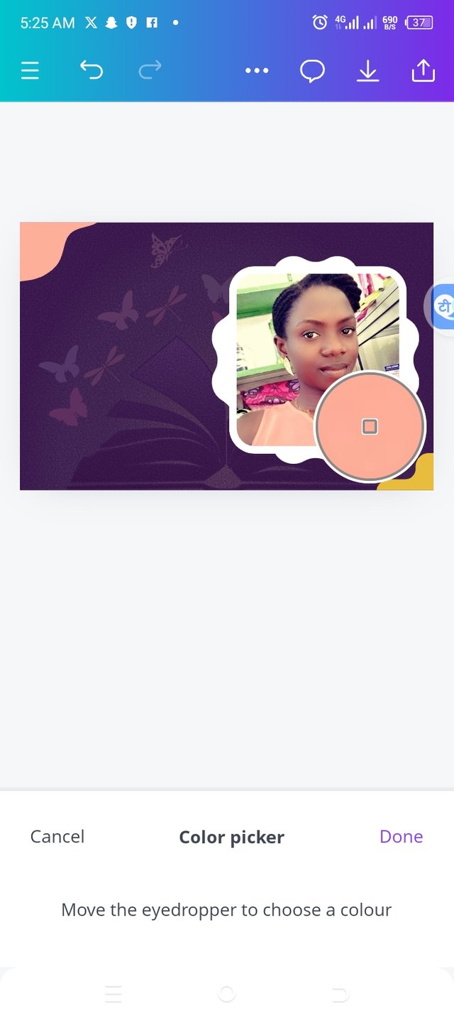
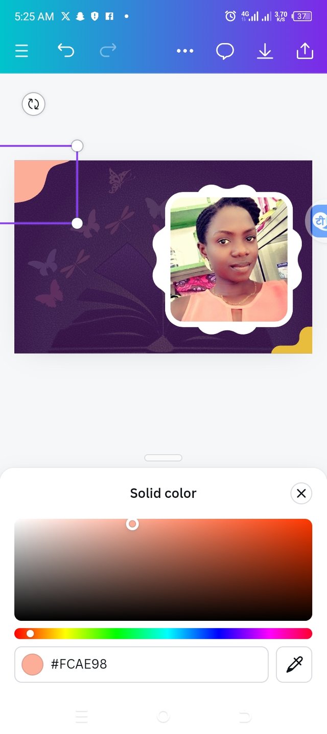
• I positioned the adjusted image to where it should be.
• The I clicked on the color icon and then on the pencil right beside it to help pick a particular color from my image.
• I applied the color to the elements to look better and this time the hex code is #FCAE98 which is an orange color. You can see from my image above that the color is changed and looks better.
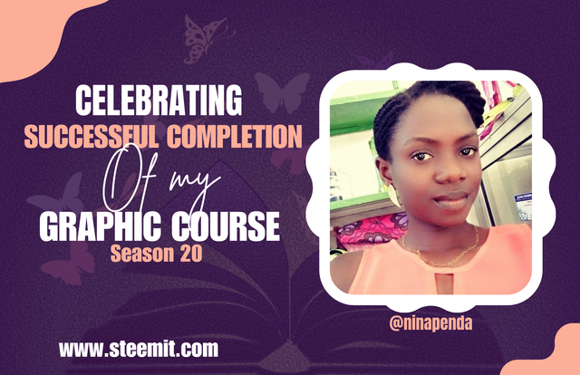
Final Step
Adding text
 |  |  |
|---|
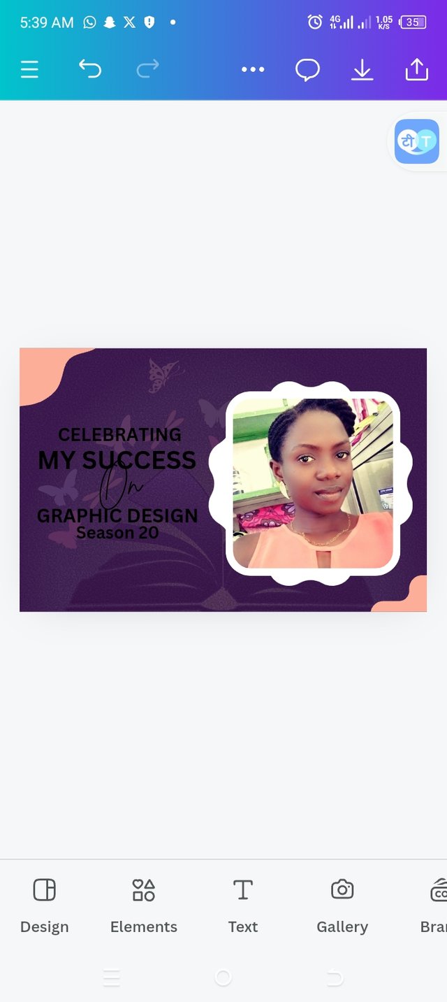
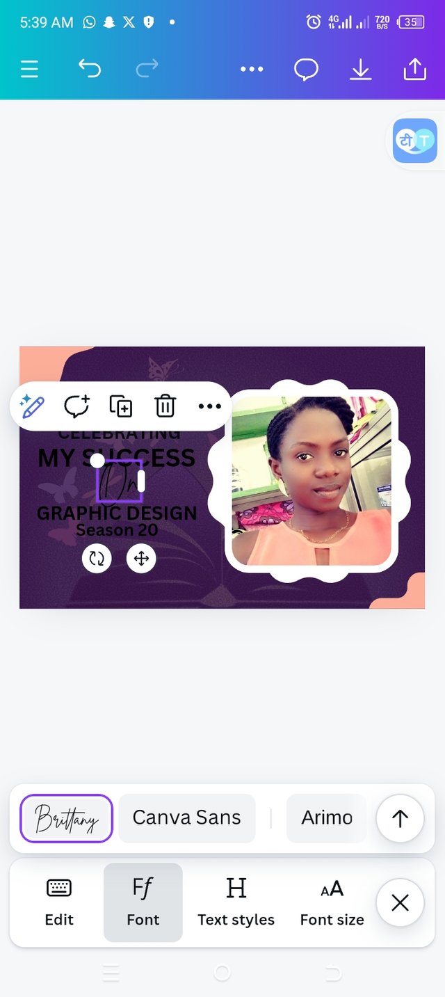
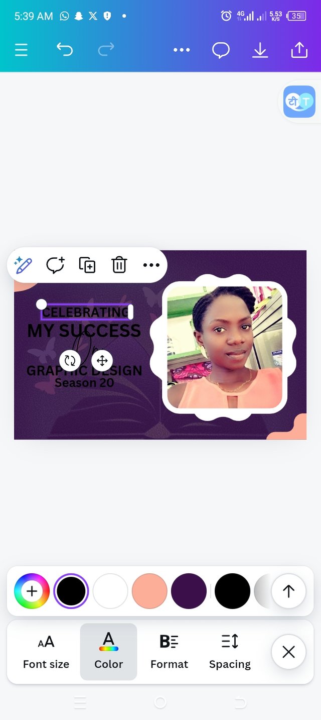
• I clicked on the text icon to type in my text "Celebrating a successful completion of my graphic course, season 20"
• Then I clicked on fonts to choose which font is best. I chose IMPACT Brittany and ATONsince I have different text.
• I began to add their colors one after another.
After adding the colors, I have this design below👇
Principles used for my design
• Color combination: Looking at my design, you can see that I have combined two colors for my text and, you would also notice that the used colors appeared right on the image and each color chosen complement each other.
• Balance: You can see balance from the top to the bottom and from the left to the right as all elements are balanced.
• Emphasis: Using two colors and dividing the text in different sections, made them stand out. Looking at the text, I also made a word to be less obvious. The background image and the main image show design shows the beauty in being successful. The text and colors applied shows the emphasis.
• Element Spacing: If you look closely , you will notice that my elements were not too spaced out neither are they jammed. I made sure I used my spacing to balance each text appropriately while working.
• Hierarchy: Using hierarchy, I made my background image transparent so that my key image will be visible and projecting. For the text, I used different colors to highlight them better to please my viewers.
• Edge to Edge: Looking at my design,you would notice that non of my text or images got to the edge,this way, if I am to print my design, non of them would be cut off.
• Design Size & Dimension: I have used a landscape size of 17×11 because I have less information to fill in, this way my design looks good.

Upvoted. Thank You for sending some of your rewards to @null. It will make Steem stronger.
You have done an amazing job..am so proud of your graphic skills now. Its obvious that you have benefited from this course . Your design looks so beautiful.
Congratulations 🎉 to the completion of your graphic course. Now I wish we could have a graduation ceremony or party.
Hello @ninapenda thank you for participating in this week's lesson. We have assessed your entry and we present the result of our assessment below.
Feedback:
Let me start by appreciating you for coming this far with me on this six weeks course and also commending you for the effort put into this practical, I love the outcome of your step, your design looks cool.
Your design is just so simple and straightforward, with all the necessary
graphics principles in place. It would have been super dope if you had a way of adding something that represent Canva like i.e logo. Is it me not very good with my Grammer or there was an omission in your caption... "Celebrating (the/my) Successful completion of my graphic Design Design course"... My thoughts though.
In all, you did beautifully well and I must commend you for a job weldone, thanks for appreciation message, I wish I could do more in this limited period of 6 weeks, but then am glad I could still dish out value...let hope for the best in the coming days. Thanks for staying through the whole process.
Regards
@lhorgic❤️
You said it is easy but for me it is not easy. You arecsi talented in making this all.